Loading Report View…
0/ 100
ummasfoods.com Website Audit Report
ummasfoods.com scored 64 out of 100 in this SavageAudit website audit covering Performance, SEO, Design, Copy, User Experience, and Conversion. The report uses captured website evidence to explain what is working, what is limiting the experience, and which improvements deserve attention first.
“The storefront is ambitious, then trips over its own shoelaces.”
Umma’s Foods looks like it hired a nutritionist, a designer, and a racetrack clown all at once. The branding is appetizing; the page behavior is the part that needs a rescue team.
 https://ummasfoods.com/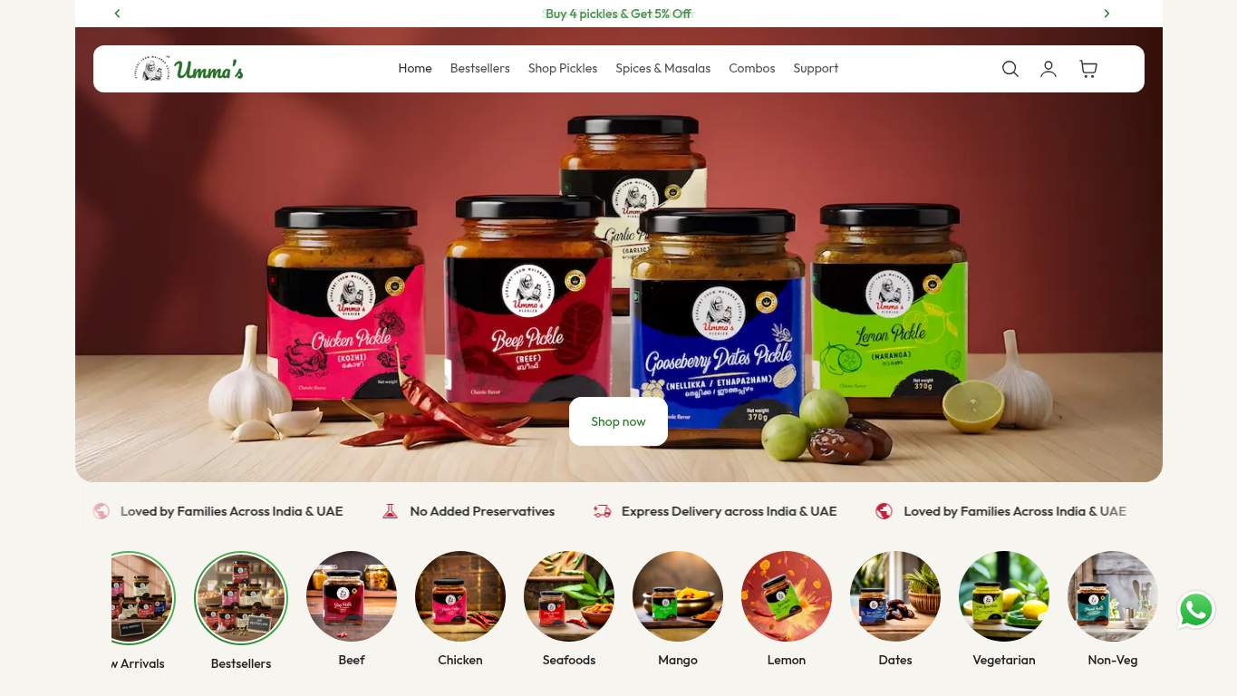
TECHNICAL SUMMARY
The good news: SEO foundations are strong, with a valid canonical, clean language setup, and crawlable pages. The bad news: performance is dragging the whole storefront through the mud — LCP is 8.0s, interactive time is 25.2s, CLS is 0.65, and the page is hauling 5,741 KiB while 742 KiB of JavaScript sits around doing nothing. Fix the heavy hero and defer the JavaScript first; until then, the store will keep losing impatient buyers and mobile traffic before they ever reach the products.
Where It Burns
6 categoriesWebsite Audit Findings for ummasfoods.com
SavageAudit identified 36 visible findings and recommendations across 6 audit categories. Each section below combines the category score with observed evidence and prioritized fixes.
2701 PERFORMANCELCP 8.0 s9002 SEOTitle Length 83 characters5803 DESIGNHeading Count 729404 COPYWord Count 14134805 UXJS Errors 29506 CONVERSIONCTA Count 2
01
PERFORMANCE AUDIT
27
LCP8.0 sInteractive25.2 sCLS0.65Total Size5,741 KiB
- 🔥Your 8.0s LCP arrives like a delayed airport bag: eventually, but nobody’s happy about it.
💀
The page loads like it’s carrying the entire warehouse on its back.
- →Compress hero images and switch them to WebP/AVIF so the landing asset stops dragging the homepage.LCP: 8.0 sImpact: highEffort: medium
Why this matters
The 8.0s LCP points directly at oversized hero content delaying the first meaningful render.
- →Defer non-critical JavaScript and cut render-blocking resources so the main thread can breathe.TBT: 1,080 msImpact: highEffort: medium
Why this matters
A 1,080 ms TBT means JavaScript is hogging the processor instead of letting users interact.
- →Enable CDN caching and longer cache TTLs for static assets to reduce the load tax on repeat visits.FCP: 2.9 sImpact: mediumEffort: low
Why this matters
An FCP of 2.9s suggests users wait too long for visible content, and caching is the cheapest win here.
02
SEO AUDIT
90
Title Length83 charactersH1 Count6Missing Alt4Schema Blocks6 JSON-LD blocks
- 🔥The title is 83 characters, which is less a meta title and more a tiny paragraph with ambition.
💀
SEO is mostly fine, but the heading stack is making the page look like it was assembled mid-shift.
- →Shorten the title tag to under 60 characters so search snippets stop getting clipped.Title Length: 83 charactersImpact: mediumEffort: low
Why this matters
An 83-character title is too long for consistent search display and weakens snippet clarity.
- →Consolidate the homepage to one H1 and use H2/H3 for subheads so the content hierarchy stops shouting.H1 Count: 6Impact: mediumEffort: low
Why this matters
Six H1s create structural ambiguity for crawlers and dilute the main page topic.
- →Add descriptive alt text to every meaningful image so the 4 missing alts stop wasting image-search and accessibility context.Missing Alt: 4Impact: mediumEffort: medium
Why this matters
Missing alt text blocks image understanding and reduces crawl context for visual assets.
03
DESIGN AUDIT
58
Heading Count72Empty Heading1Font Families6Images118
- 🔥Seventy-two headings on one page is less hierarchy and more an escape room made of text.
💀
The layout has good ingredients, but the typography budget is being spent like someone lost the receipt.
- →Add supporting imagery so the layout feels intentional instead of overcrowded by content blocks.Images: 118Impact: mediumEffort: medium
Why this matters
With 118 images and a dense content stack, the page needs tighter visual support to stay readable.
- →Fix the 4 missing alt attributes so accessibility and visual assets stop drifting apart.Missing Alt: 4Impact: mediumEffort: medium
Why this matters
Missing alts hurt both accessibility and the semantic clarity of image-heavy layouts.
- →Reduce font families from 6 to 2-3 so the page stops looking like a typography sampler.Font Families: 6Impact: mediumEffort: low
Why this matters
Six families create inconsistency and visual noise where the brand should feel more unified.
04
COPY AUDIT
94
Word Count1413Sentence Count133H1 Count6CTA Count2
- 🔥An 83-character title plus 6 H1s is what happens when the homepage refuses to pick a narrator.
💀
The writing knows what it sells, but the page keeps changing its mind about what to say first.
- →Tighten the headline to state the value proposition in one sentence so the page stops introducing itself six times.H1 Count: 6Impact: highEffort: low
Why this matters
Six H1s signal a muddled primary message, and the homepage needs one clear lead instead.
- →Break dense paragraphs into shorter sentences and bullets so the 133-sentence copy becomes skimmable.Avg Words/Sentence: 11Impact: lowEffort: medium
Why this matters
Short average sentence length helps, but the overall sentence volume still overwhelms quick scanning.
- →Add a clear primary CTA and make it visually dominant so the homepage stops treating ‘Contact Us’ like the only plan.CTA Count: 2Impact: mediumEffort: low
Why this matters
Only 2 CTAs on a commerce homepage is too sparse for guiding action confidently.
05
UX AUDITUSER EXPERIENCE AUDIT
48
JS Errors2Broken Assets4Interactive25.2 sLong Tasks20
- 🔥Two console errors — a 503 and a 400 — means the page is occasionally answering itself with a shrug.
💀
Users aren’t just waiting; they’re watching the page fumble live on arrival.
- →Fix client-side JavaScript errors so interactions stop failing silently in production.JS Errors: 2Impact: highEffort: medium
Why this matters
Two console errors mean real user interactions may be breaking without feedback.
- →Repair failed asset URLs and deployment paths so scripts and fetches load cleanly.Broken Assets: 4Impact: highEffort: medium
Why this matters
Broken assets are direct, user-visible failures that can destabilize the whole page.
- →Reduce form fields to only the essentials so the 175-input sprawl stops turning simple actions into paperwork.Form Fields: 175Impact: mediumEffort: medium
Why this matters
A 175-field surface area is far too heavy for a smooth browsing or inquiry experience.
06
CONVERSION AUDIT
95
CTA Count2Form Count30Input Count175Social Proof3
- 🔥There are 118 buttons, but only 2 CTAs; that’s not guidance, that’s button confetti.
💀
The page wants a sale, but its own interface keeps asking for a committee meeting first.
- →Add a primary CTA above the fold that matches the core offer so buyers don’t have to hunt for the next step.CTA Count: 2Impact: mediumEffort: low
Why this matters
Two CTAs are too few for a commerce homepage that needs a clear action path.
- →Place testimonials, ratings, or recognizable trust cues near the CTA so the page isn’t asking for blind faith.Social Proof: 3Impact: mediumEffort: low
Why this matters
Only 3 proof signals leaves the CTA under-supported at the exact moment trust matters.
- →Offer a low-friction contact option like a visible email, chat, or short form so conversion doesn’t detour through 30 forms.Contact Path: PresentImpact: lowEffort: medium
Why this matters
A contact path exists, but the current experience still feels too effort-heavy for quick conversion.
Audit overview
ummasfoods.com Audit Summary
The good news: SEO foundations are strong, with a valid canonical, clean language setup, and crawlable pages. The bad news: performance is dragging the whole storefront through the mud — LCP is 8.0s, interactive time is 25.2s, CLS is 0.65, and the page is hauling 5,741 KiB while 742 KiB of JavaScript sits around doing nothing. Fix the heavy hero and defer the JavaScript first; until then, the store will keep losing impatient buyers and mobile traffic before they ever reach the products.
Based on the category scores in this report, Conversion is the strongest area while Performance has the most room for improvement.
How SavageAudit Evaluated ummasfoods.com
SavageAudit evaluated the public website at https://ummasfoods.com/ across performance, technical SEO, design, copy, user experience, and conversion signals. Scores and recommendations reflect the website evidence available when this audit was generated on July 9, 2026.
Similar Website Audit Reports
Compare this result with other public SavageAudit reports that received a similar overall website score.