Loading Report View…
0/ 100
utsav2007-kac.github.io Website Audit Report
utsav2007-kac.github.io scored 58 out of 100 in this SavageAudit website audit covering Performance, SEO, Design, Copy, User Experience, and Conversion. The report uses captured website evidence to explain what is working, what is limiting the experience, and which improvements deserve attention first.
“A clinic page with the charisma of a waiting room pamphlet left in the rain.”
सक्रिय माउथकेयर ने इलाज के लिए हाथ बढ़ाया है, लेकिन वेबसाइट ने खुद को ऐसे पेश किया जैसे उसे भी चबाने में दिक्कत हो। The site looks serious, but the page keeps tripping over its own mouth.
 https://utsav2007-kac.github.io/active-mouthcare/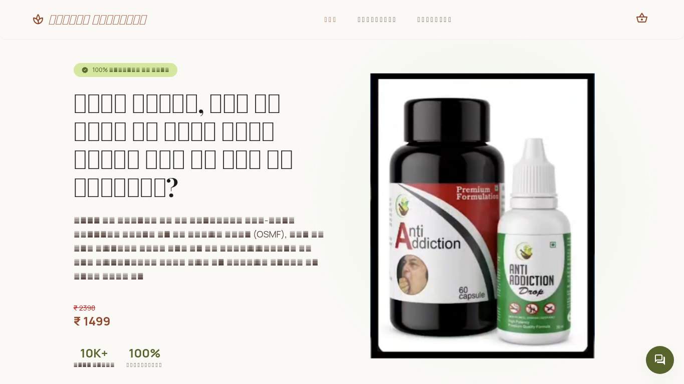
TECHNICAL SUMMARY
The biggest problem is speed and discoverability: Largest Contentful Paint is 23.9 s, First Contentful Paint is 9.1 s, and estimated image delivery savings are 3,629 KiB on a 5,063 KiB page. SEO is half-built at best: the meta description is missing, canonical is missing, and there’s no schema, Open Graph, or Twitter metadata to help search or sharing. Fix the oversized hero and missing CTA first, because this clinic page is currently leaking trust before it can generate a lead.
Where It Burns
6 categoriesWebsite Audit Findings for utsav2007-kac.github.io
SavageAudit identified 36 visible findings and recommendations across 6 audit categories. Each section below combines the category score with observed evidence and prioritized fixes.
4901 PERFORMANCELCP 23.9 s6202 SEOMeta description missing7403 DESIGNHeading level skips h2 -> h45504 COPYWord count 638105 UXJS errors 11806 CONVERSIONCTA count 0
01
PERFORMANCE AUDIT
49
LCP23.9 sFCP9.1 sTotal page weight5,063 KiBImage delivery savings3,629 KiB
- 🔥Your Largest Contentful Paint is 23.9 s, which is long enough for a patient to rethink the appointment, the clinic, and their life choices.
💀
The page loads like it’s carrying the whole clinic on a stretcher.
- →Compress the oversized hero images and convert them to WebP/AVIF.LCP: 23.9 sImpact: highEffort: medium
Why this matters
The 23.9 s LCP points directly at heavy visual assets dragging the main content into the mud.
- →Enable CDN caching and long cache TTLs for static files.FCP: 9.1 sImpact: mediumEffort: low
Why this matters
A 9.1 s FCP means users wait too long before anything useful appears, and caching can reduce repeat-load pain.
- →Defer non-critical JavaScript and cut render-blocking resources.TBT: 0 msImpact: highEffort: medium
Why this matters
The page has render-blocking savings of 8,160 ms, so the bottleneck is not theory; it’s the browser standing around waiting.
02
SEO AUDIT
62
Meta descriptionmissingCanonicalmissingSchemaNoneOpen Graph / Twitter metadataabsent
- 🔥The meta description is missing, so Google gets a clinic page and a shrug instead of a pitch.
💀
Search engines were handed a clinic flyer with no caption, no context, and no backup plan.
- →Write a 140–160 character meta description with the primary keyword and patient benefit.Meta description: missingImpact: highEffort: low
Why this matters
A missing meta description leaves search results without a compelling snippet for this clinic offer.
- →Add a self-referencing canonical tag for the page URL.Canonical: missingImpact: highEffort: low
Why this matters
Without a canonical, the page sends mixed signals about the preferred URL and weakens index clarity.
- →Add JSON-LD for the clinic page, such as Organization or WebSite schema.Schema: NoneImpact: mediumEffort: medium
Why this matters
Schema is completely absent, so rich-result context and entity clarity are being skipped.
03
DESIGN AUDIT
74
Heading level skipsh2 -> h4Font families11Images6Missing alt text0
- 🔥The heading structure skips from h2 to h4, which is the content equivalent of missing a stair and acting like it was planned.
💀
The page is arranged like a clinic brochure that lost its spine halfway down the hallway.
- →Reduce the font stack from 11 families to 2–3 for a consistent visual system.Font Families: 11Impact: mediumEffort: low
Why this matters
Too many typefaces make the layout feel visually fragmented instead of clinically trustworthy.
- →Add supporting imagery so the layout feels intentional, not empty.Images: 6Impact: mediumEffort: medium
Why this matters
The current image set exists, but the oversized hero and weak supporting structure make the page feel unbalanced.
- →Test spacing and alignment across breakpoints to keep the layout stable.Viewport: PresentImpact: lowEffort: medium
Why this matters
A viewport exists, but the page still needs breakpoint checks to keep the clinic layout coherent on mobile and desktop.
04
COPY AUDIT
55
Word count63Sentence count9CTA count0Social proof count1
- 🔥Sixty-three words across nine sentences means the page can barely finish a thought before needing another cup of tea.
💀
The copy talks just enough to be present and not enough to be persuasive.
- →Tighten the headline so it states the clinic value in one sentence.H1 Count: 1Impact: mediumEffort: low
Why this matters
The page has one headline, but it needs to do more work than just exist.
- →Add a clear CTA tied to consultation or contact.CTA Count: 0Impact: highEffort: low
Why this matters
With no CTA at all, the copy has no next step and no way to turn interest into leads.
- →Break the short body copy into skimmable bullets and shorter sentences.Avg Words/Sentence: 7Impact: lowEffort: medium
Why this matters
The page is brief, but the structure still needs more clarity and scanning support for nervous patients.
05
UX AUDITUSER EXPERIENCE AUDIT
81
JS errors1Broken assets1Form fields9External links0
- 🔥One console error and one broken favicon asset is a tiny fail, but it’s still a fail with a 404 receipt attached.
💀
The interface mostly works, but it has the polish of a clinic desk with a blinking error light.
- →Fix the client-side JavaScript error so interactions do not fail silently.JS Errors: 1Impact: highEffort: medium
Why this matters
A single console error can make a clinic flow feel unreliable right when users need confidence.
- →Repair the failed favicon URL and deployment path.Broken Assets: 1Impact: highEffort: medium
Why this matters
The 404 favicon is a visible deployment miss that makes the page feel neglected from the first glance.
- →Reduce the form fields from 9 to only the essentials.Form Fields: 9Impact: mediumEffort: medium
Why this matters
Nine fields is a lot of effort for a lead-generation clinic page, especially when trust signals are still thin.
06
CONVERSION AUDIT
18
CTA count0Contact pathMissingForms2Required inputs6
- 🔥CTA count is 0, which means the page is offering hope, not action.
💀
The page wants patients, but it forgot to put a hand on the doorknob.
- →Add a primary CTA above the fold that matches the clinic offer.CTA Count: 0Impact: highEffort: low
Why this matters
With no CTA, the page has no obvious conversion path from curiosity to contact.
- →Offer a low-friction contact option like a visible phone, chat, or email.Contact Path: MissingImpact: highEffort: medium
Why this matters
The page has forms, but no simple contact route is visible in the extracted data, which hurts lead capture.
- →Place social proof or trust signals near the CTA.Social Proof: 1Impact: mediumEffort: low
Why this matters
One proof point is not enough to carry a clinic lead page, especially when the CTA is currently absent.
Audit overview
utsav2007-kac.github.io Audit Summary
The biggest problem is speed and discoverability: Largest Contentful Paint is 23.9 s, First Contentful Paint is 9.1 s, and estimated image delivery savings are 3,629 KiB on a 5,063 KiB page. SEO is half-built at best: the meta description is missing, canonical is missing, and there’s no schema, Open Graph, or Twitter metadata to help search or sharing. Fix the oversized hero and missing CTA first, because this clinic page is currently leaking trust before it can generate a lead.
Based on the category scores in this report, User Experience is the strongest area while Conversion has the most room for improvement.
How SavageAudit Evaluated utsav2007-kac.github.io
SavageAudit evaluated the public website at https://utsav2007-kac.github.io/active-mouthcare/ across performance, technical SEO, design, copy, user experience, and conversion signals. Scores and recommendations reflect the website evidence available when this audit was generated on July 1, 2026.
Similar Website Audit Reports
Compare this result with other public SavageAudit reports that received a similar overall website score.