SINGLE URL ROAST
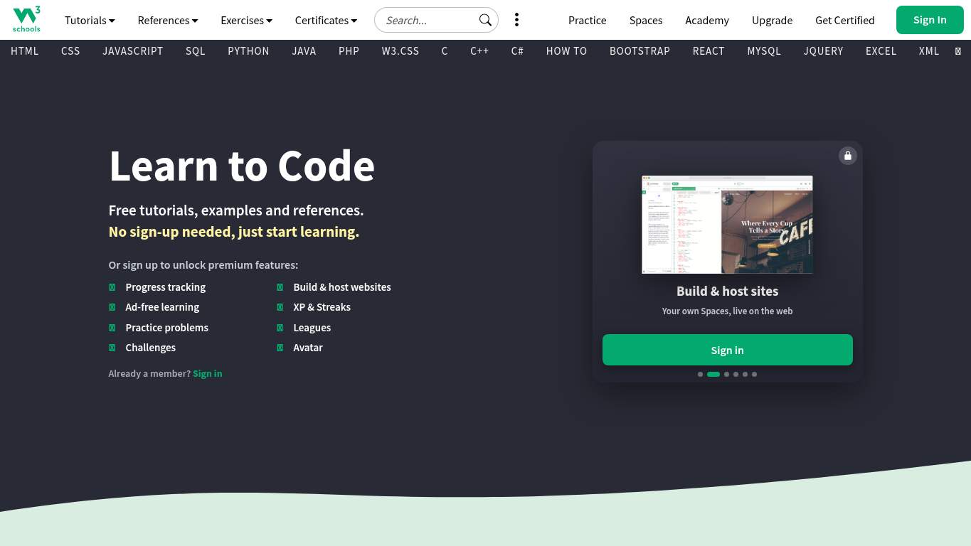
https://www.w3schools.com/ “Tutorial giant, but the homepage is tripping over its own syllabus.” W3Schools has the confidence of a seasoned instructor and the page organization of a desk after finals week. It keeps yelling “learn here” while stuffing the front row with extra menus, repeated CTAs, and enough clutter to make beginners feel like they’ve opened the wrong workbook.
https://www.w3schools.com/ screenshot TECHNICAL SUMMARY The main damage is a brutal LCP of 11.1s, interactive time of 11.4s, and 474 KiB of unused JavaScript, with total byte weight at 1,679 KiB. SEO is undercut by a missing canonical, an empty meta description, and zero structured data, while the page also has 18 H1s and 6 heading skips, so the content hierarchy is basically doing improv instead of instruction. Fix the heavy hero/load path first because speed and discoverability are both leaking trust, clicks, and sign-ups.
Categories 6 categories AI Visibility Partial Rewrite Owner only Share Share link 02
Canonical missing Meta Description missing Schema None H1 Count 18
🔥 Your canonical URL is missing, so search engines have to guess which copy of the page is the real one like a student guessing on the last question.Show 2 more roasts 💀 The page is searchable in theory, but structurally it’s leaving the index to read the room without a map.
Priority Fixes (3) → Add a self-referencing canonical tag so the page stops sending duplicate-signal confusion. Canonical: missing Impact: high Effort: low
Why this matters An empty canonical URL means search engines are not being told which version to trust.
→ Write a 140–160 character meta description that includes the main tutorial value proposition. Meta description: missing Impact: high Effort: low
Why this matters A missing meta description wastes control of the search snippet and weakens click appeal.
→ Add JSON-LD structured data for WebSite or Organization so the page can earn richer context in search. Schema: None Impact: medium Effort: medium
Why this matters Schema count is zero, so the page is skipping rich-result context and entity clarity.
03
Heading Skips 6 patterns H1 Count 18 Empty Headings 2 Font Families 14
🔥 Six heading skips is not structure; that’s content playing hopscotch across the page.Show 2 more roasts 💀 The page is visually competent, then the markup starts throwing confetti at the hierarchy.
Priority Fixes (3) → Consolidate typography to 2–3 font families so the interface stops looking like a font sampler. Font Families: 14 Impact: medium Effort: low
Why this matters Fourteen font families create inconsistency and make the layout feel less intentional.
→ Fix the heading structure so it follows a clean progression instead of jumping levels. Viewport: Present Impact: low Effort: medium
Why this matters The viewport exists, but the 6 heading skips show the content structure is not being organized cleanly.
→ Fix missing alt text on meaningful images so the page passes accessibility checks without extra drama. Missing Alt: 8 Impact: medium Effort: medium
Why this matters Eight missing alt attributes weaken both accessibility and layout completeness.
04
H1 Count 18 Meta Description missing Word Count 1974 CTA Count 15
🔥 The title string repeats “jQuery” four times like the page is trying to hypnotize search engines.Show 2 more roasts 💀 The copy keeps promising clarity, then hands the reader a megaphone and three different scripts.
Priority Fixes (3) → Tighten the headline to one plain value statement so the homepage stops talking in riddles. H1 Count: 18 Impact: high Effort: low
Why this matters Eighteen H1s signal the headline message is diluted instead of singular and clear.
→ Break long passages into shorter bullets and sentences so beginners can scan instead of spelunk. Avg Words/Sentence: 24 Impact: low Effort: medium
Why this matters An average of 24 words per sentence is workable, but it’s still heavy for beginner-first tutorial copy.
→ Make one primary CTA stand out and demote the rest so the page stops sounding like every button is shouting at once. CTA Count: 15 Impact: medium Effort: low
Why this matters Fifteen CTAs dilute the main action and blur what users should do next.
05
Broken Assets 3 Console Errors 0 Missing Alt 8 Footer absent
🔥 Three broken assets on a tutorial homepage is the browser equivalent of mission control losing three critical telemetry feeds.Show 2 more roasts 💀 The experience is mostly stable, until the page starts dropping assets like a nervous launch countdown.
Priority Fixes (3) → Repair the failed asset URLs and deployment paths so the page loads cleanly on first visit. Broken Assets: 3 Impact: high Effort: medium
Why this matters Three broken assets, including a fetch error and two blocked images, create visible user-facing friction.
→ Keep console errors at zero with routine browser smoke tests, even if the current run is clean. JS Errors: 0 Impact: low Effort: low
Why this matters The console is clean now, so this is a maintenance guardrail rather than a fire drill.
→ Keep navigation and footer links consistent across pages so users can recover when the page gets crowded. Nav/Footer: Nav / No footer Impact: low Effort: medium
Why this matters A nav-only layout with no footer reduces wayfinding consistency for a content-heavy tutorial site.
06
CTA Count 15 Social Proof 2 Form Count 0 Link Count 413
🔥 Fifteen CTAs and only two social proof signals is not persuasion; it’s button inflation.Show 2 more roasts 💀 The signup path is loud, crowded, and under-supported, which is a bad trio for beginners deciding whether to commit.
Priority Fixes (3) → Add a primary CTA above the fold that matches the core offer and stop making every button audition for the lead role. CTA Count: 15 Impact: medium Effort: low
Why this matters Fifteen CTAs indicate the main action is not visually or verbally dominant enough.
→ Place testimonials, logos, or stats near the signup CTA so users see proof before they commit. Social Proof: 2 Impact: medium Effort: low
Why this matters Only two social proof signals leaves the signup ask looking under-supported for a learning platform.
→ Offer a low-friction contact path alongside signup to reduce hesitation and improve trust. Contact Path: Present Impact: low Effort: medium
Why this matters A contact path exists, but converting learners often needs an easier fallback than hunting through a crowded page.