Loading Report View…
0/ 100
bylowin.com Website Audit Report
bylowin.com scored 65 out of 100 in this SavageAudit website audit covering Performance, SEO, Design, Copy, User Experience, and Conversion. The report uses captured website evidence to explain what is working, what is limiting the experience, and which improvements deserve attention first.
“Beautiful gallery, confused sales pitch, and a homepage that loads like it’s still getting ready.”
LÖWIN clearly knows how to make a mountain look good, but the site is far less committed to making a visitor do anything about it. The visuals have taste; the conversion path has commitment issues.
 https://bylowin.com/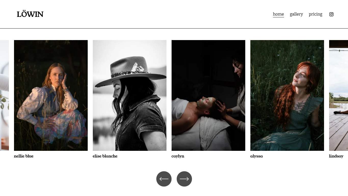
TECHNICAL SUMMARY
The site is crawlable, has strong SEO fundamentals, and includes valid schema, but the experience is dragged down by a 17.2s LCP, 17.4s interactive time, 2,817 KiB total weight, and 809 KiB of unused JavaScript. Performance is the main issue, while the lack of an H1 and CTA leaves the page visually polished but strategically underpowered.
Where It Burns
6 categoriesWebsite Audit Findings for bylowin.com
SavageAudit identified 36 visible findings and recommendations across 6 audit categories. Each section below combines the category score with observed evidence and prioritized fixes.
4801 PERFORMANCELCP 17.2s8802 SEOSEO Score 1008503 DESIGNImages 194804 COPYWord Count 1317205 UXInteractive 17.4s4806 CONVERSIONCTA Count 0
01
PERFORMANCE AUDIT
48
LCP17.2sInteractive17.4sFCP4.3sUnused JavaScript809 KiB
- 🔥Your LCP of 17.2s is not a hero image, it’s a hostage situation with a camera attached.
💀
The page loads like it’s editing the photos in real time, and the audience leaves before the premiere.
- →Compress hero images and convert them to WebP/AVIF so the main visual stops dragging the page.LCP: 17.2 sImpact: highEffort: medium
Why this matters
A 17.2s LCP says the hero is the bottleneck, so shrinking and modernizing those assets is the fastest way to get the page visible sooner.
- →Defer non-critical JavaScript and cut render-blocking resources so the browser can stop starring in a waiting-room drama.TBT: 330 msImpact: highEffort: medium
Why this matters
330 ms of blocking work and 9 long tasks mean scripts are stealing the main thread when they should be staying backstage.
- →Enable CDN caching and long cache TTLs for static assets so repeat visitors don’t relive the same loading tragedy.FCP: 4.3 sImpact: mediumEffort: low
Why this matters
A 4.3s first paint is still slow enough to lose impatient visitors, and caching is the lowest-effort way to reduce that delay.
02
SEO AUDIT
88
SEO Score100H1 Count0Redirect Count1Missing Alt1
- 🔥You’ve got 2 JSON-LD schema types and 0 parse errors, which is the rare part of this site that showed up prepared.
💀
The search setup is competent, but the heading hierarchy and URL hop make the page feel slightly directionless.
- →Add one H1 that states the primary value proposition for LÖWIN in plain language.H1 Count: 0Impact: highEffort: low
Why this matters
Zero H1s leaves the page without a clear top-level topic, which weakens search clarity and first-read understanding.
- →Add descriptive alt text to the one missing image so the visual story is readable when the image isn’t.Missing Alt: 1Impact: mediumEffort: medium
Why this matters
One missing alt attribute is small but avoidable, and meaningful photography pages should not be whispering to assistive tech.
- →Publish llms.txt or ai.txt with priority URLs and support paths so AI crawlers don’t have to guess what matters.AI Hints: MissingImpact: mediumEffort: medium
Why this matters
The site is allowed by major AI crawlers, but without an AI hint file you’re leaving citation routing up to chance.
03
DESIGN AUDIT
85
Images19Missing Alt1H1 Count0Font Families3
- 🔥The typography is clean, but 3 font families on a 131-word page is a lot of wardrobe for a very short monologue.
💀
It looks thoughtfully arranged, but the structure is still pretending a portfolio grid can do the job of a real landing page.
- →Add supporting imagery or context panels so the layout feels intentional instead of just image-heavy.Images: 19Impact: mediumEffort: medium
Why this matters
Nineteen images can carry a page visually, but without added structure they can also make the layout feel like a stack of postcards.
- →Fix the missing alt text on the image that currently has none.Missing Alt: 1Impact: mediumEffort: medium
Why this matters
Even a single missing alt breaks accessibility continuity on a site that depends on visual storytelling.
- →Test spacing and alignment across mobile and desktop breakpoints so the gallery doesn’t collapse under its own ambition.Viewport: PresentImpact: lowEffort: medium
Why this matters
Viewport support exists, but responsive behavior still needs validation when a mostly visual page carries this many images and headings.
04
COPY AUDIT
48
Word Count131Sentence Count10CTA Count0Avg Words/Sentence13
- 🔥At 131 words total, the site gives the audience a postcard when it needed a pitch.
💀
The writing is brief enough to be polite and weak enough to leave the inquiry button unemployed.
- →Tighten the headline to state the value in one sentence that a Montana client can actually act on.H1 Count: 0Impact: highEffort: low
Why this matters
With no H1, the page lacks a decisive opening line that explains what LÖWIN offers and why it matters.
- →Break the short copy into sharper sections and add scannable bullets where the portfolio needs context.Avg Words/Sentence: 13Impact: lowEffort: medium
Why this matters
The sentence length is fine, but the overall 131-word copy block is too thin to guide a visitor toward hiring you.
- →Add a clear CTA because the page currently has none, which is a spectacular way to end a lead-gen page without asking for leads.CTA Count: 0Impact: highEffort: low
Why this matters
Zero CTA text means the copy never transitions from brand mood to contact intent, which is a direct conversion leak.
05
UX AUDITUSER EXPERIENCE AUDIT
72
Interactive17.4sTotal Blocking Time330 msForm Inputs12CTA Count0
- 🔥Interactive time sits at 17.4s, so the page’s first job is apparently keeping people company while it loads.
💀
The experience is usable enough to survive, but it still asks visitors to do the thinking the page should have done.
- →Reduce the form to the essentials so the contact flow feels like a conversation, not a tax return.Form Fields: 12Impact: mediumEffort: medium
Why this matters
Twelve inputs are a lot for a photography inquiry, especially when the page already lacks a strong prompt to start the process.
- →Make navigation and footer links consistent so visitors don’t have to relearn the site on every page.Nav/Footer: Nav / FooterImpact: lowEffort: medium
Why this matters
The site has a minimal nav, so consistency matters more when the page structure is already sparse.
- →Keep runtime errors and broken assets at zero with browser smoke tests and production monitoring.JS Errors: 0Impact: lowEffort: low
Why this matters
Zero errors is the current baseline; preserving that prevents UX regressions from quietly sabotaging the contact path.
06
CONVERSION AUDIT
48
CTA Count0Form Count1Form Inputs12Social Proof Count1
- 🔥CTA count is 0, so the site is asking strangers to marry the brand without ever asking for a date.
💀
The page is dressed for discovery but not for decision, so the contact goal gets left on read.
- →Add a primary CTA above the fold that matches the core offer and tells visitors exactly what to do next.CTA Count: 0Impact: highEffort: low
Why this matters
With no CTA at all, the page has no obvious next step for a visitor who is ready to inquire.
- →Surface one low-friction contact path like a short form, visible email, or direct booking link.Contact Path: PresentImpact: lowEffort: medium
Why this matters
A contact path exists, but it needs to be easier to see and faster to use for local service leads.
- →Place social proof near the CTA so the lone proof point does more than decorate the page.Social Proof: 1Impact: mediumEffort: low
Why this matters
One proof element is better than none, but without strategic placement it won’t help visitors move from interest to inquiry.
Audit overview
bylowin.com Audit Summary
The site is crawlable, has strong SEO fundamentals, and includes valid schema, but the experience is dragged down by a 17.2s LCP, 17.4s interactive time, 2,817 KiB total weight, and 809 KiB of unused JavaScript. Performance is the main issue, while the lack of an H1 and CTA leaves the page visually polished but strategically underpowered.
Based on the category scores in this report, SEO is the strongest area while Conversion has the most room for improvement.
How SavageAudit Evaluated bylowin.com
SavageAudit evaluated the public website at https://bylowin.com/ across performance, technical SEO, design, copy, user experience, and conversion signals. Scores and recommendations reflect the website evidence available when this audit was generated on July 1, 2026.
Similar Website Audit Reports
Compare this result with other public SavageAudit reports that received a similar overall website score.