Loading Report View…
0/ 100
boat-lifestyle.com Website Audit Report
boat-lifestyle.com scored 52 out of 100 in this SavageAudit website audit covering Performance, SEO, Design, Copy, User Experience, and Conversion. The report uses captured website evidence to explain what is working, what is limiting the experience, and which improvements deserve attention first.
“A premium storefront held together by lag, clutter, and misplaced confidence.”
boAt brought the headphones, the product photos, and the coupon confetti—then buried them under a pile of browser drama. The homepage looks like it’s trying to sell audio gear and do accounting for every pixel at the same time.
 https://www.boat-lifestyle.com/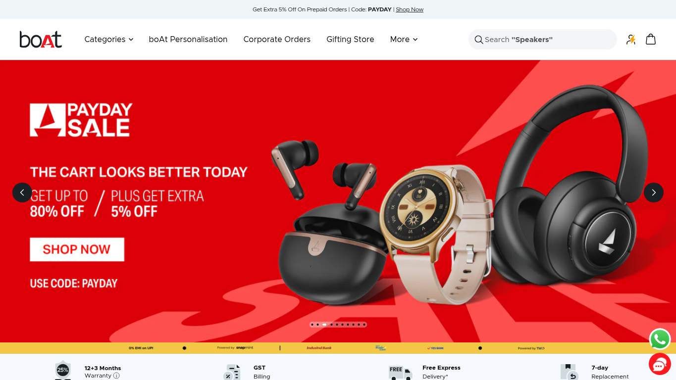
TECHNICAL SUMMARY
The homepage has decent SEO structure and a solid crawl setup, but the execution is bleeding attention: performance is the real tax collector here. With an LCP of 13.1s, FCP at 5.2s, interactive time at 36.8s, and 2,130ms of blocking time, the first impression arrives late enough to need a refund, and the 1,807 KiB of unused JavaScript plus 6,580 KiB total page weight are doing the opposite of direct-from-brand speed. Fix the heavy hero assets first, then cut render-blocking scripts; otherwise your trust signals and CTA work are just standing around waiting for the page to catch up.
Where It Burns
6 categoriesWebsite Audit Findings for boat-lifestyle.com
SavageAudit identified 36 visible findings and recommendations across 6 audit categories. Each section below combines the category score with observed evidence and prioritized fixes.
2701 PERFORMANCELCP 13.1 s8002 SEOSEO Score 85/1004003 DESIGNImages 3866204 COPYWord Count 3,5253705 UXJS Errors 68006 CONVERSIONCTA Count 4
01
PERFORMANCE AUDIT
27
LCP13.1 sFCP5.2 sTBT2,130 msUnused JS1,807 KiB
- 🔥Your LCP of 13.1s is longer than a product launch and half a playlist; the hero arrives fashionably late to its own homepage.
💀
The storefront doesn’t load like a premium brand; it arrives like it missed the whole meeting.
- →Compress the hero media and convert it to WebP/AVIF so the main banner stops acting like a suitcase full of bricks.LCP: 13.1 sImpact: highEffort: medium
Why this matters
The biggest content element is arriving absurdly late, and the hero asset weight is the most obvious culprit.
- →Defer non-critical JavaScript and strip out render-blocking resources so the page can become usable before the whole script pile finishes warming up.TBT: 2,130 msImpact: highEffort: medium
Why this matters
Main-thread blocking is severe enough to make interactions feel frozen instead of instant.
- →Enable CDN caching and long cache TTLs for static assets so repeat visitors aren’t forced to re-download the same shopping baggage.FCP: 5.2 sImpact: mediumEffort: low
Why this matters
The first paint is slow enough that better caching could meaningfully reduce how long shoppers stare at a blanking screen.
02
SEO AUDIT
80
SEO Score85/100Missing Alt78Heading Skipsh1->h4Product Schemafalse
- 🔥The SEO setup is mostly doing its job, which is adorable considering 78 images are missing alt text like a warehouse full of unnamed boxes.
💀
Search engines can read the page, but the images, headings, and product context keep undercutting the win.
- →Shorten the title tag to under 60 characters so the page stops introducing itself like a full legal disclaimer.Title Length: 70 charactersImpact: mediumEffort: low
Why this matters
The title is longer than ideal and risks getting clipped in search results.
- →Add descriptive alt text to every meaningful image so the 386-image catalog stops being invisible to search and accessibility tools.Missing Alt: 78Impact: mediumEffort: medium
Why this matters
A large chunk of the imagery is currently non-descriptive, which hurts discoverability and accessibility.
- →Nest headings sequentially from h1 to h2 to h3 so the outline stops leaping from the first floor to the attic.Heading Skips: h1->h4Impact: mediumEffort: medium
Why this matters
The current skip breaks content structure and makes the page harder to parse for crawlers and assistive tech.
03
DESIGN AUDIT
40
Images386Missing Alt78Font Families20Links433
- 🔥There are 386 images and 78 missing alt texts, which is a lot of visual inventory for a page that still leaves accessibility blindfolded.
💀
The interface has products, colors, and hierarchy, but also the visual discipline of a clearance aisle during a flash sale.
- →Reduce font families from 20 to 2-3 so the page stops looking like every department picked its own typeface.Font Families: 20Impact: mediumEffort: low
Why this matters
Too many fonts dilute visual consistency and make the brand feel less controlled.
- →Add supporting imagery where the layout feels empty so the 386-image library does more than merely exist.Images: 386Impact: mediumEffort: medium
Why this matters
The page has plenty of assets, but the layout still risks feeling overloaded instead of intentionally composed.
- →Fix missing alt text to pass accessibility audits and stop leaving 78 images in the dark.Missing Alt: 78Impact: mediumEffort: medium
Why this matters
Accessibility is already failing on a large set of images, which also affects polish and usability.
04
COPY AUDIT
62
Word Count3,525Sentence Count106H1 TextboAt LifestyleCTA Count4
- 🔥The page has 3,525 words and 106 sentences, so the homepage occasionally reads like it’s preparing for deposition, not shopping.
💀
The copy knows how to talk, but not always how to sell the first click.
- →Tighten the headline to state the value in one sentence so shoppers know what to buy before the banner starts monologuing.H1 Count: 1Impact: mediumEffort: low
Why this matters
The page has one primary headline, and it isn’t doing enough product-specific selling for an ecommerce homepage.
- →Break long paragraphs into skimmable bullets and shorter sentences so the 106-sentence wall stops reading like a warranty hearing.Avg Words/Sentence: 33Impact: mediumEffort: medium
Why this matters
The prose is dense enough to slow scanning, which is bad for shoppers hunting specs and deal details.
- →Add a clear primary CTA above the fold and make it the obvious action, not one of four equally polite suggestions.CTA Count: 4Impact: mediumEffort: low
Why this matters
The current CTA set is too spread out to create a strong immediate action path.
05
UX AUDITUSER EXPERIENCE AUDIT
37
JS Errors6Broken Assets12Interactive Time36.8 sConsole Errors6
- 🔥Six console errors and one page-error mean the site is already tripping over its own shoelaces before shoppers touch anything.
💀
Users are expected to shop through console errors, broken assets, and a front-end that behaves like it needs supervision.
- →Fix client-side JavaScript errors so interactions stop failing silently in production.JS Errors: 6Impact: highEffort: medium
Why this matters
Console errors are present and already causing visible instability in the browsing experience.
- →Repair failed asset URLs and deployment paths so scripts, images, and stylesheets actually load instead of ghosting the page.Broken Assets: 12Impact: highEffort: medium
Why this matters
A dozen broken assets is real user-facing friction, not a cosmetic nitpick.
- →Reduce form fields to only the essentials so the 9-input setup doesn’t feel like an application for a bank loan.Form Fields: 9Impact: mediumEffort: medium
Why this matters
Too many fields increase friction on a transactional page where speed and simplicity matter.
06
CONVERSION AUDIT
80
CTA Count4Social Proof3Forms2Inputs9
- 🔥There are 150 buttons on the page and only 4 identified CTAs, so the call-to-action strategy is basically 'everybody shout at once.'
💀
The page wants orders, but its action cues are scattered, its proof is thin, and its urgency is doing light cardio.
- →Add a primary CTA above the fold that matches the core offer so shoppers stop wandering through 150 button options like it’s a mall directory.CTA Count: 4Impact: mediumEffort: low
Why this matters
The current CTA count is too low and too diffuse for a high-intent ecommerce homepage.
- →Place social proof near the CTA so the 3 trust signals actually help the decision instead of loitering somewhere in the layout.Social Proof: 3Impact: mediumEffort: low
Why this matters
A small amount of proof needs to show up exactly where purchase intent peaks.
- →Offer a low-friction contact option like chat or visible email so the present contact path turns into an actual assist, not a scavenger hunt.Contact Path: PresentImpact: lowEffort: medium
Why this matters
The contact path exists, but better visibility can reduce hesitation for shoppers with pre-purchase questions.
Audit overview
boat-lifestyle.com Audit Summary
The homepage has decent SEO structure and a solid crawl setup, but the execution is bleeding attention: performance is the real tax collector here. With an LCP of 13.1s, FCP at 5.2s, interactive time at 36.8s, and 2,130ms of blocking time, the first impression arrives late enough to need a refund, and the 1,807 KiB of unused JavaScript plus 6,580 KiB total page weight are doing the opposite of direct-from-brand speed. Fix the heavy hero assets first, then cut render-blocking scripts; otherwise your trust signals and CTA work are just standing around waiting for the page to catch up.
Based on the category scores in this report, SEO is the strongest area while Performance has the most room for improvement.
How SavageAudit Evaluated boat-lifestyle.com
SavageAudit evaluated the public website at https://www.boat-lifestyle.com/ across performance, technical SEO, design, copy, user experience, and conversion signals. Scores and recommendations reflect the website evidence available when this audit was generated on July 1, 2026.
Similar Website Audit Reports
Compare this result with other public SavageAudit reports that received a similar overall website score.