Loading Report View…
0/ 100
themembro.com Website Audit Report
themembro.com scored 75 out of 100 in this SavageAudit website audit covering Performance, SEO, Design, Copy, User Experience, and Conversion. The report uses captured website evidence to explain what is working, what is limiting the experience, and which improvements deserve attention first.
“A sleek front end with trust issues and a habit of tripping over itself.”
the.MEMBRO shows up dressed for a board meeting, then forgets to introduce itself. It’s got the confidence of an AI teammate and the courtroom evidence of a page that hopes nobody asks questions.
 https://themembro.com/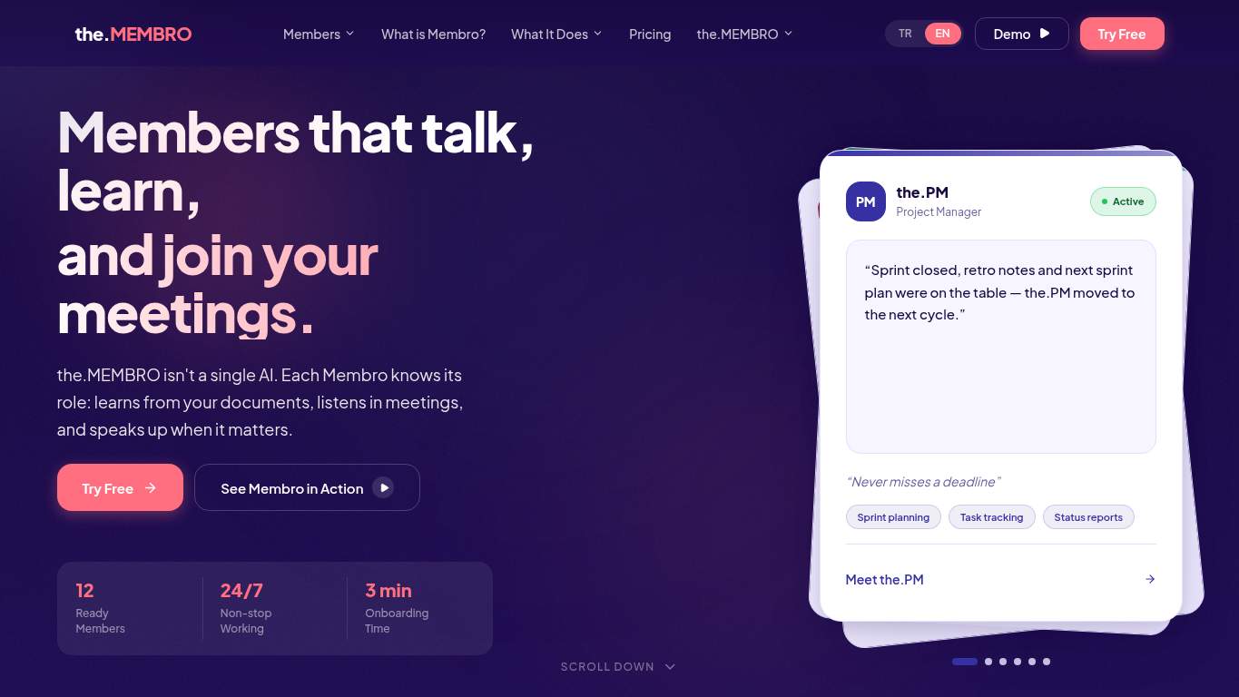
TECHNICAL SUMMARY
The good news: the site is crawlable, has structured data, and the server answers fast at 60 ms. The bad news: the money page still drags with a 6.5 s LCP, 6.7 s interactive time, an empty canonical, no H1, no sitemap, 2 console errors, and 3 broken assets — so the first impression is doing the work while the page itself is quietly fumbling the demo. Fix the hero asset weight and the trust/relevance basics first; that’s where discoverability, credibility, and trial starts are leaking.
Where It Burns
6 categoriesWebsite Audit Findings for themembro.com
SavageAudit identified 36 visible findings and recommendations across 6 audit categories. Each section below combines the category score with observed evidence and prioritized fixes.
7101 PERFORMANCELCP 6.5 s8202 SEOCanonical missing7603 DESIGNImages 467504 COPYWord Count 10327405 UXRedirects 17606 CONVERSIONCTA Count 11
01
PERFORMANCE AUDIT
71
LCP6.5 sSpeed Index7.1 sInteractive6.7 sMain-thread work3.0 s
- 🔥Your LCP of 6.5 s is the AI equivalent of a dramatic pause that never pays off.
💀
The page starts the race in sneakers, then asks the hero image to carry the whole stadium.
- →Compress hero images and switch them to WebP/AVIF so the landing hero stops dragging LCP around by the ankles.LCP: 6.5 sImpact: highEffort: medium
Why this matters
The heaviest visible content is delaying the first meaningful render, which directly hurts trial intent and first impression speed.
- →Defer non-critical JavaScript and trim render-blocking resources so the main thread stops playing goalie for every script.TBT: 170 msImpact: highEffort: medium
Why this matters
Even with modest blocking time, the page has 5 long tasks and 3.0 s of main-thread work, so script weight is still slowing interaction.
- →Enable CDN caching and longer cache TTLs for static assets to stop making repeat visitors pay the reload tax.FCP: 1.7 sImpact: mediumEffort: low
Why this matters
First paint is decent but not elite; better caching can shave the early delay and improve perceived speed on return visits.
02
SEO AUDIT
82
CanonicalmissingH1 Count0sitemap.xmlMissingAI CrawlersMixed 1/4
- 🔥Your canonical is missing, so search engines get to guess which version is the real one like it’s a group project.
💀
The page is indexable, but the structure is doing SEO with one eye closed and one shoe off.
- →Add a self-referencing canonical tag so the.MEMBRO stops sending mixed signals about which URL deserves credit.Canonical: missingImpact: highEffort: low
Why this matters
Without a canonical, the / and /en versions can dilute signals and confuse indexing.
- →Add one H1 tag with the core value proposition so the page has a real headline, not just a stylish opening act.H1 Count: 0Impact: highEffort: low
Why this matters
The page starts at H2, which weakens topical clarity for both search engines and humans.
- →Generate and submit a sitemap.xml so search engines don’t have to hunt your pages like a lost demo link.sitemap.xml: MissingImpact: mediumEffort: low
Why this matters
A sitemap makes discovery and indexing more reliable, especially for a SaaS site with multiple important pages.
03
DESIGN AUDIT
76
Images46H1 Count0Console Errors2Broken Assets3
- 🔥There are 46 images on the page, but the layout still feels like the hero mockup is doing all the emotional labor.
💀
The interface is clean enough to look expensive, but the structure is still arguing with itself.
- →Add supporting imagery and balance the hero so the product doesn’t have to carry the entire visual load alone.Images: 46Impact: mediumEffort: medium
Why this matters
Despite many images, the composition is still overly dependent on the mockup, which makes the page feel less complete than it should.
- →Fix missing alt text coverage so the image-heavy layout doesn’t turn accessibility into a side quest.Missing Alt: 0Impact: lowEffort: medium
Why this matters
Accessibility checks are clean here, so the current evidence is limited/unknown — keep it that way as the page evolves.
- →Test spacing and alignment across breakpoints to make sure the clear desktop hierarchy survives smaller screens intact.Viewport: PresentImpact: lowEffort: medium
Why this matters
Viewport support exists, but responsive harmony still needs verification to keep the visual system consistent.
04
COPY AUDIT
75
Word Count1032Sentence Count169CTA Count11Social Proof1
- 🔥With 1,032 words across 169 sentences, this copy is talking at people like it’s billed by the syllable.
💀
It sounds informed, but the message is buried under a novella and a button stampede.
- →Tighten the headline to state the value in one sentence so visitors know what the product is before the paragraph marathon starts.H1 Count: 0Impact: highEffort: low
Why this matters
The page lacks a true H1, and the current opening needs sharper positioning for a team AI product.
- →Break dense sections into shorter sentences and bullets so the 169-sentence wall stops reading like a terms-and-conditions audiobook.Avg Words/Sentence: 6Impact: lowEffort: medium
Why this matters
The copy is structurally dense overall, even if individual sentences are short, which means skimmability still needs work.
- →Make the primary CTA stand out and reduce competing button variants so the page stops auditioning eleven different closers.CTA Count: 11Impact: mediumEffort: low
Why this matters
Too many CTAs blur the ask, especially for a free-trial SaaS page that should make the next step obvious.
05
UX AUDITUSER EXPERIENCE AUDIT
74
Redirects1JS Errors2Broken Assets3Interactive6.7 s
- 🔥The page redirects once from / to /en, which is a small detour but still a detour before the pitch even starts.
💀
The journey is mostly smooth until the site starts tripping over tiny things that users absolutely notice.
- →Make navigation and footer links consistent across pages so the user doesn’t have to relearn the map every time.Nav/Footer: Nav / FooterImpact: lowEffort: medium
Why this matters
The site has standard navigation and footer patterns, but consistency across routed pages still matters for a multi-page SaaS flow.
- →Fix the 2 client-side JavaScript errors so interactions don’t fail silently while users are trying to explore the product.JS Errors: 2Impact: highEffort: medium
Why this matters
Console errors plus missing favicon requests suggest real runtime/deployment friction, not harmless noise.
- →Repair the 3 failed asset URLs, including the pricing fetch abort and favicon 404s, so the page stops looking half-deployed.Broken Assets: 3Impact: highEffort: medium
Why this matters
Broken assets are visible friction and can undermine both perceived quality and reliability during a trial decision.
06
CONVERSION AUDIT
76
CTA Count11Social Proof1Form Count0Interactive6.7 s
- 🔥The page has 11 CTAs, but when everything is a call to action, nothing actually gets the whistle.
💀
It asks for trust, but doesn’t stage the proof or the path to earn it.
- →Add a primary CTA above the fold that matches the free-trial offer so the first decision is obvious.CTA Count: 11Impact: mediumEffort: low
Why this matters
The current button density is high enough to dilute urgency, so one dominant path should lead the page.
- →Offer a low-friction contact option such as a form, chat, or visible email so visitors have a fallback besides trial-or-nothing.Contact Path: PresentImpact: lowEffort: medium
Why this matters
The page has contact access, but there’s no actual form, which limits alternative conversion paths for cautious buyers.
- →Place testimonials, logos, or concrete usage stats near the CTA so the trial ask isn’t standing there naked.Social Proof: 1Impact: mediumEffort: low
Why this matters
A single proof point is thin for a SaaS subscription page that needs trust before a free-trial click.
Audit overview
themembro.com Audit Summary
The good news: the site is crawlable, has structured data, and the server answers fast at 60 ms. The bad news: the money page still drags with a 6.5 s LCP, 6.7 s interactive time, an empty canonical, no H1, no sitemap, 2 console errors, and 3 broken assets — so the first impression is doing the work while the page itself is quietly fumbling the demo. Fix the hero asset weight and the trust/relevance basics first; that’s where discoverability, credibility, and trial starts are leaking.
Based on the category scores in this report, SEO is the strongest area while Performance has the most room for improvement.
How SavageAudit Evaluated themembro.com
SavageAudit evaluated the public website at https://themembro.com/ across performance, technical SEO, design, copy, user experience, and conversion signals. Scores and recommendations reflect the website evidence available when this audit was generated on July 10, 2026.
Similar Website Audit Reports
Compare this result with other public SavageAudit reports that received a similar overall website score.