Loading Report View…
0/ 100
slurrpfarm.com Website Audit Report
slurrpfarm.com scored 65 out of 100 in this SavageAudit website audit covering Performance, SEO, Design, Copy, User Experience, and Conversion. The report uses captured website evidence to explain what is working, what is limiting the experience, and which improvements deserve attention first.
“A snack brand drowning in clutter, delay, and way too many opinions.”
Slurrp Farm brought the wholesome ingredients to the party, then invited 287 buttons, 51 CTAs, and a headline that screams like it lost its patience in a courtroom. For parents shopping for kids’ food, this page asks for trust while waving 222 images and 16 font families around like a glitter cannon.
 https://slurrpfarm.com/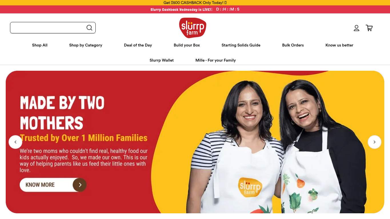
TECHNICAL SUMMARY
The site has decent crawlability and a solid SEO base, but the execution is noisy: LCP is 16.2s, interactive lands at 16.5s, total weight is 4,061 KiB, and image delivery alone leaves 700 KiB on the table. Add 0 JSON-LD, a missing meta description audit, 21 missing alt attributes, 1 console 404 on the favicon, and heading skips from h1->h3 and h2->h4, and the fix-first priority is obvious: stop making the browser and the shopper do extra work. That cleanup matters because this is transactional ecommerce for parents, where speed, clarity, and trust proof are the difference between a bundle click and a bounce.
Where It Burns
6 categoriesWebsite Audit Findings for slurrpfarm.com
SavageAudit identified 36 visible findings and recommendations across 6 audit categories. Each section below combines the category score with observed evidence and prioritized fixes.
6801 PERFORMANCELCP 16.2 s7202 SEOMeta Description Missing4003 DESIGNImages 2225304 COPYWord Count 4,1617305 UXConsole Errors 17406 CONVERSIONCTA Count 51
01
PERFORMANCE AUDIT
68
LCP16.2 sInteractive16.5 sTotal Byte Weight4,061 KiBImage Delivery Savings700 KiB
- 🔥Your LCP is 16.2s, which is not a hero moment — it’s an endurance sport nobody signed up for.
💀
The page is carrying a pantry-sized payload and making visitors wait for the privilege.
- →Compress the hero and top-fold images, then convert them to WebP/AVIF.LCP: 16.2 sImpact: highEffort: medium
Why this matters
A 16.2s LCP means the biggest visible content is arriving absurdly late, and hero assets are the obvious first target.
- →Defer non-critical JavaScript and cut render-blocking resources.TBT: 50 msImpact: highEffort: medium
Why this matters
The page has measurable blocking work, so pushing non-essential scripts out of the critical path will reduce delay and make the page feel less like it's thinking about it.
- →Enable CDN caching and long cache TTLs for static assets.FCP: 2.4 sImpact: mediumEffort: low
Why this matters
A 2.4s FCP is not catastrophic, but better caching would trim early visual latency and help the storefront appear sooner.
02
SEO AUDIT
72
Meta DescriptionMissingSchema JSON-LD Count0Heading Level Skipsh1->h3, h2->h4Missing Alt Attributes21
- 🔥You’ve got 0 JSON-LD blocks, which means Google gets no schema context and the page shows up to search like it forgot its ID.
💀
Search can find the page, but the page is doing its best to be forgettable on the way there.
- →Shorten the title tag to under 60 characters.Title Length: 65 charactersImpact: mediumEffort: low
Why this matters
A 65-character title is longer than ideal, so trimming it improves snippet cleanliness and reduces truncation risk.
- →Add JSON-LD structured data for WebSite, Organization, and Product where relevant.Schema: NoneImpact: mediumEffort: medium
Why this matters
With 0 schema blocks, search gets no structured context for brand, products, or breadcrumbs.
- →Add Organization or WebSite schema with sameAs links to official profiles.Entity Graph: MissingImpact: mediumEffort: medium
Why this matters
The entity graph is missing, so the brand is leaving trust and identity signals scattered instead of machine-readable.
03
DESIGN AUDIT
40
Images222Missing Alt21Font Families16Buttons287
- 🔥There are 222 images and 21 missing alt attributes, so the site is visually busy and still not fully explaining itself.
💀
It’s visually crowded enough to sell snacks and confuse the eyeballs at the same time.
- →Reduce font families from 16 to 2-3.Font Families: 16Impact: mediumEffort: low
Why this matters
Sixteen font families creates visual noise and makes the brand feel less disciplined than a kids-snack aisle should.
- →Fix missing alt text for meaningful images.Missing Alt: 21Impact: mediumEffort: medium
Why this matters
Twenty-one missing alt attributes means important visuals are silent to assistive tech and weaker for accessibility.
- →Add supporting imagery more intentionally so the layout feels designed, not just packed.Images: 222Impact: mediumEffort: medium
Why this matters
With 222 images, the page has plenty of material but not enough clear visual hierarchy to make it feel deliberate.
04
COPY AUDIT
53
Word Count4,161Sentence Count98CTA Count51Link Count364
- 🔥The page runs 4,161 words across 98 sentences, which is a lot of talking for a snack shelf.
💀
It talks like a catalog, not a confidence builder, and it keeps repeating itself until the message gets indigestion.
- →Tighten the headline to state the value in one sentence.H1 Count: 1Impact: mediumEffort: low
Why this matters
The page has one main heading, so the headline needs to do more of the heavy lifting instead of hiding the offer in wall-of-copy mode.
- →Break long paragraphs into skimmable bullets and shorter sentences.Avg Words/Sentence: 42Impact: mediumEffort: medium
Why this matters
An average of 42 words per sentence is too much work for parents scanning for ingredient, nutrition, and bundle clarity.
- →Make the primary CTA stand out and reduce competing action labels.CTA Count: 51Impact: mediumEffort: low
Why this matters
Fifty-one CTAs dilute urgency and turn the page into a menu instead of a decision path.
05
UX AUDITUSER EXPERIENCE AUDIT
73
Console Errors1Broken Assets1Layout Shifts1Form Fields668
- 🔥A 404 on /favicon.ico is a tiny error with huge manners problems; even the browser noticed the page forgot its outfit.
💀
The experience mostly works, but it keeps tripping over its own paperwork and one broken asset.
- →Fix client-side JavaScript errors so interactions do not fail silently.JS Errors: 1Impact: highEffort: medium
Why this matters
Even one console error can break interactions or hide failures, and production UX should not be guessing whether the page is working.
- →Repair failed asset URLs and deployment paths.Broken Assets: 1Impact: highEffort: medium
Why this matters
The favicon 404 proves at least one asset path is broken, which is sloppy and user-visible even if it seems small.
- →Reduce form fields to only the essentials.Form Fields: 668Impact: mediumEffort: medium
Why this matters
Six hundred sixty-eight fields across 136 forms is far beyond reasonable and adds avoidable interaction burden.
06
CONVERSION AUDIT
74
CTA Count51Buttons287Social Proof4Contact PathPresent
- 🔥There are 51 CTAs and 287 buttons, so the page is trying to close the sale by sheer volume instead of clarity.
💀
It wants the sale, but it’s surrounded by so many distractions that the cart has to fight for its life.
- →Add a primary CTA above the fold that matches the core offer.CTA Count: 51Impact: mediumEffort: low
Why this matters
With 51 CTAs, the page lacks a single obvious buying path and needs one dominant action to guide parents to purchase.
- →Place testimonials, ratings, or trust stats closer to the purchase CTA.Social Proof: 4Impact: mediumEffort: low
Why this matters
Four social proof items are not enough near the decision point for a transactional kids-food page that depends on trust.
- →Offer a low-friction contact option such as chat, form, or visible email near purchase paths.Contact Path: PresentImpact: lowEffort: medium
Why this matters
A contact path exists, but making it easier to find can help undecided parents resolve purchase objections faster.
Audit overview
slurrpfarm.com Audit Summary
The site has decent crawlability and a solid SEO base, but the execution is noisy: LCP is 16.2s, interactive lands at 16.5s, total weight is 4,061 KiB, and image delivery alone leaves 700 KiB on the table. Add 0 JSON-LD, a missing meta description audit, 21 missing alt attributes, 1 console 404 on the favicon, and heading skips from h1->h3 and h2->h4, and the fix-first priority is obvious: stop making the browser and the shopper do extra work. That cleanup matters because this is transactional ecommerce for parents, where speed, clarity, and trust proof are the difference between a bundle click and a bounce.
Based on the category scores in this report, Conversion is the strongest area while Design has the most room for improvement.
How SavageAudit Evaluated slurrpfarm.com
SavageAudit evaluated the public website at https://slurrpfarm.com/ across performance, technical SEO, design, copy, user experience, and conversion signals. Scores and recommendations reflect the website evidence available when this audit was generated on July 1, 2026.
Similar Website Audit Reports
Compare this result with other public SavageAudit reports that received a similar overall website score.