Loading Report View…
0/ 100
buildonelevelhigher.com Website Audit Report
buildonelevelhigher.com scored 79 out of 100 in this SavageAudit website audit covering Performance, SEO, Design, Copy, User Experience, and Conversion. The report uses captured website evidence to explain what is working, what is limiting the experience, and which improvements deserve attention first.
“Strong messaging, but the site is making trust and speed do all the apologizing.”
One Level Higher talks like it’s ready to coach strong leaders into disciplined systems, then shows up with the digital equivalent of a half-packed suitcase. The playbooks sound sharp; the site itself keeps wandering off with the trust, speed, and clarity it promised to bring.
 https://buildonelevelhigher.com/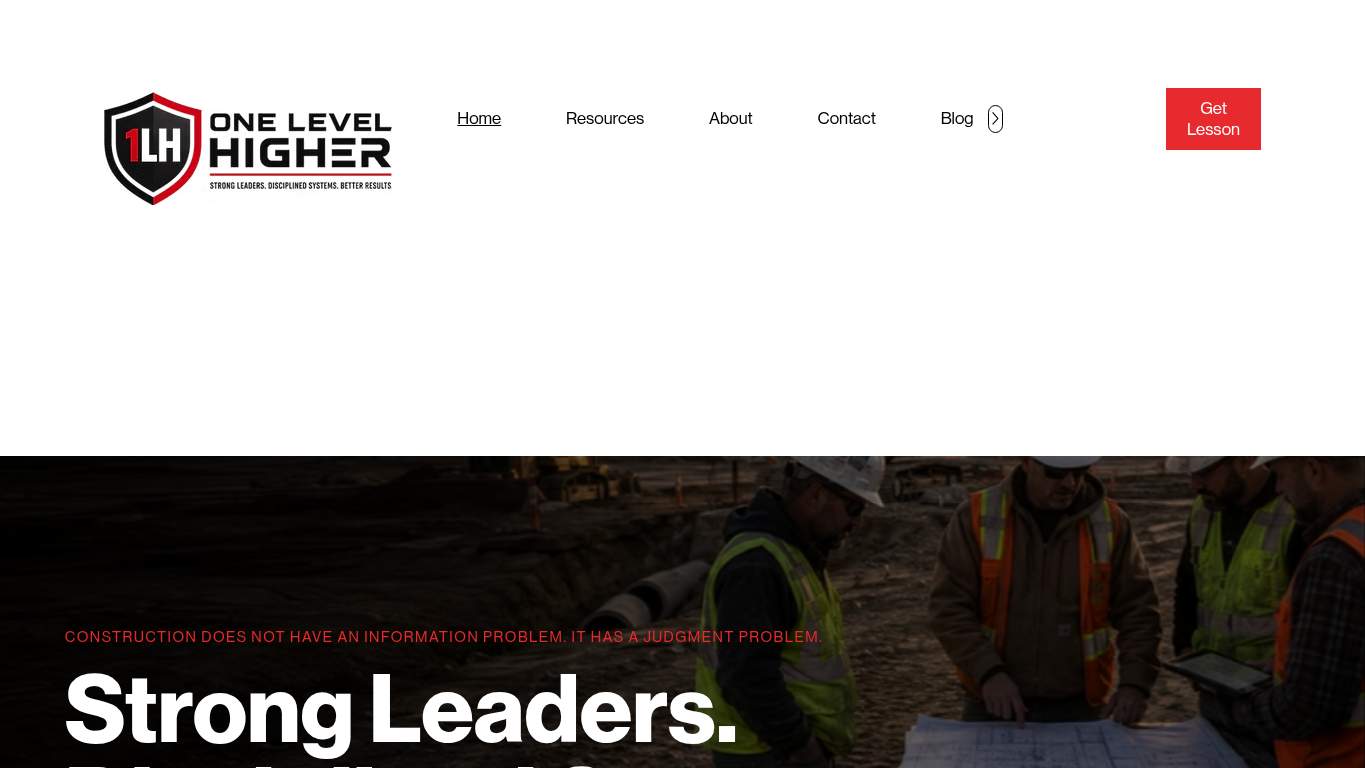
TECHNICAL SUMMARY
The good news: the brand message is strong, the SEO base is decent, and the page is crawlable with a proper canonical. The bad news: LCP is 7.5s, FCP is 3.9s, the root document takes 760ms, and the page drags 4,206 KiB of baggage while leaving 248 KiB of unused JavaScript on the floor. Add 7 console errors, 4 broken assets, and a missing meta description, and the homepage starts looking less like a leadership platform and more like an airport delay announcement with nicer typography.
Where It Burns
6 categoriesWebsite Audit Findings for buildonelevelhigher.com
SavageAudit identified 36 visible findings and recommendations across 6 audit categories. Each section below combines the category score with observed evidence and prioritized fixes.
6301 PERFORMANCELCP 7.5s7302 SEOMeta Description missing8003 DESIGNMissing Alt Attributes 89604 COPYWord Count 9907605 UXJS Errors 79306 CONVERSIONCTA Count 2
01
PERFORMANCE AUDIT
63
LCP7.5sFCP3.9sTotal Byte Weight4,206 KiBUnused JavaScript Savings248 KiB
- 🔥Your LCP of 7.5s is taking longer to land than a red-eye with weather issues. For a leadership site, that’s a lot of waiting before anyone gets to the strong leaders part.
💀
The homepage is hauling too much code and arriving too late to lead anyone anywhere.
- →Compress the hero assets and convert them to WebP/AVIF so the page stops waiting on the visual centerpiece.LCP: 7.5 sImpact: highEffort: medium
Why this matters
The hero is the thing visitors see first, and a 7.5s LCP says it is the bottleneck instead of the welcome mat.
- →Serve static assets with long cache TTLs and CDN caching so repeat visits don’t reload the same baggage.FCP: 3.9 sImpact: mediumEffort: low
Why this matters
A 3.9s FCP suggests the page is slow to show anything useful, and better caching is the lowest-effort way to reduce the wait.
- →Defer non-critical JavaScript and trim render-blocking resources so the browser can actually move instead of babysitting scripts.TBT: 110 msImpact: highEffort: medium
Why this matters
Even though TBT is not the worst offender, the page still has enough blocking behavior to keep the main thread needlessly busy.
02
SEO AUDIT
73
Meta DescriptionmissingOpen Graph ImagemissingHeading Skipsh2→h5, h2→h6Canonicalpresent and matching
- 🔥The meta description is empty, which is a bold strategy for a lead-gen agency that wants leaders to trust the pitch before the click.
💀
Technically indexable, socially forgettable, and structurally a little too free-spirited for its own good.
- →Write a 140–160 character meta description with the primary keyword so search snippets stop freelancing.Meta description: missingImpact: highEffort: low
Why this matters
An empty meta description wastes the search result real estate the page already earned.
- →Add an og:image tag so shared links don’t show up like a missing-headshot conference badge.Open Graph Image: MissingImpact: mediumEffort: low
Why this matters
Without an Open Graph image, social previews lose the visual context that helps a coaching brand look credible at first glance.
- →Add Organization or WebSite schema with sameAs links to canonical brand profiles so the entity graph stops being invisible.Entity Graph: MissingImpact: mediumEffort: medium
Why this matters
The page has crawlability and canonical basics, but no entity graph means search engines get less brand context than they should.
03
DESIGN AUDIT
80
Missing Alt Attributes8Font Families20Heading Count24H3 Count0
- 🔥Eight missing alt attributes across 17 images is accessibility on layaway: the visuals show up, but some of the story doesn’t.
💀
The layout looks professional at first glance, then the details start auditioning for chaos.
- →Fix missing alt text on all meaningful images so the visual narrative is actually accessible.Missing Alt: 8Impact: mediumEffort: medium
Why this matters
Eight missing alt attributes means the design is carrying assets that some users and tools cannot fully interpret.
- →Reduce the font stack from 20 families to 2–3 so the page stops looking like it borrowed typography from three different decades.Font Families: 20Impact: mediumEffort: low
Why this matters
A huge font count creates inconsistency and makes a clean leadership brand feel oddly improvised.
- →Add supporting imagery where the layout feels empty so the page doesn’t leave whole zones of white space acting like a power outage.Images: 17Impact: mediumEffort: medium
Why this matters
The page has enough images to work with, but the visual support appears thin relative to the space it occupies.
04
COPY AUDIT
96
Word Count990Sentence Count77CTA Count2H1 Count1
- 🔥The H1 is clean, and the 990-word body proves you can write; the problem is that a lot of the page still sounds like it’s introducing the idea instead of selling the outcome.
💀
The copy knows the vocabulary, but it still has to earn the conviction.
- →Tighten the headline so the value shows up in one sentence and doesn’t make visitors decode the pitch.H1 Count: 1Impact: mediumEffort: low
Why this matters
The page has one H1, so the main opportunity is making that single headline do more persuasive work.
- →Break dense paragraphs into skimmable bullets and shorter sentences so the leadership framework reads like a playbook, not a lecture.Avg Words/Sentence: 13Impact: lowEffort: medium
Why this matters
The writing is readable, but the page still benefits from easier scanning for busy business leaders.
- →Make the primary CTA stand out more clearly so 'Contact' isn’t competing with the rest of the page for attention.CTA Count: 2Impact: mediumEffort: low
Why this matters
With only two CTAs, the page needs a more decisive hierarchy around the action it wants most.
05
UX AUDITUSER EXPERIENCE AUDIT
76
JS Errors7Broken Assets4Interactive Time10.9sCLS0
- 🔥Seven console errors mean the browser is quietly complaining in the corner while the page tries to act composed.
💀
The page is usable in theory, but in practice it keeps tripping over its own runtime.
- →Fix the client-side JavaScript errors so interactions don’t fail silently in production.JS Errors: 7Impact: highEffort: medium
Why this matters
Seven console errors are enough to make the page feel unreliable even when the layout looks intact.
- →Repair the failed asset URLs and deployment paths so scripts, images, and stylesheets load cleanly.Broken Assets: 4Impact: highEffort: medium
Why this matters
Broken assets create visible and invisible friction, and this page already has four of them doing damage.
- →Reduce the form fields from 13 to the essentials so the contact path feels like a conversation, not an intake exam.Form Fields: 13Impact: mediumEffort: medium
Why this matters
A 13-field form raises the effort required to engage, which is especially rough for a lead-generation page.
06
CONVERSION AUDIT
93
CTA Count2Social Proof1Forms2Required Inputs0
- 🔥Only two CTAs on a lead-gen homepage is fine if every word and section pulls its weight; here, the page is still making the visitor work too hard for the next step.
💀
The page points to contact, but it doesn’t yet build enough confidence to earn it fast.
- →Add a primary CTA above the fold that matches the core offer so the next step is obvious immediately.CTA Count: 2Impact: mediumEffort: low
Why this matters
Two CTAs can work, but without a dominant primary action the homepage makes visitors decide instead of guiding them.
- →Place testimonials, logos, stats, or credentials near the CTA so the contact ask has some backup singers.Social Proof: 1Impact: mediumEffort: low
Why this matters
For a leadership coaching agency, one piece of social proof is thin support for a high-trust conversion moment.
- →Offer a low-friction contact option such as form, chat, or visible email so the path to inquiry feels easy.Contact Path: PresentImpact: lowEffort: medium
Why this matters
The contact path exists, but making it easier to access can reduce hesitation for busy decision-makers.
Audit overview
buildonelevelhigher.com Audit Summary
The good news: the brand message is strong, the SEO base is decent, and the page is crawlable with a proper canonical. The bad news: LCP is 7.5s, FCP is 3.9s, the root document takes 760ms, and the page drags 4,206 KiB of baggage while leaving 248 KiB of unused JavaScript on the floor. Add 7 console errors, 4 broken assets, and a missing meta description, and the homepage starts looking less like a leadership platform and more like an airport delay announcement with nicer typography.
Based on the category scores in this report, Copy is the strongest area while Performance has the most room for improvement.
How SavageAudit Evaluated buildonelevelhigher.com
SavageAudit evaluated the public website at https://buildonelevelhigher.com/ across performance, technical SEO, design, copy, user experience, and conversion signals. Scores and recommendations reflect the website evidence available when this audit was generated on June 28, 2026.
Similar Website Audit Reports
Compare this result with other public SavageAudit reports that received a similar overall website score.