Loading Report View…
0/ 100
butektanks.com Website Audit Report
butektanks.com scored 87 out of 100 in this SavageAudit website audit covering Performance, SEO, Design, Copy, User Experience, and Conversion. The report uses captured website evidence to explain what is working, what is limiting the experience, and which improvements deserve attention first.
“All steel, no spark: the site looks trustworthy but sells like it’s allergic to asking.”
Butek Tanks has the confidence of a veteran manufacturer and the sales energy of a brochure left in a depot office. It knows it makes serious steel water storage solutions; it just forgets to act like anyone should actually contact the team.
 https://butektanks.com/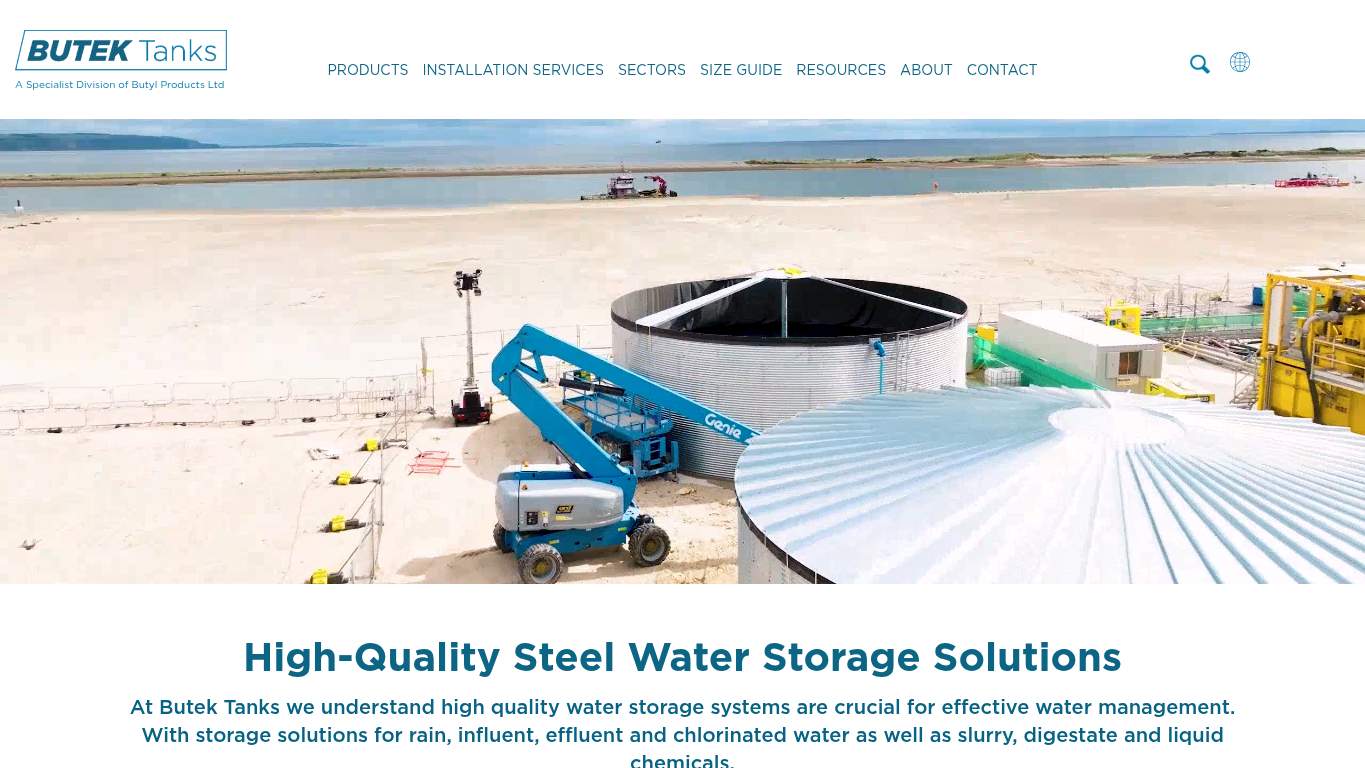
TECHNICAL SUMMARY
The fundamentals are solid, but the presentation keeps tripping over itself: a page weight of 1,539 KiB, Speed Index at 8.5 s, LCP at 2.8 s, and a broken MP4 asset all nudge the site from credible into sluggish. SEO is mostly intact, yet the robots-txt audit scored 0, Open Graph is half-formed, and the heading structure jumps from h1 to h3 like the content outline got edited by a forklift. Fix the heavy hero assets and the broken media first; that’s the fastest way to protect trust, keep buyers engaged, and make contact intent feel inevitable instead of optional.
Where It Burns
6 categoriesWebsite Audit Findings for butektanks.com
SavageAudit identified 36 visible findings and recommendations across 6 audit categories. Each section below combines the category score with observed evidence and prioritized fixes.
8901 PERFORMANCELCP 2.8 s8502 SEOrobots.txt audit 08903 DESIGNImages 158104 COPYWord count 5399205 UXNav/Footer No nav / Footer8806 CONVERSIONCTA count 2
01
PERFORMANCE AUDIT
89
LCP2.8 sSpeed Index8.5 sTotal Page Weight1,539 KiBBroken Assets1
- 🔥Your page ships 1,539 KiB like it’s delivering steel by emotional support trailer. The 544 KiB image savings are basically standing at the door asking to be let in.
💀
The site is sturdy enough to load, but heavy enough to make patience feel like a procurement requirement.
- →Compress hero images and switch to WebP/AVIF format.LCP: 2.8 sImpact: highEffort: medium
Why this matters
The hero load is good enough to function but still slow enough to delay first serious engagement on a contact-led manufacturer site.
- →Enable CDN caching and serve static assets with long cache TTLs.FCP: 2.3 sImpact: mediumEffort: low
Why this matters
First paint is arriving late enough that caching can shave visible delay without a redesign.
- →Defer non-critical JavaScript and reduce render-blocking resources.TBT: 0 msImpact: highEffort: medium
Why this matters
Even with zero blocking time, trimming non-critical scripts keeps the page feeling lighter and protects future performance regressions.
02
SEO AUDIT
85
robots.txt audit0Open Graph titleHome PageMissing alt text6Heading skipsh1->h3
- 🔥Your robots.txt exists, but the Lighthouse robots-txt audit still scored 0, which is the digital equivalent of having a gate with no actual fence.
💀
The site is indexable, but its social and structural signals are doing industrial-strength underachievement.
- →Add matching og:title and og:description tags so shared previews describe the page clearly.Open Graph: IncompleteImpact: mediumEffort: low
Why this matters
Social previews currently default to a vague label instead of the manufacturer brand and offer.
- →Nest headings sequentially (h1 -> h2 -> h3) so the content outline is predictable.Heading Skips: h1->h3Impact: mediumEffort: medium
Why this matters
The structure skips a level, which weakens scannability and makes the page harder for search systems to parse cleanly.
- →Add descriptive alt text to every meaningful image.Missing Alt: 6Impact: mediumEffort: medium
Why this matters
Six missing alt attributes are six chances to look less complete to accessibility tools and search engines alike.
03
DESIGN AUDIT
89
Images15Missing alt text6Font families4Broken media assets1
- 🔥Six of 15 images missing alt text is a nice way to make a professionally built page feel like it forgot half its captions.
💀
The layout is competent, but the details keep dressing the page like a committee-approved prototype.
- →Add supporting imagery so the layout feels intentional, not empty.Images: 15Impact: mediumEffort: medium
Why this matters
Fifteen images is enough visual material, but the current presentation still needs stronger support to feel composed and deliberate.
- →Fix missing alt text to pass accessibility audits.Missing Alt: 6Impact: mediumEffort: medium
Why this matters
Six missing image descriptions make the design feel unfinished and weaken accessibility compliance.
- →Test spacing and alignment across mobile and desktop breakpoints.Viewport: PresentImpact: lowEffort: medium
Why this matters
The viewport is in place, but visual consistency still needs verification so the layout behaves like a manufacturer site, not a lucky accident.
04
COPY AUDIT
81
Word count539Sentence count20CTA count2Open Graph descriptionempty
- 🔥The page has 539 words across 20 sentences, which is plenty of room to say something sharper than brochure fog.
💀
The wording explains what Butek Tanks does, but it doesn’t exactly sharpen the blade for action.
- →Tighten the headline to state your value in one sentence.H1 Count: 1Impact: mediumEffort: low
Why this matters
The page has one headline doing all the heavy lifting, so it needs to land the offer faster.
- →Break long paragraphs into skimmable bullets and shorter sentences.Avg Words/Sentence: 27Impact: mediumEffort: medium
Why this matters
At an average of 27 words per sentence, the copy asks buyers to read like they’re reviewing a tender document.
- →Add a clear CTA - make the primary one stand out.CTA Count: 2Impact: mediumEffort: low
Why this matters
Only two CTAs, both identical, gives the page too little variation to guide different buyer intents.
05
UX AUDITUSER EXPERIENCE AUDIT
92
Nav/FooterNo nav / FooterForm fields23Broken assets1Console errors0
- 🔥There is no nav element on the page, so the user journey is basically ‘good luck, engineer your own way forward.’
💀
The experience is usable, but the missing navigation and bloated forms make the route to contact feel needlessly ceremonial.
- →Ensure consistent navigation and footer links across all pages.Nav/Footer: No nav / FooterImpact: mediumEffort: medium
Why this matters
Without navigation, the user has fewer ways to orient themselves or keep exploring after landing.
- →Repair failed asset URLs and deployment paths so scripts, images, and stylesheets load cleanly.Broken Assets: 1Impact: highEffort: medium
Why this matters
One broken media asset is enough to make the interface feel less dependable than a manufacturer site should.
- →Reduce form fields (currently 23) to only the essentials.Form Fields: 23Impact: mediumEffort: medium
Why this matters
A 23-field form is not a contact path; it’s a relationship stress test.
06
CONVERSION AUDIT
88
CTA count2Form count3Form fields23Social proof0
- 🔥CTA count sits at 2, and both instances just say Contact, which is what happens when a sales page leaves the hard sell in the loading dock.
💀
The page has the bones of a lead generator, but the actual close is underfed, underproved, and overcomplicated.
- →Add a primary CTA above the fold that matches your core offer.CTA Count: 2Impact: mediumEffort: low
Why this matters
The page needs one unmistakable next step so buyers don’t have to hunt for how to start a sales conversation.
- →Offer a low-friction contact option - form, chat, or visible email.Contact Path: PresentImpact: lowEffort: medium
Why this matters
The path exists, but it still needs to be easier to spot and faster to use for high-intent buyers.
- →Add social proof - testimonials, client logos, or user counts - near the CTA.Social Proof: 0Impact: highEffort: medium
Why this matters
With zero proof points near the ask, the page is leaning on heritage alone instead of reinforcing buying confidence.
Audit overview
butektanks.com Audit Summary
The fundamentals are solid, but the presentation keeps tripping over itself: a page weight of 1,539 KiB, Speed Index at 8.5 s, LCP at 2.8 s, and a broken MP4 asset all nudge the site from credible into sluggish. SEO is mostly intact, yet the robots-txt audit scored 0, Open Graph is half-formed, and the heading structure jumps from h1 to h3 like the content outline got edited by a forklift. Fix the heavy hero assets and the broken media first; that’s the fastest way to protect trust, keep buyers engaged, and make contact intent feel inevitable instead of optional.
Based on the category scores in this report, User Experience is the strongest area while Copy has the most room for improvement.
How SavageAudit Evaluated butektanks.com
SavageAudit evaluated the public website at https://butektanks.com/ across performance, technical SEO, design, copy, user experience, and conversion signals. Scores and recommendations reflect the website evidence available when this audit was generated on July 8, 2026.
Similar Website Audit Reports
Compare this result with other public SavageAudit reports that received a similar overall website score.