Loading Report View…
0/ 100
airfareterminals.com Website Audit Report
airfareterminals.com scored 75 out of 100 in this SavageAudit website audit covering Performance, SEO, Design, and Copy. The report uses captured website evidence to explain what is working, what is limiting the experience, and which improvements deserve attention first.
“A sluggish terminal directory that misses every connection before passengers even reach the gate.”
This travel guide cooks up a kitchen disaster where the ingredients are stale, the timer is broken, and travelers are left stranded at an empty counter.
 https://airfareterminals.com/
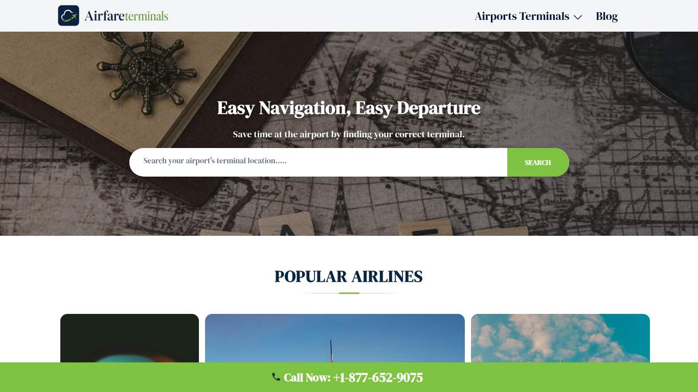
TECHNICAL SUMMARY
The performance profile is deeply burnt with an LCP of 6.7 seconds and a Speed Index of 6.6 seconds, while a Cumulative Layout Shift score of 1 makes the layout jump like a frightened passenger. Fixing the heavy hero assets should be priority number one to prevent immediate user abandonment.
Where It Burns
6 categoriesWebsite Audit Findings for airfareterminals.com
SavageAudit identified 12 visible findings and recommendations across 4 audit categories. Each section below combines the category score with observed evidence and prioritized fixes.
4801 PERFORMANCELargest Contentful Paint 6.7 s9302 SEOSEO Score 1009803 DESIGNFont Families 26304 COPYWord Count 744Free05 UXSign in to viewFree06 CONVERSIONSign in to view
01
PERFORMANCE AUDIT
48
Largest Contentful Paint6.7 sSpeed Index6.6 sCumulative Layout Shift1
- 🔥Your Largest Contentful Paint of 6.7 seconds is slower than a delayed international flight waiting for a gate assignment.
💀
Your page speed is so sluggish that travelers will book alternative flights before the hero image even finishes loading.
- →Compress hero images and switch to WebP/AVIF format.LCP: 6.7 sImpact: highEffort: medium
Why this matters
Your Largest Contentful Paint is 6.7 seconds, which is significantly delayed.
LIMITED DEPTH
Create free accountSign up free to unlock all hidden roast lines, key metrics, and prioritized fixes for PERFORMANCE. The stopwatch has receipts we have not opened yet.
02
SEO AUDIT
93
SEO Score100Open Graph ImageMissing
- 🔥You managed a perfect 100 SEO score, yet left out an Open Graph image so social shares look like a blank boarding pass.
💀
Your technical optimization is pristine, but you forgot to pack a social preview image for the journey.
- →Add an og:image meta tag for a polished appearance when shared on social media.Open Graph Image: MissingImpact: mediumEffort: low
Why this matters
Open Graph image is missing (hasOgImage is false).
LIMITED DEPTH
Create free accountSign up free to unlock all hidden roast lines, key metrics, and prioritized fixes for SEO. Search engines noticed more than this first punchline.
03
DESIGN AUDIT
98
Font Families2Images3
- 🔥Using only 2 font families across the entire layout keeps the typography cleaner than an airport runway at dawn.
💀
The design relies on a sparse visual menu that leaves visitors staring at empty visual plates.
- →Add supporting imagery so the layout feels intentional, not empty.Images: 3Impact: mediumEffort: medium
Why this matters
Only 3 images are present on the page, creating a thin visual layout.
LIMITED DEPTH
Create free accountSign up free to unlock all hidden roast lines, key metrics, and prioritized fixes for DESIGN. The visual hierarchy argument gets louder deeper down.
04
COPY AUDIT
63
Word Count744Sentence Count16
- 🔥You crammed 744 words into a meager 16 sentences, resulting in monstrous run-on paragraphs that read like a legal disclaimer.
💀
Your writing style serves massive paragraphs that choke readers before they find their terminal gate.
- →Break long paragraphs into skimmable bullets and shorter sentences.Avg Words/Sentence: 47Impact: mediumEffort: medium
Why this matters
Word count is 744 words with only 16 sentences, averaging 47 words per sentence.
LIMITED DEPTH
Create free accountSign up free to unlock all hidden roast lines, key metrics, and prioritized fixes for COPY. Messaging slippage gets sharper past the first line.
05
UX AUDITUSER EXPERIENCE AUDIT
FREE UNLOCKFull analysis locked
Users shouldn't have to fight your interface to convert. Create a free account to open the UX failure map.
06
CONVERSION AUDIT
FREE UNLOCKFull analysis locked
Traffic arrived. Confidence left before checkout. Create a free account to see what's killing your conversions.
Audit overview
airfareterminals.com Audit Summary
The performance profile is deeply burnt with an LCP of 6.7 seconds and a Speed Index of 6.6 seconds, while a Cumulative Layout Shift score of 1 makes the layout jump like a frightened passenger. Fixing the heavy hero assets should be priority number one to prevent immediate user abandonment.
Based on the category scores in this report, Design is the strongest area while Performance has the most room for improvement.
How SavageAudit Evaluated airfareterminals.com
SavageAudit evaluated the public website at https://airfareterminals.com/ across performance, technical SEO, design, copy, user experience, and conversion signals. Scores and recommendations reflect the website evidence available when this audit was generated on October 23, 2026.
Similar Website Audit Reports
Compare this result with other public SavageAudit reports that received a similar overall website score.