Loading Report View…
0/ 100
fssa-site.weststar.kz Website Audit Report
fssa-site.weststar.kz scored 88 out of 100 in this SavageAudit website audit covering Performance, SEO, Design, Copy, User Experience, and Conversion. The report uses captured website evidence to explain what is working, what is limiting the experience, and which improvements deserve attention first.
“A respectable shell with a recruitment problem and a social proof leak.”
FSSA shows up dressed like a serious staffing agency, then leaves the hero holding a collage, a Facebook-only CTA, and the kind of trust signals you’d expect from a half-finished pitch deck. For a business selling employer confidence, this page is doing a lot of talking and not enough proving.
 https://fssa-site.weststar.kz/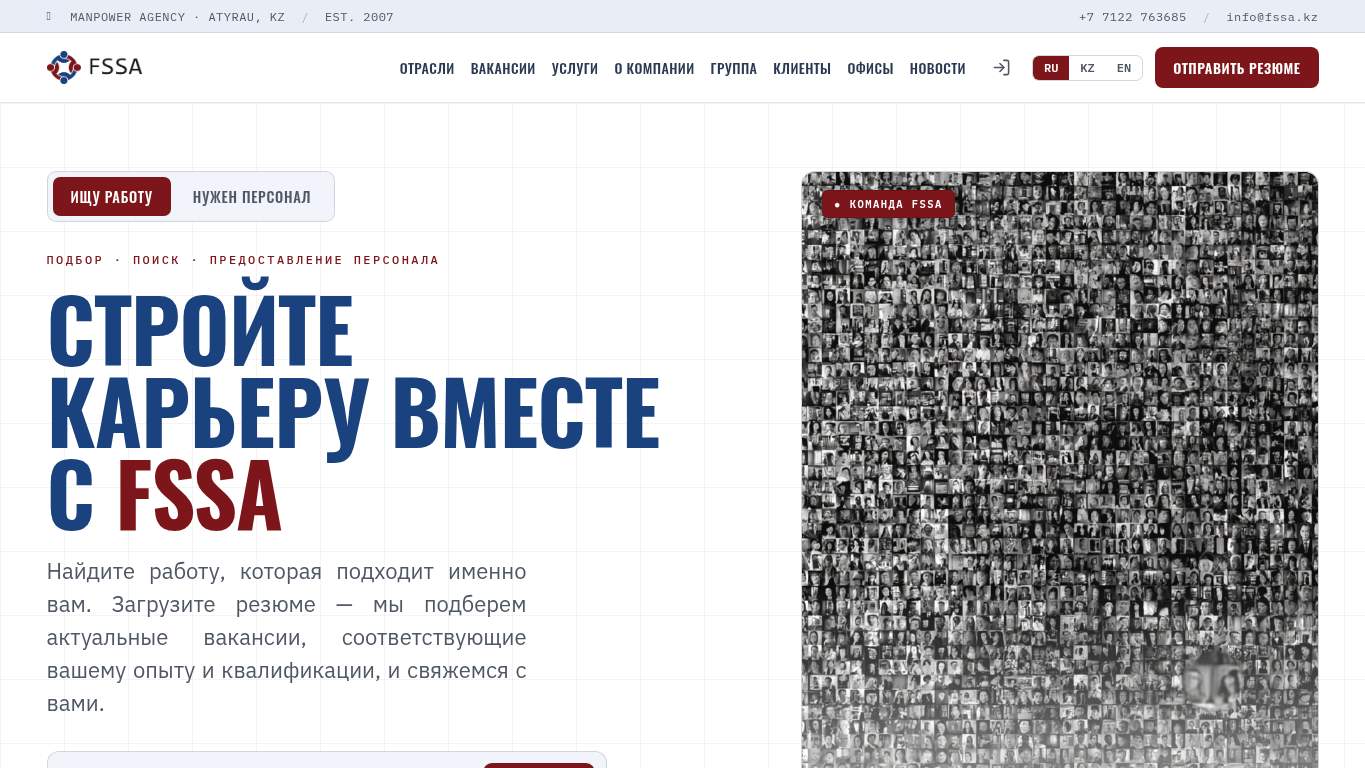
TECHNICAL SUMMARY
The good news: the site is crawlable, canonicalized correctly, and the server isn’t on life support with a 520 ms document response. The bad news: the page is still dragging a 1,213 KiB body, a 3.2 s LCP/FCP, and 2,480 ms of render-blocking savings, while SEO is missing schema and social preview metadata entirely. Fix the hero asset and blocking resources first, because that’s the fastest way to improve trust, lead capture, and discoverability for a staffing brand that needs employers to believe it before they call.
Where It Burns
6 categoriesWebsite Audit Findings for fssa-site.weststar.kz
SavageAudit identified 36 visible findings and recommendations across 6 audit categories. Each section below combines the category score with observed evidence and prioritized fixes.
8601 PERFORMANCELCP 3.2 s8302 SEOSchema JSON-LD 08503 DESIGNFont Families 69404 COPYCTA Count 18905 UXButtons 189206 CONVERSIONCTA Count 1
01
PERFORMANCE AUDIT
86
LCP3.2 sFCP3.2 sSpeed Index5.3 sTotal Byte Weight1,213 KiB
- 🔥Your LCP is 3.2 s, which is long enough for a hiring manager to open another tab and forget your name.
💀
Heavy page, late reveal, and just enough blocking to make a recruitment pitch feel like a queue at HR.
- →Compress hero images and switch them to WebP/AVIF so the first meaningful view stops arriving like a regional train.LCP: 3.2 sImpact: highEffort: medium
Why this matters
The hero is the biggest visible bottleneck, and a 3.2 s LCP is exactly the kind of delay that makes employers bounce before the pitch lands.
- →Enable CDN caching and serve static assets with long cache TTLs so repeat visits don’t reload the same giant file pile.FCP: 3.2 sImpact: mediumEffort: low
Why this matters
A 3.2 s first paint suggests the page is still waiting on assets that should already be on the client’s machine.
- →Defer non-critical JavaScript and reduce render-blocking resources so the page stops doing paperwork before showing the headline.TBT: 0 msImpact: highEffort: medium
Why this matters
The audit flags render-blocking savings even though TBT is fine, which means the visible delay is coming from blocking resources, not interaction jank.
02
SEO AUDIT
83
Schema JSON-LD0H1 Count2Open Graph FieldsmissingTwitter Cardmissing
- 🔥You’ve got a page for a recruitment agency and still ship zero schema, like a mechanic forgetting the engine before the test drive.
💀
Search can read the page, but the structured context is naked, the heading logic is split-brained, and social previews are absent.
- →Add JSON-LD structured data for Organization and WebSite so the page stops introducing itself like a stranger at a trade show.Schema: NoneImpact: mediumEffort: medium
Why this matters
Schema is completely absent, which removes rich-result context and weakens entity clarity for a recruitment brand.
- →Consolidate to one H1 tag and push the second headline into H2 or H3, because 2 H1s is a structural shrug.H1 Count: 2Impact: mediumEffort: low
Why this matters
Two H1s dilute the primary topic signal and make the page hierarchy look like it was assembled by committee.
- →Publish llms.txt or ai.txt with priority URLs and core docs so AI crawlers know where the useful staffing pages live.AI Hints: MissingImpact: mediumEffort: medium
Why this matters
The site has no AI hint file, which makes citation-friendly discovery more accidental than strategic.
03
DESIGN AUDIT
85
Font Families6Images5H3 Count0H2 Count12
- 🔥The page uses 6 font families, which is less a design system and more a font tasting menu.
💀
The layout is competent, but the typography buffet and collage hero make the brand feel less curated than it should for employer trust.
- →Reduce font families from 6 to 2–3 so the page stops looking like it borrowed typefaces from six different interns.Font Families: 6Impact: mediumEffort: low
Why this matters
Six families create unnecessary visual noise and weaken the professional consistency a staffing agency needs.
- →Add supporting imagery that is clearer and less collage-like so the hero stops reading like generic stock-card chaos.Images: 5Impact: mediumEffort: medium
Why this matters
Only 5 images are carrying the whole visual argument, and the current hero already feels noisy rather than purposeful.
- →Test spacing and alignment across breakpoints so the compact nav and language switcher don’t turn small screens into a finger-fitness exam.Viewport: PresentImpact: lowEffort: medium
Why this matters
Viewport support exists, but the compact controls and dense layout still need breakpoint QA to stay usable on mobile.
04
COPY AUDIT
94
CTA Count1Word Count606Sentence Count70Title/Meta Alignmentpartial
- 🔥The title says FSSA — Кадровое агентство · Атырау, Казахстан, while the meta description has 2007, full-cycle staffing, and Kazakhstan coverage trying to do the job of an entire sales team.
💀
The copy knows what the company does, but the page still makes the lead path feel like an afterthought with a social-media detour.
- →Tighten the headline to one sentence that states the value proposition without making the H1 pair do interpretive dance.H1 Count: 2Impact: highEffort: low
Why this matters
Two H1s already muddy the message, so the lead headline needs to do one job clearly and immediately.
- →Add a clear primary CTA and make it stand out above the fold, because 1 CTA labeled Facebook is not a sales path.CTA Count: 1Impact: mediumEffort: low
Why this matters
The current CTA count is too thin for a lead-generation staffing site that needs employers to contact sales.
- →Break long paragraphs into skimmable bullets and shorter sentences so the 606 words stop feeling like a polite avalanche.Avg Words/Sentence: 9Impact: lowEffort: medium
Why this matters
Even with readable sentence length, the total copy load is still heavy enough to benefit from more scannable structure.
05
UX AUDITUSER EXPERIENCE AUDIT
89
Buttons18Links101Forms2Inputs19
- 🔥There are 18 buttons and 101 links, which is less a navigation system and more a scavenger hunt for employers.
💀
The interface is functional, but the control count and form burden make simple contact feel more bureaucratic than it should.
- →Reduce form fields from 19 to only the essentials so the contact flow stops acting like an onboarding exam.Form Fields: 19Impact: mediumEffort: medium
Why this matters
Nineteen inputs is too much friction for a lead-generation agency where the goal is to start a conversation, not collect a dossier.
- →Ensure consistent navigation and footer links across all pages so users don’t have to relearn the site every time they click.Nav/Footer: Nav / FooterImpact: lowEffort: medium
Why this matters
The site has enough links already; consistency matters so the structure feels intentional instead of sprawling.
- →Smoke-test the page in the browser console and keep runtime errors at zero, because the one thing worse than a long form is a broken long form.JS Errors: 0Impact: lowEffort: low
Why this matters
Errors are currently at zero, so maintaining that baseline protects the existing interaction path from regressions.
06
CONVERSION AUDIT
92
CTA Count1Social Proof3Forms2Inputs19
- 🔥There is 1 CTA, and it’s Facebook — which is a very creative way to make a sales page forget it has sales.
💀
The page can technically convert, but the CTA and proof placement are making employers work harder than the offer deserves.
- →Add a primary CTA above the fold that matches the core offer, because one Facebook CTA is not a serious lead capture strategy.CTA Count: 1Impact: mediumEffort: low
Why this matters
The site has only one CTA, and it points to Facebook instead of the direct contact action employers need.
- →Place testimonials, logos, or hard stats near the CTA so the page stops asking for trust without showing receipts.Social Proof: 3Impact: mediumEffort: low
Why this matters
Three social proof items exist, but the visual observations say no obvious client logos or testimonials are visible above the fold.
- →Offer a low-friction contact option like a short form, chat, or visible email so sales contact doesn’t feel like filing a request to an oracle.Contact Path: PresentImpact: lowEffort: medium
Why this matters
A contact path exists, but the current 19-input setup is still too heavy for fast employer inquiries.
Audit overview
fssa-site.weststar.kz Audit Summary
The good news: the site is crawlable, canonicalized correctly, and the server isn’t on life support with a 520 ms document response. The bad news: the page is still dragging a 1,213 KiB body, a 3.2 s LCP/FCP, and 2,480 ms of render-blocking savings, while SEO is missing schema and social preview metadata entirely. Fix the hero asset and blocking resources first, because that’s the fastest way to improve trust, lead capture, and discoverability for a staffing brand that needs employers to believe it before they call.
Based on the category scores in this report, Copy is the strongest area while SEO has the most room for improvement.
How SavageAudit Evaluated fssa-site.weststar.kz
SavageAudit evaluated the public website at https://fssa-site.weststar.kz/ across performance, technical SEO, design, copy, user experience, and conversion signals. Scores and recommendations reflect the website evidence available when this audit was generated on July 1, 2026.
Similar Website Audit Reports
Compare this result with other public SavageAudit reports that received a similar overall website score.