Loading Report View…
0/ 100
gonoise.com Website Audit Report
gonoise.com scored 53 out of 100 in this SavageAudit website audit covering Performance, SEO, Design, Copy, User Experience, and Conversion. The report uses captured website evidence to explain what is working, what is limiting the experience, and which improvements deserve attention first.
“A fancy storefront that forgot how to move people to buy.”
Noise looks like it hired a whole design team and then left the front door locked. The homepage is acting like a premium lifestyle brand while the actual shopping flow is buried under popups, blur, and indecision.
 https://www.gonoise.com/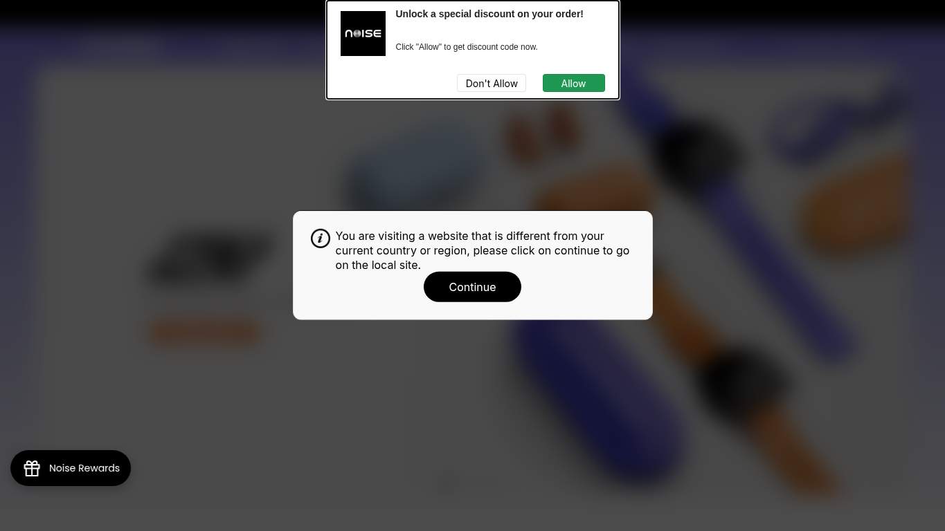
TECHNICAL SUMMARY
Performance is the biggest self-own: LCP lands at 25.8 s, interactive at 50.2 s, TBT sits at 1,890 ms, and unused JavaScript is a bloated 1,810 KiB. SEO basics are mostly intact, but the page starts at H2 with no H1, has one h3→h6 skip, and throws 3 console/runtime errors, so the structure is doing just enough to avoid applause and not enough to earn it. Fix the hero payload and deferred scripts first; every second shaved here protects trust, product discovery, and buy intent on an ecommerce homepage.
Where It Burns
6 categoriesWebsite Audit Findings for gonoise.com
SavageAudit identified 36 visible findings and recommendations across 6 audit categories. Each section below combines the category score with observed evidence and prioritized fixes.
2301 PERFORMANCELCP 25.8 s9102 SEOH1 Count 05403 DESIGNImages 777304 COPYWord Count 6992805 UXFCP 6.9 s2906 CONVERSIONCTA Count 0
01
PERFORMANCE AUDIT
23
LCP25.8 sTTI50.2 sTBT1,890 msUnused JS1,810 KiB
- 🔥Your LCP of 25.8 s is not a hero section; it’s an airport delay announcement with product cards.
💀
This page is dragging a suitcase full of scripts while the customer waits at the gate.
- →Compress hero images and switch to WebP/AVIF format.LCP: 25.8 sImpact: highEffort: medium
Why this matters
The hero is taking 25.8 s to become meaningful, so the first visual asset needs to be lighter before shoppers give up.
- →Defer non-critical JavaScript and reduce render-blocking resources.TBT: 1,890 msImpact: highEffort: medium
Why this matters
With 1,890 ms of blocking time, the browser is busy babysitting scripts instead of letting users interact.
- →Enable CDN caching and serve static assets with long cache TTLs.FCP: 6.9 sImpact: mediumEffort: low
Why this matters
A first paint at 6.9 s is too slow for an ecommerce homepage, and caching can cut repeat-load drag quickly.
02
SEO AUDIT
91
H1 Count0First Headingh2Heading Skipsh3->h6Schema Blocks2
- 🔥You have 2 JSON-LD blocks but no WebSite schema, so Google gets a business card with the website name missing.
💀
The page is crawlable, but the heading structure is dressed like it forgot how outlines work.
- →Add one H1 tag with your primary value proposition.H1 Count: 0Impact: highEffort: low
Why this matters
The page has no H1, so the main topic is currently implied instead of declared.
- →Start the page hierarchy with a single descriptive H1.First Heading: h2Impact: mediumEffort: low
Why this matters
Beginning with H2 makes the outline feel like it missed the opening sentence.
- →Nest headings sequentially (h1 -> h2 -> h3) so the content outline is predictable.Heading Skips: h3->h6Impact: mediumEffort: medium
Why this matters
The h3→h6 jump breaks semantic order and weakens how both crawlers and readers parse the page.
03
DESIGN AUDIT
54
Images77Font Families8Missing Alt1First Impression3/10
- 🔥Seventy-seven images on the page, and still the first impression is a 3/10—somehow all that visual volume still feels underfed.
💀
The layout has a lot of assets, but not enough discipline to look intentional.
- →Add supporting imagery so the layout feels intentional, not empty.Images: 77Impact: mediumEffort: medium
Why this matters
With 77 images already present, the composition should feel deliberate instead of overloaded and visually noisy.
- →Fix missing alt text to pass accessibility audits.Missing Alt: 1Impact: mediumEffort: medium
Why this matters
Even one missing alt text is an avoidable accessibility miss on a consumer electronics storefront.
- →Reduce font families from 8 to 2-3 for visual consistency.Font Families: 8Impact: mediumEffort: low
Why this matters
Eight type families makes the page look like it was assembled from three different brands and a lucky draw.
04
COPY AUDIT
73
Word Count699Sentence Count35CTA Count0H1 Count0
- 🔥With 699 words across 77 images and 100 internal links, the page talks like it’s trying to say everything and explaining almost nothing.
💀
The words are present, but the page never gets around to making a real ask.
- →Tighten the headline to state your value in one sentence.H1 Count: 0Impact: highEffort: low
Why this matters
Without a clear H1, the homepage never states the core promise in a way shoppers can instantly parse.
- →Break long paragraphs into skimmable bullets and shorter sentences.Avg Words/Sentence: 20Impact: lowEffort: medium
Why this matters
An average of 20 words per sentence is workable, but the page still needs easier scanning for ecommerce browsing.
- →Add a clear CTA - there are none right now.CTA Count: 0Impact: highEffort: low
Why this matters
Zero CTAs means the copy describes the brand without telling the visitor what to do next.
05
UX AUDITUSER EXPERIENCE AUDIT
28
FCP6.9 sBroken Assets12JS Errors3Long Tasks20
- 🔥First Contentful Paint at 6.9 s means the page greets people like a slow elevator that stops on every floor.
💀
The interface is slow, brittle, and busy breaking the moment someone tries to use it.
- →Repair failed asset URLs and deployment paths so scripts, images, and stylesheets load cleanly.Broken Assets: 12Impact: highEffort: medium
Why this matters
Twelve broken assets are a direct source of broken interaction and a bad first impression.
- →Fix client-side JavaScript errors so interactions do not fail silently in production.JS Errors: 3Impact: highEffort: medium
Why this matters
Three console errors mean real users may hit features that look fine until they simply stop working.
- →Reduce form fields (currently 27) to only the essentials.Form Fields: 27Impact: mediumEffort: medium
Why this matters
Twenty-seven fields is too much effort for a homepage-adjacent experience, especially when the page is already slow.
06
CONVERSION AUDIT
29
CTA Count0Buttons22Inputs27Social Proof1
- 🔥There are 0 CTAs, which is a bold strategy for a transactional ecommerce homepage selling smart technology.
💀
The page asks for attention but hides the actual path to purchase like it’s a secret menu item.
- →Add a primary CTA above the fold that matches your core offer.CTA Count: 0Impact: highEffort: low
Why this matters
Without a primary CTA, visitors have no obvious next step toward buying.
- →Offer a low-friction contact option - form, chat, or visible email.Contact Path: PresentImpact: lowEffort: medium
Why this matters
A contact path exists, but it needs to be easier to find and use when shoppers have pre-purchase questions.
- →Include social proof or trust signals (testimonials, logos, stats) near the CTA.Social Proof: 1Impact: mediumEffort: low
Why this matters
One trust signal is thin for ecommerce, especially when the page is already burying the buy decision.
Audit overview
gonoise.com Audit Summary
Performance is the biggest self-own: LCP lands at 25.8 s, interactive at 50.2 s, TBT sits at 1,890 ms, and unused JavaScript is a bloated 1,810 KiB. SEO basics are mostly intact, but the page starts at H2 with no H1, has one h3→h6 skip, and throws 3 console/runtime errors, so the structure is doing just enough to avoid applause and not enough to earn it. Fix the hero payload and deferred scripts first; every second shaved here protects trust, product discovery, and buy intent on an ecommerce homepage.
Based on the category scores in this report, SEO is the strongest area while Performance has the most room for improvement.
How SavageAudit Evaluated gonoise.com
SavageAudit evaluated the public website at https://www.gonoise.com/ across performance, technical SEO, design, copy, user experience, and conversion signals. Scores and recommendations reflect the website evidence available when this audit was generated on July 1, 2026.
Similar Website Audit Reports
Compare this result with other public SavageAudit reports that received a similar overall website score.