Loading Report View…
0/ 100
yal.inc Website Audit Report
yal.inc scored 72 out of 100 in this SavageAudit website audit covering Performance, SEO, Design, Copy, User Experience, and Conversion. The report uses captured website evidence to explain what is working, what is limiting the experience, and which improvements deserve attention first.
“All branding gloss, then the intern forgot the actual business.”
YAL dressed for a board meeting and brought a blank business card. The site keeps repeating purpose while hiding the proof, which is bold for a page asking people to trust and contact it.
 https://yal.inc/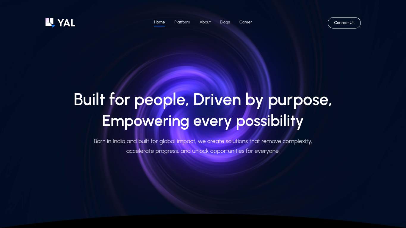
TECHNICAL SUMMARY
The design is doing most of the heavy lifting, but the page still lands like a presentation deck with the facts removed. Biggest drag is performance: LCP is 12.7s, interactive time is 14.7s, Speed Index is 12.0s, and the page weighs 15,452 KiB, so the hero arrives late and the whole thing acts expensive in the worst way. SEO and copy are underfed too: canonical is missing, schema is absent, the title is just "YAL," and the meta description says "Generated by create next app"—which is not a strategy, it’s a confession. Fix the hero payload and the trust signals first; right now the site is losing discoverability and contact intent before the pitch even has a chance.
Where It Burns
6 categoriesWebsite Audit Findings for yal.inc
SavageAudit identified 36 visible findings and recommendations across 6 audit categories. Each section below combines the category score with observed evidence and prioritized fixes.
6001 PERFORMANCELCP 12.7 s6902 SEOCanonical missing9803 DESIGNH1 Count 26604 COPYTitle Length YAL8205 UXButton Count 67206 CONVERSIONCTA Count 3
01
PERFORMANCE AUDIT
60
LCP12.7 sInteractive14.7 sSpeed Index12.0 sTotal Page Weight15,452 KiB
- 🔥Your LCP of 12.7 s is longer than a polite conversation and several bad decisions.
💀
The site loads like it’s paying rent by the kilobyte and collecting the bill in attention.
- →Compress hero images and switch them to WebP/AVIF so the largest above-the-fold asset stops dragging the page.LCP: 12.7 sImpact: highEffort: medium
Why this matters
The hero is arriving far too late, and this is the most direct way to reduce the time users wait before seeing the core message.
- →Defer non-critical JavaScript and reduce render-blocking resources so the page can become interactive sooner.TBT: 90 msImpact: highEffort: medium
Why this matters
Even with a modest blocking total, the page stays unresponsive long enough to hurt contact intent and perceived quality.
- →Enable CDN caching and serve static assets with long cache TTLs to cut repeat-load overhead.FCP: 1.1 sImpact: mediumEffort: low
Why this matters
The first paint is decent, but better caching helps preserve that early momentum instead of letting the heavy asset load waste it.
02
SEO AUDIT
69
CanonicalmissingSchemaNoneOG Title/DescriptionemptyTwitter Cardmissing
- 🔥Missing canonical on a single-page brand site is SEO’s version of leaving the office without locking the door.
💀
Search engines are being asked to infer the story while the page hands them a shrug and a blank form.
- →Add a self-referencing canonical tag so search engines stop guessing which URL is the boss.Canonical: missingImpact: highEffort: low
Why this matters
The page currently has no canonical declaration, which invites duplicate-signal confusion and weakens index confidence.
- →Add JSON-LD structured data that matches the page type, such as Organization or WebSite.Schema: NoneImpact: mediumEffort: medium
Why this matters
With no schema at all, the page misses a clean way to communicate entity and site context to search engines.
- →Generate and submit a sitemap.xml to help crawlers find and prioritize the site’s pages.sitemap.xml: MissingImpact: mediumEffort: low
Why this matters
A missing sitemap makes discovery less efficient, especially when the site’s actual offering is already thinly described.
03
DESIGN AUDIT
98
H1 Count2Heading Count9Image Count7Font Families3
- 🔥Two H1s on a 167-word page is the typography equivalent of two captains fighting over a tiny boat.
💀
The layout knows how to dress up, but it still leaves the credibility table empty.
- →Add supporting imagery so the layout feels intentional, not empty.Images: 7Impact: mediumEffort: medium
Why this matters
The page has visuals, but the observed lack of trust proof means the design assets are not carrying enough explanatory weight.
- →Fix missing alt text to pass accessibility audits.Missing Alt: 0Impact: lowEffort: medium
Why this matters
Alt text is currently complete, so keep it that way and protect the accessibility win from regressions.
- →Test spacing and alignment across mobile and desktop breakpoints.Viewport: PresentImpact: lowEffort: medium
Why this matters
Viewport support exists, but responsive behavior still needs verification so the polished look survives beyond one screen size.
04
COPY AUDIT
66
Title LengthYALWord Count167Sentence Count6Meta DescriptionGenerated by create next app
- 🔥The title is just "YAL," which is branding in the same way a blank name tag is networking.
💀
The copy keeps announcing the name and forgetting the reason anyone should care.
- →Tighten the headline to state your value in one sentence.H1 Count: 2Impact: highEffort: low
Why this matters
The current headline structure splits attention instead of delivering one clear value proposition for YAL.
- →Break long paragraphs into skimmable bullets and shorter sentences.Avg Words/Sentence: 28Impact: mediumEffort: medium
Why this matters
The copy is too dense for a page that needs to quickly explain who YAL is and why a visitor should contact it.
- →Add a clear CTA - make the primary one stand out.CTA Count: 3Impact: mediumEffort: low
Why this matters
The page has multiple action phrases, but the messaging needs one obvious ask instead of three competing invitations.
05
UX AUDITUSER EXPERIENCE AUDIT
82
Button Count6Link Count19Form Count0Broken Assets0
- 🔥Six buttons on a page with no form is a bold choice; it’s giving people ways to click, not ways to proceed.
💀
The interface is functional, but it still makes visitors assemble the story themselves.
- →Ensure consistent navigation and footer links across all pages.Nav/Footer: Nav / FooterImpact: lowEffort: medium
Why this matters
The page has a nav and footer, but consistency matters when the site is sparse and every link must pull its weight.
- →Smoke-test the page in the browser console and keep runtime errors at zero.JS Errors: 0Impact: lowEffort: low
Why this matters
The current clean runtime state should be preserved, because one messy release would be immediately visible on a minimal page.
- →Reduce form fields to only the essentials.Form Fields: 0Impact: lowEffort: medium
Why this matters
There is no form at all, so the next step should be a minimal contact path rather than a bureaucratic obstacle course.
06
CONVERSION AUDIT
72
CTA Count3Social Proof Count1Form Count0Contact PathPresent
- 🔥Three CTAs split between "Contact Us" and "Contact" is action language with commitment issues.
💀
The page wants contact, but it has the persuasion infrastructure of an empty front desk.
- →Add a primary CTA above the fold that matches your core offer.CTA Count: 3Impact: mediumEffort: low
Why this matters
The CTA language is fragmented, so a single primary action is needed to stop the page from dithering at the moment of intent.
- →Offer a low-friction contact option - form, chat, or visible email.Contact Path: PresentImpact: lowEffort: medium
Why this matters
A contact route exists, but it is too dependent on clicks rather than giving visitors a straightforward way to reach YAL.
- →Include social proof or trust signals near the CTA.Social Proof: 1Impact: mediumEffort: low
Why this matters
With only one trust signal, the page needs proof near the ask or it will keep converting on hope and typography alone.
Audit overview
yal.inc Audit Summary
The design is doing most of the heavy lifting, but the page still lands like a presentation deck with the facts removed. Biggest drag is performance: LCP is 12.7s, interactive time is 14.7s, Speed Index is 12.0s, and the page weighs 15,452 KiB, so the hero arrives late and the whole thing acts expensive in the worst way. SEO and copy are underfed too: canonical is missing, schema is absent, the title is just "YAL," and the meta description says "Generated by create next app"—which is not a strategy, it’s a confession. Fix the hero payload and the trust signals first; right now the site is losing discoverability and contact intent before the pitch even has a chance.
Based on the category scores in this report, Design is the strongest area while Performance has the most room for improvement.
How SavageAudit Evaluated yal.inc
SavageAudit evaluated the public website at https://yal.inc/ across performance, technical SEO, design, copy, user experience, and conversion signals. Scores and recommendations reflect the website evidence available when this audit was generated on July 4, 2026.
Similar Website Audit Reports
Compare this result with other public SavageAudit reports that received a similar overall website score.