Loading Report View…
0/ 100
dekorcompany.com Website Audit Report
dekorcompany.com scored 55 out of 100 in this SavageAudit website audit covering Performance, SEO, Design, Copy, User Experience, and Conversion. The report uses captured website evidence to explain what is working, what is limiting the experience, and which improvements deserve attention first.
“Beautiful storefront, terrifyingly slow checkout of the brain.”
Dekor Company looks like it hired a strong visual merchandiser and then locked them out of the loading dock. The home decor is trying to sell a curated lifestyle while the page drags around like a sofa delivery up four flights of stairs.
 https://www.dekorcompany.com/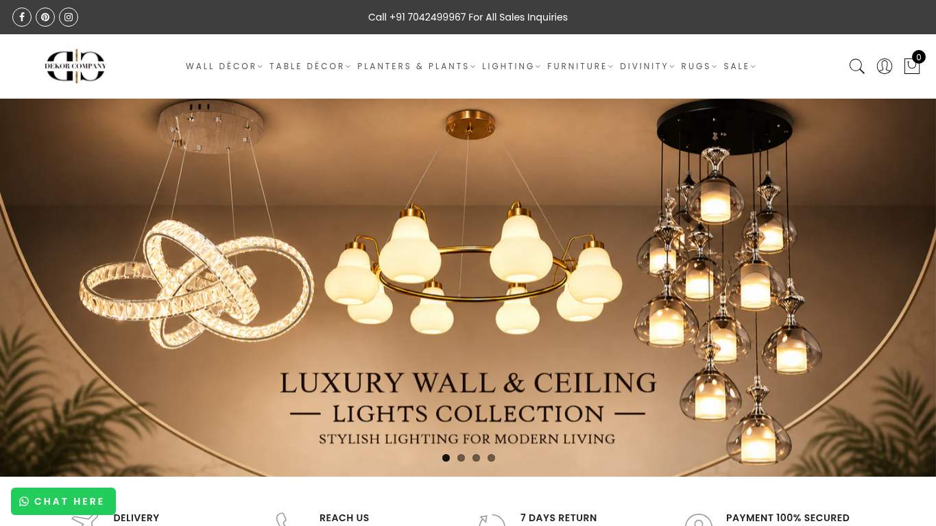
TECHNICAL SUMMARY
The homepage has a brutal performance problem: Largest Contentful Paint is 15.7 s, Speed Index is 11.8 s, First Contentful Paint is 5.1 s, and Total Blocking Time is 1,440 ms, with 1,510 KiB of unused JavaScript and 1,880 ms of render-blocking savings on the table. On the plus side, SEO is structurally decent with canonical and robots in place, but the page still starts at h3, has 40 missing image alts, and throws a console error; fix the hero assets and JavaScript first, because the delay is actively killing trust, discoverability, and product intent before shoppers even reach the wall art.
Where It Burns
6 categoriesWebsite Audit Findings for dekorcompany.com
SavageAudit identified 36 visible findings and recommendations across 6 audit categories. Each section below combines the category score with observed evidence and prioritized fixes.
1501 PERFORMANCELCP 15.7 s7902 SEOMissing image alts 404703 DESIGNTotal headings 748404 COPYTitle length 103 characters4005 UXJS errors 19106 CONVERSIONCTA count 5
01
PERFORMANCE AUDIT
15
LCP15.7 sSpeed Index11.8 sTBT1,440 msUnused JS savings1,510 KiB
- 🔥Largest Contentful Paint is 15.7 s, which is less a homepage and more an airport delay announcement for your hero image.
💀
Your homepage arrives so late it should have baggage claim tags.
- →Compress the hero assets and convert them to WebP/AVIF so the top-of-page imagery stops holding the whole store hostage.LCP: 15.7 sImpact: highEffort: medium
Why this matters
The main visual is landing far too late, and hero image weight is the most likely offender blocking the first meaningful paint.
- →Defer non-critical JavaScript and cut back on render-blocking resources so the browser can stop juggling 20 long tasks like an overbooked gate agent.TBT: 1,440 msImpact: highEffort: medium
Why this matters
The page spends too long blocking interactivity, which lines up with the high blocking time and long-task count.
- →Enable CDN caching and long cache TTLs for static assets so first paint stops arriving like a package from another continent.FCP: 5.1 sImpact: mediumEffort: low
Why this matters
A slow first paint suggests the browser is waiting too long on repeatable assets that should be served much faster.
02
SEO AUDIT
79
Missing image alts40H1 count2First heading levelh3Console errors1
- 🔥The page has 40 missing image alts, so 43 decor images are giving search engines the silent treatment.
💀
Search visibility is mostly intact, but the page structure is dressed like it found the hierarchy in a clearance bin.
- →Shorten the title tag to under 60 characters so the brand name doesn’t crowd out the actual keyword intent.Title Length: 103 charactersImpact: mediumEffort: low
Why this matters
The title is too long and is stuffing payment-brand text into prime SEO real estate.
- →Consolidate the page to one H1 and move subtopics into H2/H3 so search engines stop guessing which heading is the actual headline.H1 Count: 2Impact: mediumEffort: low
Why this matters
Two H1s dilute the primary topic signal on a product-led ecommerce homepage.
- →Add descriptive alt text to every meaningful image, especially the 40 missing ones, so product photos can actually contribute to discovery.Missing Alt: 40Impact: mediumEffort: medium
Why this matters
Missing alt text leaves a big chunk of visual content invisible to search and assistive tech.
03
DESIGN AUDIT
47
Total headings74H3 count67Font families13Missing alt text40
- 🔥There are 74 headings on one page, including 67 h3s, which is less a layout and more a label factory.
💀
The page has structure anxiety: too many headings, too many fonts, and not enough discipline.
- →Add supporting imagery so the layout feels intentionally curated instead of stretched across empty space.Images: 43Impact: mediumEffort: medium
Why this matters
The page has lots of content but the visual arrangement is still overloaded rather than composed.
- →Fix missing alt text so the 40 unlabelled images don’t turn the design into an accessibility blindfold.Missing Alt: 40Impact: mediumEffort: medium
Why this matters
The visual assets are present, but a large share are not described well enough for accessibility or fallback context.
- →Reduce the font stack from 13 families to 2-3 so the site stops looking like it borrowed typography from every aisle in the store.Font Families: 13Impact: mediumEffort: low
Why this matters
Too many typefaces create inconsistency and visual noise on a storefront that should feel edited.
04
COPY AUDIT
84
Title length103 charactersMeta description length273 charactersWord count1,949CTA count5
- 🔥The title tag is 103 characters long and crams Mastercard, Visa, American Express, and PayPal into the brand name like a desperate suitcase zipper.
💀
The copy can speak in full paragraphs; it just needs to stop shouting the checkout aisle into the title tag.
- →Tighten the headline to state the value in one sentence, instead of letting the H1 do unpaid overtime.H1 Count: 2Impact: highEffort: low
Why this matters
The page has multiple headline signals, which weakens the core value proposition and makes the message harder to parse quickly.
- →Break dense paragraphs into shorter, skimmable lines so the 117 sentences don’t feel like a catalog essay.Avg Words/Sentence: 17Impact: lowEffort: medium
Why this matters
Readable ecommerce copy should be fast to scan, especially for shopping intent.
- →Make the primary CTA stand out so the 5 CTAs stop competing like five sales associates shouting in the same aisle.CTA Count: 5Impact: mediumEffort: low
Why this matters
Too many similar calls to action dilute the main purchase path and blur next-step clarity.
05
UX AUDITUSER EXPERIENCE AUDIT
40
JS errors1Broken assets12CLS0.369Long tasks20
- 🔥There is 1 JavaScript runtime error, 'jQuery is not defined', so one broken dependency is already freelancing as the UX department.
💀
The page doesn’t just load slowly; it loads with enough breakage to make interactions feel experimental.
- →Fix the client-side JavaScript error so interactions stop failing silently the moment jQuery goes missing.JS Errors: 1Impact: highEffort: medium
Why this matters
A runtime error can break visible interactions and undermine every downstream user action.
- →Repair the 12 failed asset URLs and deployment paths so scripts, images, and stylesheets load like a functioning store, not a half-built popup.Broken Assets: 12Impact: highEffort: medium
Why this matters
Broken assets directly damage page functionality and can create missing UI elements or delayed rendering.
- →Reduce form fields from 21 to the essentials so users don’t feel like they’re applying for a mortgage to buy wall art.Form Fields: 21Impact: mediumEffort: medium
Why this matters
A large field count adds friction on a transactional page and slows completion.
06
CONVERSION AUDIT
91
CTA count5Forms5Social proof count4Links438
- 🔥There are 5 forms and 21 inputs on the page, which is a lot of paperwork for a site selling home decor, not a visa application.
💀
The page can attract attention, but the purchase path still needs a louder, cleaner nudge toward checkout.
- →Add a primary CTA above the fold that matches the core offer so shoppers know exactly where to click first.CTA Count: 5Impact: mediumEffort: low
Why this matters
Multiple CTAs without a dominant primary action can scatter purchase intent before the user reaches products.
- →Place testimonials, review counts, or recognizable trust proof closer to the main CTA so the buy decision isn’t asked to fly solo.Social Proof: 4Impact: mediumEffort: low
Why this matters
The existing trust signals are too sparse and need to sit closer to the point of action.
- →Keep a low-friction contact path visible, but streamline it so the page doesn’t ask shoppers to negotiate with five forms before buying.Contact Path: PresentImpact: lowEffort: medium
Why this matters
Contact options exist, but the experience should make them easier to find and easier to use without interrupting the purchase flow.
Audit overview
dekorcompany.com Audit Summary
The homepage has a brutal performance problem: Largest Contentful Paint is 15.7 s, Speed Index is 11.8 s, First Contentful Paint is 5.1 s, and Total Blocking Time is 1,440 ms, with 1,510 KiB of unused JavaScript and 1,880 ms of render-blocking savings on the table. On the plus side, SEO is structurally decent with canonical and robots in place, but the page still starts at h3, has 40 missing image alts, and throws a console error; fix the hero assets and JavaScript first, because the delay is actively killing trust, discoverability, and product intent before shoppers even reach the wall art.
Based on the category scores in this report, Conversion is the strongest area while Performance has the most room for improvement.
How SavageAudit Evaluated dekorcompany.com
SavageAudit evaluated the public website at https://www.dekorcompany.com/ across performance, technical SEO, design, copy, user experience, and conversion signals. Scores and recommendations reflect the website evidence available when this audit was generated on July 1, 2026.
Similar Website Audit Reports
Compare this result with other public SavageAudit reports that received a similar overall website score.