Loading Report View…
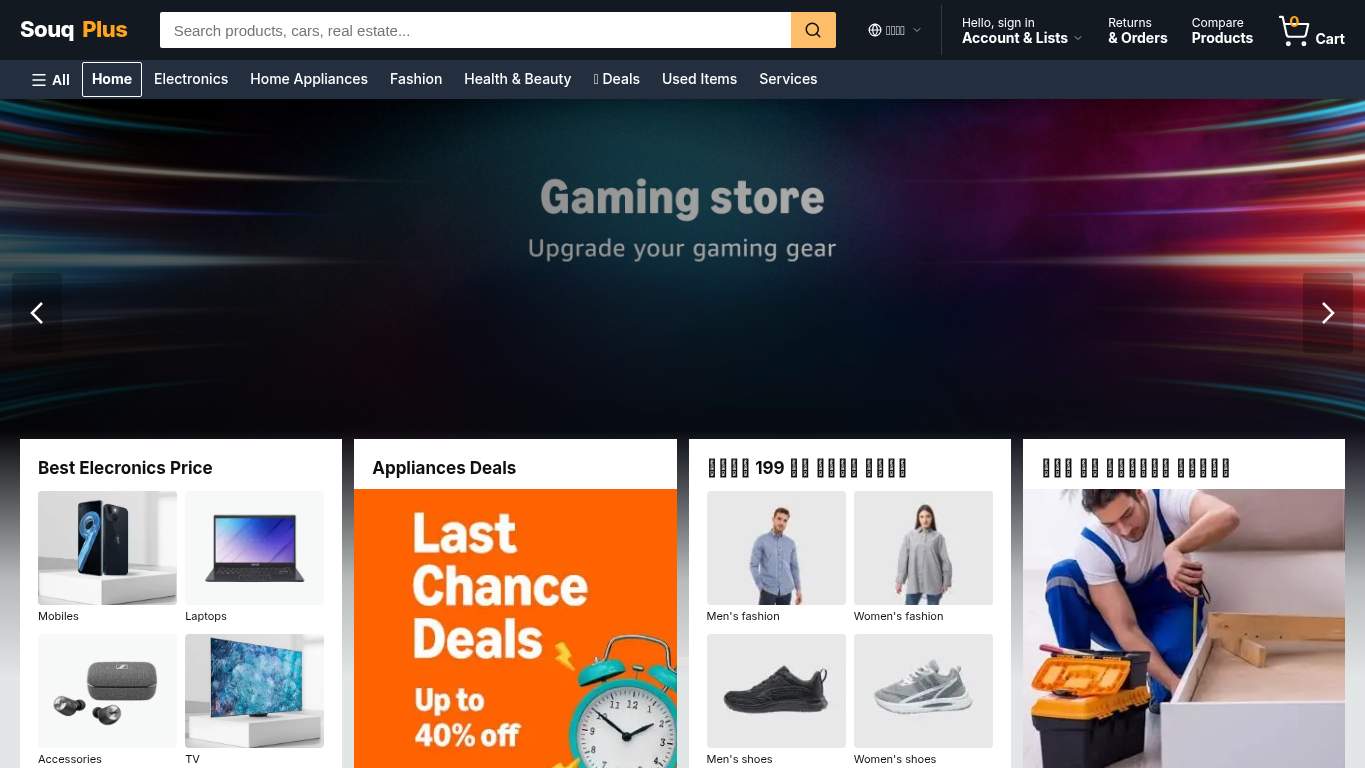
souqplus-web.vercel.app scored 65 out of 100 in this SavageAudit website audit covering Performance, SEO, Design, Copy, User Experience, and Conversion. The report uses captured website evidence to explain what is working, what is limiting the experience, and which improvements deserve attention first.
“Built like a catalog, converted like a ghost town.”
Souq Plus looks like it showed up to sell everything in Egypt and forgot to actually ask for the sale. The homepage has the confidence of a megastore and the conversion instincts of a brochure left in the stockroom.

The good news: crawlability, robots, and schema are mostly present, and the page is not melting down technically. The bad news: the canonical points to a different domain, there’s no H1, the largest contentful paint is 5.9 s, speed index is 8.6 s, and the page is throwing 6 console errors plus 11 broken assets like it’s running QA in production. For an ecommerce homepage, 0 CTAs and 0 forms is less “optimized funnel” and more “we hope they telepathically know what to do.”
SavageAudit identified 36 visible findings and recommendations across 6 audit categories. Each section below combines the category score with observed evidence and prioritized fixes.
The page eventually arrives, but not before the shopper has wandered off to buy somewhere with less drama.
A 5.9 s LCP means the largest visible element is dragging the whole storefront down, so the hero needs to be lighter.
Even with a modest 70 ms TBT, reducing blocking scripts helps the page stop pretending it’s a desktop app on a slow coffee break.
A decent 1.1 s FCP can still be made more reliable and consistent when static assets are cached properly.
The page is indexable, but the signal stack is wobbling like a mall kiosk with three signs pointing in different directions.
The audited URL and canonical disagree, which can split ranking signals and confuse search engines about which page deserves credit.
With zero H1s, the page has no clear primary heading for crawlers or users to latch onto.
Forty-eight missing alt attributes leave a lot of visual content invisible to accessibility tech and weaker for image search context.
Visually it has structure, but the broken assets and missing alt text make the design feel half-dressed.
With 68 images already in play, the visual system should feel curated instead of like a stock-photo warehouse after closing time.
Nearly half the images lack alt text, which weakens the design’s accessibility and makes content harder to understand without visuals.
Viewport support exists, but the mixed visual styles and crowded above-the-fold area need breakpoint testing to stay coherent.
The copy has product volume but no directional gravity, like a store full of goods with the lights on and nobody at the counter.
With no H1, the page lacks a clear top-line promise for shoppers scanning for the deal, delivery, and product range.
An average of 36 words per sentence is too dense for shoppers skimming fast for prices, deals, and delivery info.
Zero CTA labels means the page never explicitly tells visitors how to start shopping or where to click next.
Users can navigate it, but the broken requests make the experience feel like the site is improvising in real time.
The site has nav and footer present, but with 140 links and broken assets, consistency becomes essential to keep users from getting lost.
Six console errors are a real user-facing warning sign, especially when they repeat the same broken resource path.
Eleven broken assets mean the page is serving visible and functional failures instead of a smooth shopping flow.
This homepage introduces the store, but it never asks for the sale, proves the trust, or opens the checkout door.
No primary CTA means shoppers can browse forever without being told how to buy, which is fatal for a transactional homepage.
A missing contact path leaves buyers with no easy way to ask about delivery, payments, or order issues before purchasing.
One trust element is not enough to calm shoppers who need reassurance before buying online in Egypt.
The good news: crawlability, robots, and schema are mostly present, and the page is not melting down technically. The bad news: the canonical points to a different domain, there’s no H1, the largest contentful paint is 5.9 s, speed index is 8.6 s, and the page is throwing 6 console errors plus 11 broken assets like it’s running QA in production. For an ecommerce homepage, 0 CTAs and 0 forms is less “optimized funnel” and more “we hope they telepathically know what to do.”
Based on the category scores in this report, Performance is the strongest area while Conversion has the most room for improvement.
SavageAudit evaluated the public website at https://souqplus-web.vercel.app/en across performance, technical SEO, design, copy, user experience, and conversion signals. Scores and recommendations reflect the website evidence available when this audit was generated on June 26, 2026.
Compare this result with other public SavageAudit reports that received a similar overall website score.