Loading Report View…
0/ 100
printblur.com Website Audit Report
printblur.com scored 65 out of 100 in this SavageAudit website audit covering Performance, SEO, Design, Copy, User Experience, and Conversion. The report uses captured website evidence to explain what is working, what is limiting the experience, and which improvements deserve attention first.
“A merch marketplace buried under clutter, bloat, and its own paperwork.”
Printblur is trying to sell custom merch like it’s a gallery opening, but the homepage keeps tripping over its own shoelaces. The popup barges in, the headings are a mess, and the site acts like trust is optional in ecommerce.
 https://printblur.com/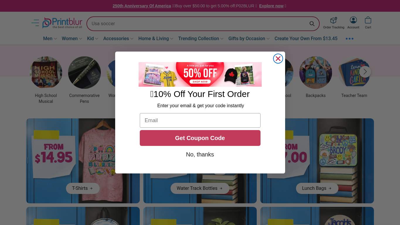
TECHNICAL SUMMARY
The biggest problem is speed: Largest Contentful Paint is 13.4 s, Speed Index is 11.3 s, interactive time is 13.6 s, and the page weighs 11,637 KiB with 6,502 KiB of image savings on the table. SEO is partly intact with canonical and schema present, but the page has 0 H1s, a title polluted with “Close dialog,” and missing robots.txt/sitemap support; meanwhile UX is bleeding on 3 console errors and 4 broken assets. Fix the hero payload first, then clean up the broken scripts and headline structure—because shoppers won’t wait around for a print-on-demand storefront that loads like it’s being assembled in real time.
Where It Burns
6 categoriesWebsite Audit Findings for printblur.com
SavageAudit identified 36 visible findings and recommendations across 6 audit categories. Each section below combines the category score with observed evidence and prioritized fixes.
5501 PERFORMANCELCP 13.4 s7302 SEOH1 Count 04603 DESIGNHeading Count 1037504 COPYWord Count 2,5136005 UXConsole Errors 38706 CONVERSIONCTA Count 13
01
PERFORMANCE AUDIT
55
LCP13.4 sSpeed Index11.3 sInteractive13.6 sTotal Byte Weight11,637 KiB
- 🔥Your LCP of 13.4 s is not a hero image; it’s a hostage situation.
💀
The storefront loads like it’s buffering a future it can’t afford.
- →Compress hero images and switch them to WebP/AVIF so the first view stops dragging its feet.LCP: 13.4 sImpact: highEffort: medium
Why this matters
The homepage’s largest visible content is arriving far too late, which is exactly what hurts product discovery and immediate shopping intent.
- →Defer non-critical JavaScript and trim render-blocking resources so the page can become usable sooner.TBT: 320 msImpact: highEffort: medium
Why this matters
Blocking scripts are stealing time from interaction, and shoppers do not need a loyalty lecture before they can click a product.
- →Enable CDN caching and long cache TTLs for static assets to reduce repeat-load drag.FCP: 2.8 sImpact: mediumEffort: low
Why this matters
Early paint is decent but still slow enough to feel sluggish, and caching is the cheapest way to stop repeated asset bloat from punishing return visitors.
02
SEO AUDIT
73
H1 Count0Title Length69 charactersSchema Blocks6Heading Skipsh2->h4
- 🔥You’ve got 6 JSON-LD blocks, which is great, but 0 H1s means the page forgot to introduce itself to search engines.
💀
Search engines get a brochure, then immediately trip over the title tag on the way out.
- →Shorten the title tag so it stays under 60 characters and stops carrying UI debris.Title Length: 69 charactersImpact: mediumEffort: low
Why this matters
The title is too long and polluted with interface text, which weakens clarity for both search results and social previews.
- →Add one H1 that states the main value proposition of the marketplace.H1 Count: 0Impact: highEffort: low
Why this matters
The page currently has no primary heading, so its core topic is being inferred instead of explicitly declared.
- →Generate and submit a sitemap.xml so crawlers can find the catalog instead of wandering around like lost shoppers.sitemap.xml: MissingImpact: mediumEffort: low
Why this matters
Without a sitemap, indexability for a marketplace with many products becomes needlessly messy and slower to expand.
03
DESIGN AUDIT
46
Heading Count103Empty Headings1Missing Alt2Font Families7
- 🔥The page has 103 headings and 1 empty one, so the hierarchy reads like a filing cabinet tipped down the stairs.
💀
The layout is trying to look curated, but the structure is basically a rack after closing time.
- →Reduce the font stack from 7 families to 2–3 so the interface stops looking like a design sample pack.Font Families: 7Impact: mediumEffort: low
Why this matters
Too many typefaces dilute visual consistency and make a retail interface feel less intentional.
- →Add supporting imagery where the layout feels thin so the page doesn’t read like empty wall space with buttons.Images: 231Impact: mediumEffort: medium
Why this matters
Even with many images, the visual support is not carrying the composition cleanly, which hurts perceived quality for a product marketplace.
- →Fix the missing alt text on meaningful images so the visual system also works for accessibility and fallback contexts.Missing Alt: 2Impact: mediumEffort: medium
Why this matters
Two missing alts is enough to leave important visuals unnamed, which is sloppy for a product-heavy homepage.
04
COPY AUDIT
75
Word Count2,513Sentence Count162CTA Count13H1 Count0
- 🔥The title says “Co-create The World with Creative ProductsClose dialog,” which is inspirational until the browser ruins it.
💀
The words are everywhere, yet the main promise still has to fight for oxygen.
- →Tighten the headline so it states the value proposition in one sentence.H1 Count: 0Impact: highEffort: low
Why this matters
With no H1 and a fuzzy title, the page is making visitors decode the offer instead of instantly understanding it.
- →Break long paragraphs into shorter chunks and bullets so the homepage stops reading like a wall of retail prose.Avg Words/Sentence: 16Impact: lowEffort: medium
Why this matters
The copy volume is high enough that skimmability matters, especially for shoppers who came to browse, not study.
- →Make the primary CTA stand out instead of letting 13 calls to action blur together.CTA Count: 13Impact: mediumEffort: low
Why this matters
Too many CTAs dilute the message and make it harder for a buyer to know what to do first.
05
UX AUDITUSER EXPERIENCE AUDIT
60
Console Errors3Broken Assets4Long Tasks8TBT320 ms
- 🔥Three console errors and one of them is a CORS failure, so the page is breaking the kind of promises browsers remember.
💀
The experience is held together by hope, network retries, and a prayer.
- →Fix client-side JavaScript errors so interactions do not fail silently in production.JS Errors: 3Impact: highEffort: medium
Why this matters
Three console errors, including a CORS issue, are the kind of front-end noise that turns real interactions into guesswork.
- →Repair the broken asset URLs and deployment paths so scripts actually load instead of disappearing like unpaid intern work.Broken Assets: 4Impact: highEffort: medium
Why this matters
Broken assets mean parts of the page are literally failing to load, which is a direct hit to usability and stability.
- →Reduce form fields from 10 to the essentials so checkout and lead capture stop feeling like paperwork.Form Fields: 10Impact: mediumEffort: medium
Why this matters
Ten fields is a lot of typing for a shopper, and every extra field is another chance to abandon the flow.
06
CONVERSION AUDIT
87
CTA Count13Forms4Social Proof3Contact PathPresent
- 🔥There are 4 forms and 10 inputs, but 0 required inputs, so the site is somehow both demanding and indecisive.
💀
It wants the sale, but it keeps sending shoppers to browse instead of buy.
- →Add a primary CTA above the fold that matches the core offer, instead of making category links do the heavy lifting.CTA Count: 13Impact: mediumEffort: low
Why this matters
The page has plenty of clickable options, but not one obvious action that says ‘buy this now’ for a transactional marketplace.
- →Place testimonials, ratings, or brand proof near the CTA so buyers aren’t asked to trust the merch on sheer optimism.Social Proof: 3Impact: mediumEffort: low
Why this matters
Three social proof signals are too sparse for a personalized-product store where trust drives purchases.
- →Keep a low-friction contact option visible, but streamline the path so contact doesn’t compete with checkout momentum.Contact Path: PresentImpact: lowEffort: medium
Why this matters
A contact path exists, which is good, but it should support purchase confidence rather than distract from the primary sales flow.
Audit overview
printblur.com Audit Summary
The biggest problem is speed: Largest Contentful Paint is 13.4 s, Speed Index is 11.3 s, interactive time is 13.6 s, and the page weighs 11,637 KiB with 6,502 KiB of image savings on the table. SEO is partly intact with canonical and schema present, but the page has 0 H1s, a title polluted with “Close dialog,” and missing robots.txt/sitemap support; meanwhile UX is bleeding on 3 console errors and 4 broken assets. Fix the hero payload first, then clean up the broken scripts and headline structure—because shoppers won’t wait around for a print-on-demand storefront that loads like it’s being assembled in real time.
Based on the category scores in this report, Conversion is the strongest area while Design has the most room for improvement.
How SavageAudit Evaluated printblur.com
SavageAudit evaluated the public website at https://printblur.com/ across performance, technical SEO, design, copy, user experience, and conversion signals. Scores and recommendations reflect the website evidence available when this audit was generated on July 9, 2026.
Similar Website Audit Reports
Compare this result with other public SavageAudit reports that received a similar overall website score.