Loading Report View…
0/ 100
laouu.netlify.app Website Audit Report
laouu.netlify.app scored 80 out of 100 in this SavageAudit website audit covering Performance, SEO, Design, Copy, User Experience, and Conversion. The report uses captured website evidence to explain what is working, what is limiting the experience, and which improvements deserve attention first.
“Pretty campus, terrible admissions paperwork.”
You built a language academy page that can speak beautifully, but apparently forgot to introduce itself to Google. The site is doing a respectable impression of a brochure with the lights on and the doors locked.
 https://laouu.netlify.app/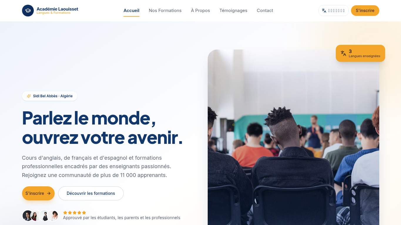
TECHNICAL SUMMARY
The good news: the page is mostly usable, with strong copy, clear hierarchy, and decent interaction timing. The bad news: search visibility is kneecapped by a noindex directive, missing canonical, and zero structured data, while the experience still drags on first paint and hero delivery with an LCP of 4.8s, FCP of 3.4s, and an estimated 1,360ms of render-blocking savings. Fix the indexability issue first, then trim the hero weight and blocking resources so this education site can actually attract students and adults instead of hiding from them.
Where It Burns
6 categoriesWebsite Audit Findings for laouu.netlify.app
SavageAudit identified 36 visible findings and recommendations across 6 audit categories. Each section below combines the category score with observed evidence and prioritized fixes.
7901 PERFORMANCELCP 4.8 s3802 SEOIndexability Noindex8003 DESIGNMissing alt text 49804 COPYWord count 3349305 UXConsole errors 18806 CONVERSIONCTA instances 3
01
PERFORMANCE AUDIT
79
LCP4.8 sFCP3.4 sRender-blocking savings1,360 msUnused JavaScript savings88 KiB
- 🔥Your LCP is 4.8s, which is a long enough pause to make a prospective student wonder if the page is loading or ghosting them.
💀
The page arrives late, drags its feet, and keeps enough dead weight around to miss the first impression.
- →Compress the hero image and convert it to WebP/AVIF to reduce the LCP bottleneck.LCP: 4.8 sImpact: highEffort: medium
Why this matters
A 4.8s LCP means the hero is arriving late enough to hurt the first impression and enrollment intent.
- →Defer non-critical JavaScript and cut render-blocking resources so the page can paint sooner.TBT: 0 msImpact: highEffort: medium
Why this matters
Even with 0 ms TBT, Lighthouse still flags 1,360 ms of render-blocking savings, so the bottleneck is load order, not interaction time.
- →Enable CDN caching and long cache TTLs for static assets to speed up first paint.FCP: 3.4 sImpact: mediumEffort: low
Why this matters
A 3.4s FCP means users wait too long before seeing anything useful, which is brutal for a contact-led education page.
02
SEO AUDIT
38
IndexabilityNoindexCanonicalmissingSchemaNoneSocial preview tagsmissing
- 🔥Meta robots says noindex,nofollow, so this page is basically wearing a disguise and asking Google not to remember it.
💀
Search engines are being told to ignore the page while the page also refuses to describe itself properly.
- →Remove noindex from the meta robots tag so the page can actually rank.Indexability: NoindexImpact: highEffort: low
Why this matters
If the page should attract students through search, noindex is a self-inflicted blackout.
- →Add a self-referencing canonical tag to stop duplicate-signal confusion.Canonical: missingImpact: highEffort: low
Why this matters
A missing canonical leaves the preferred URL ambiguous and weakens search consolidation.
- →Add JSON-LD structured data for the academy and page type so search engines get context instead of guessing.Schema: NoneImpact: mediumEffort: medium
Why this matters
With zero schema, the page gives up rich-result context that could help discoverability and trust.
03
DESIGN AUDIT
80
Missing alt text4Font families16Heading skipsh2 -> h4Image count8
- 🔥The page uses 16 font families, which is less a system and more a typographic group project gone feral.
💀
The design has enough discipline to look decent, then trips over accessibility and hierarchy like it forgot the syllabus.
- →Add descriptive alt text to all meaningful images so accessibility and SEO stop bleeding together.Missing Alt: 4Impact: mediumEffort: medium
Why this matters
Four missing alt attributes means the page is failing both screen readers and image context.
- →Reduce font families from 16 to 2–3 to restore visual consistency.Font Families: 16Impact: mediumEffort: low
Why this matters
Sixteen font families is visual overengineering, not brand expression.
- →Add supporting imagery so the layout feels intentional rather than thin around the edges.Images: 8Impact: mediumEffort: medium
Why this matters
Eight images can work, but the current balance still reads as under-supported for an education brand.
04
COPY AUDIT
98
Word count334Sentence count21CTA count3H1 count1
- 🔥The title says 'Language Academy Website Design' while the H1 says 'Parlez le monde, ouvrez votre avenir.' — even the page introduction needs an interpreter.
💀
The writing is clean and confident, but the opening message and calls to action still feel like they’re negotiating with themselves.
- →Tighten the headline so it states the academy value in one sentence without making visitors decode it.H1 Count: 1Impact: mediumEffort: low
Why this matters
The site has one H1, so the issue is clarity, not structure; the message needs to work harder for enrollment intent.
- →Break longer copy into shorter sentences and bullets so students and adults can scan course benefits faster.Avg Words/Sentence: 16Impact: lowEffort: medium
Why this matters
At 16 words per sentence, the writing is readable, but a bit too smooth for quick decision-making.
- →Make the primary CTA visually dominant so the 3 CTA instances don’t compete with each other.CTA Count: 3Impact: mediumEffort: low
Why this matters
Three CTA instances with only two buttons means the page is offering action, but not hierarchy.
05
UX AUDITUSER EXPERIENCE AUDIT
93
Console errors1Broken assets1Images8Missing alt text4
- 🔥The site ships with 1 console error, and it’s a 404 for the favicon — a tiny error with the dramatic energy of a missing nametag at orientation.
💀
The experience is mostly smooth until the browser starts tripping over a broken asset and inaccessible imagery.
- →Fix the client-side JavaScript error so production interactions don’t fail silently.JS Errors: 1Impact: highEffort: medium
Why this matters
Even one console error can reveal a production issue and erodes confidence in the build.
- →Repair failed asset URLs and deployment paths so every required file loads cleanly.Broken Assets: 1Impact: highEffort: medium
Why this matters
A 404 favicon is small, but it signals broken delivery and sloppy asset handling.
- →Ensure navigation and footer consistency across pages so users don’t have to relearn the interface.Nav/Footer: Nav / FooterImpact: lowEffort: medium
Why this matters
Consistent navigation matters for an education site where users may compare courses, contact info, and details across pages.
06
CONVERSION AUDIT
88
CTA instances3Buttons2Form count0Social proof2
- 🔥The page has 3 CTA instances but only 2 buttons, so the action path is trying to enroll people with one hand tied behind its back.
💀
The page can be contacted, but it still makes people work too hard to raise their hand.
- →Add a primary CTA above the fold that clearly matches enrollment or contact intent.CTA Count: 3Impact: mediumEffort: low
Why this matters
Three CTA instances without a dominant primary action makes the user choose instead of convert.
- →Offer a low-friction contact option such as a short form or chat so visitors can inquire without hunting.Contact Path: PresentImpact: lowEffort: medium
Why this matters
The page is contact-led, but zero forms and zero inputs make the handoff less direct than it should be.
- →Place testimonials or stronger trust signals closer to the CTA so the page has more than self-confidence to sell the courses.Social Proof: 2Impact: mediumEffort: low
Why this matters
Two social-proof items are thin for an education purchase, especially when the trust signals are mostly self-reported.
Audit overview
laouu.netlify.app Audit Summary
The good news: the page is mostly usable, with strong copy, clear hierarchy, and decent interaction timing. The bad news: search visibility is kneecapped by a noindex directive, missing canonical, and zero structured data, while the experience still drags on first paint and hero delivery with an LCP of 4.8s, FCP of 3.4s, and an estimated 1,360ms of render-blocking savings. Fix the indexability issue first, then trim the hero weight and blocking resources so this education site can actually attract students and adults instead of hiding from them.
Based on the category scores in this report, Copy is the strongest area while SEO has the most room for improvement.
How SavageAudit Evaluated laouu.netlify.app
SavageAudit evaluated the public website at https://laouu.netlify.app/ across performance, technical SEO, design, copy, user experience, and conversion signals. Scores and recommendations reflect the website evidence available when this audit was generated on July 3, 2026.
Similar Website Audit Reports
Compare this result with other public SavageAudit reports that received a similar overall website score.