Loading Report View…
0/ 100
geeksforgeeks.org Website Audit Report
geeksforgeeks.org scored 68 out of 100 in this SavageAudit website audit covering Performance, SEO, Design, Copy, User Experience, and Conversion. The report uses captured website evidence to explain what is working, what is limiting the experience, and which improvements deserve attention first.
“Ambitious course page, but the experience keeps tripping over itself.”
GeeksforGeeks built a course catalog that looks like it studied hard and still handed in the group project late. The brand is doing the heavy lifting while the page quietly burns through attention like a toaster left on in the kitchen.
 https://www.geeksforgeeks.org/courses?source=google&medium=cpc&device=c&keyword=geeksforgeeks&matchtype=b&campaignid=20039445781&adgroup=147845288105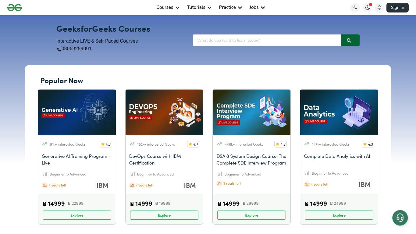
TECHNICAL SUMMARY
The page is strongest on SEO basics and schema, but performance is dragging the whole education funnel through the mud: Largest Contentful Paint is 10.1s, interactive time is 20.7s, and render-blocking savings alone are estimated at 3,320ms. The fix-first move is to cut the blocking weight and unused JavaScript, because a course page that loads like a small apocalypse will cost trust, contact intent, and paid traffic efficiency.
Where It Burns
6 categoriesWebsite Audit Findings for geeksforgeeks.org
SavageAudit identified 36 visible findings and recommendations across 6 audit categories. Each section below combines the category score with observed evidence and prioritized fixes.
4401 PERFORMANCELCP 10.1 s7202 SEOImage Alt Missing 476503 DESIGNImage Count 1159804 COPYTitle Length 63 characters5105 UXConsole Errors 18106 CONVERSIONCTA Count 1
01
PERFORMANCE AUDIT
44
LCP10.1 sInteractive20.7 sTotal Byte Weight2,798 KiBUnused JavaScript575 KiB
- 🔥Largest Contentful Paint is 10.1s, which is less 'learn DS & Algorithms' and more 'wait while the kitchen catches up.'
💀
Your course page loads like it’s compiling the syllabus in real time, and the browser is not impressed.
- →Compress hero images and switch them to WebP/AVIF so the hero stops dragging on LCP.LCP: 10.1 sImpact: highEffort: medium
Why this matters
A 10.1s LCP is the kind of delay that makes users question whether the course page is loading or just thinking about it.
- →Defer non-critical JavaScript and reduce render-blocking resources to cut main-thread clog.TBT: 740 msImpact: highEffort: medium
Why this matters
740ms of blocking time is enough to make interactions feel sticky on a page meant to move learners toward contact.
- →Enable CDN caching and serve static assets with long cache TTLs so repeat visits don’t rehearse the same delay.FCP: 3.6 sImpact: mediumEffort: low
Why this matters
A 3.6s first paint means the page is spending too long getting its first sentence out, which hurts speed perception and ad traffic efficiency.
02
SEO AUDIT
72
Image Alt Missing47Canonical MatchfalseHeading Skipsh2->h4Schema Parse Errors0
- 🔥The canonical points to /courses while the audited URL keeps its marketing costume on with tracking parameters, so search signals are doing a little identity crisis dance.
💀
SEO is mostly competent, but the page keeps leaving search and accessibility clues on the floor like a student rushing out of class.
- →Update the canonical tag so it matches the final preferred version of this page.Canonical: https://www.geeksforgeeks.org/coursesImpact: highEffort: low
Why this matters
When the audited URL carries tracking parameters but the canonical doesn’t fully line up, you risk duplicate-signal confusion.
- →Add descriptive alt text to every meaningful image.Missing Alt: 47Impact: mediumEffort: medium
Why this matters
Forty-seven missing alt attributes on a course page is a lot of invisible context for both search engines and assistive tech.
- →Keep llms.txt/ai.txt, then align them with a valid sitemap, self-canonical URLs, and indexable pages so AI hints point at crawlable destinations.AI Hints: PartialImpact: mediumEffort: medium
Why this matters
Partial AI hint coverage is only useful if it points at pages that canonicalize cleanly and remain indexable.
03
DESIGN AUDIT
65
Image Count115Missing Alt47Font Families20Heading Skipsh2->h4
- 🔥The page uses 115 images but still feels visually repetitive, which is a wild amount of visual inventory for a layout that keeps reading like the same card in different shoes.
💀
The design has enough components to build a campus, yet somehow still feels templated and over-decorated.
- →Add supporting imagery so the layout feels intentional, not empty.Images: 115Impact: mediumEffort: medium
Why this matters
A high image count should buy visual clarity, but here it mostly buys repetition.
- →Fix missing alt text to pass accessibility audits.Missing Alt: 47Impact: mediumEffort: medium
Why this matters
Forty-seven unlabeled images make the design less legible for assistive tech and less disciplined overall.
- →Reduce font families from 20 to 2-3 for visual consistency.Font Families: 20Impact: mediumEffort: low
Why this matters
Twenty font families is visual overkill on a course page that should look focused, not like it raided every font drawer in the building.
04
COPY AUDIT
98
Title Length63 charactersWord Count323Sentence Count17H1 Count1
- 🔥The title is 63 characters and the meta description is present, so the copy at least knows how to introduce itself without forgetting its own name tag.
💀
The writing is one of the few adults in the room; it just needs a tighter headline and cleaner packaging.
- →Tighten the headline to state your value in one sentence.H1 Count: 1Impact: mediumEffort: low
Why this matters
The page has one H1, which is the perfect place to stop introducing the offer and start selling the outcome.
- →Break long paragraphs into skimmable bullets and shorter sentences.Avg Words/Sentence: 19Impact: lowEffort: medium
Why this matters
Nineteen words per sentence is readable, but for learners comparing live and self-paced courses, bullets would be faster to scan.
- →Add a clear CTA - make the primary one stand out.CTA Count: 1Impact: mediumEffort: low
Why this matters
One CTA can work, but only if the copy around it stops acting shy and gives the user a single next step.
05
UX AUDITUSER EXPERIENCE AUDIT
51
Console Errors1Broken Assets12Animated Elements2Required Inputs0
- 🔥The page throws one console error from FedCM and 12 broken assets into the mix, which is a charming way to say the interaction layer arrived slightly injured.
💀
The user experience is mostly functional until the page starts leaking errors and broken assets like a kitchen disaster autopsy.
- →Fix client-side JavaScript errors so interactions do not fail silently in production.JS Errors: 1Impact: highEffort: medium
Why this matters
Even one runtime error can wreck trust when users are trying to investigate courses and next steps.
- →Repair failed asset URLs and deployment paths so scripts, images, and stylesheets load cleanly.Broken Assets: 12Impact: highEffort: medium
Why this matters
Twelve broken assets is not a small blemish; it is the browser tripping over your page furniture.
- →Ensure consistent navigation and footer links across all pages.Nav/Footer: No nav / FooterImpact: mediumEffort: medium
Why this matters
A course page without consistent navigation makes it harder for users to compare offerings, verify trust, and move deeper into the catalog.
06
CONVERSION AUDIT
81
CTA Count1Social Proof2Buttons21Required Inputs0
- 🔥There is 1 CTA and 2 social proof items, so the page has the bare minimum of persuasion and is hoping the brand logo does the rest.
💀
The conversion setup is decent, but the page still acts like a busy brochure instead of a focused enrollment machine.
- →Add a primary CTA above the fold that matches your core offer.CTA Count: 1Impact: mediumEffort: low
Why this matters
One CTA is too easy to overlook on a transactional course page with many competing actions.
- →Offer a low-friction contact option - form, chat, or visible email.Contact Path: PresentImpact: lowEffort: medium
Why this matters
The contact path exists, but the page should make the route unmistakable for learners ready to ask questions.
- →Include social proof or trust signals near the CTA.Social Proof: 2Impact: mediumEffort: low
Why this matters
Two trust signals are not enough if they sit far from the ask; they need to sit next to the action where hesitation happens.
Audit overview
geeksforgeeks.org Audit Summary
The page is strongest on SEO basics and schema, but performance is dragging the whole education funnel through the mud: Largest Contentful Paint is 10.1s, interactive time is 20.7s, and render-blocking savings alone are estimated at 3,320ms. The fix-first move is to cut the blocking weight and unused JavaScript, because a course page that loads like a small apocalypse will cost trust, contact intent, and paid traffic efficiency.
Based on the category scores in this report, Copy is the strongest area while Performance has the most room for improvement.
How SavageAudit Evaluated geeksforgeeks.org
SavageAudit evaluated the public website at https://www.geeksforgeeks.org/courses?source=google&medium=cpc&device=c&keyword=geeksforgeeks&matchtype=b&campaignid=20039445781&adgroup=147845288105 across performance, technical SEO, design, copy, user experience, and conversion signals. Scores and recommendations reflect the website evidence available when this audit was generated on July 6, 2026.
Similar Website Audit Reports
Compare this result with other public SavageAudit reports that received a similar overall website score.