Loading Report View…
0/ 100
partnershipfortraumarecovery.com Website Audit Report
partnershipfortraumarecovery.com scored 84 out of 100 in this SavageAudit website audit covering Performance, SEO, Design, Copy, User Experience, and Conversion. The report uses captured website evidence to explain what is working, what is limiting the experience, and which improvements deserve attention first.
“Beautiful therapy branding, then the homepage trips over its own shoelaces.”
For a trauma recovery clinic, this homepage is dressed like a calm intake conversation but moves like a filing cabinet falling down stairs. It knows how to talk about healing; it just forgot to make the first impression feel like one.
 https://partnershipfortraumarecovery.com/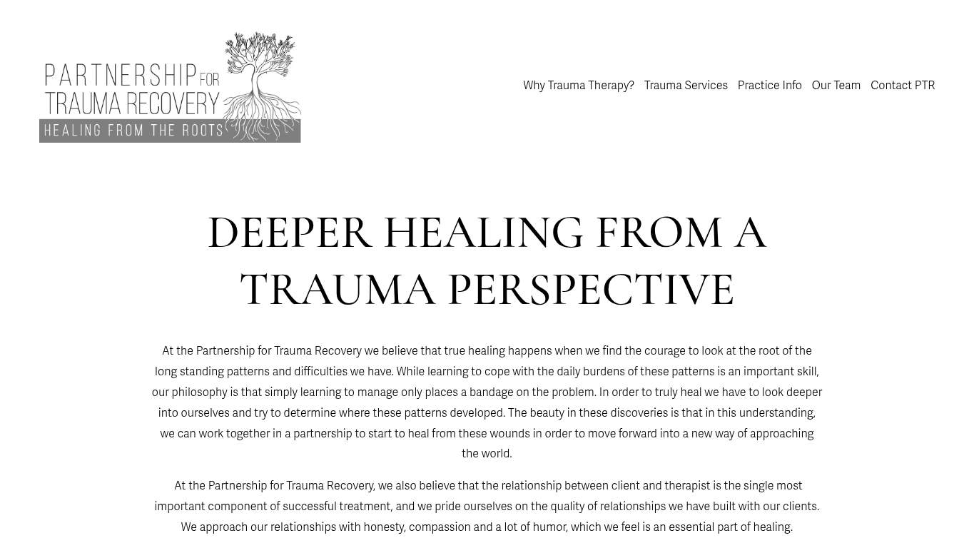
TECHNICAL SUMMARY
The good news: your SEO, design, copy, and conversion foundations are strong, with clean metadata, a valid canonical, 3 schema types, and a clear contact path. The bad news: performance is dragging the whole experience down hard — LCP is 6.6 s, FCP is 4.0 s, interactive time is 15.7 s, and render-blocking resources alone leave 1,200 ms on the table. Fix the heavy hero assets and defer blocking JavaScript first; that’s the fastest path to better trust, more booked calls, and fewer visitors bouncing before the healing journey even starts.
Where It Burns
6 categoriesWebsite Audit Findings for partnershipfortraumarecovery.com
SavageAudit identified 36 visible findings and recommendations across 6 audit categories. Each section below combines the category score with observed evidence and prioritized fixes.
5801 PERFORMANCELCP 6.6 s9202 SEORedirect Count 19303 DESIGNImage Count 29204 COPYWord Count 4188405 UXFCP 4.0 s9306 CONVERSIONCTA Count 4
01
PERFORMANCE AUDIT
58
LCP6.6 sFCP4.0 sInteractive Time15.7 sUnused JS Savings755 KiB
- 🔥Your LCP sits at 6.6 s, which is less “calm healing page” and more “waiting room with no receptionist.”
💀
The page spends more time loading than some people spend deciding whether to book therapy.
- →Compress the hero images and convert them to WebP/AVIF so the first meaningful view stops lumbering in at 6.6 s.LCP: 6.6 sImpact: highEffort: medium
Why this matters
The largest content is arriving too slowly, and the hero is the most likely thing holding back the first impression and booking intent.
- →Defer non-critical JavaScript and cut render-blocking resources so the page stops stalling interactivity at 380 ms of blocking time.TBT: 380 msImpact: highEffort: medium
Why this matters
The main thread is busy enough to delay real interaction, which is a brutal look for a clinic page asking for trust and contact.
- →Enable CDN caching and long cache TTLs for static assets so the first paint stops arriving at 4.0 s like it had to drive in from another state.FCP: 4.0 sImpact: mediumEffort: low
Why this matters
The initial visual response is slow enough to weaken perceived responsiveness before visitors read a single word.
02
SEO AUDIT
92
Redirect Count1Schema Types3Parse Errors0Heading LevelsH1 + 6 H2s, 0 H3s
- 🔥The redirect from https://partnershipfortraumarecovery.com/ to the www version is one extra hop — tiny in isolation, annoying in aggregate.
💀
SEO is mostly behaving, but the site still makes search and structure do a little unnecessary emotional labor.
- →Shorten the title tag to under 60 characters so search snippets stop stretching like they’re trying to hold a yoga pose.Title Length: 70 charactersImpact: mediumEffort: low
Why this matters
The current title is long enough to get truncated, which weakens clarity for both search results and share previews.
- →Publish llms.txt or ai.txt with your priority URLs and support paths so AI crawlers stop freelancing your brand story.AI Hints: MissingImpact: mediumEffort: medium
Why this matters
AI crawler guidance is absent, so the pages you want cited are not explicitly declared.
- →Add an entity graph with Organization or WebSite schema plus sameAs links so your clinic identity stops showing up as a half-finished dossier.Entity Graph: MissingImpact: mediumEffort: medium
Why this matters
Structured brand identity is incomplete, which limits confidence and entity clarity for discovery systems.
03
DESIGN AUDIT
93
Image Count2Layout Shifts1 foundFont Families3Unused CSS Savings172 KiB
- 🔥With only 2 images, the homepage looks like it got dressed in a hurry and left the supporting visuals at home.
💀
The design is clean, but it’s running on minimal visual support and one small wobble away from feeling underfed.
- →Add supporting imagery so the hero and service sections feel intentional instead of text doing all the emotional heavy lifting.Images: 2Impact: mediumEffort: medium
Why this matters
The page has too little visual reinforcement for a trauma recovery clinic, which reduces warmth and scene-setting.
- →Fix missing alt text so the page stops making accessibility audits do unpaid labor.Missing Alt: 0Impact: lowEffort: medium
Why this matters
There are no missing alt attributes reported, so this is a low-risk maintenance item, but it must stay at zero.
- →Test spacing and alignment across breakpoints so the layout stays composed when the viewport changes its mind.Viewport: PresentImpact: lowEffort: medium
Why this matters
Responsive support exists, but it still needs manual breakpoint testing to ensure the composition holds together.
04
COPY AUDIT
92
Word Count418Sentence Count28CTA Count4Social Proof Items2
- 🔥At 418 words across 28 sentences, the homepage sounds like it’s trying to be supportive while also applying for a grant.
💀
The copy knows the mission, but it occasionally talks like a brochure wrote a diary entry.
- →Tighten the headline so the value proposition lands in one sentence instead of arriving with a suitcase.H1 Count: 1Impact: mediumEffort: low
Why this matters
The single H1 exists, but its phrasing can be made sharper so visitors immediately understand the clinic’s offer.
- →Break long paragraphs into skimmable bullets and shorter sentences so stressed visitors don’t need a seminar before they can book.Avg Words/Sentence: 15Impact: lowEffort: medium
Why this matters
The page is readable, but shortening the path through the copy will help visitors absorb key trust and service information faster.
- →Add a clearer primary CTA and stop making four buttons compete for attention like four interns trying to lead the meeting.CTA Count: 4Impact: mediumEffort: low
Why this matters
The call-to-action language repeats too often, which weakens the visual and verbal hierarchy of the main next step.
05
UX AUDITUSER EXPERIENCE AUDIT
84
FCP4.0 sLCP6.6 sRedirect Count1Console Errors0
- 🔥The redirect adds one extra step before the final URL, which is a funny way to introduce a clinic about easing people’s load.
💀
The experience is functional, but the slow arrival makes the first interaction feel heavier than it should.
- →Ensure navigation and footer links stay consistent across pages so visitors don’t feel like the site changed therapists mid-session.Nav/Footer: Nav / FooterImpact: lowEffort: medium
Why this matters
The page already has nav and footer, but consistency matters for wayfinding and confidence across the site.
- →Smoke-test the page in the browser console and keep runtime errors at zero; right now that part is the one thing not making a scene.JS Errors: 0Impact: lowEffort: low
Why this matters
Console errors are currently absent, so this is a keep-it-clean maintenance guardrail rather than a repair.
- →Reduce form fields to only the essentials so the contact path feels less like intake paperwork and more like a first step.Form Fields: 2Impact: lowEffort: medium
Why this matters
The form is already short, but every extra field still adds friction for visitors seeking help quickly.
06
CONVERSION AUDIT
93
CTA Count4Form Inputs2Required Inputs0Social Proof2
- 🔥You have 4 CTAs and 1 form, yet the primary action still feels buried like a good idea in a bad meeting deck.
💀
The page is willing to ask for contact, but not nearly forcefully enough to deserve the click.
- →Add a primary CTA above the fold that matches the core offer so the first screen stops being coy about booking intent.CTA Count: 4Impact: mediumEffort: low
Why this matters
Multiple CTAs exist, but none are dominating the hero area strongly enough to steer high-intent visitors immediately.
- →Offer a low-friction contact option like a visible email or simplified form so people seeking trauma support don’t have to hunt for the door.Contact Path: PresentImpact: lowEffort: medium
Why this matters
A contact path exists, but the execution can still be made easier to spot and use from the landing page.
- →Place testimonials or other trust signals closer to the CTA so the page stops asking for belief before showing its receipts.Social Proof: 2Impact: mediumEffort: low
Why this matters
The page has limited social proof, and it needs to sit nearer the action to support booking confidence.
Audit overview
partnershipfortraumarecovery.com Audit Summary
The good news: your SEO, design, copy, and conversion foundations are strong, with clean metadata, a valid canonical, 3 schema types, and a clear contact path. The bad news: performance is dragging the whole experience down hard — LCP is 6.6 s, FCP is 4.0 s, interactive time is 15.7 s, and render-blocking resources alone leave 1,200 ms on the table. Fix the heavy hero assets and defer blocking JavaScript first; that’s the fastest path to better trust, more booked calls, and fewer visitors bouncing before the healing journey even starts.
Based on the category scores in this report, Design is the strongest area while Performance has the most room for improvement.
How SavageAudit Evaluated partnershipfortraumarecovery.com
SavageAudit evaluated the public website at https://partnershipfortraumarecovery.com/ across performance, technical SEO, design, copy, user experience, and conversion signals. Scores and recommendations reflect the website evidence available when this audit was generated on July 1, 2026.
Similar Website Audit Reports
Compare this result with other public SavageAudit reports that received a similar overall website score.