Loading Report View…
0/ 100
spokup.com Website Audit Report
spokup.com scored 93 out of 100 in this SavageAudit website audit covering Performance, SEO, Design, and Copy. The report uses captured website evidence to explain what is working, what is limiting the experience, and which improvements deserve attention first.
“Your agency site is an empty showroom masquerading as a high-end digital design studio.”
You claim to be a premium content and design studio, yet your site feels like a ghost town with all the personality of a blank sheet of paper. It’s an irony of the highest order that a web design agency has failed to design an experience that actually converts.
 https://spokup.com/
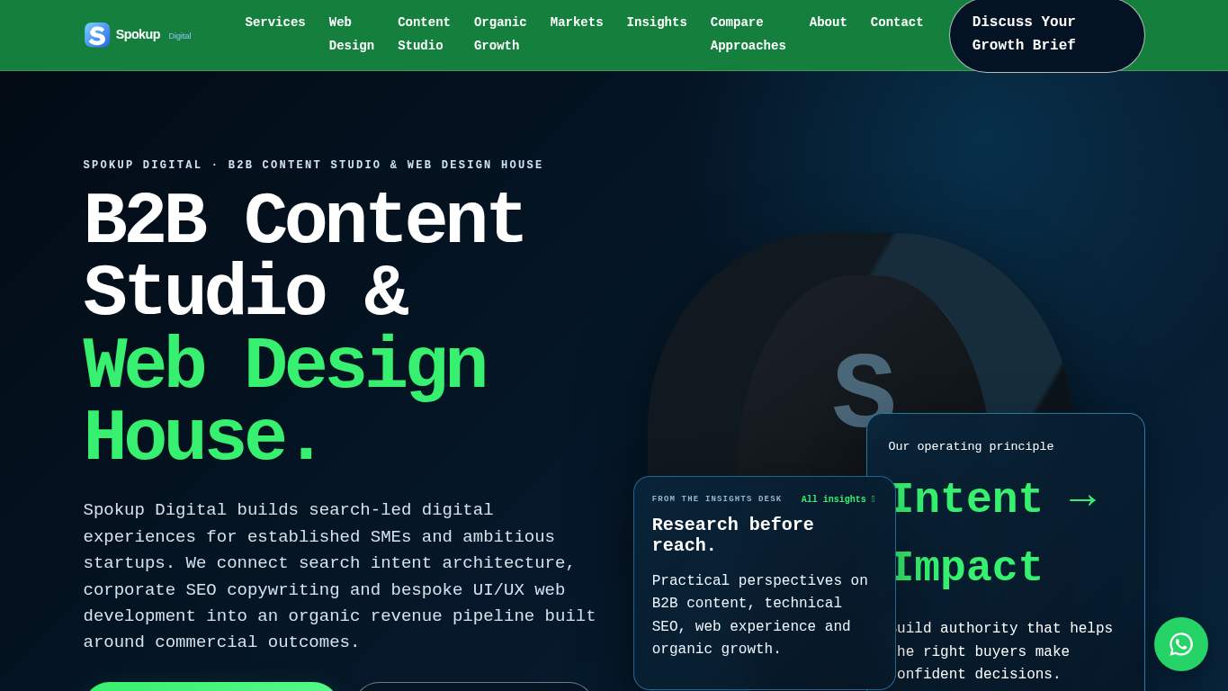
TECHNICAL SUMMARY
While your server response time of 190ms is snappy, your site is a conversion black hole with zero forms and only three repetitive CTAs. You have 39 headings across a 1027-word site but practically no visual assets to support the brand, making it a technical success that is a business failure. Prioritize adding lead capture forms and social proof to turn this brochure into a pipeline.
Where It Burns
6 categoriesWebsite Audit Findings for spokup.com
SavageAudit identified 12 visible findings and recommendations across 4 audit categories. Each section below combines the category score with observed evidence and prioritized fixes.
9801 PERFORMANCERender-blocking savings 980 ms9302 SEOHeading count 398303 DESIGNImage count 29804 COPYWord count 1027Free05 UXSign in to viewFree06 CONVERSIONSign in to view
01
PERFORMANCE AUDIT
98
Render-blocking savings980 msUnused JS73 KiB
- 🔥Your render-blocking resources are costing visitors 980 ms of their lives, which is an eternity in the B2B world.
💀
Your performance is technically proficient, yet you still manage to block the render path like an amateur.
- →Defer non-critical JavaScript and reduce render-blocking resources.TBT: 40 msImpact: highEffort: medium
Why this matters
The 980 ms render-blocking delay is killing your load efficiency despite a low TBT.
LIMITED DEPTH
Create free accountSign up free to unlock all hidden roast lines, key metrics, and prioritized fixes for PERFORMANCE. The stopwatch has receipts we have not opened yet.
02
SEO AUDIT
93
Heading count39Open Graph ImageMissing
- 🔥You’ve managed to create 39 headings for 1027 words, proving you love structure more than you love actual content depth.
💀
Your SEO is a hollow shell that ignores the social signals necessary to actually win business.
- →Add an og:image meta tag for a polished appearance when shared on social media.Open Graph Image: MissingImpact: mediumEffort: low
Why this matters
Missing social previews make your agency look unprofessional when shared by prospective enterprise clients.
LIMITED DEPTH
Create free accountSign up free to unlock all hidden roast lines, key metrics, and prioritized fixes for SEO. Search engines noticed more than this first punchline.
03
DESIGN AUDIT
83
Image count2Heading count39
- 🔥With only two images across a massive page, your visual hierarchy is less of a design and more of a minimalist protest.
💀
Your design is an empty void that fails to leverage the visual tools of a modern agency.
- →Add supporting imagery so the layout feels intentional, not empty.Images: 2Impact: mediumEffort: medium
Why this matters
Having only 2 images on a 1027-word page makes your site feel unfinished and uninspiring for a design house.
LIMITED DEPTH
Create free accountSign up free to unlock all hidden roast lines, key metrics, and prioritized fixes for DESIGN. The visual hierarchy argument gets louder deeper down.
04
COPY AUDIT
98
Word count1027CTA count3
- 🔥You have 1027 words of copy but only three CTAs, all of which lazily say 'Contact'.
💀
Your copy is verbose and repetitive, failing to provide the diverse calls to action your business model demands.
- →Add a clear CTA - make the primary one stand out.CTA Count: 3Impact: mediumEffort: low
Why this matters
Repeating the same 'Contact' button three times is a failure to guide the user through a conversion funnel.
LIMITED DEPTH
Create free accountSign up free to unlock all hidden roast lines, key metrics, and prioritized fixes for COPY. Messaging slippage gets sharper past the first line.
05
UX AUDITUSER EXPERIENCE AUDIT
FREE UNLOCKFull analysis locked
Users shouldn't have to fight your interface to convert. Create a free account to open the UX failure map.
06
CONVERSION AUDIT
FREE UNLOCKFull analysis locked
Traffic arrived. Confidence left before checkout. Create a free account to see what's killing your conversions.
Audit overview
spokup.com Audit Summary
While your server response time of 190ms is snappy, your site is a conversion black hole with zero forms and only three repetitive CTAs. You have 39 headings across a 1027-word site but practically no visual assets to support the brand, making it a technical success that is a business failure. Prioritize adding lead capture forms and social proof to turn this brochure into a pipeline.
Based on the category scores in this report, Performance is the strongest area while Design has the most room for improvement.
How SavageAudit Evaluated spokup.com
SavageAudit evaluated the public website at https://spokup.com/ across performance, technical SEO, design, copy, user experience, and conversion signals. Scores and recommendations reflect the website evidence available when this audit was generated on November 5, 2026.
Similar Website Audit Reports
Compare this result with other public SavageAudit reports that received a similar overall website score.