Loading Report View…
0/ 100
reha-tool-digital.de Website Audit Report
reha-tool-digital.de scored 83 out of 100 in this SavageAudit website audit covering Performance, SEO, Design, Copy, User Experience, and Conversion. The report uses captured website evidence to explain what is working, what is limiting the experience, and which improvements deserve attention first.
“A competent brochure site with a trust leak and a sleepy checkout path.”
Reha-Tool Digital shows up in a clean lab coat, then forgets to bring the proof. For a healthcare SaaS selling systematic advice, it’s oddly shy about trust, clarity, and the actual moment someone should say yes.
 https://www.reha-tool-digital.de/app-bestellen/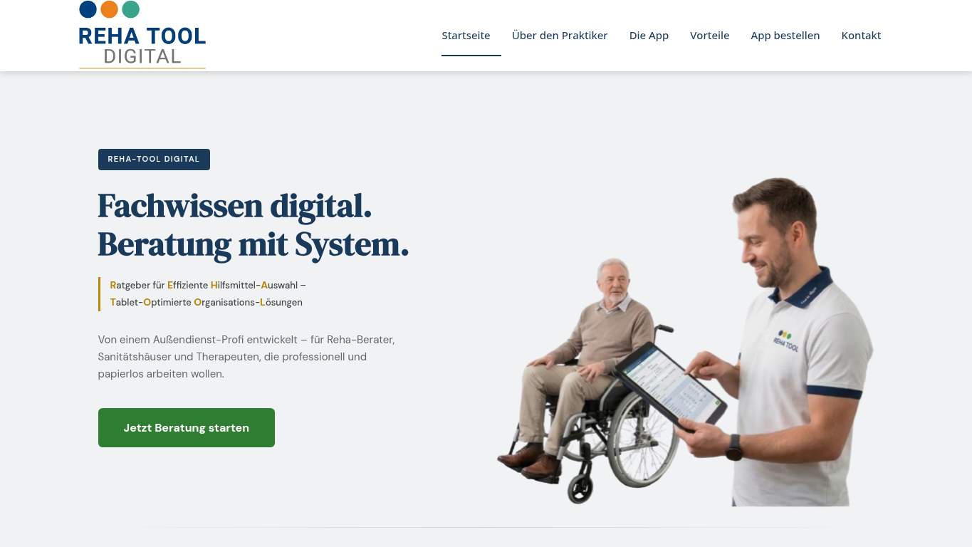
TECHNICAL SUMMARY
The page is technically acceptable on paper, but the experience is dragged down by a 6.6s largest contentful paint, a 9.3s speed index, and 0.124 CLS with 3 layout shifts. SEO is mostly intact, yet the canonical aligns with the audited URL and the social share package is missing Twitter title, description, and image, while the conversion story is weakened by only 2 social proof items and no visible contact path.
Where It Burns
6 categoriesWebsite Audit Findings for reha-tool-digital.de
SavageAudit identified 36 visible findings and recommendations across 6 audit categories. Each section below combines the category score with observed evidence and prioritized fixes.
6501 PERFORMANCELCP 6.6 s7402 SEOCanonical Match Yes8003 DESIGNLayout Shifts 39004 COPYWord Count 1999705 UXCLS 0.1249506 CONVERSIONCTA Count 3
01
PERFORMANCE AUDIT
65
LCP6.6 sSpeed Index9.3 sCache Savings855 KiBUnused CSS131 KiB
- 🔥Your 6.6s LCP is moving like a rehab intake form faxed from 2008.
💀
The page is hauling enough dead weight to make every visit feel like a delayed appointment.
- →Compress the hero images and serve them as WebP/AVIF to cut the LCP down.LCP: 6.6 sImpact: highEffort: medium
Why this matters
The largest contentful paint is already too slow, so the hero is the most likely place to win back visible speed and trust.
- →Defer non-critical JavaScript and trim render-blocking resources.TBT: 60 msImpact: highEffort: medium
Why this matters
Even with modest blocking time, the page is still dragging on core rendering work instead of getting the consultation offer on screen sooner.
- →Enable CDN caching and long cache TTLs for static assets.FCP: 2.9 sImpact: mediumEffort: low
Why this matters
First contentful paint is sluggish enough that caching can shave off the early wait and make the page feel less like a queued appointment.
02
SEO AUDIT
74
Canonical MatchYesMissing Alt2Title Length69 charactersTwitter ImageMissing
- 🔥The canonical points to the homepage while the audited page is the homepage too—at least the URL drama is keeping the plot simple.
💀
Search engines can read the room better than this page can, and they’re still getting mixed signals.
- →Shorten the title tag to under 60 characters so it stops repeating itself like a nervous intern.Title Length: 69 charactersImpact: mediumEffort: low
Why this matters
The title is too long and duplicates the brand phrase, which wastes the little snippet real estate you have.
- →Add descriptive alt text to every meaningful image.Missing Alt: 2Impact: mediumEffort: medium
Why this matters
Two images have no alt text, which hurts accessibility and removes useful search context from the page.
- →Publish llms.txt or ai.txt with the key URLs and support paths.AI Hints: MissingImpact: mediumEffort: medium
Why this matters
The page has no AI hint file, so crawlers get less guidance on the pages and docs you actually want cited.
03
DESIGN AUDIT
80
Layout Shifts3CLS0.124Images7Font Families11
- 🔥A font stack of 11 families is not typography; it’s a casting call.
💀
The layout is competent, but it keeps tripping over its own wardrobe and calling it style.
- →Add supporting imagery that shows the product in real workflows, not just posed hero theatre.Images: 7Impact: mediumEffort: medium
Why this matters
The page has seven images, but the visuals are not doing enough heavy lifting to make the layout feel intentional and product-specific.
- →Reduce font families from 11 to 2-3 so the typography stops looking like a committee decision.Font Families: 11Impact: mediumEffort: low
Why this matters
An 11-family stack is excessive and can make a professional SaaS page feel visually inconsistent.
- →Fix missing alt text to pass accessibility audits and clean up the image experience.Missing Alt: 2Impact: mediumEffort: medium
Why this matters
Two missing alt attributes weaken both accessibility and the sense that the design was finished with care.
04
COPY AUDIT
90
Word Count199Sentence Count14CTA Count3H1 Count1
- 🔥The H1 is one sentence wearing two jobs, and the missing space in 'Fachwissen digital.Beratung' makes it look like the keyboard sneezed.
💀
The copy knows the brand name, but it still acts shy when it should explain the workflow and the payoff.
- →Tighten the headline so it states the value in one sentence instead of split-brain branding.H1 Count: 1Impact: mediumEffort: low
Why this matters
There is only one H1, so it has to do the job cleanly and not waste space on awkward phrasing.
- →Break longer paragraphs into skimmable bullets and shorter sentences.Avg Words/Sentence: 14Impact: lowEffort: medium
Why this matters
The current sentence length is readable, but the page still needs easier scanning for busy rehab consultants and sanitation shop operators.
- →Make the primary CTA stand out and stop letting duplicate generic labels do the talking.CTA Count: 3Impact: mediumEffort: low
Why this matters
Three CTAs only help if one clearly owns the consultation action; right now the labels fight the message.
05
UX AUDITUSER EXPERIENCE AUDIT
97
CLS0.124Broken Assets1Form Fields4JS Errors0
- 🔥Three layout shifts and a CLS of 0.124 mean the page keeps moving the furniture after the visitor sits down.
💀
The interface is usable, but it still has one hand busy dropping plates while the other asks for attention.
- →Repair failed asset URLs and deployment paths so scripts and resources load cleanly.Broken Assets: 1Impact: highEffort: medium
Why this matters
A broken asset is visible friction, and the Google Analytics fetch failure proves the page has at least one unstable dependency.
- →Reduce form fields to only the essentials.Form Fields: 4Impact: lowEffort: medium
Why this matters
Four fields may be reasonable, but the page can still be made leaner for faster consultation starts.
- →Smoke-test the page in the browser console and keep runtime errors at zero.JS Errors: 0Impact: lowEffort: low
Why this matters
There are no current JS errors, so this is a cheap guardrail to keep the page from turning into a support ticket later.
06
CONVERSION AUDIT
95
CTA Count3Social Proof2Contact PathMissingHas Contactfalse
- 🔥Three CTAs, and two of them say 'Startseite'—that’s not a funnel, that’s a detour sign.
💀
The page asks for trust, but it doesn’t bother to earn much of it at the point of action.
- →Add a primary CTA above the fold that matches the consultation offer.CTA Count: 3Impact: mediumEffort: low
Why this matters
The page has multiple CTAs, but none of the evidence says one clearly owns the main conversion action.
- →Offer a low-friction contact option such as a visible email, form, or chat.Contact Path: MissingImpact: highEffort: medium
Why this matters
Without a visible contact path, visitors who are ready to start a consultation have to hunt for the exit.
- →Place testimonials, logos, or stats near the CTA.Social Proof: 2Impact: mediumEffort: low
Why this matters
Two proof points are not enough for a healthcare software decision; they need to sit beside the ask, not off to the side like reluctant witnesses.
Audit overview
reha-tool-digital.de Audit Summary
The page is technically acceptable on paper, but the experience is dragged down by a 6.6s largest contentful paint, a 9.3s speed index, and 0.124 CLS with 3 layout shifts. SEO is mostly intact, yet the canonical aligns with the audited URL and the social share package is missing Twitter title, description, and image, while the conversion story is weakened by only 2 social proof items and no visible contact path.
Based on the category scores in this report, User Experience is the strongest area while Performance has the most room for improvement.
How SavageAudit Evaluated reha-tool-digital.de
SavageAudit evaluated the public website at https://www.reha-tool-digital.de/app-bestellen/ across performance, technical SEO, design, copy, user experience, and conversion signals. Scores and recommendations reflect the website evidence available when this audit was generated on July 9, 2026.
Similar Website Audit Reports
Compare this result with other public SavageAudit reports that received a similar overall website score.