Loading Report View…
0/ 100
throughowlseye.com Website Audit Report
throughowlseye.com scored 83 out of 100 in this SavageAudit website audit covering Performance, SEO, Design, Copy, User Experience, and Conversion. The report uses captured website evidence to explain what is working, what is limiting the experience, and which improvements deserve attention first.
“A charming cultural magazine trapped in a sluggish opening act.”
Through Owl’s Eye knows what it wants to be, but the homepage keeps introducing itself like it missed the cue sheet. The result is a site that talks culture fluently while making the front door feel oddly shy.
 https://throughowlseye.com/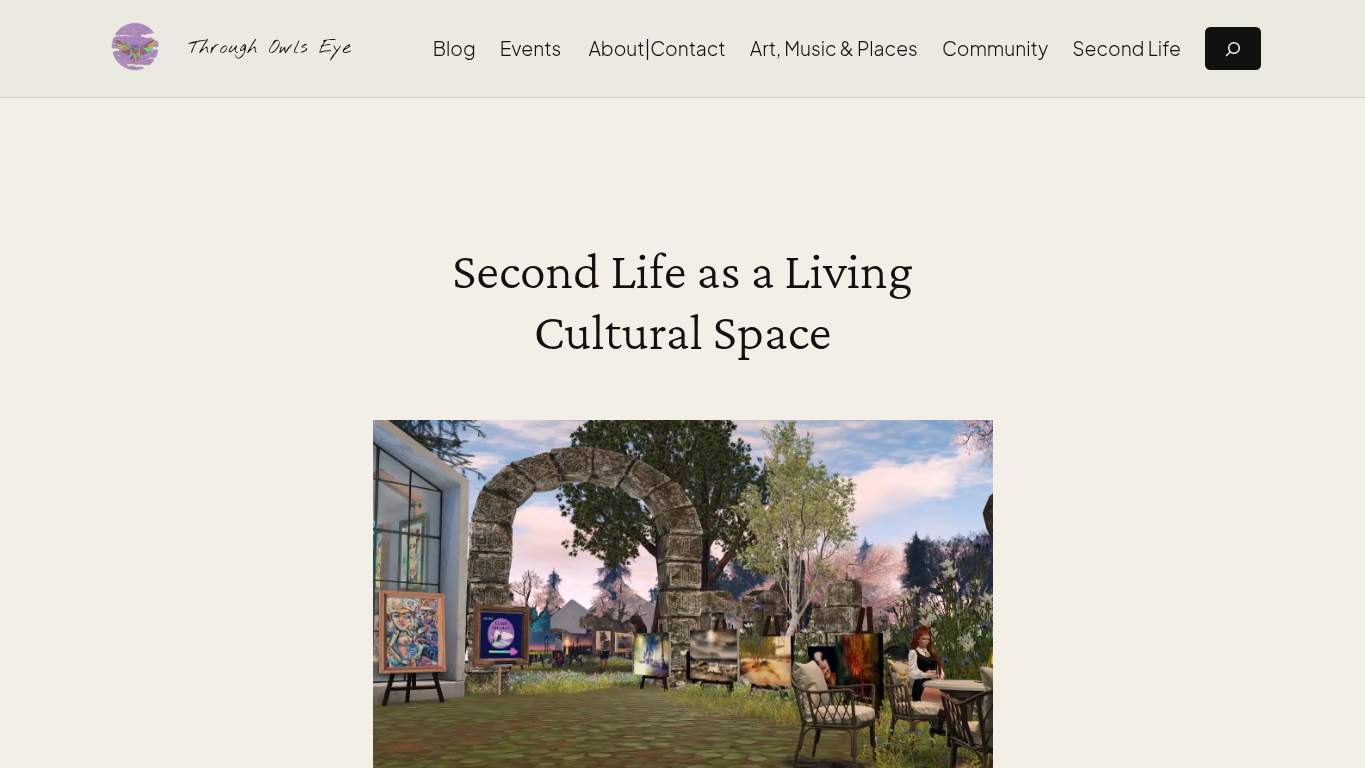
TECHNICAL SUMMARY
The good news: SEO is basically behaving, with a matching canonical, clean robots directives, valid schema, and no noindex nonsense. The bad news: performance is dragging the whole Second Life editorial experience behind the curtain, with an LCP of 5.1 s, TBT of 1,310 ms, interactive time at 8.7 s, and 11.5 s of main-thread work; fix the heavy hero and defer the JavaScript first, because slow first impression kills read-time and contact intent.
Where It Burns
6 categoriesWebsite Audit Findings for throughowlseye.com
SavageAudit identified 36 visible findings and recommendations across 6 audit categories. Each section below combines the category score with observed evidence and prioritized fixes.
6001 PERFORMANCELCP 5.1 s9302 SEOSEO score 1008003 DESIGNImages 99604 COPYWord count 6237705 UXJS errors 09606 CONVERSIONCTA count 3
01
PERFORMANCE AUDIT
60
LCP5.1 sTBT1,310 msInteractive8.7 sMain-thread work11.5 s
- 🔥Your LCP of 5.1 s shows the hero arriving like a delayed airport announcement: technically coming, spiritually gone. For a page about a living cultural space, the opening image takes longer to appear than some live performances take to start.
💀
The page arrives late, talks over itself, and makes readers wait for the curtain to rise.
- →Compress the hero images and convert them to WebP/AVIF.LCP: 5.1 sImpact: highEffort: medium
Why this matters
The 5.1 s LCP says the biggest visible element is arriving too late, and the hero is the first thing readers judge.
- →Defer non-critical JavaScript and cut render-blocking resources.TBT: 1,310 msImpact: highEffort: medium
Why this matters
A TBT of 1,310 ms means script work is freezing interactivity long enough to make the homepage feel sticky.
- →Enable CDN caching and set long cache TTLs for static assets.FCP: 1.1 sImpact: mediumEffort: low
Why this matters
FCP is already decent at 1.1 s, so caching helps preserve the early paint while reducing repeat-load waste.
02
SEO AUDIT
93
SEO score100Schema parse errors0CanonicalMatches URLEmpty headings3
- 🔥SEO is the one department here actually showing up to work: the score is 100, canonical matches the URL, and robots are behaving. That’s the digital equivalent of the gallery having perfect labeling while the gift shop is on fire.
💀
Search can read this site perfectly; the page’s actual content hierarchy is where the weirdness sneaks in.
- →Add descriptive alt text to every meaningful image.Missing Alt: 8Impact: mediumEffort: medium
Why this matters
Eight missing alt attributes leave search engines and assistive tech staring at blank placeholders instead of context.
- →Add citation-ready answer blocks that can stand on their own in search results.Citability: NoneImpact: mediumEffort: medium
Why this matters
Citability is currently none, so the page is making search do interpretive dance instead of extracting clear facts.
- →Remove empty heading tags or replace them with meaningful text.Empty Headings: 3Impact: lowEffort: low
Why this matters
Three empty headings weaken structure and give crawlers a content outline with missing chapters.
03
DESIGN AUDIT
80
Images9Missing alt text8Font families14Empty headings3
- 🔥Eight of nine images without alt text is accessibility negligence wearing a neat layout. That’s not visual minimalism; that’s a gallery with half the caption cards stolen.
💀
The layout has enough typefaces to start a festival, yet still can’t caption most of its own images.
- →Add supporting imagery so the layout feels intentional, not empty.Images: 9Impact: mediumEffort: medium
Why this matters
With only 9 images and weak visual support, the page leans too hard on text and feels under-illustrated for a culture publication.
- →Fix missing alt text to pass accessibility audits.Missing Alt: 8Impact: mediumEffort: medium
Why this matters
Eight missing alt attributes leave the visual design inaccessible and unfinished for screen-reader users.
- →Reduce font families from 14 to 2-3 for visual consistency.Font Families: 14Impact: mediumEffort: low
Why this matters
Fourteen font families make the design feel fragmented instead of editorially controlled.
04
COPY AUDIT
96
Word count623Sentence count42Social proof elements1CTA count3
- 🔥The copy is doing the work, which is why it’s almost suspicious that the page has 623 words and still leaves the homepage feeling like an introduction without a proper mic drop. With 42 sentences, it reads like a thoughtful essay that forgot the one-line thesis card.
💀
The writing can explain the topic, but it doesn’t yet sell the point of view with enough force.
- →Tighten the headline to state the value in one sentence.H1 Count: 1Impact: mediumEffort: low
Why this matters
With a single H1 doing all the framing, the headline needs to carry the value proposition harder and faster.
- →Break long paragraphs into skimmable bullets and shorter sentences.Avg Words/Sentence: 15Impact: lowEffort: medium
Why this matters
An average of 15 words per sentence is readable, but trimming and chunking will make the article easier to scan.
- →Add a clear primary CTA and make it visually dominant.CTA Count: 3Impact: mediumEffort: low
Why this matters
Three CTAs are present, but the page still lacks a strong directional sentence that tells readers what to do next.
05
UX AUDITUSER EXPERIENCE AUDIT
77
JS errors0Broken assets1Empty headings3Missing alt text8
- 🔥The page is mostly stable, with 0 console errors and 0 redirects, which is the bare minimum and somehow still a relief. Then one broken asset shows up like a glitch in the exhibit lighting and spoils the clean run.
💀
It works, but the one broken asset and missing structure keep poking holes in the experience.
- →Repair failed asset URLs and deployment paths so scripts, images, and stylesheets load cleanly.Broken Assets: 1Impact: highEffort: medium
Why this matters
A single broken asset is enough to create visible friction and undermine confidence in an otherwise stable page.
- →Ensure consistent navigation and footer links across all pages.Nav/Footer: Nav / FooterImpact: lowEffort: medium
Why this matters
The page has nav and footer, but consistency matters when readers move across a content-heavy site with multiple entry points.
- →Smoke-test the page in the browser console and keep runtime errors at zero.JS Errors: 0Impact: lowEffort: low
Why this matters
Zero JS errors is good; keeping it that way avoids turning a clean editorial page into a broken exhibit.
06
CONVERSION AUDIT
96
CTA count3Forms2Social proof1Copyright year2026
- 🔥Three CTAs exist, but none of them feels like the homepage is actually asking for the reader’s next move. It’s the digital equivalent of a docent waving politely instead of opening the gallery door.
💀
The page invites interaction, but it never fully commits to the ask.
- →Add a primary CTA above the fold that matches your core offer.CTA Count: 3Impact: mediumEffort: low
Why this matters
Three CTAs exist, but the page still lacks a dominant first action that tells readers what matters most.
- →Offer a low-friction contact option - form, chat, or visible email.Contact Path: PresentImpact: lowEffort: medium
Why this matters
A contact path exists, but it needs to be obvious and easy enough that interested readers don’t bounce out of politeness.
- →Include social proof or trust signals near the CTA.Social Proof: 1Impact: mediumEffort: low
Why this matters
With only 1 proof element, the page needs stronger credibility cues near the ask to support reader action.
Audit overview
throughowlseye.com Audit Summary
The good news: SEO is basically behaving, with a matching canonical, clean robots directives, valid schema, and no noindex nonsense. The bad news: performance is dragging the whole Second Life editorial experience behind the curtain, with an LCP of 5.1 s, TBT of 1,310 ms, interactive time at 8.7 s, and 11.5 s of main-thread work; fix the heavy hero and defer the JavaScript first, because slow first impression kills read-time and contact intent.
Based on the category scores in this report, Copy is the strongest area while Performance has the most room for improvement.
How SavageAudit Evaluated throughowlseye.com
SavageAudit evaluated the public website at https://throughowlseye.com/ across performance, technical SEO, design, copy, user experience, and conversion signals. Scores and recommendations reflect the website evidence available when this audit was generated on June 29, 2026.
Similar Website Audit Reports
Compare this result with other public SavageAudit reports that received a similar overall website score.