Loading Report View…
0/ 100
smia.ma Website Audit Report
smia.ma scored 81 out of 100 in this SavageAudit website audit covering Performance, SEO, Design, Copy, User Experience, and Conversion. The report uses captured website evidence to explain what is working, what is limiting the experience, and which improvements deserve attention first.
“Clear branding, but the AI community checkout lane is missing its cashier.”
SMIA looks like it dressed for an AI summit, then forgot to bring the proof that anyone actually showed up. The site keeps asking researchers, engineers, and decision-makers to join, while serving them a text-heavy lobby and calling it hospitality.
 https://smia.ma/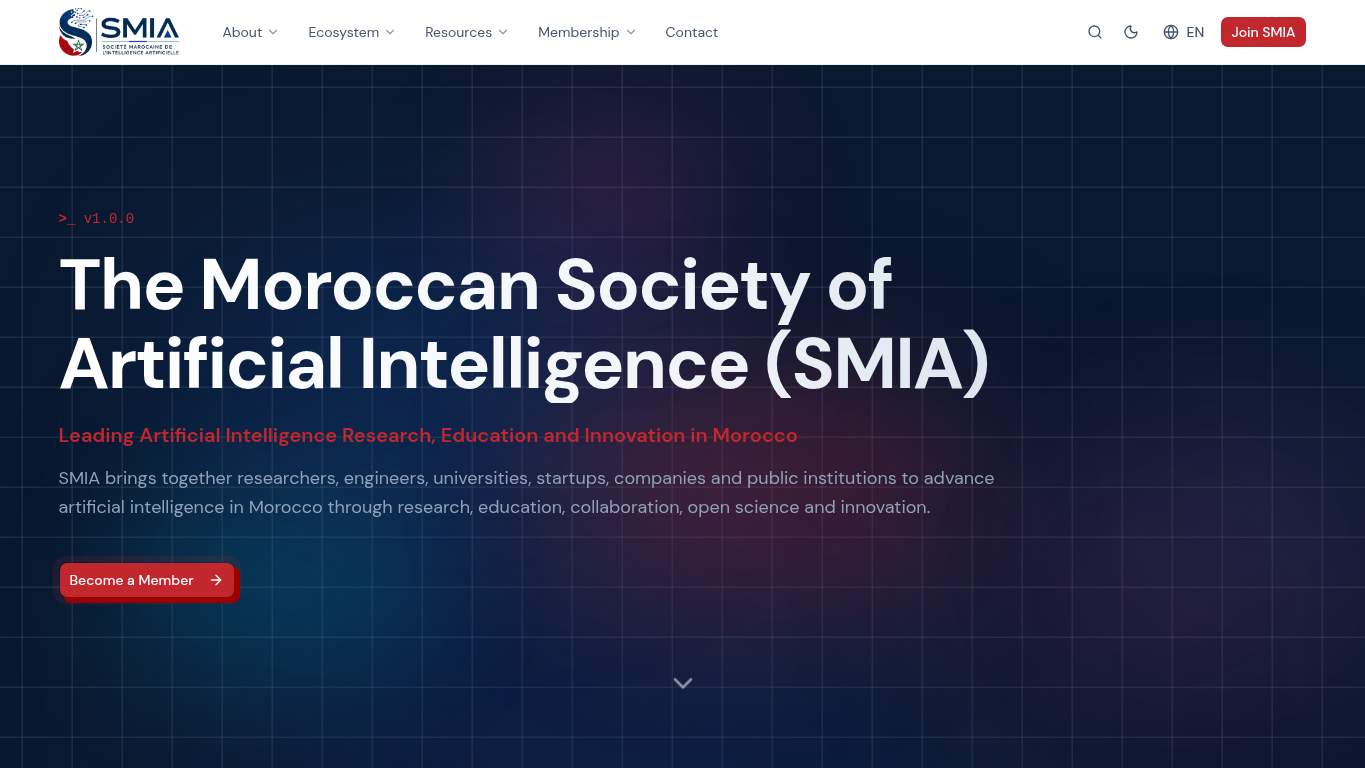
TECHNICAL SUMMARY
The good news: core SEO is mostly intact, metadata is present, and the page is indexable. The bad news: the front end is a slow-moving kitchen disaster—Speed Index is 11.6 s, Interactive is 10.0 s, and the page is carrying 1,038 KiB with 169 KiB of unused JavaScript. Fix the heavy hero and render-blocking script path first, because the nonprofit membership pitch loses trust and intent before people ever reach the Join SMIA moment.
Where It Burns
6 categoriesWebsite Audit Findings for smia.ma
SavageAudit identified 36 visible findings and recommendations across 6 audit categories. Each section below combines the category score with observed evidence and prioritized fixes.
7701 PERFORMANCELCP 3.7 s7502 SEOCanonical Match https://smia.ma/en/ vs https://smia.ma/7203 DESIGNMissing Alt Text 39204 COPYWord Count 1,1227805 UXBroken Assets 38806 CONVERSIONForm Count 0
01
PERFORMANCE AUDIT
77
LCP3.7 sSpeed Index11.6 sInteractive10.0 sUnused JavaScript169 KiB
- 🔥Your LCP sits at 3.7 s, which is the site equivalent of serving the appetizer after the guests have left.
💀
Beautifully branded, mechanically overcooked: the page arrives late, then asks for patience like that’s a feature.
- →Compress hero images and convert them to WebP/AVIF so the page stops dragging its headline through traffic.LCP: 3.7 sImpact: highEffort: medium
Why this matters
The largest content is arriving too slowly, which is why the membership pitch feels late instead of decisive.
- →Defer non-critical JavaScript and cut render-blocking resources so the page can become usable before the audience ages out.TBT: 170 msImpact: highEffort: medium
Why this matters
Even with decent blocking time, the page still reaches interactivity too slowly for a membership-first conversion path.
- →Enable CDN caching and long cache TTLs for static assets to reduce the drag on first view.FCP: 2.3 sImpact: mediumEffort: low
Why this matters
The first content appears late enough that extra caching will help the page stop feeling like it’s loading in reverse.
02
SEO AUDIT
75
Canonical Matchhttps://smia.ma/en/ vs https://smia.ma/Redirect Count2JSON-LD Blocks3Heading Structure1 H1, 10 H2s, 40 H3s
- 🔥Your canonical points to https://smia.ma/en/ while the requested URL is https://smia.ma/, which is duplicate-signal confusion wearing a blazer.
💀
The technical foundations are mostly there, but the canonical and redirect chain make discoverability look like it needs a translator.
- →Update the canonical tag so it matches the final preferred version of this page.Canonical: https://smia.ma/en/Impact: highEffort: low
Why this matters
The page is currently sending mixed signals about which URL should rank, and that muddies search confidence.
- →Shorten the title tag to under 60 characters so the brand and intent don’t get chopped off in search results.Title Length: 63 charactersImpact: mediumEffort: low
Why this matters
A slightly long title is an easy cleanup that helps the nonprofit membership page read cleaner in search.
- →Publish llms.txt or ai.txt with priority URLs and support paths so AI crawlers can find the pages you actually want cited.AI Hints: MissingImpact: mediumEffort: medium
Why this matters
For an AI society, skipping explicit crawler guidance is a bit rich; this helps entity discovery and citation quality.
03
DESIGN AUDIT
72
Missing Alt Text3Total Headings51Font Families14Images8
- 🔥Three of eight images have missing alt text, so the accessibility layer is doing interpretive dance instead of documentation.
💀
The layout is orderly, but the image support and font sprawl make it feel assembled from a very confident template kit.
- →Add supporting imagery so the layout feels intentional, not empty.Images: 8Impact: mediumEffort: medium
Why this matters
The hero is text-heavy and visually under-supported, which weakens the first impression for a membership brand.
- →Fix missing alt text to pass accessibility audits.Missing Alt: 3Impact: mediumEffort: medium
Why this matters
Three unlabeled images is enough to make the site feel careless where it should feel community-ready.
- →Reduce font families from 14 to 2-3 for visual consistency.Font Families: 14Impact: mediumEffort: low
Why this matters
This many font entries makes the design system look like it got into the pantry and never came back out.
04
COPY AUDIT
92
Word Count1,122Sentence Count38CTA Count9Social Proof Items3
- 🔥The page gives you 1,122 words across 38 sentences, so yes, it can explain itself—the question is whether anyone wants to read the full novel before joining.
💀
The writing is informative and ambitious, but the page keeps circling the same ask while under-serving proof.
- →Tighten the headline to state your value in one sentence.H1 Count: 1Impact: mediumEffort: low
Why this matters
The site has one main headline, so that line needs to do more than introduce the organization—it needs to sell the membership reason fast.
- →Break long paragraphs into skimmable bullets and shorter sentences.Avg Words/Sentence: 30Impact: mediumEffort: medium
Why this matters
Longer sentence flow can work for thought leadership, but it slows scanning for busy researchers and decision-makers.
- →Add a clear primary CTA that stands out from the repeated secondary asks.CTA Count: 9Impact: mediumEffort: low
Why this matters
Nine CTAs without stronger hierarchy makes the page sound eager in every direction and decisive in none.
05
UX AUDITUSER EXPERIENCE AUDIT
78
Broken Assets3Long Tasks6Buttons23Links83
- 🔥Three broken assets on a membership site is a charming way to ask visitors to trust you while a few files are literally failing the assignment.
💀
The interface mostly works, but the broken asset trail and crowded interaction surface keep the experience from feeling dependable.
- →Repair failed asset URLs and deployment paths so scripts, images, and stylesheets load cleanly.Broken Assets: 3Impact: highEffort: medium
Why this matters
Broken assets are user-visible friction, and even a small number can make the membership flow feel unreliable.
- →Smoke-test the page in the browser console and keep runtime errors at zero.JS Errors: 0Impact: lowEffort: low
Why this matters
Console stability is currently fine, so maintaining that baseline prevents small regressions from sneaking into the experience.
- →Ensure consistent navigation and footer links across all pages.Nav/Footer: Nav / FooterImpact: lowEffort: medium
Why this matters
A community association needs predictable navigation, especially when users are hunting for membership, events, or contact paths.
06
CONVERSION AUDIT
88
Form Count0CTA Count9Contact PathPresentSocial Proof3
- 🔥There is no form on the page, so the primary membership conversion is being asked to happen by psychic transmission.
💀
The page asks for commitment without giving visitors a direct way to commit, then wonders why the handshake feels incomplete.
- →Add a primary CTA above the fold that matches your core offer.CTA Count: 9Impact: mediumEffort: low
Why this matters
The page has plenty of calls to action, but not a clear dominant one that drives the Join SMIA decision.
- →Offer a low-friction contact option - form, chat, or visible email.Contact Path: PresentImpact: lowEffort: medium
Why this matters
The path exists in some form, but without a simple direct capture step, potential members have to work too hard to raise their hand.
- →Include social proof or trust signals near the CTA.Social Proof: 3Impact: mediumEffort: low
Why this matters
With only three trust items, the join prompt needs proof right beside it so the ask feels grounded, not aspirational.
Audit overview
smia.ma Audit Summary
The good news: core SEO is mostly intact, metadata is present, and the page is indexable. The bad news: the front end is a slow-moving kitchen disaster—Speed Index is 11.6 s, Interactive is 10.0 s, and the page is carrying 1,038 KiB with 169 KiB of unused JavaScript. Fix the heavy hero and render-blocking script path first, because the nonprofit membership pitch loses trust and intent before people ever reach the Join SMIA moment.
Based on the category scores in this report, Copy is the strongest area while Design has the most room for improvement.
How SavageAudit Evaluated smia.ma
SavageAudit evaluated the public website at https://smia.ma/ across performance, technical SEO, design, copy, user experience, and conversion signals. Scores and recommendations reflect the website evidence available when this audit was generated on July 3, 2026.
Similar Website Audit Reports
Compare this result with other public SavageAudit reports that received a similar overall website score.