Loading Report View…
0/ 100
beautifynailsandhair.cz Website Audit Report
beautifynailsandhair.cz scored 69 out of 100 in this SavageAudit website audit covering Performance, SEO, Design, Copy, User Experience, and Conversion. The report uses captured website evidence to explain what is working, what is limiting the experience, and which improvements deserve attention first.
“A tidy salon site that forgets appointments are the whole point.”
This homepage spends more time looking presentable than telling people why they should book. For a beauty salon, that’s like opening the chair salon and forgetting to mention chairs.
 https://www.beautifynailsandhair.cz/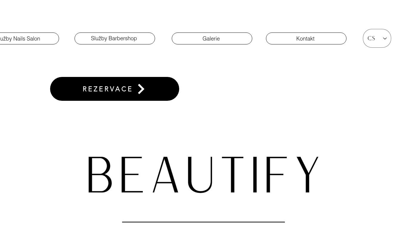
TECHNICAL SUMMARY
The good news: the site is structurally sane, with a clean canonical, no console errors, and decent SEO fundamentals. The bad news: the homepage still drags its feet with an 8.5s LCP, 16.2s interactive time, 449 KiB of unused JavaScript, and a 3,238 KiB payload, while conversion is kneecapped by zero CTAs and no form path. Fix the hero load and add a real booking/contact action first; that’s the difference between a local service page that earns trust and one that just occupies browser space.
Where It Burns
6 categoriesWebsite Audit Findings for beautifynailsandhair.cz
SavageAudit identified 36 visible findings and recommendations across 6 audit categories. Each section below combines the category score with observed evidence and prioritized fixes.
5901 PERFORMANCELCP 8.5 s7702 SEOSEO score 92/1008003 DESIGNHeading count 157304 COPYWord count 5896905 UXInteractive time 16.2 s4606 CONVERSIONCTA count 0
01
PERFORMANCE AUDIT
59
LCP8.5 sInteractive16.2 sUnused JavaScript449 KiBTotal page weight3,238 KiB
- 🔥Your 8.5s LCP is taking longer to show up than a client who says they’re "almost there" and isn’t.
💀
The page loads like it’s being styled in slow motion while the booking window closes.
- →Compress the hero media and switch it to WebP/AVIF.LCP: 8.5 sImpact: highEffort: medium
Why this matters
The homepage’s main content arrives too late, so the first thing visitors experience is waiting instead of your salon.
- →Defer non-critical JavaScript and strip render-blocking resources.TBT: 370 msImpact: highEffort: medium
Why this matters
370 ms of blocking work is enough to make the page feel sticky, especially on mobile booking traffic.
- →Enable CDN caching and give static assets long cache TTLs.FCP: 3.3 sImpact: mediumEffort: low
Why this matters
A 3.3 s first paint is sluggish for a local salon site, and caching is the cheapest way to stop repeating the penalty.
02
SEO AUDIT
77
SEO score92/100Meta descriptionmissingH1 count4Missing alt text2
- 🔥The meta description is missing, so search engines get a blank stare where your salon pitch should be.
💀
Search can find the salon, but the page still acts like its own introduction is optional.
- →Write a 140–160 character meta description with the primary keyword and booking intent.Meta description: missingImpact: highEffort: low
Why this matters
A missing description wastes search result real estate and leaves booking intent on the table.
- →Consolidate the page to one H1 and demote the rest to H2/H3.H1 Count: 4Impact: mediumEffort: low
Why this matters
Four H1s blur the topic hierarchy, which makes the page harder for search engines and humans to parse.
- →Add descriptive alt text to every meaningful image.Missing Alt: 2Impact: mediumEffort: medium
Why this matters
Two missing alt attributes leave important visual context undocumented and slightly weaken image search accessibility.
03
DESIGN AUDIT
80
Heading count15First heading level2Missing alt text2Font families20
- 🔥The layout is clean, but the hero area is so underused it could qualify for witness protection.
💀
Looks professional at a glance, then starts improvising with too many fonts and too little hierarchy.
- →Add supporting imagery or content blocks so the large hero area feels intentional.Images: 26Impact: mediumEffort: medium
Why this matters
The page has enough imagery to support a richer layout, but the top section still feels empty and underexplained.
- →Fix the two missing alt attributes.Missing Alt: 2Impact: mediumEffort: medium
Why this matters
Accessibility should not be left hanging on two unlabeled images, especially on a service page that needs trust.
- →Reduce font families from 20 to 2–3 for consistency.Font Families: 20Impact: mediumEffort: low
Why this matters
Twenty font-family entries create visual noise and make the page feel less disciplined than the brand deserves.
04
COPY AUDIT
73
Word count589Sentence count23CTA count0H1 count4
- 🔥The title says "Domů | Beautify Nails Hai" like the page got cut off mid-thought and never recovered.
💀
The copy introduces the salon, then forgets to make the booking case in one clean sentence.
- →Tighten the headline into one sentence that states the salon’s value clearly.H1 Count: 4Impact: highEffort: low
Why this matters
Four competing H1s dilute the main message when the homepage should instantly explain what the salon does.
- →Break long paragraphs into shorter, skimmable sentences and bullets.Avg Words/Sentence: 26Impact: lowEffort: medium
Why this matters
An average sentence length of 26 words is a bit of a monologue for people trying to decide where to book.
- →Add a clear CTA tied to the primary action.CTA Count: 0Impact: highEffort: low
Why this matters
With zero CTAs, the page can describe the salon all day and still fail to ask for the booking.
05
UX AUDITUSER EXPERIENCE AUDIT
69
Interactive time16.2 sLong tasks6Layout shifts1Nav elementmissing
- 🔥16.2s interactive time means clicking this page feels like waiting for nail polish to dry in real time.
💀
The interface is usable in theory, but it makes visitors work too hard to reach the appointment action.
- →Ensure consistent navigation and footer links across the site.Nav/Footer: No nav / FooterImpact: mediumEffort: medium
Why this matters
Without consistent navigation, local visitors have to hunt for basics instead of moving toward booking.
- →Smoke-test the page in the browser console and keep runtime errors at zero.JS Errors: 0Impact: lowEffort: low
Why this matters
Zero errors is good, but keeping it that way prevents accidental UX regressions from sneaking in.
- →Reduce form fields to only the essentials.Form Fields: 0Impact: lowEffort: medium
Why this matters
A zero-field form means there is no guided user path; adding only the essentials would make contact less of a scavenger hunt.
06
CONVERSION AUDIT
46
CTA count0Form count0Social proof count1Button count1
- 🔥CTA count is 0, which is a bold strategy for a booking business that survives on people actually booking.
💀
The page has a booking business model and almost no booking machinery attached to it.
- →Add a primary CTA above the fold that matches the core offer.CTA Count: 0Impact: highEffort: low
Why this matters
The site currently asks visitors to infer the next step, which is how bookings quietly vanish.
- →Offer a low-friction contact option such as a form, chat, or visible email.Contact Path: PresentImpact: lowEffort: medium
Why this matters
A contact path exists in theory, but without a visible lightweight action it’s too easy for users to bounce.
- →Place testimonials or other trust signals near the CTA.Social Proof: 1Impact: mediumEffort: low
Why this matters
One proof point is a start, but bookings convert better when trust shows up right beside the action button.
Audit overview
beautifynailsandhair.cz Audit Summary
The good news: the site is structurally sane, with a clean canonical, no console errors, and decent SEO fundamentals. The bad news: the homepage still drags its feet with an 8.5s LCP, 16.2s interactive time, 449 KiB of unused JavaScript, and a 3,238 KiB payload, while conversion is kneecapped by zero CTAs and no form path. Fix the hero load and add a real booking/contact action first; that’s the difference between a local service page that earns trust and one that just occupies browser space.
Based on the category scores in this report, Design is the strongest area while Conversion has the most room for improvement.
How SavageAudit Evaluated beautifynailsandhair.cz
SavageAudit evaluated the public website at https://www.beautifynailsandhair.cz/ across performance, technical SEO, design, copy, user experience, and conversion signals. Scores and recommendations reflect the website evidence available when this audit was generated on July 2, 2026.
Similar Website Audit Reports
Compare this result with other public SavageAudit reports that received a similar overall website score.