Loading Report View…
0/ 100
mcaffeine.com Website Audit Report
mcaffeine.com scored 60 out of 100 in this SavageAudit website audit covering Performance, SEO, Design, Copy, User Experience, and Conversion. The report uses captured website evidence to explain what is working, what is limiting the experience, and which improvements deserve attention first.
“Built to sell caffeinated skincare, but the homepage forgot how to behave.”
mCaffeine brought the coffee, the claims, and the happy-customer flex — then buried them under a homepage that feels like it got dressed in a hurry. The brand sounds ready for checkout; the site keeps tripping over itself on the way there.
 https://www.mcaffeine.com/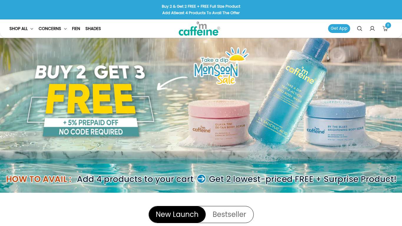
TECHNICAL SUMMARY
The good news: the page is crawlable, canonicalized, and has structured data in place. The bad news: performance is dragging a suitcase through molasses, with a 12.8 s LCP, 34.8 s interactive time, 950 ms TBT, 1,220 KiB of unused JavaScript, and 7,484 KiB total byte weight. On top of that, 5 console errors, 12 broken assets, and a heading structure that starts at level 3 make the experience feel like the storefront is being assembled live in front of customers.
Where It Burns
6 categoriesWebsite Audit Findings for mcaffeine.com
SavageAudit identified 36 visible findings and recommendations across 6 audit categories. Each section below combines the category score with observed evidence and prioritized fixes.
4401 PERFORMANCELCP 12.8 s7802 SEOMeta Description Present, but audit score 05603 DESIGNImages 1568404 COPYWord Count 3,7403905 UXConsole Errors 57706 CONVERSIONCTA Count 4
01
PERFORMANCE AUDIT
44
LCP12.8 sInteractive34.8 sTBT950 msUnused JavaScript1,220 KiB
- 🔥A 12.8 s LCP on an ecommerce homepage is not a launch; it’s a slow-cooked apology.
💀
The homepage is carrying enough dead code to qualify as a bad balance sheet.
- →Compress the hero assets and convert them to WebP/AVIF so the main visual stops dragging the page down.LCP: 12.8 sImpact: highEffort: medium
Why this matters
The LCP is critically slow, which points straight at the oversized above-the-fold content.
- →Defer non-critical scripts and trim render-blocking resources so the page can become interactive sooner.TBT: 950 msImpact: highEffort: medium
Why this matters
The blocking time is high enough to make taps and clicks feel like they’re waiting in line.
- →Enable CDN caching and longer cache TTLs for static assets to reduce repeat-load drag.FCP: 1.7 sImpact: mediumEffort: low
Why this matters
First paint is decent, but caching can shave repeat visit cost and protect that early visual start.
02
SEO AUDIT
78
Meta DescriptionPresent, but audit score 0Open Graph ImageMissingTwitter ImageMissingFirst Heading Level3
- 🔥Your title tag is 82 characters long, which is less a title and more a hostage note for search results.
💀
Search can find the page, but the presentation keeps showing up underdressed.
- →Shorten the title tag to under 60 characters so it stops hogging SERP space.Title Length: 82 charactersImpact: mediumEffort: low
Why this matters
The current title is too long for clean search display and risks truncation.
- →Add descriptive alt text to all meaningful images so image search and accessibility stop getting ignored together.Missing Alt: 2Impact: mediumEffort: medium
Why this matters
Two images are missing alt text, leaving both SEO and accessibility with no useful context.
- →Add og:image and twitter:image so social shares don’t look like a screenshot from a forgotten draft.Open Graph Image: MissingImpact: mediumEffort: low
Why this matters
Social previews have no image, which weakens shareability and click appeal.
03
DESIGN AUDIT
56
Images156Font Families15Layout Shifts15Animated Elements24
- 🔥The homepage has 156 images, but the layout still feels like the visuals are arguing with each other in public.
💀
Too many visual voices, not enough visual control.
- →Reduce font families from 15 to 2–3 so the typography stops looking like a brand mood board with commitment issues.Font Families: 15Impact: mediumEffort: low
Why this matters
Fifteen families create inconsistency and visual noise across the page.
- →Add supporting imagery where content feels thin so the layout reads intentional instead of stretched.Images: 156Impact: mediumEffort: medium
Why this matters
Despite the high image count, the page still needs better visual balance and support.
- →Fix missing alt text on the two affected images so the design doesn’t fail the accessibility basics.Missing Alt: 2Impact: mediumEffort: medium
Why this matters
Two missing alts are enough to break the polish story for screen readers and audits.
04
COPY AUDIT
84
Word Count3,740Sentence Count360CTA Count4H1 Count1
- 🔥The page packs 3,740 words into 360 sentences, which is less homepage copy and more a caffeine-fueled memoir.
💀
The copy knows the brand story, then keeps narrating past the point of persuasion.
- →Tighten the headline so the value proposition lands in one sentence instead of a whole mood board.H1 Count: 1Impact: mediumEffort: low
Why this matters
A single main heading should do more of the selling heavy lifting.
- →Break long paragraphs into shorter lines and bullets so shoppers can scan instead of decoding a wall of text.Avg Words/Sentence: 10Impact: lowEffort: medium
Why this matters
The page has 360 sentences, so readability matters even when the average sentence isn’t extreme.
- →Make one primary CTA dominate the page instead of letting 4 CTA texts compete like interns at a pitch meeting.CTA Count: 4Impact: mediumEffort: low
Why this matters
With only four CTA texts identified, the hierarchy needs to be more decisive.
05
UX AUDITUSER EXPERIENCE AUDIT
39
Console Errors5Broken Assets12Forms160Inputs977
- 🔥Five console errors and 12 broken assets is a bold way to make a shopping page feel haunted.
💀
Users are trying to shop while the page is busy failing in the background.
- →Fix client-side JavaScript errors so interactions stop failing silently in production.JS Errors: 5Impact: highEffort: medium
Why this matters
Five errors are enough to break user interactions and undermine trust in the interface.
- →Repair failed asset URLs and deployment paths so scripts, images, and stylesheets actually load.Broken Assets: 12Impact: highEffort: medium
Why this matters
Twelve broken assets is active user-facing damage, not a minor cleanup item.
- →Reduce form fields to the essentials so shoppers don’t need a mortgage application to buy skincare.Form Fields: 977Impact: mediumEffort: medium
Why this matters
The form surface area is massive, which creates unnecessary user effort and abandonment risk.
06
CONVERSION AUDIT
77
CTA Count4Buttons183Contact PathMissingSocial Proof3
- 🔥There are 183 buttons but only 4 CTA texts, so the page is shouting everywhere and persuading nowhere.
💀
The page has plenty of clickable clutter and not enough decisive buying momentum.
- →Add a primary CTA above the fold that matches the core offer and stops the button chaos from diluting intent.CTA Count: 4Impact: mediumEffort: low
Why this matters
Only four CTA texts are identified, so the page needs one clear buying command.
- →Add a visible contact option like chat, form, or email so buyers aren’t left guessing when checkout gets sticky.Contact Path: MissingImpact: highEffort: medium
Why this matters
A transactional ecommerce site needs a low-friction support route before trust can convert.
- →Move testimonials, ratings, or other trust proof closer to the main CTA so the buy button stops standing alone.Social Proof: 3Impact: mediumEffort: low
Why this matters
Three social proof signals exist, but placement matters when the goal is a clean purchase decision.
Audit overview
mcaffeine.com Audit Summary
The good news: the page is crawlable, canonicalized, and has structured data in place. The bad news: performance is dragging a suitcase through molasses, with a 12.8 s LCP, 34.8 s interactive time, 950 ms TBT, 1,220 KiB of unused JavaScript, and 7,484 KiB total byte weight. On top of that, 5 console errors, 12 broken assets, and a heading structure that starts at level 3 make the experience feel like the storefront is being assembled live in front of customers.
Based on the category scores in this report, Copy is the strongest area while User Experience has the most room for improvement.
How SavageAudit Evaluated mcaffeine.com
SavageAudit evaluated the public website at https://www.mcaffeine.com/ across performance, technical SEO, design, copy, user experience, and conversion signals. Scores and recommendations reflect the website evidence available when this audit was generated on June 27, 2026.
Similar Website Audit Reports
Compare this result with other public SavageAudit reports that received a similar overall website score.