Loading Report View…
0/ 100
laou.netlify.app Website Audit Report
laou.netlify.app scored 83 out of 100 in this SavageAudit website audit covering Performance, SEO, Design, Copy, User Experience, and Conversion. The report uses captured website evidence to explain what is working, what is limiting the experience, and which improvements deserve attention first.
“A competent shell with trust leaks and lazy technical housekeeping.”
Académie Laouisset brought a decent outfit to class, then forgot the ID badge, the brochure, and one of the shoes. The page looks like it knows the curriculum, but it still flirts with being a generic school flyer in a trench coat.
 https://laou.netlify.app/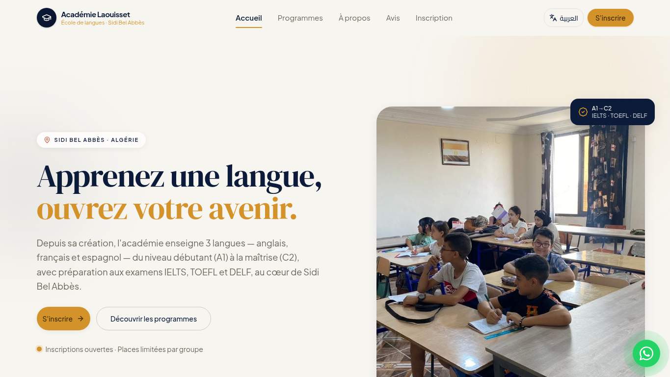
TECHNICAL SUMMARY
The good news: the page is mostly crawlable, uses a single H1, and has strong copy and UX scores. The bad news: LCP is 4.3 s, FCP is 3.2 s, and render-blocking work could save 1,700 ms — so the first impression gets to the classroom late. SEO is held back by a missing canonical, missing robots.txt, missing sitemap, and no social share image; the fix-first move is to clean up discoverability and load the hero faster so enrollment intent doesn’t wander off before contact.
Where It Burns
6 categoriesWebsite Audit Findings for laou.netlify.app
SavageAudit identified 36 visible findings and recommendations across 6 audit categories. Each section below combines the category score with observed evidence and prioritized fixes.
8401 PERFORMANCELCP 4.3 s7702 SEOCanonical missing6703 DESIGNHeading level skips h2->h49804 COPYH1 Count 19605 UXJS Errors 17206 CONVERSIONCTA Count 1
01
PERFORMANCE AUDIT
84
LCP4.3 sFCP3.2 sRender-blocking savings1,700 msUnused JavaScript savings90 KiB
- 🔥Your LCP at 4.3 s arrives like the teacher who says "be on time" and then shows up after the bell.
💀
The page isn’t broken; it’s just making first impressions work overtime.
- →Compress the hero image and convert it to WebP/AVIF so the classroom photo stops dragging first paint around.LCP: 4.3 sImpact: highEffort: medium
Why this matters
A 4.3 s LCP points straight at heavy above-the-fold assets, and the hero is the first thing standing between interest and enrollment.
- →Defer non-critical scripts and trim render-blocking resources before the browser starts lecturing itself.TBT: 0 msImpact: highEffort: medium
Why this matters
Even with TBT at 0 ms, Lighthouse flags 1,700 ms of render-blocking savings, so the bottleneck is still choking visual delivery.
- →Enable long-lived caching for static assets so repeat visitors don’t have to reload the same 3.2 s opening act.FCP: 3.2 sImpact: mediumEffort: low
Why this matters
The FCP is already slow enough to matter, and better caching is the low-effort way to cut repeat-load drag.
02
SEO AUDIT
77
Canonicalmissingrobots.txtMissingsitemap.xmlMissingOpen Graph imagemissing
- 🔥The canonical tag is missing, so search engines have to guess which version of your page is the real one — adorable in a noogie sort of way.
💀
Search engines can find the page, but they’re being asked to improvise the entire filing system.
- →Add a self-referencing canonical tag so the homepage stops competing with itself like a student arguing with their own notes.Canonical: missingImpact: highEffort: low
Why this matters
A missing canonical creates duplicate-signal confusion and weakens the page’s authority in search.
- →Create a robots.txt file so crawlers know the rules instead of wandering the academy halls unsupervised.robots.txt: MissingImpact: mediumEffort: low
Why this matters
Without robots.txt, crawler guidance is absent, which is sloppy for a site that needs discoverability for enrollments.
- →Publish a sitemap.xml and submit it so search engines can actually index the course pages instead of playing hide-and-seek.sitemap.xml: MissingImpact: mediumEffort: low
Why this matters
A missing sitemap makes it harder for search engines to discover and prioritize key pages.
03
DESIGN AUDIT
67
Heading level skipsh2->h4Font families19Images1Missing alt text0
- 🔥One heading jump from h2 to h4 is a tiny structural tantrum; the page outline is doing parkour where it should be walking upstairs.
💀
The design is clean enough to pass a glance, but the structure and typography are auditioning for chaos.
- →Reduce the font stack from 19 families to 2–3 so the page stops looking like it borrowed typefaces from a ransom note.Font Families: 19Impact: mediumEffort: low
Why this matters
Nineteen fonts signals inconsistent presentation and makes the visual system feel less intentional.
- →Add supporting imagery beyond the single classroom shot so the homepage doesn’t feel like one photo and a prayer.Images: 1Impact: mediumEffort: medium
Why this matters
One image is thin visual support for an education brand that should sell environment, credibility, and outcomes.
- →Run a heading-structure pass and remove the h2-to-h4 skip so the content outline stops tripping over its own shoelaces.Viewport: PresentImpact: lowEffort: medium
Why this matters
The page is responsive, but heading hierarchy still needs cleanup to improve semantic structure and readability.
04
COPY AUDIT
98
H1 Count1Word count368Sentence count21CTA Count1
- 🔥The title and H1 are close but not identical, which is the content equivalent of introducing yourself and then mumbling your own name.
💀
The copy knows the offer, but the CTA behaves like a receptionist who only accepts voicemail by email.
- →Tighten the headline so it says the value proposition in one sentence and matches the title more cleanly.H1 Count: 1Impact: mediumEffort: low
Why this matters
The site has one H1, but the current wording is softer than the title and could be more direct for course enrollment intent.
- →Break the longer copy into shorter, skimmable chunks so students can find levels, exams, and location details without reading a novella.Avg Words/Sentence: 18Impact: lowEffort: medium
Why this matters
At 18 words per sentence, the page is readable but still heavier than ideal for quick decision-making.
- →Add a clearer primary CTA instead of making the email address do all the enrollment work.CTA Count: 1Impact: mediumEffort: low
Why this matters
One CTA is thin for a course-enrollment page, especially when the primary action is just contact by email.
05
UX AUDITUSER EXPERIENCE AUDIT
96
JS Errors1Broken Assets1Network server latency40 ms
- 🔥One console error on favicon.ico is a tiny typo of a problem, but it still means the browser found a pothole and drove into it.
💀
The interface mostly behaves, but one broken asset is still enough to make the page look undercooked at the edges.
- →Fix the client-side error path so production users don’t inherit a quiet console failure like a surprise pop quiz.JS Errors: 1Impact: highEffort: medium
Why this matters
A recorded console error means something is failing in the live experience, even if the page still loads.
- →Repair the favicon deployment path so the browser stops chasing a 404 like it owes it money.Broken Assets: 1Impact: highEffort: medium
Why this matters
A broken asset is a visible deployment mistake and a needless quality hit, even if it’s only the favicon.
- →Keep navigation and footer links consistent across pages so users don’t feel like they’ve entered different campuses with the same logo.Nav/Footer: Nav / FooterImpact: lowEffort: medium
Why this matters
Consistent navigation matters for repeat visits and trust, especially for a school site where users compare information across pages.
06
CONVERSION AUDIT
72
CTA Count1Form Count0Social Proof2
- 🔥Two buttons and one CTA text means the page is doing enrollment with the enthusiasm of a form letter.
💀
The page can be contacted, but it doesn’t exactly stage a persuasive enrollment moment.
- →Add a primary CTA above the fold that speaks directly to course enrollment instead of leaving the email address to do all the persuading.CTA Count: 1Impact: mediumEffort: low
Why this matters
One CTA is weak for a school homepage where the main business goal is getting inquiries and enrollments.
- →Introduce a low-friction contact form or chat path so interested students don’t have to turn into copy-paste diplomats.Contact Path: PresentImpact: lowEffort: medium
Why this matters
The current contact path exists, but it’s too dependent on direct email and misses easier conversion options.
- →Place social proof closer to the CTA so the page stops asking students to trust the academy on enthusiasm alone.Social Proof: 2Impact: mediumEffort: low
Why this matters
Two proof points are present, but they need to sit nearer the action to support trust at the decision moment.
Audit overview
laou.netlify.app Audit Summary
The good news: the page is mostly crawlable, uses a single H1, and has strong copy and UX scores. The bad news: LCP is 4.3 s, FCP is 3.2 s, and render-blocking work could save 1,700 ms — so the first impression gets to the classroom late. SEO is held back by a missing canonical, missing robots.txt, missing sitemap, and no social share image; the fix-first move is to clean up discoverability and load the hero faster so enrollment intent doesn’t wander off before contact.
Based on the category scores in this report, Copy is the strongest area while Design has the most room for improvement.
How SavageAudit Evaluated laou.netlify.app
SavageAudit evaluated the public website at https://laou.netlify.app/ across performance, technical SEO, design, copy, user experience, and conversion signals. Scores and recommendations reflect the website evidence available when this audit was generated on July 3, 2026.
Similar Website Audit Reports
Compare this result with other public SavageAudit reports that received a similar overall website score.