Loading Report View…
0/ 100
oneapps.tech Website Audit Report
oneapps.tech scored 65 out of 100 in this SavageAudit website audit covering Performance, SEO, Design, Copy, User Experience, and Conversion. The report uses captured website evidence to explain what is working, what is limiting the experience, and which improvements deserve attention first.
“Ambition everywhere, but the page forgets to ask for the sale.”
This site looks like it hired a neon sign and forgot the landing page. For traffic arbitrage buyers, it’s serving mystery meat where proof, clarity, and a next step should be doing the heavy lifting.
 https://oneapps.tech/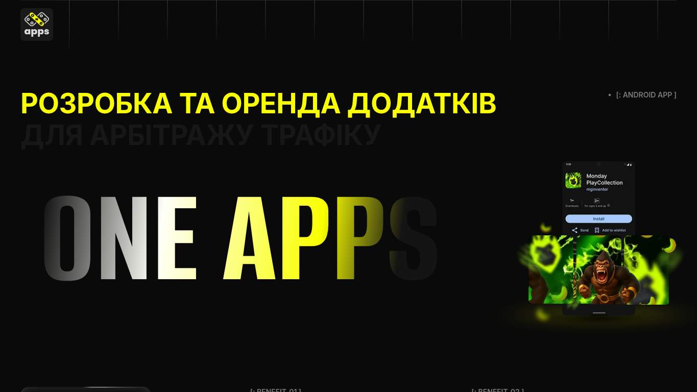
TECHNICAL SUMMARY
The good news: the page is crawlable, canonicalized correctly, and the SEO baseline is solid. The bad news: interaction takes 22.3 s, TBT is 700 ms, unused JavaScript could save 409 KiB, and the page weighs 17,212 KiB—so the browser is basically carrying a shipping container uphill while your offer waits for applause. Fix the heavy hero assets and render-blocking JavaScript first, because speed, trust, and lead capture are all getting kneecapped at the same time.
Where It Burns
6 categoriesWebsite Audit Findings for oneapps.tech
SavageAudit identified 36 visible findings and recommendations across 6 audit categories. Each section below combines the category score with observed evidence and prioritized fixes.
7101 PERFORMANCELCP 3.3 s8502 SEOOpen Graph/Twitter Metadata Missing9103 DESIGNImages 1215904 COPYWord Count 1574205 UXNav/Footer No nav / No footer2006 CONVERSIONForms 0
01
PERFORMANCE AUDIT
71
LCP3.3 sSpeed Index6.4 sInteractive22.3 sTBT700 ms
- 🔥Your LCP of 3.3 s is fine until the site keeps the rest of the party waiting; the Speed Index at 6.4 s is the actual slow dance. The hero is arriving like a late DJ, and by then the crowd has already left the room.
💀
The page moves like it’s buffering a whole ad network just to say hello.
- →Compress the hero images and convert them to WebP or AVIF so the first impression stops arriving on foot.LCP: 3.3 sImpact: highEffort: medium
Why this matters
The hero is still heavy enough to drag LCP to 3.3 s, which slows the first meaningful view of the offer and hurts lead intent.
- →Defer non-critical JavaScript and trim render-blocking resources so the page can become interactive before the next calendar year.TBT: 700 msImpact: highEffort: medium
Why this matters
700 ms of blocking work is enough to make the page feel sticky, especially when interactive time is already 22.3 s.
- →Enable CDN caching and long cache TTLs for static assets so the site stops re-downloading its own luggage.FCP: 1.4 sImpact: mediumEffort: low
Why this matters
Even with an acceptable FCP of 1.4 s, the huge page weight and cache savings opportunity show the delivery layer is wasting bandwidth.
02
SEO AUDIT
85
Open Graph/Twitter MetadataMissingSchema TypesOrganization, ContactPointWord Count157Sitemap.xmlMissing
- 🔥The SEO score is 100, which is adorable until social previews show up naked: ogTitle is empty, ogDescription is empty, and hasOgImage is false. Your link card is basically a blank business card.
💀
Search can find you, but social and AI previews are being handed an empty envelope.
- →Add descriptive alt text to every meaningful image so the page stops treating accessibility like an optional side quest.Missing Alt: 8Impact: mediumEffort: medium
Why this matters
Eight missing alt attributes means image meaning is being dropped on the floor for crawlers and assistive tech.
- →Generate and submit a sitemap.xml so the crawl path includes more than just the homepage and a prayer.sitemap.xml: MissingImpact: mediumEffort: low
Why this matters
A missing sitemap weakens discovery of any deeper app rental, support, or delivery pages you expect to rank.
- →Review robots.txt so GPTBot, ClaudeBot, and Google-Extended can crawl the pages you actually want cited in AI answers.AI Crawlers: Mixed 1/4Impact: mediumEffort: low
Why this matters
The current crawler policy blocks major AI systems, which limits citation reach for a business that should be discoverable in technical buying research.
03
DESIGN AUDIT
91
Images121Missing Alt8Font Families3Console Errors1
- 🔥There are 121 images and 8 missing alt attributes, which is a lot of visual noise for a page with no nav and no footer. The design is doing a parade float impression while forgetting the roads.
💀
A stack of images, fonts, and loud visuals is pretending to be a system.
- →Add supporting imagery so the layout feels intentional instead of like 121 assets were thrown at the page and hoped for the best.Images: 121Impact: mediumEffort: medium
Why this matters
With 121 images, the layout needs stronger visual hierarchy and supporting structure so the page reads as designed, not assembled in a hurry.
- →Fix missing alt text to clear the accessibility audit and stop leaving eight images speechless.Missing Alt: 8Impact: mediumEffort: medium
Why this matters
Eight missing alt attributes weaken accessibility and make the page look neglected in places it should be precise.
- →Test spacing and alignment across mobile and desktop breakpoints so the aggressive styling doesn’t collapse into a neon traffic jam.Viewport: PresentImpact: lowEffort: medium
Why this matters
Viewport support exists, but that only means the responsive work still needs actual checking instead of blind faith.
04
COPY AUDIT
59
Word Count157Sentence Count66CTA Count0Meta Description Length161 characters
- 🔥The title is 58 characters long and the meta description is 161 characters of promotional bravado, but the body copy only gets 157 words to prove any of it. That’s not messaging; that’s a teaser trailer for a business that sells app rentals.
💀
The copy hypes the service, then hides before anyone can act.
- →Tighten the headline so it states the offer in one sentence without making readers decode the whole market category first.H1 Count: 1Impact: mediumEffort: low
Why this matters
The page has a single H1, so that headline needs to carry the value proposition instead of sounding like a file name with ambition.
- →Break the copy into skimmable bullets and shorter sentences so the page stops reading like 66 tiny speed bumps.Avg Words/Sentence: 2Impact: lowEffort: medium
Why this matters
The sentence structure is so fragmented that the offer becomes harder to scan and easier to ignore.
- →Add a clear CTA right now because zero CTAs means the page explains the deal and then politely escorts people to nowhere.CTA Count: 0Impact: highEffort: low
Why this matters
There is no visible next step in the copy, so the page has no instruction for high-intent visitors.
05
UX AUDITUSER EXPERIENCE AUDIT
42
Nav/FooterNo nav / No footerLinks2 totalJS Errors1Broken Assets8
- 🔥No nav and no footer means the site behaves like a hallway with no doors. On a traffic arbitrage offer, that is a remarkable commitment to making people guess.
💀
The experience has no map, no exits, and a few broken floorboards.
- →Ensure consistent navigation and footer links so visitors can actually move from the homepage to proof, terms, or contact.Nav/Footer: No nav / No footerImpact: mediumEffort: medium
Why this matters
Without navigation or a footer, users lose their route to trust content and next-step pages.
- →Fix the client-side JavaScript error so interactions don’t fail silently while the rest of the page pretends everything is fine.JS Errors: 1Impact: highEffort: medium
Why this matters
A visible console error can break interactive behavior and signals unfinished implementation.
- →Repair the failed asset URLs and deployment paths so the broken resources stop turning the page into a scavenger hunt.Broken Assets: 8Impact: highEffort: medium
Why this matters
Eight broken assets create direct user-facing friction and can damage both perceived quality and actual functionality.
06
CONVERSION AUDIT
20
Forms0Inputs0CTA Count0Social Proof1
- 🔥There are 0 forms, 0 inputs, and 0 required inputs, which is an impressive way to run a lead-gen page without letting leads enter the stadium. If contact sales is the goal, the gate is literally missing.
💀
It sells the dream but never hands anyone the number to call.
- →Add a primary CTA above the fold that matches the core offer, because right now the page is all intro and no invitation.CTA Count: 0Impact: highEffort: low
Why this matters
A zero-CTA page cannot convert high-intent visitors into contact sales conversations.
- →Offer a low-friction contact option such as a form, chat, or visible email so interested buyers have somewhere to go besides disappointment.Contact Path: MissingImpact: highEffort: medium
Why this matters
With no contact path, the page blocks the exact action it is supposed to drive.
- →Place social proof or trust signals near the CTA so the page stops asking buyers to trust a single lonely proof element.Social Proof: 1Impact: mediumEffort: low
Why this matters
One social proof element is thin for a SaaS offer targeting cautious arbitrage buyers who expect evidence before outreach.
Audit overview
oneapps.tech Audit Summary
The good news: the page is crawlable, canonicalized correctly, and the SEO baseline is solid. The bad news: interaction takes 22.3 s, TBT is 700 ms, unused JavaScript could save 409 KiB, and the page weighs 17,212 KiB—so the browser is basically carrying a shipping container uphill while your offer waits for applause. Fix the heavy hero assets and render-blocking JavaScript first, because speed, trust, and lead capture are all getting kneecapped at the same time.
Based on the category scores in this report, Design is the strongest area while Conversion has the most room for improvement.
How SavageAudit Evaluated oneapps.tech
SavageAudit evaluated the public website at https://oneapps.tech/ across performance, technical SEO, design, copy, user experience, and conversion signals. Scores and recommendations reflect the website evidence available when this audit was generated on July 8, 2026.
Similar Website Audit Reports
Compare this result with other public SavageAudit reports that received a similar overall website score.