Loading Report View…
0/ 100
bookkhooone.ir Website Audit Report
bookkhooone.ir scored 75 out of 100 in this SavageAudit website audit covering Performance, SEO, Design, Copy, User Experience, and Conversion. The report uses captured website evidence to explain what is working, what is limiting the experience, and which improvements deserve attention first.
“A nice storefront that somehow forgot how to sell.”
بوکخونه looks like it dressed up for a parent-focused sale and then hid the checkout keys. The catalog is there, the confidence isn’t, and the page keeps whispering “browse” when it should be shouting “buy.”
 https://bookkhooone.ir/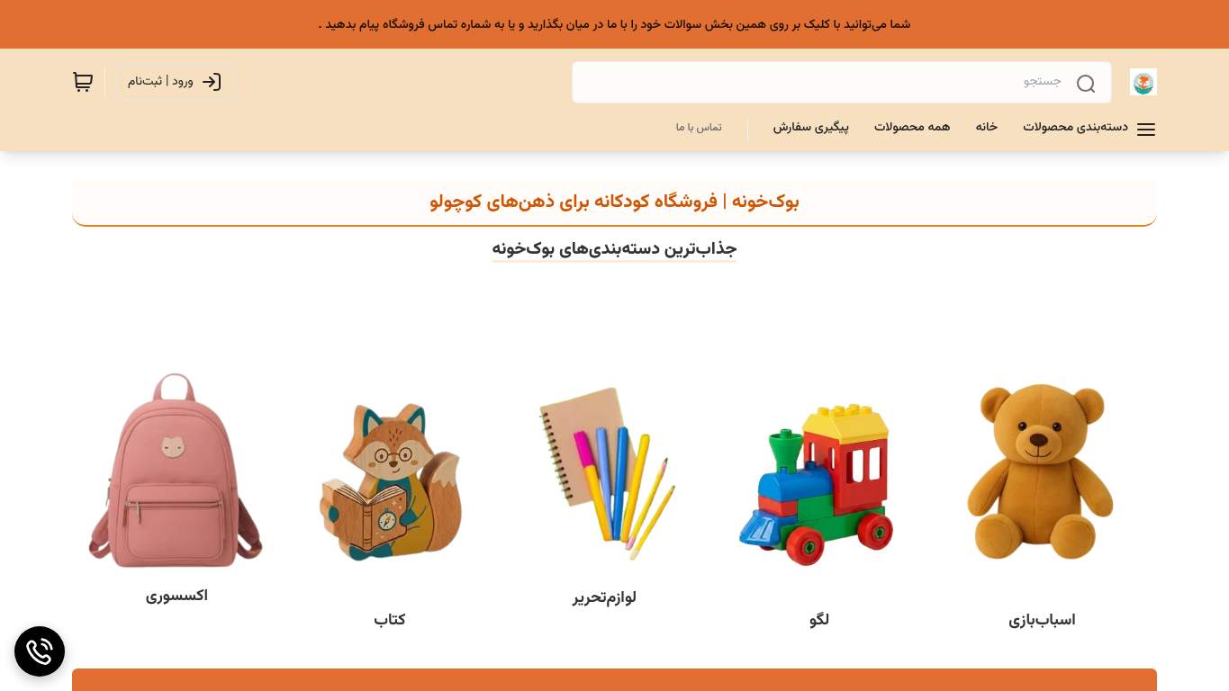
TECHNICAL SUMMARY
The biggest wound is performance: LCP is 13.0 s, interactive time is 15.2 s, and the page weighs 3,081 KiB, so the kids’ catalog arrives like it was shipped by mule. SEO is mostly tidy with a correct canonical and zero schema errors, but the schema only covers WebSite/SearchAction, while 21 missing image alts and no AI hint file leave discoverability underfed. Fix-first: compress the hero assets, cut unused JavaScript, and add a real above-the-fold CTA with trust proof so parents can actually move from curiosity to purchase.
Where It Burns
6 categoriesWebsite Audit Findings for bookkhooone.ir
SavageAudit identified 36 visible findings and recommendations across 6 audit categories. Each section below combines the category score with observed evidence and prioritized fixes.
6101 PERFORMANCELCP 13.0 s9302 SEOSchema Types WebSite, SearchAction8703 DESIGNImages 826104 COPYWord Count 2918305 UXLinks 1036106 CONVERSIONCTA Count 0
01
PERFORMANCE AUDIT
61
LCP13.0 sInteractive15.2 sTotal Byte Weight3,081 KiBUnused JavaScript Savings137 KiB
- 🔥Your LCP of 13.0 s is so late it missed the whole school pickup line and the bedtime routine.
💀
The page arrives like a toy shipment with half the box filled with air and delay.
- →Compress hero images and switch them to WebP/AVIF.LCP: 13.0 sImpact: highEffort: medium
Why this matters
A 13.0 s LCP means the main storefront moment is arriving far too late, so the hero media is likely dragging the entire first view down.
- →Defer non-critical JavaScript and reduce render-blocking resources.TBT: 30 msImpact: highEffort: medium
Why this matters
Even with a modest TBT, render-blocking work is still stealing time from visibility and interactivity, which matters when the page already feels slow to become usable.
- →Enable CDN caching and serve static assets with long cache TTLs.FCP: 1.7 sImpact: mediumEffort: low
Why this matters
The first paint is decent, but better asset caching can keep the early experience snappy while the heavier content is being sorted out.
02
SEO AUDIT
93
Schema TypesWebSite, SearchActionSchema Parse Errors0Missing Alt Text21AI Hint FileMissing
- 🔥The good news: the canonical is clean and the schema has zero parse errors; the bad news: it only introduces WebSite and SearchAction, like a lawyer who brought one business card to court.
💀
Technically tidy, but the page is under-annotated for search, assistants, and image understanding.
- →Add descriptive alt text to every meaningful image.Missing Alt: 21Impact: mediumEffort: medium
Why this matters
With 21 missing alts across 82 images, search engines and assistive tech are getting too many blank spots on a product-heavy page.
- →Publish llms.txt or ai.txt with priority URLs and support paths.AI Hints: MissingImpact: mediumEffort: medium
Why this matters
AI crawlers are allowed but there’s no explicit guidance file, so the site is making discovery harder than it needs to be.
- →Add Organization or WebSite schema with sameAs links to official brand profiles.Entity Graph: MissingImpact: mediumEffort: medium
Why this matters
The schema is sparse, and without entity connections the brand is leaving context on the table for search and rich understanding.
03
DESIGN AUDIT
87
Images82Missing Alt Text21Layout Shifts Found10CLS0.045
- 🔥There are 82 images and 21 of them are missing alt text, so part of the visual catalog is basically playing hide-and-seek with accessibility.
💀
The layout is competent, but the image-heavy presentation leaves too many blanks and too much motion.
- →Add supporting imagery so the layout feels intentional, not empty.Images: 82Impact: mediumEffort: medium
Why this matters
With 82 images and a homepage that still feels underused above the fold, the composition needs more deliberate visual support.
- →Fix missing alt text to pass accessibility audits.Missing Alt: 21Impact: mediumEffort: medium
Why this matters
Twenty-one missing alts is avoidable accessibility debt on a children’s storefront that should be easy for every parent to use.
- →Test spacing and alignment across mobile and desktop breakpoints.Viewport: PresentImpact: lowEffort: medium
Why this matters
The viewport is present, but the layout still needs breakpoint checks to make sure the crowded top area and empty hero space behave well across screens.
04
COPY AUDIT
61
Word Count291Sentence Count4Button Count8CTA Count0
- 🔥The homepage says 291 words across 4 sentences, which is less “guided shopping” and more “abstract performance art.”
💀
The page talks about itself nicely, then forgets to tell parents what to do next.
- →Tighten the headline to state your value in one sentence.H1 Count: 1Impact: mediumEffort: low
Why this matters
There is only one H1, so it needs to carry the value proposition instead of just brand atmosphere.
- →Break long paragraphs into skimmable bullets and shorter sentences.Avg Words/Sentence: 73Impact: mediumEffort: medium
Why this matters
The copy is too dense for a parent browsing products, and readability drops when sentences become mini tax returns.
- →Add a clear CTA - there are none right now.CTA Count: 0Impact: highEffort: low
Why this matters
With zero CTAs identified, the page gives visitors information but not a purchase path.
05
UX AUDITUSER EXPERIENCE AUDIT
83
Links103Internal Links98Broken Assets1Console Errors0
- 🔥There are 103 links on the page, including 98 internal links, which makes the navigation feel like the whole catalog got dumped on the floor.
💀
The interface is busy enough to explore, but not focused enough to guide a parent with intent.
- →Repair failed asset URLs and deployment paths so scripts, images, and stylesheets load cleanly.Broken Assets: 1Impact: highEffort: medium
Why this matters
Even one broken asset is enough to make the experience feel less reliable, especially on a storefront where trust matters.
- →Ensure consistent navigation and footer links across all pages.Nav/Footer: Nav / FooterImpact: lowEffort: medium
Why this matters
The dense link surface needs a stable information architecture so users don’t have to parse the catalog like a legal document.
- →Smoke-test the page in the browser console and keep runtime errors at zero.JS Errors: 0Impact: lowEffort: low
Why this matters
Console errors are currently zero, so keeping it that way prevents small issues from turning into checkout-nightmares later.
06
CONVERSION AUDIT
61
CTA Count0Social Proof2LCP13.0 sInteractive15.2 s
- 🔥There are 0 CTA texts on a children’s store homepage, which is a spectacular way to make buying feel like a scavenger hunt.
💀
The storefront has products, but the path to purchase is so timid it could apologize to the cart.
- →Add a primary CTA above the fold that matches your core offer.CTA Count: 0Impact: highEffort: low
Why this matters
With zero CTA texts identified, the homepage is not directing purchase intent where parents can immediately act on it.
- →Offer a low-friction contact option - form, chat, or visible email.Contact Path: PresentImpact: lowEffort: medium
Why this matters
A contact path exists, but it needs to be visible and easy to use when shoppers have questions about age suitability or shipping.
- →Include social proof or trust signals near the CTA.Social Proof: 2Impact: mediumEffort: low
Why this matters
Two trust elements are not enough for a transactional kids’ store; parents need reassurance beside the action button, not somewhere in the basement.
Audit overview
bookkhooone.ir Audit Summary
The biggest wound is performance: LCP is 13.0 s, interactive time is 15.2 s, and the page weighs 3,081 KiB, so the kids’ catalog arrives like it was shipped by mule. SEO is mostly tidy with a correct canonical and zero schema errors, but the schema only covers WebSite/SearchAction, while 21 missing image alts and no AI hint file leave discoverability underfed. Fix-first: compress the hero assets, cut unused JavaScript, and add a real above-the-fold CTA with trust proof so parents can actually move from curiosity to purchase.
Based on the category scores in this report, SEO is the strongest area while Conversion has the most room for improvement.
How SavageAudit Evaluated bookkhooone.ir
SavageAudit evaluated the public website at https://bookkhooone.ir/ across performance, technical SEO, design, copy, user experience, and conversion signals. Scores and recommendations reflect the website evidence available when this audit was generated on July 4, 2026.
Similar Website Audit Reports
Compare this result with other public SavageAudit reports that received a similar overall website score.