Loading Report View…
0/ 100
comparos.in Website Audit Report
comparos.in scored 60 out of 100 in this SavageAudit website audit covering Performance, SEO, Design, and Copy. The report uses captured website evidence to explain what is working, what is limiting the experience, and which improvements deserve attention first.
“An appliance comparison platform that compares everything except its own broken layout and scripts.”
This consumer electronics catalog drowns shoppers in thousands of words while failing basic asset delivery and navigation layout requirements. It aims to guide gadget buyers but leaves them stranded with broken tracking pixels and zero structured product data.
 https://comparos.in/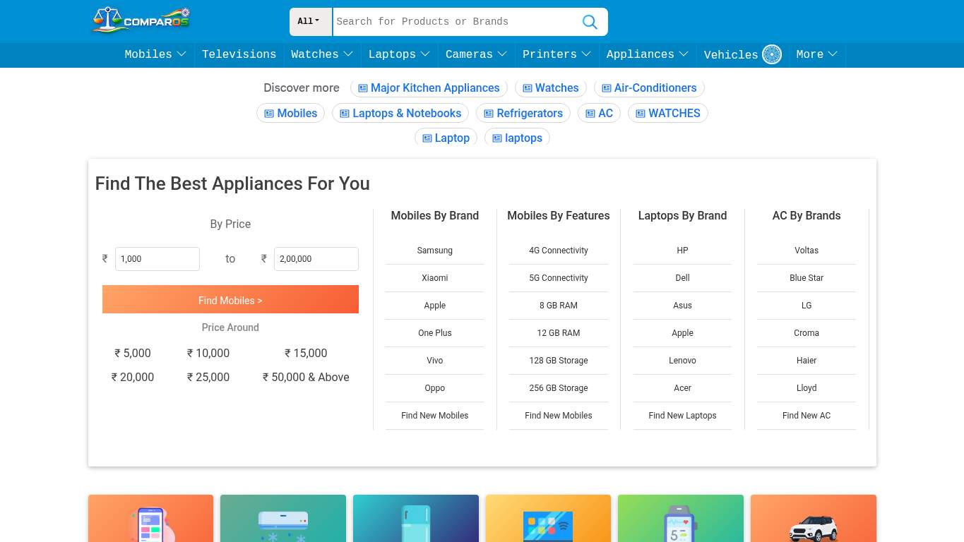
TECHNICAL SUMMARY
Operating at a performance score of 50 out of 100 with 12 broken asset requests, the site struggles to deliver a stable experience. The lack of standard navigation elements and 0 product schema types severely limits discoverability for appliance shoppers, making fixing asset paths the priority fix-first action.
Where It Burns
6 categoriesWebsite Audit Findings for comparos.in
SavageAudit identified 12 visible findings and recommendations across 4 audit categories. Each section below combines the category score with observed evidence and prioritized fixes.
5001 PERFORMANCEPerformance Score 50/1005502 SEOSEO Score 50/1004903 DESIGNFont Families 138604 COPYWord Count 2255 wordsFree05 UXSign in to viewFree06 CONVERSIONSign in to view
01
PERFORMANCE AUDIT
50
Performance Score50/100Broken Assets12
- 🔥Your performance score of 50 out of 100 means your electronic store loads at the speed of dial-up nostalgia.
💀
A performance score of 50 and 12 aborted script requests turn your gadget catalog into an endurance test for shoppers.
- →Compress hero images and switch to WebP/AVIF format.LCP: UnknownImpact: highEffort: medium
Why this matters
Largest Contentful Paint is Unknown, so the main visual payload is a likely speed bottleneck.
LIMITED DEPTH
Create free accountSign up free to unlock all hidden roast lines, key metrics, and prioritized fixes for PERFORMANCE. The stopwatch has receipts we have not opened yet.
02
SEO AUDIT
55
SEO Score50/100Product Schema Count0
- 🔥Your SEO score sits at a lackluster 50 out of 100 while competing in a brutal consumer electronics vertical.
💀
A 50 out of 100 SEO score combined with zero product schema ensures your gadget comparisons stay completely invisible to search engines.
- →Publish llms.txt or ai.txt with your priority URLs, core docs, and support paths so AI crawlers can find the pages you actually want cited.AI Hints: MissingImpact: mediumEffort: medium
Why this matters
The AI hint file is missing completely, leaving AI citation potential unmanaged.
LIMITED DEPTH
Create free accountSign up free to unlock all hidden roast lines, key metrics, and prioritized fixes for SEO. Search engines noticed more than this first punchline.
03
DESIGN AUDIT
49
Font Families13Image Count116
- 🔥You loaded 13 font families into a single page, which isn't typography styling—it's a digital ransom note for your brand guidelines.
💀
A chaotic mix of 13 font families across 116 images creates an amateur visual disaster that screams unpolished.
- →Reduce font families from 13 to 2-3 for visual consistency.Font Families: 13Impact: mediumEffort: low
Why this matters
There are 13 font families detected, resulting in fragmented typography styling.
LIMITED DEPTH
Create free accountSign up free to unlock all hidden roast lines, key metrics, and prioritized fixes for DESIGN. The visual hierarchy argument gets louder deeper down.
04
COPY AUDIT
86
Word Count2255 wordsCopyright Yearnull
- 🔥Your 2255 words and 95 sentences contain plenty of specs, but your copyright year is null or missing in the footer section.
💀
Pacing through 2255 words is easy, but a null copyright year makes your gadget specs look like they were pulled from a 2012 catalog.
- →Tighten the headline to state your value in one sentence.H1 Count: 1Impact: mediumEffort: low
Why this matters
The page has 1 H1 headline that needs to hook shoppers instantly.
LIMITED DEPTH
Create free accountSign up free to unlock all hidden roast lines, key metrics, and prioritized fixes for COPY. Messaging slippage gets sharper past the first line.
05
UX AUDITUSER EXPERIENCE AUDIT
FREE UNLOCKFull analysis locked
Users shouldn't have to fight your interface to convert. Create a free account to open the UX failure map.
06
CONVERSION AUDIT
FREE UNLOCKFull analysis locked
Traffic arrived. Confidence left before checkout. Create a free account to see what's killing your conversions.
Audit overview
comparos.in Audit Summary
Operating at a performance score of 50 out of 100 with 12 broken asset requests, the site struggles to deliver a stable experience. The lack of standard navigation elements and 0 product schema types severely limits discoverability for appliance shoppers, making fixing asset paths the priority fix-first action.
Based on the category scores in this report, Copy is the strongest area while Design has the most room for improvement.
How SavageAudit Evaluated comparos.in
SavageAudit evaluated the public website at https://comparos.in/ across performance, technical SEO, design, copy, user experience, and conversion signals. Scores and recommendations reflect the website evidence available when this audit was generated on August 25, 2026.
Similar Website Audit Reports
Compare this result with other public SavageAudit reports that received a similar overall website score.