Loading Report View…
0/ 100
thejuneshop.com Website Audit Report
thejuneshop.com scored 59 out of 100 in this SavageAudit website audit covering Performance, SEO, Design, Copy, User Experience, and Conversion. The report uses captured website evidence to explain what is working, what is limiting the experience, and which improvements deserve attention first.
“Looks trustworthy until the page starts face-planting in public.”
The June Shop brought the aesthetic, but the homepage is carrying enough technical baggage to make shoppers reconsider the whole trip. It looks like a polished storefront from a distance, then you hit the page and discover the browser doing damage control behind the curtain.
 https://thejuneshop.com/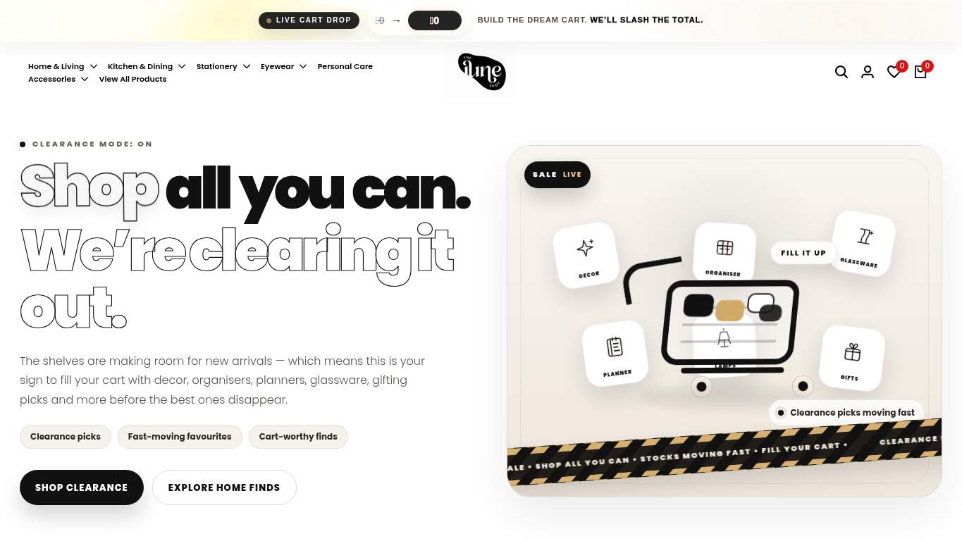
TECHNICAL SUMMARY
The homepage has decent SEO fundamentals, but the experience is getting kneecapped by a massive performance and interaction problem: LCP is 9.2 s, Interactive is 22.2 s, TBT is 1,610 ms, and main-thread work hits 35.0 s. On top of that, 12 console errors ($ is not defined) and 12 broken assets are actively sabotaging user interactions and likely hurting trust and revenue intent; fix the JavaScript and broken assets first, then cut the 4,262 KiB payload and unused JS before shoppers bounce.
Where It Burns
6 categoriesWebsite Audit Findings for thejuneshop.com
SavageAudit identified 36 visible findings and recommendations across 6 audit categories. Each section below combines the category score with observed evidence and prioritized fixes.
3801 PERFORMANCELCP 9.2 s8702 SEOSEO score 1005303 DESIGNImages 3507504 COPYH1 count 23205 UXJS errors 128506 CONVERSIONCTA count 13
01
PERFORMANCE AUDIT
38
LCP9.2 sInteractive22.2 sTBT1,610 msTotal size4,262 KiB
- 🔥Your LCP of 9.2 s is less ‘shop all you can’ and more ‘wait all you can.’ In home decor, that’s not a reveal; it’s a hostage situation.
💀
The storefront arrives carrying too much baggage, then asks shoppers to be patient while it catches its breath.
- →Compress hero images and switch to WebP/AVIF format.LCP: 9.2 sImpact: highEffort: medium
Why this matters
A 9.2 s LCP is dominated by heavy hero content, so shrinking and modernizing those assets is the fastest way to get the page to stop arriving late to its own party.
- →Defer non-critical JavaScript and reduce render-blocking resources.TBT: 1,610 msImpact: highEffort: medium
Why this matters
With 1,610 ms of blocking time, the browser is spending too much time busy instead of responsive, which directly slows shopper interaction.
- →Enable CDN caching and serve static assets with long cache TTLs.FCP: 2.9 sImpact: mediumEffort: low
Why this matters
A 2.9 s first contentful paint suggests repeat visits are still paying the full loading tax instead of reusing cached assets.
02
SEO AUDIT
87
SEO score100H1 count2Missing alt images46Schema parse errors0
- 🔥The SEO is doing its job, which makes the missing og:image feel like forgetting the outfit before the photoshoot. Shared links will show up looking like a blank invitation.
💀
Search can understand the store, but the share cards and heading structure are still dressed like interns.
- →Add an og:image meta tag for a polished appearance when shared on social media.Open Graph Image: MissingImpact: mediumEffort: low
Why this matters
Without an og:image, social shares have no visual anchor, which makes discovery look less like a brand and more like a forgotten URL.
- →Shorten title tag to under 60 characters.Title Length: 66 charactersImpact: mediumEffort: low
Why this matters
A 66-character title is already crowding the shelf, and tightening it improves display in search results without cutting meaning.
- →Consolidate to one H1 tag. Use H2/H3 for subheadings.H1 Count: 2Impact: mediumEffort: low
Why this matters
Two H1s blur the page’s primary topic, which makes the heading hierarchy look like it’s arguing with itself.
03
DESIGN AUDIT
53
Images350Missing alt46Buttons100Link count517
- 🔥There are 350 images on the page, but 46 of them have no alt text, so the accessibility story is basically 'some assembly required.' That’s a lot of visual inventory with a surprising number of missing labels.
💀
It’s visually confident, but the information architecture is carrying 350 images and still losing track of 46 alt tags.
- →Add supporting imagery so the layout feels intentional, not empty.Images: 350Impact: mediumEffort: medium
Why this matters
With 350 images, the page needs disciplined visual support or it risks feeling overloaded rather than curated.
- →Fix missing alt text to pass accessibility audits.Missing Alt: 46Impact: mediumEffort: medium
Why this matters
Forty-six missing alt attributes is not a rounding error; it leaves a large chunk of the visual catalog undocumented for assistive tech.
- →Test spacing and alignment across mobile and desktop breakpoints.Viewport: PresentImpact: lowEffort: medium
Why this matters
The viewport is present, but that only proves the page can scale; it does not guarantee the dense interface behaves nicely on smaller screens.
04
COPY AUDIT
75
H1 count2Avg words/sentence23Title length66 charactersMeta description duplication'Explore the our wide range of Home Decor...'
- 🔥The homepage headline count is doing the most: two H1s, one of them 'Shop all you can. We’re clearing it out.' That’s not a hero line, that’s a clearance aisle with stage lighting.
💀
The copy wants to sell lifestyle and gifting, but it keeps sounding like it was assembled in a hurry between keyword dumps.
- →Tighten the headline to state your value in one sentence.H1 Count: 2Impact: highEffort: low
Why this matters
Two H1s and a promotional line dilute the core message, so one sharper promise will read faster and stronger.
- →Break long paragraphs into skimmable bullets and shorter sentences.Avg Words/Sentence: 23Impact: lowEffort: medium
Why this matters
A 23-word average sentence length is manageable, but on a commerce homepage it slows scanning when shoppers are looking for product facts.
- →Add a clear CTA - make the primary one stand out.CTA Count: 13Impact: mediumEffort: low
Why this matters
Thirteen CTAs spread attention thin, so the page needs one unmistakable instruction instead of a chorus line.
05
UX AUDITUSER EXPERIENCE AUDIT
32
JS errors12Broken assets12Long tasks20Bootup time3.7 s
- 🔥Twelve console errors all shouting '$ is not defined' is a masterclass in how to make the browser improvise badly. The page is playing sports commentary on its own collapse and still missing the ball.
💀
Users are being asked to shop through console smoke, broken assets, and enough form fields to file taxes.
- →Fix client-side JavaScript errors so interactions do not fail silently in production.JS Errors: 12Impact: highEffort: medium
Why this matters
Twelve '$ is not defined' errors mean interactions are likely failing before users can even engage with the page.
- →Repair failed asset URLs and deployment paths so scripts, images, and stylesheets load cleanly.Broken Assets: 12Impact: highEffort: medium
Why this matters
Broken scripts and fetches are direct user-facing failures, not minor housekeeping; they can break the page’s behavior outright.
- →Reduce form fields (currently 189) to only the essentials.Form Fields: 189Impact: mediumEffort: medium
Why this matters
A 189-field setup is excessive for a shopping flow and creates unnecessary effort before purchase intent can convert.
06
CONVERSION AUDIT
85
CTA count13Buttons100Links517Social proof3
- 🔥There are 13 CTAs, but the big ones keep repeating 'Baby Record Books', 'The Couple Notebook', and 'Notebooks & Notepads' like a playlist stuck on shuffle. That’s not guidance; that’s attention dilution with a nice font.
💀
The page has plenty of ways to click and not nearly enough reasons to trust the first one.
- →Add a primary CTA above the fold that matches your core offer.CTA Count: 13Impact: mediumEffort: low
Why this matters
Thirteen CTAs without a dominant leader makes the buying path harder to spot, which weakens purchase intent.
- →Offer a low-friction contact option - form, chat, or visible email.Contact Path: PresentImpact: lowEffort: medium
Why this matters
The contact path exists, but making it visibly low-friction can reduce hesitation for shoppers who need quick reassurance before buying.
- →Include social proof or trust signals (testimonials, logos, stats) near the CTA.Social Proof: 3Impact: mediumEffort: low
Why this matters
Only 3 social proof items leaves the CTA underpowered for an ecommerce purchase decision that depends on trust and reassurance.
Audit overview
thejuneshop.com Audit Summary
The homepage has decent SEO fundamentals, but the experience is getting kneecapped by a massive performance and interaction problem: LCP is 9.2 s, Interactive is 22.2 s, TBT is 1,610 ms, and main-thread work hits 35.0 s. On top of that, 12 console errors ($ is not defined) and 12 broken assets are actively sabotaging user interactions and likely hurting trust and revenue intent; fix the JavaScript and broken assets first, then cut the 4,262 KiB payload and unused JS before shoppers bounce.
Based on the category scores in this report, SEO is the strongest area while User Experience has the most room for improvement.
How SavageAudit Evaluated thejuneshop.com
SavageAudit evaluated the public website at https://thejuneshop.com/ across performance, technical SEO, design, copy, user experience, and conversion signals. Scores and recommendations reflect the website evidence available when this audit was generated on July 1, 2026.
Similar Website Audit Reports
Compare this result with other public SavageAudit reports that received a similar overall website score.