Loading Report View…
0/ 100
thecoffeeguide.coffee Website Audit Report
thecoffeeguide.coffee scored 80 out of 100 in this SavageAudit website audit covering Performance, SEO, Design, Copy, User Experience, and Conversion. The report uses captured website evidence to explain what is working, what is limiting the experience, and which improvements deserve attention first.
“A coffee encyclopedia with a control panel held together by broken parts.”
The Coffee Guide looks like it brewed a gorgeous first cup, then forgot the rest of the workflow and left the kitchen running. Plenty of beans on the page; not enough proof the machine knows how to serve them cleanly.
 https://thecoffeeguide.coffee/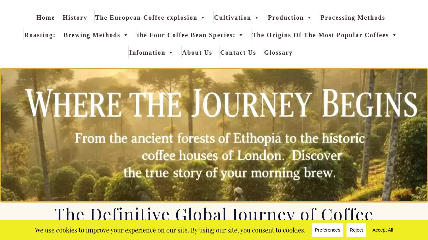
TECHNICAL SUMMARY
SEO is doing the heavy lifting with a perfect score, but the experience is kneecapped by 7 console errors, 8 broken assets, and a 4.4 s LCP that makes the hero arrive like it got lost on the global journey. Fix the broken assets and the render-blocking pileup first; that will improve trust, speed, and the chance that readers actually reach the contact path instead of watching the site rehearse failure.
Where It Burns
6 categoriesWebsite Audit Findings for thecoffeeguide.coffee
SavageAudit identified 35 visible findings and recommendations across 6 audit categories. Each section below combines the category score with observed evidence and prioritized fixes.
7901 PERFORMANCELCP 4.4 s9402 SEOSEO Score 100/1006903 DESIGNImages 118604 COPYWord count 14616705 UXJS errors 77906 CONVERSIONCTA count 3
01
PERFORMANCE AUDIT
79
LCP4.4 sSpeed Index6.4 sRender-blocking savings1,380 msUnused JavaScript134 KiB
- 🔥Your 4.4 s LCP is arriving like a coffee shipment stuck in customs while the beans get cold.
💀
The page spends too long waking up for a site built to educate quickly.
- →Compress hero images and switch to WebP/AVIF format.LCP: 4.4 sImpact: highEffort: medium
Why this matters
The largest contentful paint is too slow, so the hero is the first thing making the site feel late to the party.
- →Defer non-critical JavaScript and reduce render-blocking resources.TBT: 160 msImpact: highEffort: medium
Why this matters
Render-blocking work is holding the page hostage before it can become interactive without stalling the reader.
- →Enable CDN caching and serve static assets with long cache TTLs.FCP: 2.8 sImpact: mediumEffort: low
Why this matters
First content paint is still sluggish, and better caching would get the page visible sooner for impatient coffee readers.
02
SEO AUDIT
94
SEO Score100/100JSON-LD blocks1Console errors7404s2
- 🔥SEO is the one place this bean actually got roasted properly: a perfect score means the basics are mostly doing their job.
💀
Strong discoverability, but the schema cupboard is missing a few essential jars.
- →Add Organization or WebSite schema with sameAs links to your official LinkedIn, X, YouTube, GitHub, Crunchbase, or other canonical brand profiles.Entity Graph: MissingImpact: mediumEffort: medium
Why this matters
The entity graph is missing, so search engines get less confidence about who this brand is and where its official presence lives.
- →Add citation-ready 40-140 word answer blocks with concrete facts, definitions, proof points, or step summaries that can survive extraction without extra context.Citability: NoneImpact: mediumEffort: medium
Why this matters
There are no citability blocks, which limits how easily this coffee history content can be lifted into visible search answers.
03
DESIGN AUDIT
69
Images11Font families6Heading count21Missing alt text0
- 🔥Eleven images on the page, and still the layout feels like it forgot to bring visual support to the meeting.
💀
The design has structure, but it’s carrying too many fonts and not enough visual confidence.
- →Add supporting imagery so the layout feels intentional, not empty.Images: 11Impact: mediumEffort: medium
Why this matters
The page has some imagery, but the visual system still needs more support to make the layout feel designed instead of assembled.
- →Reduce font families from 6 to 2-3 for visual consistency.Font Families: 6Impact: mediumEffort: low
Why this matters
Six font families is too many voices arguing over the same coffee story, and it weakens consistency.
- →Test spacing and alignment across mobile and desktop breakpoints.Viewport: PresentImpact: lowEffort: medium
Why this matters
The viewport exists, but the layout still needs breakpoint checks so the page doesn’t keep wrapping like it’s under stress.
04
COPY AUDIT
86
Word count1461Sentence count53CTA count3Title/H1 mismatchPresent
- 🔥The title says one thing and the H1 says another, which is a bold move for a site about clarity and expertise.
💀
The copy knows coffee history, but it still needs a cleaner pitch and a less repetitive ask.
- →Tighten the headline to state your value in one sentence.H1 Count: 1Impact: mediumEffort: low
Why this matters
The page has a single headline, so it should do more of the heavy lifting and stop making the title and H1 compete.
- →Break long paragraphs into skimmable bullets and shorter sentences.Avg Words/Sentence: 28Impact: mediumEffort: medium
Why this matters
Long sentences slow comprehension, especially on an educational page where readers want crisp, scannable facts.
- →Add a clear CTA - make the primary one stand out.CTA Count: 3Impact: mediumEffort: low
Why this matters
Three repeated CTAs create noise instead of direction, so the primary action needs to be unmistakable.
05
UX AUDITUSER EXPERIENCE AUDIT
67
JS errors7Broken assets8Interactive5.3 sLong tasks3
- 🔥Seven JavaScript errors mean the page is quietly breaking while users pretend not to notice.
💀
Users are asked to trust a page that keeps tripping over its own assets and scripts.
- →Fix client-side JavaScript errors so interactions do not fail silently in production.JS Errors: 7Impact: highEffort: medium
Why this matters
Seven console errors mean the browser is already reporting trouble before the user even starts reading.
- →Repair failed asset URLs and deployment paths so scripts, images, and stylesheets load cleanly.Broken Assets: 8Impact: highEffort: medium
Why this matters
Broken assets are user-facing failures, and this site has enough of them to make the page feel unstable.
- →Ensure consistent navigation and footer links across all pages.Nav/Footer: Nav / FooterImpact: lowEffort: medium
Why this matters
Navigation consistency matters for a content site with heavy internal linking, because people need a predictable path through the coffee archive.
06
CONVERSION AUDIT
79
CTA count3Forms0Inputs0Social proof1
- 🔥Three CTAs and all three say 'Contact Us,' which is a minimalist approach to persuasion and a maximalist approach to ambiguity.
💀
The contact path exists, but it’s dressed like a side quest instead of the main event.
- →Add a primary CTA above the fold that matches your core offer.CTA Count: 3Impact: mediumEffort: low
Why this matters
The site has CTAs, but none are winning the spotlight, so the main action needs to be obvious immediately.
- →Offer a low-friction contact option - form, chat, or visible email.Contact Path: PresentImpact: lowEffort: medium
Why this matters
There is a contact path, but no visible form or lightweight option, which makes the ask harder than it should be.
- →Include social proof or trust signals (testimonials, logos, stats) near the CTA.Social Proof: 1Impact: mediumEffort: low
Why this matters
A single proof point is not much of a persuasion brew, and placing more trust near the CTA will help readers commit.
Audit overview
thecoffeeguide.coffee Audit Summary
SEO is doing the heavy lifting with a perfect score, but the experience is kneecapped by 7 console errors, 8 broken assets, and a 4.4 s LCP that makes the hero arrive like it got lost on the global journey. Fix the broken assets and the render-blocking pileup first; that will improve trust, speed, and the chance that readers actually reach the contact path instead of watching the site rehearse failure.
Based on the category scores in this report, SEO is the strongest area while User Experience has the most room for improvement.
How SavageAudit Evaluated thecoffeeguide.coffee
SavageAudit evaluated the public website at https://thecoffeeguide.coffee/ across performance, technical SEO, design, copy, user experience, and conversion signals. Scores and recommendations reflect the website evidence available when this audit was generated on July 9, 2026.
Similar Website Audit Reports
Compare this result with other public SavageAudit reports that received a similar overall website score.