Loading Report View…
0/ 100
kaimaoffice.wixsite.com Website Audit Report
kaimaoffice.wixsite.com scored 64 out of 100 in this SavageAudit website audit covering Performance, SEO, Design, Copy, User Experience, and Conversion. The report uses captured website evidence to explain what is working, what is limiting the experience, and which improvements deserve attention first.
“Mission control is yelling while the donation button stays hidden.”
Kaima Social Farming looks like it knows exactly what it grows, but not how to ask for help growing it. The page keeps wandering around the greenhouse instead of handing visitors a clear mission, a clear next step, and a reason to trust it.
 https://kaimaoffice.wixsite.com/website-2/en-home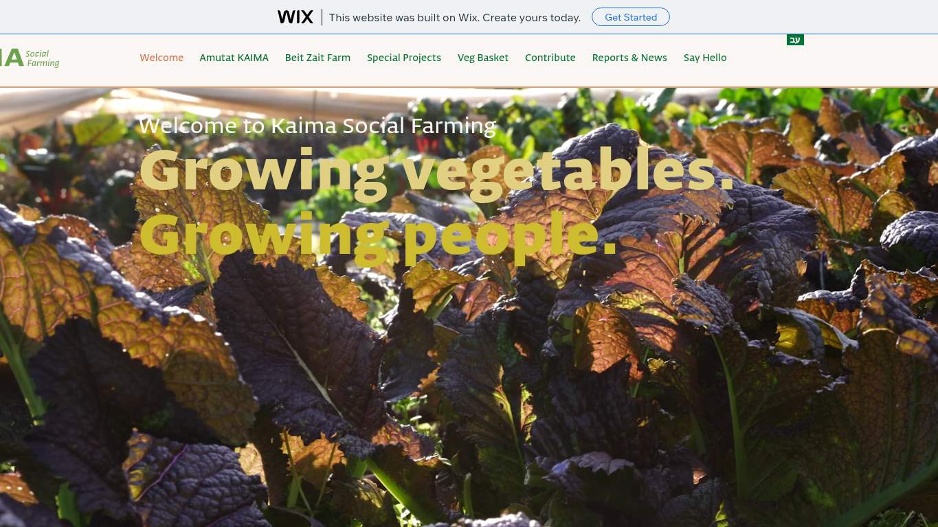
TECHNICAL SUMMARY
The good news: the layout is readable, the visual hierarchy is clear, and the performance basics aren’t on fire. The bad news: the page is blocked from indexing by a noindex tag, has no meta description, no schema, no OG image, and the hero is dragging a 6.9 s LCP while 11 broken assets and a 1,040 ms network latency make the whole thing feel like space mission control panic. Fix the indexability issue first, then the broken assets and hero weight, because right now discoverability and donation intent are both getting stranded in orbit.
Where It Burns
6 categoriesWebsite Audit Findings for kaimaoffice.wixsite.com
SavageAudit identified 36 visible findings and recommendations across 6 audit categories. Each section below combines the category score with observed evidence and prioritized fixes.
7201 PERFORMANCELCP 6.9 s3202 SEOIndexability Noindex7403 DESIGNImages 807704 COPYWord count 1588505 UXBroken Assets 113706 CONVERSIONCTA Count 1
01
PERFORMANCE AUDIT
72
LCP6.9 sFCP2.7 sTotal byte weight98,231 KiBNetwork server latency1,040 ms
- 🔥Your 6.9 s LCP arrives like a delivery truck that took the scenic route through every field on the farm.
💀
The page eventually shows up, but it does so carrying enough baggage to scare off anyone in a hurry.
- →Compress the hero media and convert it to WebP/AVIF so the page stops dragging a 6.9 s LCP around the field.LCP: 6.9 sImpact: highEffort: medium
Why this matters
The hero content is the main reason the largest visible element is arriving absurdly late, which hurts first impressions and donation intent.
- →Serve static assets from a CDN with longer cache TTLs so the 2.7 s FCP stops acting like it needs permission from three committees.FCP: 2.7 sImpact: mediumEffort: low
Why this matters
A better cache strategy reduces repeat-load delays and helps visitors see the page sooner.
- →Defer non-critical JavaScript and trim render-blocking resources to stop the page from making users wait while the thread clears its throat.TBT: 70 msImpact: highEffort: medium
Why this matters
Even though TBT is modest, reducing blocking code helps keep interaction snappy and protects the experience on weaker devices.
02
SEO AUDIT
32
IndexabilityNoindexMeta descriptionmissingSchemaNoneH1 Count4
- 🔥The page is wearing a noindex tag like a cloak of invisibility and then acting surprised nobody found it.
💀
Search engines are being told to ignore the page, then given almost nothing useful even if they disobey.
- →Remove noindex from the meta robots tag so the site can actually show up in search instead of hiding in the bushes.Indexability: NoindexImpact: highEffort: low
Why this matters
A noindex directive is a hard stop for organic visibility, which is fatal for a nonprofit that needs discovery and community reach.
- →Write a 140-160 character meta description that names Kaima Social Farming and the mission clearly.Meta description: missingImpact: highEffort: low
Why this matters
The page currently gives search results nothing to sell the mission with, so snippets are doing charity work for you.
- →Add JSON-LD for Organization or WebSite so the page stops showing up to search engines as a blank social-farming silhouette.Schema: NoneImpact: mediumEffort: medium
Why this matters
Structured data helps search engines understand the organization, and right now that context is completely absent.
03
DESIGN AUDIT
74
Images80Missing Alt6Font Families20Heading skipsh1->h4, h1->h5
- 🔥The page has 80 images, but 6 of them are missing alt text, so accessibility is doing laps while the visuals pose for the camera.
💀
It looks organized from a distance, but the structure is doing paperwork in the wrong order.
- →Reduce the font stack from 20 families to 2-3 so the visual system stops sounding like a costume party.Font Families: 20Impact: mediumEffort: low
Why this matters
Too many fonts dilute consistency and make the page feel less intentional, especially for a trust-based nonprofit.
- →Add descriptive alt text to the 6 missing images so the layout stops excluding people while pretending to be informative.Missing Alt: 6Impact: mediumEffort: medium
Why this matters
Alt text is both accessibility and semantic support, and 6 missing items is enough to be a real gap.
- →Use the 80 images more strategically by adding stronger supporting imagery around the mission and impact sections.Images: 80Impact: mediumEffort: medium
Why this matters
The page already has plenty of media, but without clearer visual support it still feels like content is floating instead of reinforcing the story.
04
COPY AUDIT
77
Word count158Sentence count9H1 Count4CTA Count1
- 🔥With 158 words across 9 sentences, the page explains itself the way a postcard explains a social movement.
💀
The copy keeps introducing itself, but never bothers to close the deal or name the real next step.
- →Tighten the headline into one sentence that clearly states what Kaima Social Farming does and why it matters.H1 Count: 4Impact: highEffort: low
Why this matters
Multiple top-level headlines dilute the message, and this nonprofit needs a single mission statement visitors can grasp immediately.
- →Replace the current Wix promotional CTA with a real action like donate, volunteer, or partner.CTA Count: 1Impact: mediumEffort: low
Why this matters
The only CTA on the page is vendor marketing, which wastes the one spot where the site should be asking for support.
- →Break the short body copy into skimmable bullets and shorter sentences so the mission and community impact land faster.Avg Words/Sentence: 18Impact: lowEffort: medium
Why this matters
The average sentence length is workable, but the current structure is still too dense for quick nonprofit scanning.
05
UX AUDITUSER EXPERIENCE AUDIT
85
Broken Assets11Interactive7.0 sLinks85External links41
- 🔥There are 11 broken assets, which means the page has more missing pieces than a toolkit left in the rain.
💀
Users keep hitting broken parts and outbound detours before they can even get oriented.
- →Repair the 11 failed asset URLs so scripts, images, and stylesheets stop arriving like they were sent by carrier pigeon.Broken Assets: 11Impact: highEffort: medium
Why this matters
Broken media files create obvious user-facing friction and make the site feel unreliable during a first visit.
- →Keep navigation and footer links consistent across pages so the 85-link maze doesn’t turn into a scavenger hunt.Nav/Footer: Nav / FooterImpact: lowEffort: medium
Why this matters
A nonprofit site depends on easy movement between mission, programs, and contact paths, and consistency helps people not get lost.
- →Smoke-test the page in the browser after asset fixes and keep runtime errors at zero so the experience stays clean.JS Errors: 0Impact: lowEffort: low
Why this matters
There are no console errors now, so the goal is preserving that cleanliness while repairing the broken assets.
06
CONVERSION AUDIT
37
CTA Count1Contact PathMissingForm Fields0Social Proof1
- 🔥The only CTA on the page is Wix’s own ad, which is a wild choice for a nonprofit that needs donations and support.
💀
The page is asking for nothing useful, then wondering why nobody hands it support.
- →Add a primary CTA above the fold that matches the mission, such as donate, volunteer, or partner.CTA Count: 1Impact: mediumEffort: low
Why this matters
The current CTA is promotional filler, not a conversion path, so the page needs a real next step immediately visible.
- →Create a low-friction contact path with a simple form or visible email so interested visitors can actually reach the organization.Contact Path: MissingImpact: highEffort: medium
Why this matters
Without a contact option, visitors who are ready to help have nowhere to go, which kills intent at the exact moment it appears.
- →Place more social proof near the CTA, because 1 proof point is not enough for a donation page to feel credible.Social Proof: 1Impact: mediumEffort: low
Why this matters
Community members and partners need evidence of impact before they commit time or money, and the page currently offers almost none.
Audit overview
kaimaoffice.wixsite.com Audit Summary
The good news: the layout is readable, the visual hierarchy is clear, and the performance basics aren’t on fire. The bad news: the page is blocked from indexing by a noindex tag, has no meta description, no schema, no OG image, and the hero is dragging a 6.9 s LCP while 11 broken assets and a 1,040 ms network latency make the whole thing feel like space mission control panic. Fix the indexability issue first, then the broken assets and hero weight, because right now discoverability and donation intent are both getting stranded in orbit.
Based on the category scores in this report, User Experience is the strongest area while SEO has the most room for improvement.
How SavageAudit Evaluated kaimaoffice.wixsite.com
SavageAudit evaluated the public website at https://kaimaoffice.wixsite.com/website-2/en-home across performance, technical SEO, design, copy, user experience, and conversion signals. Scores and recommendations reflect the website evidence available when this audit was generated on June 30, 2026.
Similar Website Audit Reports
Compare this result with other public SavageAudit reports that received a similar overall website score.