Loading Report View…
0/ 100
devcorex-web.vercel.app Website Audit Report
devcorex-web.vercel.app scored 88 out of 100 in this SavageAudit website audit covering Performance, SEO, Design, Copy, User Experience, and Conversion. The report uses captured website evidence to explain what is working, what is limiting the experience, and which improvements deserve attention first.
“Strong bones, weak salesmanship, and one missing map to the buffet.”
DevCoreX looks like it showed up in clean overalls and forgot the actual repair manual. The page has structure, but the brand story and trust signals are doing a disappearing act worthy of a bad magic show.
 https://devcorex-web.vercel.app/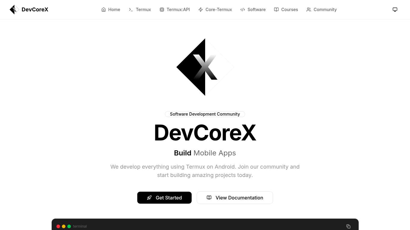
TECHNICAL SUMMARY
Performance is mostly healthy, but the page is still carrying avoidable baggage: LCP lands at 2.9 s, Speed Index at 4.6 s, and unused JavaScript could save 70 KiB. SEO is the bigger self-own here — canonical is missing, schema is absent, and both robots.txt and sitemap.xml are nowhere to be found, which makes discoverability behave like a mechanic with no lift and no flashlight. Fix the canonical and schema first, then add crawl guidance and social preview assets so the site stops hiding its own good parts from search and shares.
Where It Burns
6 categoriesWebsite Audit Findings for devcorex-web.vercel.app
SavageAudit identified 36 visible findings and recommendations across 6 audit categories. Each section below combines the category score with observed evidence and prioritized fixes.
9501 PERFORMANCELCP 2.9 s8002 SEOCanonical missing8003 DESIGNImages 39004 COPYWord count 2179805 UXConsole errors 08606 CONVERSIONCTA count 2
01
PERFORMANCE AUDIT
95
LCP2.9 sSpeed Index4.6 sFCP0.9 sUnused JS savings70 KiB
- 🔥Your LCP at 2.9 s is the kind of pause that makes people check if the engine stalled, even though FCP already lands at 0.9 s.
💀
Fast enough to start, slow enough to make the user hear the bad noises.
- →Compress hero images and switch to WebP/AVIF format.LCP: 2.9 sImpact: highEffort: medium
Why this matters
The 2.9 s LCP suggests the hero content is still too heavy for a first paint that should feel immediate.
- →Defer non-critical JavaScript and reduce render-blocking resources.TBT: 0 msImpact: highEffort: medium
Why this matters
Even with TBT at 0 ms, trimming non-critical scripts keeps the page from paying unnecessary startup tax.
- →Enable CDN caching and serve static assets with long cache TTLs.FCP: 0.9 sImpact: mediumEffort: low
Why this matters
A 0.9 s FCP is already decent, and stronger caching helps keep the first useful render consistently quick.
02
SEO AUDIT
80
CanonicalmissingSchemaNonerobots.txtMissingsitemap.xmlMissing
- 🔥Canonical is missing, so search engines get to guess which URL is the real one like a customer choosing between identical spare keys.
💀
The site is searchable in the way a toolbox is searchable after someone dumps it on the floor.
- →Add a self-referencing canonical tag to declare the preferred URL for this page.Canonical: missingImpact: highEffort: low
Why this matters
Without a canonical, the page leaves duplicate-signal decisions to search engines instead of setting the preferred address itself.
- →Add JSON-LD structured data that matches the page type, such as WebSite, Organization, Product, or Article.Schema: NoneImpact: mediumEffort: medium
Why this matters
Schema is completely absent, so the page is skipping the rich-result context that helps search engines understand DevCoreX.
- →Add a robots.txt file to guide search engine crawlers.robots.txt: MissingImpact: mediumEffort: low
Why this matters
A missing robots.txt leaves crawler behavior implicit instead of giving search bots a clear set of instructions.
03
DESIGN AUDIT
80
Images3Font families20OG imagemissingMissing alt text0
- 🔥Three images on a page with this much white space is giving 'waiting room with excellent manners.'
💀
The layout is tidy, but it still looks like it forgot to bring enough furniture.
- →Add supporting imagery so the layout feels intentional, not empty.Images: 3Impact: mediumEffort: medium
Why this matters
With only 3 images and lots of open space, the page needs more visual support to feel complete.
- →Reduce font families from 20 to 2-3 for visual consistency.Font Families: 20Impact: mediumEffort: low
Why this matters
Twenty font families is visual overkill and increases the chance of inconsistent rendering.
- →Fix missing alt text to pass accessibility audits.Missing Alt: 0Impact: lowEffort: medium
Why this matters
Alt text is currently complete, so this is a preventative accessibility check rather than a rescue mission.
04
COPY AUDIT
90
Word count217Sentence count13CTA count2Copyright yearmissing
- 🔥217 words across 13 sentences is concise, but the homepage still spends a lot of that airtime saying 'community' before it says what anyone gets.
💀
The copy is clean, but it keeps introducing DevCoreX like a handshake instead of a reason to care.
- →Tighten the headline to state your value in one sentence.H1 Count: 1Impact: mediumEffort: low
Why this matters
The page has one H1, so that headline has to do more than just name the brand.
- →Add a clear CTA - make the primary one stand out.CTA Count: 2Impact: mediumEffort: low
Why this matters
With 2 CTA labels, the page needs a clearer primary action so visitors don't have to play choose-your-own-adventure.
- →Break long paragraphs into skimmable bullets and shorter sentences.Avg Words/Sentence: 17Impact: lowEffort: medium
Why this matters
The average sentence length is manageable, but the page still benefits from more scannable structure.
05
UX AUDITUSER EXPERIENCE AUDIT
98
Console errors0Broken assets0Links39Forms0
- 🔥Zero console errors and zero broken assets is refreshing, like a garage where the tools are actually in the drawer.
💀
The experience is stable, but it could use a better way to turn interest into actual contact.
- →Ensure consistent navigation and footer links across all pages.Nav/Footer: Nav / FooterImpact: lowEffort: medium
Why this matters
The page has nav and footer present, so consistency across pages protects the browsing flow.
- →Smoke-test the page in the browser console and keep runtime errors at zero.JS Errors: 0Impact: lowEffort: low
Why this matters
Runtime errors are currently at zero, and keeping them there preserves the clean experience.
- →Monitor failed asset requests in production so broken scripts and styles do not slip through.Broken Assets: 0Impact: lowEffort: low
Why this matters
Broken assets are currently absent, so this is about preserving the current stability.
06
CONVERSION AUDIT
86
CTA count2Form count0Social proof2Contact pathPresent
- 🔥Two CTAs without a form is a polite invitation that still makes visitors wander around looking for the actual desk.
💀
It asks for action, but the path to saying yes is still wearing training wheels.
- →Add a primary CTA above the fold that matches your core offer.CTA Count: 2Impact: mediumEffort: low
Why this matters
With 2 CTAs already competing, the page needs one dominant action to drive intent instead of spreading it out.
- →Offer a low-friction contact option - form, chat, or visible email.Contact Path: PresentImpact: lowEffort: medium
Why this matters
The contact path exists in principle, but a low-friction option would make it much easier to convert interest into outreach.
- →Include social proof or trust signals (testimonials, logos, stats) near the CTA.Social Proof: 2Impact: mediumEffort: low
Why this matters
With only 2 social proof elements, the CTA needs nearby reassurance before visitors hesitate and bounce.
Audit overview
devcorex-web.vercel.app Audit Summary
Performance is mostly healthy, but the page is still carrying avoidable baggage: LCP lands at 2.9 s, Speed Index at 4.6 s, and unused JavaScript could save 70 KiB. SEO is the bigger self-own here — canonical is missing, schema is absent, and both robots.txt and sitemap.xml are nowhere to be found, which makes discoverability behave like a mechanic with no lift and no flashlight. Fix the canonical and schema first, then add crawl guidance and social preview assets so the site stops hiding its own good parts from search and shares.
Based on the category scores in this report, User Experience is the strongest area while Design has the most room for improvement.
How SavageAudit Evaluated devcorex-web.vercel.app
SavageAudit evaluated the public website at https://devcorex-web.vercel.app/ across performance, technical SEO, design, copy, user experience, and conversion signals. Scores and recommendations reflect the website evidence available when this audit was generated on July 3, 2026.
Similar Website Audit Reports
Compare this result with other public SavageAudit reports that received a similar overall website score.