SINGLE URL ROAST
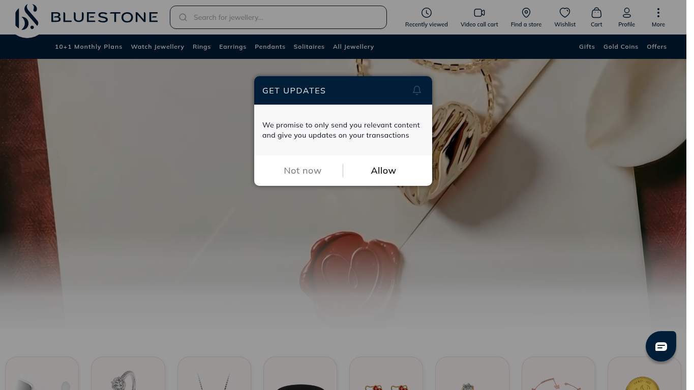
https://www.bluestone.com/ “The jewelry looks premium; the page behaves like it’s allergic to urgency.” BlueStone’s homepage is dressed for a luxury showroom but keeps tripping over its own velvet rope. The site wants to sell certified jewellery and lifetime exchange, yet the hero is blocked, the CTA is playing hide-and-seek, and the page is carrying enough baggage to qualify for checked-luggage fees.
https://www.bluestone.com/ screenshot TECHNICAL SUMMARY The biggest problem is speed: LCP is 13.1 s, TBT is 3,890 ms, and interactive time drags to 33.3 s, while the page hauls 9,471 KiB of assets and leaves 12 broken ones behind. SEO is mostly intact, but the structure is undercut by 0 H1s, 30 missing image alts, and only Organization/ContactPoint schema; fix the hero asset weight and JavaScript bloat first, because sluggish load plus a blocked hero is how you turn jewelry intent into abandoned tabs.
Categories 6 categories AI Visibility Partial Rewrite Owner only Share Share link 02
H1 Count 0 First Heading Level H2 Schema Types Organization, ContactPoint Missing Alt Images 30
🔥 You managed 0 H1s, so the page starts its argument with no opening statement.Show 2 more roasts 💀 Search engines got the gist; the structure still forgot to introduce itself.
Priority Fixes (3) → Add one H1 that states the core value proposition clearly instead of letting the page mumble from the sidelines. H1 Count: 0 Impact: high Effort: low
Why this matters The homepage has no H1 at all, so search and accessibility both lose the main topical signal.
→ Shorten the title tag to under 60 characters so it stops looking like it got clipped mid-sentence. Title Length: 103 characters Impact: medium Effort: low
Why this matters The current title is overly long and ends awkwardly, which weakens clarity and snippet quality.
→ Add descriptive alt text to every meaningful image so the visual catalog isn’t invisible to crawlers and assistive tech. Missing Alt: 30 Impact: medium Effort: medium
Why this matters Thirty images without alt text is too many missing signals for a site that sells visual products.
03
Missing Alt Images 30 Heading Count 93 Font Families 15 Empty Heading Count 1
🔥 Thirty images have no alt text, so even the jewelry is apparently expected to stay anonymous.Show 2 more roasts 💀 The layout knows how to dress up, but it forgot the wardrobe rules.
Priority Fixes (3) → Add supporting imagery and structure so the page feels intentional instead of overstuffed. Images: 306 Impact: medium Effort: medium
Why this matters A catalogue-heavy page with 306 images needs clearer visual support and hierarchy to feel controlled, not crowded.
→ Fix missing alt text across the 30 affected images so the design stops leaking accessibility value. Missing Alt: 30 Impact: medium Effort: medium
Why this matters The visual system may look clean, but missing alt text means a large chunk of it is functionally unfinished.
→ Reduce font families from 15 to 2–3 so the page stops looking like it borrowed type from every department. Font Families: 15 Impact: medium Effort: low
Why this matters Too many type families create inconsistency and undermine the premium feel expected in jewellery retail.
04
Word Count 1,977 Sentence Count 106 Title Quality Ends with bs-logo Twitter Description Empty
🔥 The title ends with 'bs-logo', which is a spectacular way to make luxury branding feel like a build artifact.Show 2 more roasts 💀 The copy writes a lot, but the first impression still forgets its own name tag.
Priority Fixes (3) → Tighten the headline so the page states the value in one sentence and stops hiding behind decorative prose. H1 Count: 0 Impact: high Effort: low
Why this matters There is no H1 to anchor the core message, which makes the homepage feel verbose but not directive.
→ Make the primary CTA stand out so shoppers can actually tell what to do first. CTA Count: 6 Impact: medium Effort: low
Why this matters The page has several CTAs, but the copy isn’t clearly prioritizing the main action for buyers.
→ Break long paragraphs into shorter, skimmable bullets so the 106 sentences stop reading like a legal deposition. Avg Words/Sentence: 19 Impact: low Effort: medium
Why this matters Readability is decent on paper, but the copy structure still needs to be easier to scan on a shopping homepage.
05
Console Errors 5 Broken Assets 12 Long Tasks 20 CLS 0.005
🔥 Five console errors plus a React error #418 is the browser filing a complaint in real time.Show 2 more roasts 💀 The page is stepping on rakes before the shopper even reaches the counter.
Priority Fixes (3) → Fix client-side JavaScript errors so interactions stop failing silently in production. JS Errors: 5 Impact: high Effort: medium
Why this matters Five console errors, including React error #418 and a CORS failure, can break critical interactions and trust.
→ Repair failed asset URLs and deployment paths so scripts and resources load cleanly. Broken Assets: 12 Impact: high Effort: medium
Why this matters Twelve broken assets and a 502 on a key script create visible friction and make the page feel unstable.
→ Keep navigation and footer links consistent so the browsing path doesn’t mutate into a scavenger hunt. Nav/Footer: Nav / Footer Impact: low Effort: medium
Why this matters The page is already noisy, and inconsistent structural navigation would make product discovery harder across the site.
06
CTA Count 6 Forms 2 Social Proof 2 Buttons 21
🔥 There are 21 buttons and only 6 CTAs, which means the page has more furniture than direction.Show 2 more roasts 💀 It knows how to ask for attention; it just forgets to earn it near the product.
Priority Fixes (3) → Add a primary CTA above the fold that matches the core offer and stops the page from making buyers hunt. CTA Count: 6 Impact: medium Effort: low
Why this matters The page has multiple CTAs, but the primary action is not visually dominant above the fold.
→ Place social proof near the CTA so shoppers see reassurance before they commit. Social Proof: 2 Impact: medium Effort: low
Why this matters Only two social proof signals is thin for a high-consideration jewellery purchase, especially near the action area.
→ Offer a low-friction contact option like chat or a visible email so hesitant buyers can get answers without playing hide-and-seek. Contact Path: Present Impact: low Effort: medium
Why this matters The contact path exists, but it needs to be easier to notice when trust-sensitive shoppers are deciding whether to buy.