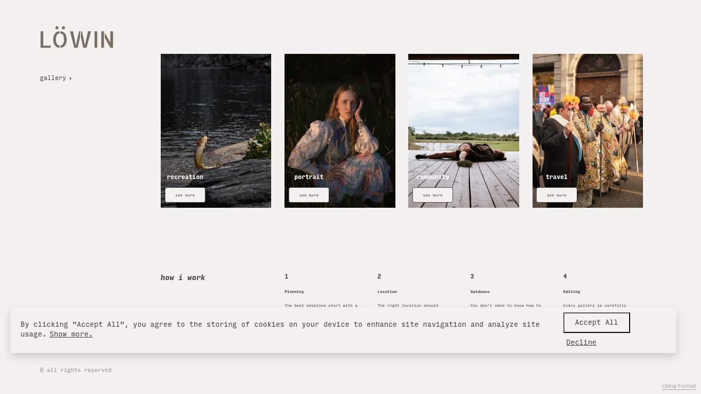
“A gorgeous portfolio with the conversion instincts of a locked gallery.”
LÖWIN brought a sharp look to the table, then hid the contact card under a mountain of elegant indecision. It’s the kind of portfolio that says “look how artistic I am” right up until someone tries to hire it.
https://bylowin.format.com/
screenshot
TECHNICAL SUMMARY
The site is visually competent, but the performance and conversion story are doing the dishes in the dark. LCP sits at 10.4s, interactive time is 10.4s, and the page is carrying 2,589 KiB with 287 KiB of unused JavaScript plus 1,340 KiB of image savings on the table; fix the hero assets first because slow first impressions directly weaken contact intent and client trust. SEO is decent but under-structured with zero JSON-LD, while the page also has no primary CTA, only one social proof element, and a contact path that feels more like a suggestion than an invitation.
🔥Your LCP of 10.4 s is less “portfolio reveal” and more “waiting room with lighting.” The hero image is taking a kitchen-gunshot autopsy to your first impression.
💀
Beautiful framing, then the load time shows up like a half-built set still waiting for props.
→
Compress hero images and switch to WebP/AVIF format.
LCP: 10.4 sImpact: highEffort: medium
Why this matters
The hero is clearly delaying the first meaningful paint, and faster image delivery is the quickest way to stop the portfolio from arriving late to its own opening.
→
Defer non-critical JavaScript and reduce render-blocking resources.
TBT: 220 msImpact: highEffort: medium
Why this matters
Main-thread work is keeping the page from becoming usable fast enough, which hurts the first interaction and makes contact behavior feel heavier than it should.
→
Enable CDN caching and serve static assets with long cache TTLs.
FCP: 2.6 sImpact: mediumEffort: low
Why this matters
The first paint is lagging, and caching is a low-effort way to stop repeat visitors from reloading the same visual baggage again and again.
🔥You’ve got 26 h2 headings and zero h3s, so the content structure reads like a staircase with one missing step everywhere you need it.
💀
Search visibility is present, but the page is acting like metadata is optional and structure is a rumor.
→
Add JSON-LD structured data that matches the page type, such as WebSite, Organization, Product, or Article.
Schema: NoneImpact: mediumEffort: medium
Why this matters
Zero structured data leaves search and AI systems with no clean entity context, which is wasted discoverability for a portfolio that needs to be found and understood.
→
Add descriptive alt text to every meaningful image.
Missing Alt: 18Impact: mediumEffort: medium
Why this matters
Eighteen missing alt attributes means the visual work is mute in accessibility and search contexts, which is a brutal way for a photography site to underdescribe its own art.
→
Publish llms.txt or ai.txt with your priority URLs, core docs, and support paths so AI crawlers can find the pages you actually want cited.
AI Hints: MissingImpact: mediumEffort: medium
Why this matters
With no AI hint file, the site is leaving citation control to chance instead of telling crawlers where the good stuff lives.
🔥Eighteen images and eighteen missing alt attributes: the whole gallery is visually busy and textually invisible.
💀
The visual language is stylish, but the typography and accessibility are throwing sand in the lens.
→
Fix missing alt text to pass accessibility audits.
Missing Alt: 18Impact: mediumEffort: medium
Why this matters
Every image lacking alt text weakens accessibility and makes the portfolio less legible for users who don’t experience the visuals the same way.
→
Reduce font families from 8 to 2-3 for visual consistency.
Font Families: 8Impact: mediumEffort: low
Why this matters
Eight fonts creates visual drift, and trimming the stack will make the brand feel intentional instead of assembled from whatever was nearest the keyboard.
→
Add supporting imagery so the layout feels intentional, not empty.
Images: 18Impact: mediumEffort: medium
Why this matters
The page already has substantial image volume, but the composition still needs stronger support so the gallery reads like curated work rather than a scattered buffet.
🔥The title is just "home - LÖWIN," which is the digital equivalent of introducing yourself as “person.”
💀
The copy has plenty to say, but it never gets to the point or the ask.
→
Add a clear CTA - there are none right now.
CTA Count: 0Impact: highEffort: low
Why this matters
With no explicit ask on the page, visitors have to guess how to hire or contact the portfolio, which is terrible for a business that lives on inbound interest.
→
Tighten the headline to state your value in one sentence.
H1 Count: 1Impact: mediumEffort: low
Why this matters
A single H1 is fine, but it needs to say what the portfolio offers instead of serving as a label on a gallery drawer.
→
Break long paragraphs into skimmable bullets and shorter sentences.
Avg Words/Sentence: 14Impact: lowEffort: medium
Why this matters
Even at a readable average, the page’s 103 sentences make the message feel spread out, and tighter chunks will help viewers find the value faster.
05
UX
84
NavAbsentForms2Input Count8Missing Alt18
🔥There’s no navigation, yet there are 21 links and 2 forms, so the site expects users to explore by instinct and optimism.
💀
The experience is clear-looking but oddly self-service, like a gallery with the map hidden in a drawer.
→
Ensure consistent navigation and footer links across all pages.
Nav/Footer: No nav / FooterImpact: mediumEffort: medium
Why this matters
Without reliable navigation, users have to hunt for context and contact paths, which is especially awkward on a portfolio meant to convert curiosity into outreach.
→
Reduce form fields (currently 8) to only the essentials.
Form Fields: 8Impact: lowEffort: medium
Why this matters
Eight fields turns contact into a mini tax return, and fewer fields will make it easier for interested viewers to actually submit the form.
→
Smoke-test the page in the browser console and keep runtime errors at zero.
JS Errors: 0Impact: lowEffort: low
Why this matters
There are no console errors now, so the win is to preserve that clean state while other usability issues get fixed.
06
CONVERSION
50
CTA Count0Forms2Required Inputs6Social Proof1
🔥CTA count is 0, so the page is beautifully dressed and completely unwilling to ask for the sale.
💀
The page invites admiration, then forgets to invite action.
→
Add a primary CTA above the fold that matches your core offer.
CTA Count: 0Impact: highEffort: low
Why this matters
A portfolio without a visible primary action leaves potential clients admiring the work and then drifting away instead of contacting you.
→
Include social proof or trust signals (testimonials, logos, stats) near the CTA.
Social Proof: 1Impact: mediumEffort: low
Why this matters
One proof element is too thin for a contact decision, and placing stronger trust signals near the ask will help visitors move from interest to inquiry.
→
Offer a low-friction contact option - form, chat, or visible email.
Contact Path: PresentImpact: lowEffort: medium
Why this matters
The contact path exists, but it needs to be easier to find and faster to use if the site wants more inquiries from portfolio traffic.