SINGLE URL ROAST
https://segura-water-site.pages.dev/ “Ambitious water tech, but the site leaks trust and crawlers.” Segura brought a respectable lab coat to the roast, then tripped over its own paperwork. The page keeps shouting field-ready while the crawl bots, headings, and demo path are all acting like they got lost in the loading dock.
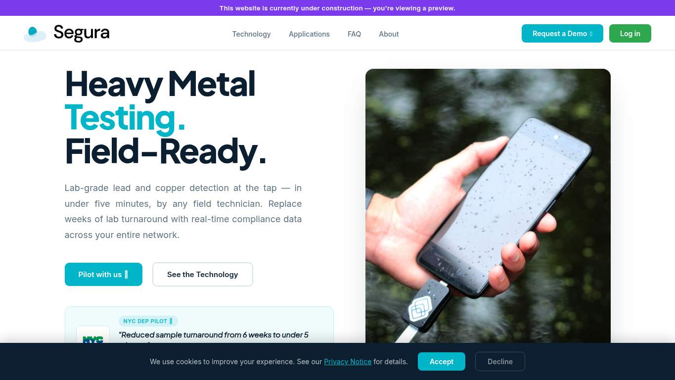
https://segura-water-site.pages.dev/ screenshot TECHNICAL SUMMARY The biggest issues are crawlability and trust signaling: meta description is missing, robots.txt is absent with 3,813 errors found, canonical is missing, and structured data is zero. On the experience side, LCP is 3.6 s, FCP is 2.9 s, total byte weight is 1,670 KiB, and render-blocking savings are estimated at 1,780 ms, so the page is doing the water-instrumentation equivalent of arriving to a field demo with half the kit still in the van. Fix the SEO plumbing first, then trim the payload and clean up the flaky UX signals so utilities teams can actually trust the demo request path and not just admire the jargon.
Categories 6 categories AI Visibility Partial Rewrite Owner only Share Share link 02
Meta description missing robots.txt errors 3,813 errors found Canonical missing Schema None
🔥 The meta description is missing, so search results get the joy of improvising your pitch for you.Show 2 more roasts 💀 Search engines are being handed a metal-testing story with no ID badge, no directions, and no coherent filing system.
Priority Fixes (3) → Write a 140–160 character meta description with the primary keyword and demo intent. Meta description: missing Impact: high Effort: low
Why this matters Without a meta description, acquisition traffic gets a blank snippet where your demo value should be.
→ Add a self-referencing canonical tag for the preferred URL. Canonical: missing Impact: high Effort: low
Why this matters A missing canonical leaves duplicate-signal ambiguity on a page that already needs cleaner crawl instructions.
→ Add JSON-LD for the page type, such as WebSite, Organization, or Product. Schema: None Impact: medium Effort: medium
Why this matters With no structured data at all, you’re skipping rich-result context that could help search engines understand the offer.
03
H1 Count 7 Heading Level Skips h2->h4 Total Headings 72 H2 Count 51
🔥 Seven H1 elements is not hierarchy; it's a committee meeting where everyone insisted on being the main character.Show 2 more roasts 💀 The layout knows how to dress professionally, but the information architecture is still arguing with itself.
Priority Fixes (3) → Add supporting imagery where the layout feels empty or overly text-heavy. Images: 47 Impact: medium Effort: medium
Why this matters Even with 47 images, the page still reads as under-supported in key areas, so the visual system needs more intentional structure.
→ Test spacing and alignment across mobile and desktop breakpoints. Viewport: Present Impact: low Effort: medium
Why this matters Viewport support exists, but it doesn’t guarantee the section stack behaves properly across screen sizes.
→ Fix missing alt text to pass accessibility audits. Missing Alt: 0 Impact: low Effort: medium
Why this matters 0 image(s) are missing alt text in the extracted HTML.
04
Word Count 7,732 Sentence Count 504 CTA Count 19 Button Count 3
🔥 Seven H1s and 7,732 words is not messaging; it’s a white paper wearing a landing-page costume.Show 2 more roasts 💀 The copy has expertise, but it also has enough volume to drown its own demo ask.
Priority Fixes (3) → Tighten the headline so the value is stated once, clearly, and fast. H1 Count: 7 Impact: high Effort: low
Why this matters Seven H1s signal the core message is fragmented, which is deadly on a demo-driven SaaS page.
→ Break long paragraphs into bullets and shorter sentences for easier scanning. Avg Words/Sentence: 15 Impact: low Effort: medium
Why this matters With 504 sentences on the page, skimmability matters or the reader will bail before reaching the proof.
→ Make one primary CTA stand out and reduce the noisy repeat asks. CTA Count: 19 Impact: medium Effort: low
Why this matters Nineteen CTA instances make the page feel eager in every direction, but not decisive about the next step.
05
Console Errors 1 Broken Assets 1 CLS 1 External Links 80
🔥 One console error and one 404 asset are enough to make the experience feel slightly haunted.Show 2 more roasts 💀 The interaction layer is mostly functional, but the broken asset and layout shifts keep tapping the glass.
Priority Fixes (3) → Fix client-side JavaScript errors so interactions fail loudly in staging, not silently in production. JS Errors: 1 Impact: high Effort: medium
Why this matters A single console error is still a production-quality bug when buyers are trying to navigate a demo-led site.
→ Repair failed asset URLs and deployment paths so the page loads cleanly. Broken Assets: 1 Impact: high Effort: medium
Why this matters The 404 favicon request is small, but it proves at least one asset path is broken and the page is not fully tidy.
→ Ensure consistent navigation and footer links across all pages. Nav/Footer: Nav / Footer Impact: low Effort: medium
Why this matters Navigation and footer presence shape whether visitors can recover from a dead end.
06
CTA Count 19 Form Count 0 Social Proof 4 Contact Path Present
🔥 Nineteen CTA instances and zero forms is the lead-gen version of showing up to a demo with no sample bottles.Show 2 more roasts 💀 The site wants the demo, but it’s hiding the easiest path behind too much talking and too little proof.
Priority Fixes (3) → Add a primary CTA above the fold that matches the core demo offer. CTA Count: 19 Impact: medium Effort: low
Why this matters With 19 CTAs, the page needs one obvious default action instead of a bouquet of equal-options chaos.
→ Keep at least one low-friction contact option visible, such as a form or direct email path. Contact Path: Present Impact: low Effort: medium
Why this matters The path exists, but the site still needs a cleaner, easier way for a utilities buyer to raise a hand fast.
→ Place social proof closer to the CTA using testimonials, logos, or quantified validation stats. Social Proof: 4 Impact: medium Effort: low
Why this matters Four proof points are not enough when the primary action is a request-a-demo decision that depends on trust.