Loading Report View…
0/ 100
omni-site-eight.vercel.app Website Audit Report
omni-site-eight.vercel.app scored 75 out of 100 in this SavageAudit website audit covering Performance, SEO, Design, Copy, User Experience, and Conversion. The report uses captured website evidence to explain what is working, what is limiting the experience, and which improvements deserve attention first.
“Strong engine, embarrassingly weak signage and no place to act.”
Omni looks like the movie trailer for a dev tool that forgot to show the actual tool. Slick enough to get a nod, but then it hands developers a mostly silent screen and expects applause.
 https://omni-site-eight.vercel.app/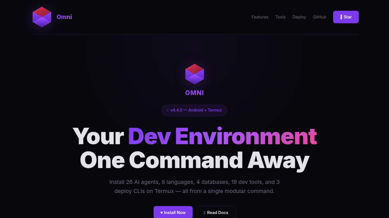
TECHNICAL SUMMARY
Performance is mostly fine, with a good-looking score, 2.7 s FCP/LCP, 0 ms TBT, and only one long task — so the app isn’t the problem. The real damage is elsewhere: missing meta description, missing canonical, zero schema, no OG/Twitter tags, no CTA, no forms, and only 3 social proof points, which means discoverability and conversion are both being left in the terminal parking lot.
Where It Burns
6 categoriesWebsite Audit Findings for omni-site-eight.vercel.app
SavageAudit identified 36 visible findings and recommendations across 6 audit categories. Each section below combines the category score with observed evidence and prioritized fixes.
9401 PERFORMANCEPerformance Score 94/1006202 SEOMeta description missing4603 DESIGNImages 08504 COPYWord count 3819605 UXUX Score 96/1005406 CONVERSIONCTA count 0
01
PERFORMANCE AUDIT
94
Performance Score94/100FCP2.7 sLCP2.7 sRender-blocking savings1,900 msLong tasks1 long task found
- 🔥A 94 score with 88 KiB total weight is the kind of restraint most sites only dream about. Unfortunately, the render-blocking estimate is still 1,900 ms, so the page is wearing a racing helmet with the handbrake on.
💀
The engine is healthy, but a 1,900 ms block is still the page stepping on its own cable.
- →Defer non-critical JavaScript and reduce render-blocking resources.TBT: 0 msImpact: highEffort: medium
Why this matters
The page is showing 1,900 ms in estimated savings from render-blocking resources, so this is the clearest fix-first cleanup even though total blocking time is currently 0 ms.
- →Enable CDN caching and serve static assets with long cache TTLs.FCP: 2.7 sImpact: mediumEffort: low
Why this matters
First contentful paint sits at 2.7 s, so tightening caching can help the page stop arriving like it took the scenic route.
- →Compress hero images and switch to WebP/AVIF format.LCP: 2.7 sImpact: highEffort: medium
Why this matters
Largest contentful paint is 2.7 s, which suggests the hero experience still has room to ship faster, especially if the visual payload grows later.
02
SEO AUDIT
62
Meta descriptionmissingCanonicalmissingSchemaNoneOG/Twitter metadatamissing
- 🔥A missing meta description means search gets to freestyle your pitch like a substitute teacher with no lesson plan. For a Termux dev tool, that is an impressively avoidable act of self-sabotage.
💀
Search visibility is being treated like an optional plugin instead of a survival feature.
- →Write a 140-160 character meta description with your primary keyword.Meta description: missingImpact: highEffort: low
Why this matters
There is no written search snippet copy, so search results have to guess what Omni does instead of showing a clean value proposition.
- →Add a self-referencing canonical tag to declare the preferred URL for this page.Canonical: missingImpact: highEffort: low
Why this matters
The canonical URL is empty, which invites duplicate-signal confusion when the page should be telling crawlers exactly which version wins.
- →Add JSON-LD structured data that matches the page type, such as WebSite, Organization, Product, or Article.Schema: NoneImpact: mediumEffort: medium
Why this matters
Schema count is zero, so the page skips rich-result context and leaves search engines with less structured understanding of the product.
03
DESIGN AUDIT
46
Images0Font families6Heading hierarchy skipsh2 -> h4Headings total20
- 🔥The visual hierarchy is clear, but the page still managed to use 6 font families. That is not a system; that is a typography committee arguing in public.
💀
Good spacing and clean type are doing charity work for a layout that is under-illustrated and overcomplicated.
- →Add supporting imagery so the layout feels intentional, not empty.Images: 0Impact: highEffort: medium
Why this matters
There are no images at all, which makes the landing page feel visually underfed for a developer product that needs quick comprehension.
- →Reduce font families from 6 to 2-3 for visual consistency.Font Families: 6Impact: mediumEffort: low
Why this matters
Using six font families creates unnecessary inconsistency when a tighter type system would make the interface feel more deliberate.
- →Fix missing alt text to pass accessibility audits.Missing Alt: 0Impact: lowEffort: medium
Why this matters
Alt text is not currently missing, so this evidence is limited; the audit item is still included here only as a guardrail for future image additions.
04
COPY AUDIT
85
Word count381Sentence count27H1 textYour Dev EnvironmentOne Command AwayCTA count0
- 🔥381 words across 27 sentences is lean, but lean is not the same as persuasive when you are explaining a modular dev environment. Right now it sounds like a product teaser, not the documentation-adjacent pitch developers need.
💀
The writing has a pulse, but the headline fumbles the spacing and the page never asks for anything.
- →Tighten the headline to state your value in one sentence.H1 Count: 1Impact: mediumEffort: low
Why this matters
The H1 is concatenated as 'Your Dev EnvironmentOne Command Away,' so the core promise is there but the presentation is tripping over its own shoelaces.
- →Add a clear CTA - there are none right now.CTA Count: 0Impact: highEffort: low
Why this matters
With zero CTAs, the page explains the product but never tells the visitor what to do next.
- →Break long paragraphs into skimmable bullets and shorter sentences.Avg Words/Sentence: 14Impact: lowEffort: medium
Why this matters
The average sentence length is manageable at 14 words, but the page still needs more skimmable structure for busy developers scanning for setup value.
05
UX AUDITUSER EXPERIENCE AUDIT
96
UX Score96/100Console errors1Broken assets1Forms0
- 🔥The good news: the page renders cleanly enough to score 96 on UX. The bad news: a favicon request still 404s, so even the tiny icon got rejected at the door.
💀
UX is nearly spotless, except for the little 404 that walks in wearing clown shoes.
- →Fix client-side JavaScript errors so interactions do not fail silently in production.JS Errors: 1Impact: highEffort: medium
Why this matters
There is one console error in production, which is enough to risk silent interaction failures even if the page otherwise looks fine.
- →Repair failed asset URLs and deployment paths so scripts, images, and stylesheets load cleanly.Broken Assets: 1Impact: highEffort: medium
Why this matters
The favicon returned a 404, proving at least one asset path is broken and the browser is already keeping receipts.
- →Ensure consistent navigation and footer links across all pages.Nav/Footer: Nav / FooterImpact: lowEffort: medium
Why this matters
Navigation and footer are present, so this is a consistency safeguard rather than a current blocker; useful for a product that may expand beyond one page.
06
CONVERSION AUDIT
54
CTA count0Form count0Input count0Social proof count3
- 🔥CTA count is 0, which is a fascinating way to run a SaaS landing page: lots of presentation, no invitation. It's the developer-tool equivalent of demoing a clean terminal and never showing the command.
💀
The page asks for attention and then forgets to ask for action.
- →Add a primary CTA above the fold that matches your core offer.CTA Count: 0Impact: highEffort: low
Why this matters
There is no primary action on the page, so visitor intent has nowhere to land.
- →Offer a low-friction contact option - form, chat, or visible email.Contact Path: PresentImpact: lowEffort: medium
Why this matters
A contact path exists conceptually, but there is no actual form or input field, so the page still lacks a practical way to convert curiosity into a conversation.
- →Include social proof or trust signals (testimonials, logos, stats) near the CTA.Social Proof: 3Impact: mediumEffort: low
Why this matters
There are only 3 social proof items, which is not enough to anchor trust near the action point for a developer audience.
Audit overview
omni-site-eight.vercel.app Audit Summary
Performance is mostly fine, with a good-looking score, 2.7 s FCP/LCP, 0 ms TBT, and only one long task — so the app isn’t the problem. The real damage is elsewhere: missing meta description, missing canonical, zero schema, no OG/Twitter tags, no CTA, no forms, and only 3 social proof points, which means discoverability and conversion are both being left in the terminal parking lot.
Based on the category scores in this report, User Experience is the strongest area while Design has the most room for improvement.
How SavageAudit Evaluated omni-site-eight.vercel.app
SavageAudit evaluated the public website at https://omni-site-eight.vercel.app/ across performance, technical SEO, design, copy, user experience, and conversion signals. Scores and recommendations reflect the website evidence available when this audit was generated on July 3, 2026.
Similar Website Audit Reports
Compare this result with other public SavageAudit reports that received a similar overall website score.