Loading Report View…
0/ 100
rezivoai.lovable.app Website Audit Report
rezivoai.lovable.app scored 84 out of 100 in this SavageAudit website audit covering Performance, SEO, Design, Copy, User Experience, and Conversion. The report uses captured website evidence to explain what is working, what is limiting the experience, and which improvements deserve attention first.
“Trust-heavy sales page with a few embarrassingly avoidable self-inflicted wounds.”
Rezivo AI shows up dressed like a clinical powerhouse, then trips over its own shoelaces in the lobby. The page wants to promise zero missed calls, but the site itself keeps dropping them.
 https://rezivoai.lovable.app/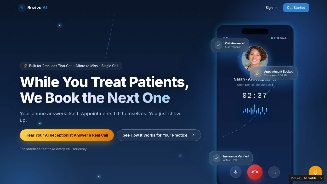
TECHNICAL SUMMARY
The page is structurally solid for SEO, but the execution leaks credibility: duplicated title text, a canonical pointing somewhere else, and two broken resources are the digital equivalent of a receptionist forgetting the dentist’s name. Performance is decent-but-not-deal-winning with a 3.5s first paint, 3.8s LCP, 7.0s interactive time, and 1.6MB of total weight; the fix-first move is compressing the hero and trimming render-blocking resources so the demo pitch stops arriving late to its own appointment.
Where It Burns
6 categoriesWebsite Audit Findings for rezivoai.lovable.app
SavageAudit identified 36 visible findings and recommendations across 6 audit categories. Each section below combines the category score with observed evidence and prioritized fixes.
7601 PERFORMANCESpeed Index 10.7 s9202 SEOTitle Length 104 characters7203 DESIGNFont Families 209804 COPYWord Count 11678505 UXConsole Errors 27206 CONVERSIONCTA Count 1
01
PERFORMANCE AUDIT
76
Speed Index10.7 sLCP3.8 sFCP3.5 sTotal Byte Weight1,609 KiB
- 🔥Your Speed Index is 10.7s, which is a long coffee break for a page selling 24/7 responsiveness.
💀
The page is supposed to never miss a call, yet its hero is still on hold.
- →Compress the hero images and convert them to WebP/AVIF so the main content stops dragging its feet.LCP: 3.8 sImpact: highEffort: medium
Why this matters
A 3.8s LCP means the biggest visual element is arriving too late, which hurts perceived speed and first impression for demo traffic.
- →Defer non-critical JavaScript and cut render-blocking resources so the page can start behaving like a reception bot instead of a loading screen.Render-blocking savings: 470 msImpact: highEffort: medium
Why this matters
The page has 470ms of render-blocking savings available, so the current delivery path is making users wait for no good reason.
- →Enable CDN caching for static assets so repeat visits don’t have to re-download the entire waiting room.FCP: 3.5 sImpact: mediumEffort: low
Why this matters
A 3.5s first paint suggests the browser is doing too much fresh work instead of reusing cached assets.
02
SEO AUDIT
92
Title Length104 charactersCanonical MatchfalseSchema Parse Errors0JSON-LD Blocks4
- 🔥The title is duplicated into a 104-character wall of text, like the page forgot it already made its point and said it again anyway.
💀
Search engines can read the page, but the page keeps introducing itself with the wrong business card.
- →Shorten the title tag so it stops rambling past the useful limit and actually fits search results.Title Length: 104 charactersImpact: mediumEffort: low
Why this matters
A 104-character title is too long for clean SERP display and is currently duplicated, which makes the page look sloppy before anyone clicks.
- →Update the canonical tag to match the preferred final URL so search signals stop splitting like a bad referral handoff.Canonical: https://rezivoaireceptionist.pages.dev/Impact: highEffort: low
Why this matters
The canonical points to a different host than the audited page, which can confuse indexing and dilute authority.
- →Add Organization or WebSite schema with sameAs links so the entity graph looks like a real company, not a placeholder dossier.Entity Graph: MissingImpact: mediumEffort: medium
Why this matters
You already have schema, but the missing entity graph weakens brand association and structured understanding for search and assistants.
03
DESIGN AUDIT
72
Font Families20Headings37Buttons21Images5
- 🔥With 20 font families on deck, the typography isn’t a system, it’s a family reunion nobody planned.
💀
The design knows how to look professional, then starts freelancing with too many fonts and too little evidence.
- →Reduce the font stack to 2–3 families so the interface stops dressing like it borrowed clothes from six different departments.Font Families: 20Impact: mediumEffort: low
Why this matters
Twenty font families create unnecessary visual noise and undermine consistency on a product page that needs calm, medical-grade clarity.
- →Add supporting imagery so the layout feels intentional instead of stretched across five lonely images.Images: 5Impact: mediumEffort: medium
Why this matters
Only 5 images leaves the page doing a lot of storytelling without enough visual proof for a trust-sensitive SaaS.
- →Test spacing and alignment across breakpoints because the current layout still needs a real mobile-and-desktop sanity check.Viewport: PresentImpact: lowEffort: medium
Why this matters
Viewport support exists, but presence alone doesn’t prove the layout won’t buckle on smaller clinic-device screens.
04
COPY AUDIT
98
Word Count1167Sentence Count129H1 Count1Citability Blocks2
- 🔥The page has 1,167 words and 129 sentences, so it clearly believes in saying things before it earns them.
💀
The copy can explain the product, but it also overshares like a receptionist with no redaction policy.
- →Tighten the headline so the value proposition lands in one clean sentence instead of auditioning for a brochure.H1 Count: 1Impact: mediumEffort: low
Why this matters
The page has a single H1, which is a good base, but the messaging still needs sharper phrasing to maximize immediate comprehension.
- →Break dense sections into shorter, skimmable bullets so medical buyers can extract the point without parsing a wall of text.Sentence Count: 129Impact: lowEffort: medium
Why this matters
The long overall copy volume and 129 sentences suggest the page benefits from more scannable structure, especially for busy clinic owners.
- →Add a clearer primary CTA label so the copy tells people exactly what happens next, not just that something should happen.CTA Count: 1Impact: mediumEffort: low
Why this matters
With only one CTA, the page depends heavily on that button doing all the persuasion work, so the wording needs to carry more intent.
05
UX AUDITUSER EXPERIENCE AUDIT
85
Console Errors2Broken Assets2Interactive Time7.0 sCLS0.009
- 🔥Two console errors and two broken assets is a charming little double-feature: the missing favicon at /favicon.svg and a 403 from ip-api.com/json/?fields=countryCode.
💀
The interface mostly behaves, but the broken requests and late interactivity keep it from feeling reliable.
- →Fix client-side JavaScript errors so interactions don’t fail silently when someone tries to use the page.JS Errors: 2Impact: highEffort: medium
Why this matters
Two console errors are enough to make production behavior look unreliable, especially on a site promising appointment handling reliability.
- →Repair the broken asset URLs and deployment paths so the favicon and fetch request stop embarrassing the build.Broken Assets: 2Impact: highEffort: medium
Why this matters
A 404 for /favicon.svg and a 403 fetch are visible signs that not everything on the page is actually landing.
- →Ensure consistent navigation and footer links across pages so users don’t have to guess where the important stuff lives.Nav/Footer: Nav / FooterImpact: lowEffort: medium
Why this matters
The page has navigation and a footer, but consistency matters on a demo-focused SaaS where users need a predictable path.
06
CONVERSION AUDIT
72
CTA Count1Forms0Social Proof3Links18
- 🔥There is 1 CTA, and it says ‘Get Started,’ which is as specific as a clinic sign that just says ‘Enter.’
💀
The page asks for a demo like it’s obvious, then supplies almost no mechanism to make saying yes easy.
- →Add a primary CTA above the fold that matches the offer instead of using a generic button label.CTA Count: 1Impact: mediumEffort: low
Why this matters
One generic CTA is too little guidance for a demo page that needs to convert clinic operators quickly.
- →Offer a low-friction contact option like a form or chat so the demo request isn’t forced through a single button path.Contact Path: PresentImpact: lowEffort: medium
Why this matters
The page technically has a contact path, but the lack of a form means there’s no easy fallback for hesitant buyers.
- →Place social proof closer to the CTA so the ‘book a demo’ ask doesn’t stand there alone like a lawyer with no witnesses.Social Proof: 3Impact: mediumEffort: low
Why this matters
You do have three trust signals, but they need to sit nearer the conversion action to help overcome skepticism in healthcare SaaS.
Audit overview
rezivoai.lovable.app Audit Summary
The page is structurally solid for SEO, but the execution leaks credibility: duplicated title text, a canonical pointing somewhere else, and two broken resources are the digital equivalent of a receptionist forgetting the dentist’s name. Performance is decent-but-not-deal-winning with a 3.5s first paint, 3.8s LCP, 7.0s interactive time, and 1.6MB of total weight; the fix-first move is compressing the hero and trimming render-blocking resources so the demo pitch stops arriving late to its own appointment.
Based on the category scores in this report, Copy is the strongest area while Conversion has the most room for improvement.
How SavageAudit Evaluated rezivoai.lovable.app
SavageAudit evaluated the public website at https://rezivoai.lovable.app/ across performance, technical SEO, design, copy, user experience, and conversion signals. Scores and recommendations reflect the website evidence available when this audit was generated on July 3, 2026.
Similar Website Audit Reports
Compare this result with other public SavageAudit reports that received a similar overall website score.