Loading Report View…
0/ 100
sugary.ae Website Audit Report
sugary.ae scored 74 out of 100 in this SavageAudit website audit covering Performance, SEO, Design, Copy, User Experience, and Conversion. The report uses captured website evidence to explain what is working, what is limiting the experience, and which improvements deserve attention first.
“A gift shop dressed for delivery, but the checkout choir never learned timing.”
Sugary shows up like it has the gift box, the flowers, and the cake — then trips over its own shoelaces before anyone can tap download. It’s the digital equivalent of wrapping a premium present in a shipping label and calling it luxury.
 https://sugary.ae/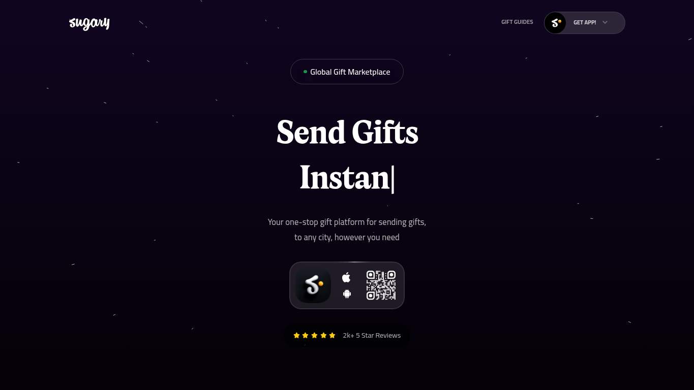
TECHNICAL SUMMARY
The site has solid discoverability basics, but the experience is kneecapped by a very slow hero: LCP is 10.6 s, Speed Index is 10.2 s, and interactive time stretches to 10.8 s with 6.3 s of main-thread work. SEO is mostly strong, but the canonical points to sugary.me while the audited page is sugary.ae, and the page also ships with 204 missing image alts plus a hydration mismatch and one broken asset, which is exactly how you turn trust into hesitation. Fix the hero asset weight first; that’s the quickest way to protect app-download intent and stop losing impatient gift buyers before they even see the offer.
Where It Burns
6 categoriesWebsite Audit Findings for sugary.ae
SavageAudit identified 36 visible findings and recommendations across 6 audit categories. Each section below combines the category score with observed evidence and prioritized fixes.
5601 PERFORMANCELCP 10.6 s8202 SEOSEO Score 927403 DESIGNImages 6158004 COPYWord Count 10,1117505 UXConsole Errors 16706 CONVERSIONCTA Count 1
01
PERFORMANCE AUDIT
56
LCP10.6 sSpeed Index10.2 sInteractive10.8 sTotal Byte Weight4,485 KiB
- 🔥Your LCP of 10.6 s is not a hero reveal; it’s a hostage situation for anyone trying to send flowers on time.
💀
A gift site that loads this slowly is basically asking customers to buy surprise and patience in the same cart.
- →Compress hero images and switch them to WebP/AVIF so the first gift actually appears before the customer loses the mood.LCP: 10.6 sImpact: highEffort: medium
Why this matters
An LCP of 10.6 s is the clearest sign the hero payload is too heavy and delaying the main content customers need to decide fast.
- →Defer non-critical JavaScript and cut render-blocking resources so the page stops idling in the garage like a car with the hood up.TBT: 240 msImpact: highEffort: medium
Why this matters
Even with a moderate TBT, render-blocking code still slows the path to interactivity and keeps the page from feeling ready.
- →Enable CDN caching and longer cache TTLs for static assets so repeat visitors aren’t forced to reload the same gift catalog from scratch.FCP: 2.9 sImpact: mediumEffort: low
Why this matters
A 2.9 s FCP suggests the early paint could be faster with better asset reuse and caching discipline.
02
SEO AUDIT
82
SEO Score92Canonical MatchfalseJSON-LD Schemas3Twitter Cardmissing
- 🔥Your canonical tag points to https://sugary.me/ while the page being audited is https://sugary.ae/; that’s duplicate-signal confusion wearing a name tag from the wrong party.
💀
Search engines can mostly read the room, but your canonical mismatch and missing product context are still making them squint.
- →Update the canonical tag so it matches the final preferred version of this page and stops sending duplicate signals.Canonical: https://sugary.me/Impact: highEffort: low
Why this matters
The canonical currently disagrees with the audited URL, which can split indexing signals and confuse search engines.
- →Consolidate the 15 H1 tags down to one and push the rest into H2/H3 so the page stops shouting in multiple directions at once.H1 Count: 15Impact: mediumEffort: low
Why this matters
Fifteen H1s dilute hierarchy and make the page structure harder for crawlers to interpret cleanly.
- →Keep llms.txt/ai.txt, then align them with a valid sitemap and self-canonical URLs so AI hints point to crawlable destinations instead of decorative directions.AI Hints: PartialImpact: mediumEffort: medium
Why this matters
AI hints are only useful when the underlying indexable URLs and sitemap are consistent and trustworthy.
03
DESIGN AUDIT
74
Images615Missing Alt204Heading Count326Font Families20
- 🔥You’ve got 615 images and 204 of them skipped alt text, so the visual catalog is doing more talking than the accessibility layer ever will.
💀
The layout has enough content to fill a mall kiosk, but the structure and accessibility are still limping behind it.
- →Add supporting imagery so the layout feels intentional instead of like a gift shop inventory dump.Images: 615Impact: mediumEffort: medium
Why this matters
With 615 images, the page needs tighter visual support and hierarchy or the interface becomes noisy and hard to scan.
- →Fix the 204 missing alt attributes so screen readers can describe the gift images instead of silently suffering.Missing Alt: 204Impact: mediumEffort: medium
Why this matters
A missing-alt count of 204 is a large accessibility gap and a clear sign the image layer isn’t fully usable.
- →Reduce font families from 20 to 2-3 so the brand stops looking like it borrowed typefaces from every aisle in the mall.Font Families: 20Impact: mediumEffort: low
Why this matters
Too many font families create inconsistency and visual clutter without adding meaningful clarity.
04
COPY AUDIT
80
Word Count10,111Sentence Count621CTA Count1TitleSugary - Online Gift Service in Dubai, UAE
- 🔥The page has 10,111 words and 621 sentences, which is less a landing page and more a gift-themed autobiography.
💀
The messaging knows the category, but it keeps talking so much that the actual ask gets buried under a mountain of prose.
- →Tighten the headline to state the value in one sentence so people know what Sugary does before the scroll wheel files for divorce.H1 Count: 15Impact: highEffort: low
Why this matters
The page’s heading sprawl shows the message is not being concentrated into one clear value statement.
- →Break the long paragraphs into shorter bullets and sentences so shoppers can scan gift options without reading a novella.Avg Words/Sentence: 16Impact: lowEffort: medium
Why this matters
Readable copy matters on a transactional gift page where users are deciding quickly across occasions and products.
- →Make the primary CTA more explicit and visible, because one 'Download onApp Store' badge is not much of a conversion strategy.CTA Count: 1Impact: mediumEffort: low
Why this matters
A single CTA creates ambiguity about the intended action, especially when the main goal is app download.
05
UX AUDITUSER EXPERIENCE AUDIT
75
Console Errors1Broken Assets1Interactive10.8 sLong Tasks13
- 🔥Hydration mismatches are still here, so the page is essentially arguing with itself while the customer waits.
💀
The interface can look presentable, but the runtime issues make it feel less like a service and more like a rehearsal.
- →Fix the client-side JavaScript error so the app stops finishing hydration like it’s apologizing for the rest of the render.JS Errors: 1Impact: highEffort: medium
Why this matters
A hydration mismatch indicates the client and server aren’t agreeing, which can cause UI glitches and unstable interactions.
- →Repair the failed asset URL so scripts, images, and stylesheets actually load instead of ghosting the user.Broken Assets: 1Impact: highEffort: medium
Why this matters
A broken asset is direct user-facing friction and can damage both functionality and trust in a transactional flow.
- →Ensure consistent navigation and footer links across the site so users aren’t left hunting for basic paths like it’s a scavenger hunt.Nav/Footer: Nav / No footerImpact: lowEffort: medium
Why this matters
The current nav/footer inconsistency weakens orientation and makes it harder for users to find support or next steps.
06
CONVERSION AUDIT
67
CTA Count1Forms0Social Proof2Footermissing
- 🔥There’s only one CTA on the page, so the whole conversion plan is basically one badge and a prayer.
💀
The page wants an app download, but it barely gives people enough cues to commit before the scroll ends.
- →Add a primary CTA above the fold that matches the app-download goal instead of relying on a single badge that behaves like a decorative sticker.CTA Count: 1Impact: mediumEffort: low
Why this matters
A single CTA is too thin for a transactional gift flow where the main business goal is app installation.
- →Place testimonials or trust stats closer to the CTA so visitors see proof before they decide to leave with their gift money intact.Social Proof: 2Impact: mediumEffort: low
Why this matters
Only two proof items means trust support is limited, so proximity to the action matters more.
- →Offer a low-friction contact option such as chat or visible email so people who need delivery reassurance don’t bounce in silence.Contact Path: PresentImpact: lowEffort: medium
Why this matters
The contact path exists, but it needs to be easier to find when users are close to converting and still need reassurance.
Audit overview
sugary.ae Audit Summary
The site has solid discoverability basics, but the experience is kneecapped by a very slow hero: LCP is 10.6 s, Speed Index is 10.2 s, and interactive time stretches to 10.8 s with 6.3 s of main-thread work. SEO is mostly strong, but the canonical points to sugary.me while the audited page is sugary.ae, and the page also ships with 204 missing image alts plus a hydration mismatch and one broken asset, which is exactly how you turn trust into hesitation. Fix the hero asset weight first; that’s the quickest way to protect app-download intent and stop losing impatient gift buyers before they even see the offer.
Based on the category scores in this report, SEO is the strongest area while Performance has the most room for improvement.
How SavageAudit Evaluated sugary.ae
SavageAudit evaluated the public website at https://sugary.ae/ across performance, technical SEO, design, copy, user experience, and conversion signals. Scores and recommendations reflect the website evidence available when this audit was generated on July 7, 2026.
Similar Website Audit Reports
Compare this result with other public SavageAudit reports that received a similar overall website score.