SINGLE URL ROAST
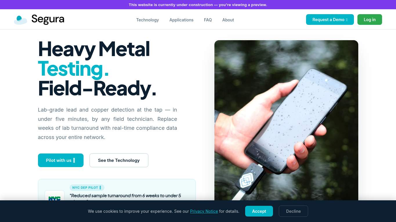
https://www.segura-water.com/ “Field-ready claims, courtroom-grade confusion.” Segura Water brought a lab-grade promise to the stage, then tripped over its own signage like a movie set with the lights still rigged. The page keeps shouting “request a demo” while the actual story is buried under enough text to qualify as a compliance novel.
https://www.segura-water.com/ screenshot TECHNICAL SUMMARY The strongest part is the fundamentals: SEO is excellent, canonical and crawlability are intact, and the page is clearly indexable. But performance and structure are doing the brand no favors — LCP sits at 4.4s, CLS is a disastrous 1 with 2 layout shifts, and render-blocking work is costing an estimated 1,780 ms, which is not exactly field-ready for a demo-led SaaS. Fix the hero asset and layout instability first, because every second of wobble chips away at trust, demo intent, and the credibility of those validation claims.
Categories 6 categories AI Visibility Partial Rewrite Owner only Share Share link 02
Canonical https://segura-water.com/ H1 Count 7 Heading skips h2→h4 JSON-LD blocks 1
🔥 The canonical points to https://segura-water.com/ while the audited URL is www.segura-water.com, so the site is whispering two different answers to the same question.Show 2 more roasts 💀 Technically indexable, structurally messy, and just inconsistent enough to confuse search engines about who’s in charge.
Priority Fixes (3) → Update the canonical tag to match the preferred version of the page. Canonical: https://segura-water.com/ Impact: high Effort: low
Why this matters The canonical and audited URL disagree, which creates duplicate-signal confusion instead of one clean index target.
→ Consolidate the page to one H1 and move the rest into H2/H3 hierarchy. H1 Count: 7 Impact: medium Effort: low
Why this matters Seven H1s turn the page outline into a shouting match, and search engines prefer one clear headline over seven competing ones.
→ Use one consistent social description across meta, Open Graph, and Twitter tags. Social Descriptions: Misaligned Impact: low Effort: low
Why this matters The current mismatch weakens preview consistency when the page is shared, which can dull click-through from social and messaging channels.
03
H1 Count 7 Heading skips h2→h4 Font families 5 Images 47
🔥 Seven H1 elements on one page is not hierarchy; that’s a content custody battle.Show 2 more roasts 💀 The page looks competent until you inspect the structure and realize the typography and headings are freelancing.
Priority Fixes (3) → Add supporting imagery so the layout feels intentional rather than visually sparse. Images: 47 Impact: medium Effort: medium
Why this matters Forty-seven images should be doing more explanatory work for a field-ready SaaS, especially when the hero is only partly convincing.
→ Fix missing alt text to keep the page accessible and audit-clean. Missing Alt: 0 Impact: low Effort: medium
Why this matters The audit shows no missing alt text, so this is a verification/maintenance item rather than an active failure, but it still needs ongoing checking.
→ Test spacing and alignment across breakpoints to confirm the layout holds up on mobile and desktop. Viewport: Present Impact: low Effort: medium
Why this matters Viewport support is present, but that only proves the browser knows where to start; it doesn’t prove the layout behaves well everywhere.
04
Word Count 7,732 Sentence Count 504 CTA Count 19 Citability blocks 6
🔥 Seven thousand seven hundred and thirty-two words is not a landing page copy deck; it’s a water-chemistry novella with a CTA cameo.Show 2 more roasts 💀 It explains the product like a textbook, then asks for a demo like the reader hasn’t already aged a month.
Priority Fixes (3) → Tighten the headline so the value proposition lands in one sentence. H1 Count: 7 Impact: high Effort: low
Why this matters The headline stack is doing too much work, and the page needs a single sharp claim for demo-seeking utility buyers.
→ Break long paragraphs into skimmable bullets and shorter sentences. Avg Words/Sentence: 15 Impact: low Effort: medium
Why this matters The copy volume is so high that scannability becomes a business issue, especially for people comparing validation data and spec sheets.
→ Make one primary CTA dominate the page and demote the rest. CTA Count: 19 Impact: medium Effort: low
Why this matters Nineteen CTA instances dilute the request-a-demo path and make the page sound decisive only in theory.
05
CTA Count 19 Buttons 3 Links 122 Final URL #home
🔥 Nineteen CTA instances and only 3 buttons is interaction design doing cosplay as abundance.Show 2 more roasts 💀 The page offers too many exits, too few decisive interactions, and one oddly self-aware anchor tag.
Priority Fixes (3) → Ensure navigation and footer links stay consistent across the site. Nav/Footer: Nav / Footer Impact: low Effort: medium
Why this matters The page already has navigation and a footer, so consistency is about reducing uncertainty, not adding more chrome.
→ Smoke-test browser behavior and keep runtime errors at zero. JS Errors: 0 Impact: low Effort: low
Why this matters Zero console errors is good, and it should stay that way so the demo path doesn’t get sabotaged by preventable runtime issues.
→ Reduce any form to only the essentials before asking for lead information. Form Fields: 0 Impact: low Effort: medium
Why this matters There is no form today, so if lead capture gets added, it should stay lean to avoid killing request-a-demo momentum.
06
CTA Count 19 Form Fields 0 Social Proof 4 Contact Path Present
🔥 Nineteen CTA instances with only 4 social proof items is the page asking for belief before it earns focus.Show 2 more roasts 💀 The page knows how to ask for a demo, but not how to close the deal without making prospects do the selling.
Priority Fixes (3) → Add a primary CTA above the fold that matches the core offer and make it visually dominant. CTA Count: 19 Impact: medium Effort: low
Why this matters Nineteen CTAs without one dominant path makes the demo request feel optional instead of obvious.
→ Offer a low-friction contact option such as a form, chat, or visible email for fast follow-up. Contact Path: Present Impact: low Effort: medium
Why this matters A contact path exists, but the absence of an inline capture mechanism means interested utilities have to work harder than they should.
→ Place stronger social proof directly near the CTA, including testimonials, logos, or validation stats. Social Proof: 4 Impact: medium Effort: low
Why this matters Four proof points are not enough near a demo ask for a lab-grade claim set; the page needs evidence where the decision happens.