Loading Report View…
portronics.com scored 52 out of 100 in this SavageAudit website audit covering Performance, SEO, Design, Copy, User Experience, and Conversion. The report uses captured website evidence to explain what is working, what is limiting the experience, and which improvements deserve attention first.
“A gadget shop with trust issues and a talent for breaking its own stage.”
Portronics shows up like a startup pitch deck that forgot the product demo, the proof, and half the wiring. There’s a lot of shiny inventory, but the page keeps tripping over its own cables while asking you to buy portable gadgets with confidence.

The big problems are structural: no H1, one malformed schema block, missing OG/Twitter images, 293 missing alt texts, and 10 console errors including Swiper failures and null references. Fix the broken assets and JavaScript first, then repair the heading/schema structure so search engines and shoppers can actually understand the storefront and trust it enough to convert.
SavageAudit identified 36 visible findings and recommendations across 6 audit categories. Each section below combines the category score with observed evidence and prioritized fixes.
The storefront spends more energy breaking than loading.
The PageSpeed API is failing with a 500, so you need a reliable measurement pipeline before you can trust the performance readout.
There are 10 console errors and repeated Swiper crashes, which strongly suggests script execution is getting in the way of clean rendering.
With 8 broken assets and a failed stylesheet path, the page is already wasting network trips; caching will help once the asset pipeline is repaired.
Search visibility is being asked to read a catalog written in invisible ink.
Without an H1, the page starts with no clear primary topic, which weakens search understanding and homepage clarity.
One parse error means at least part of the schema is broken, which can block rich-result eligibility and clean machine reading.
293 missing alt attributes is a huge accessibility and image-search miss on a visually heavy ecommerce homepage.
The layout is trying to look premium while the structure is held together with spare parts.
Fifteen font families creates inconsistent hierarchy and makes the interface feel assembled from different storefronts.
The image-heavy layout has 293 missing alts, which hurts both accessibility and the legibility of the visual system.
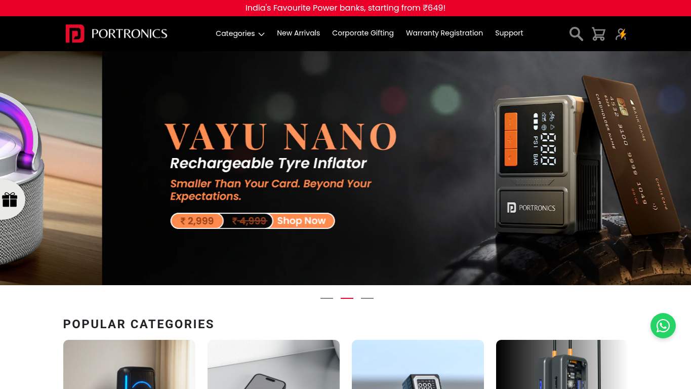
With 516 images and a cluttered hero area, the page needs better visual grouping instead of more objects fighting for attention.
The copy talks a lot, explains little, and still forgets to sound decisive.
With no H1 and a long marketing-heavy page, the brand promise needs one sharp line instead of a paragraph parade.
The page’s 274 sentences and 7,233 words need sharper scanning rhythm so shoppers can find specs, pricing, and trust info faster.
Two Contact Us CTAs dilute the buy intent when the page should be pushing the main shopping action first.
Users are being handed a crowded interface and a stack of broken interactions.
Ten JS errors, including null and undefined crashes, means key UI interactions are actively failing for users.
Eight broken assets, including a stylesheet hitting /undefined, are direct user-facing friction, not harmless technical trivia.
179 inputs is far beyond what a shopper should need on a product page and will create abandonment fast.
The store can sell, but it still makes shoppers work too hard to feel safe.
Three CTAs are present, but the current mix does not clearly prioritize buying over generic contact actions.
Only one social proof element is visible, which is thin for a transactional electronics page where trust drives purchase intent.
The path exists, but the current CTA language leans generic; a clearer support route can reduce hesitation on higher-consideration gadget purchases.
The big problems are structural: no H1, one malformed schema block, missing OG/Twitter images, 293 missing alt texts, and 10 console errors including Swiper failures and null references. Fix the broken assets and JavaScript first, then repair the heading/schema structure so search engines and shoppers can actually understand the storefront and trust it enough to convert.
Based on the category scores in this report, Conversion is the strongest area while Design has the most room for improvement.
SavageAudit evaluated the public website at https://www.portronics.com/ across performance, technical SEO, design, copy, user experience, and conversion signals. Scores and recommendations reflect the website evidence available when this audit was generated on July 1, 2026.
Compare this result with other public SavageAudit reports that received a similar overall website score.