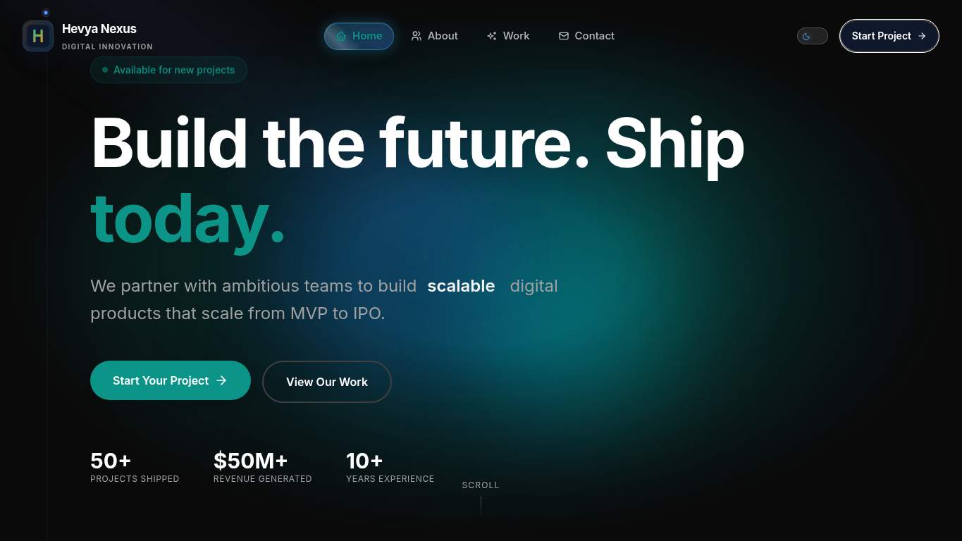
“Mission control looks sleek; the engine is still on fire.”
Hevya Nexus dressed like a premium digital product studio and then left the main act stuck in a loading loop. The homepage is trying to sell enterprise-grade innovation while the experience keeps tripping over its own shoelaces.
https://hevyanexus.com/
screenshot
TECHNICAL SUMMARY
The good news: SEO is clean, structured data is present, canonical and robots are sane, and the page is crawlable. The bad news: performance is a small technical eclipse — LCP is 6.2s, Interactive is 39.2s, TBT is 8,430ms, and main-thread work runs 36.8s, which means the site looks ready before it becomes usable. Fix the render-blocking JavaScript and heavy hero delivery first; that’s the difference between a studio that looks like it can build the future and one that makes visitors wait for it.
🔥Two H1s on a homepage is the kind of semantic confidence that makes search bots squint at the brief.
💀
SEO is the one department showing up on time, while the rest of the site is still in the launch bay.
→
Consolidate to one H1 and push the extra message into H2/H3 so the page stops shouting in two first-place voices at once.
H1 Count: 2Impact: mediumEffort: low
Why this matters
Two H1s can blur the page’s primary topic and weaken semantic clarity for crawlers and readers.
→
Add descriptive alt text to the 2 missing images so the page stops treating accessibility like an optional side quest.
Missing Alt: 2Impact: mediumEffort: medium
Why this matters
Missing alt text leaves meaningful images invisible to assistive tech and weakens page context.
→
Add citation-ready answer blocks with concrete facts and proof points so extractive systems have something usable instead of a glossy brochure fog.
Citability: NoneImpact: mediumEffort: medium
Why this matters
There are no citability blocks, so the page lacks compact, machine-usable explanations for search and AI extraction.
03
DESIGN
98
H1 Count2Heading count20Images6Missing alt text2
🔥Two H1s, 20 headings, and 6 images is a lot of structure for a page that still feels like it was assembled at mission control during a caffeine shortage.
💀
The interface looks competent, but it’s carrying extra semantic luggage like a premium deck with a mislabeled filing cabinet.
→
Add supporting imagery so the layout feels intentional instead of making a stylish gradient do all the storytelling work.
Images: 6Impact: mediumEffort: medium
Why this matters
With only 6 images, the page is visually lean enough that the abstract background has to carry too much weight.
→
Fix alt text on the 2 missing images so the design stops leaving accessibility hanging at the door.
Missing Alt: 2Impact: mediumEffort: medium
Why this matters
Alt text gaps are a direct accessibility miss, especially on a page selling expert digital craft.
→
Test spacing and alignment across mobile and desktop breakpoints so the current visual order doesn’t degrade when the viewport changes shape.
Viewport: PresentImpact: lowEffort: medium
Why this matters
Viewport support exists, but responsive checks are still needed to preserve the current polished layout across devices.
04
COPY
85
Word count764Sentence count62CTA count8Social proof count2
🔥764 words and 62 sentences is a lot of talking for a homepage that still leaves the hero feeling like a premium template wearing a company logo.
💀
The copy sounds confident, but it’s spending its words like a studio that forgot clients need specifics, not ceremonial fog.
→
Tighten the headline into one sentence that says exactly what Hevya Nexus does and why a buyer should care.
H1 Count: 2Impact: highEffort: low
Why this matters
Two H1s and a broad hero message are diluting the core value proposition instead of landing it cleanly.
→
Break dense paragraphs into shorter, skimmable chunks so the 764-word homepage stops reading like a whitepaper in a blazer.
Avg Words/Sentence: 12Impact: lowEffort: medium
Why this matters
Even with decent average sentence length, the overall page volume is high enough to reward tighter scanning structure.
→
Make one primary CTA stand out and reduce repeated variants so the page stops sending eight invitations to the same party.
CTA Count: 8Impact: mediumEffort: low
Why this matters
Eight CTAs spreads attention thin and weakens the start-project action you actually want.