A useful call to action describes the next action and gives readers enough context to understand the commitment. In our November 19 2026 checks, Calendly's free-start CTA opened account creation, while Notion offered separate signup and demo-request paths. Match your wording to the destination, explain material conditions nearby, and check the completed outcome when evaluating a change.
You click a button that says “Watch a demo.” A form opens and asks for your work email. There is no video on the screen. Now you have to work out whether the company will send a recording, arrange a call, or ask more questions first.
That is an illustrative situation. Before borrowing a CTA from another site, open its destination and check what the visitor has to do.
On November 19, 2026, we opened Calendly’s free-start path and Notion’s signup and demo routes in an unauthenticated desktop browser. The screenshots below document their public entry screens. We have no conversion-rate data for either company.
A call to action tells someone what to do next. Useful wording helps them anticipate the action, while the surrounding copy explains any cost, account requirement or other commitment they need to understand before proceeding.
CTA examples you can adapt to the next step
Start with the action your site actually provides. These are illustrative wording options, with the conditions that would make each one accurate.
| Visitor's task | Possible CTA | What should happen next |
|---|---|---|
| Open a self-service account | Create your account | Account creation with the required information made clear |
| Start a time-limited product trial | Start your trial | A trial signup with duration, billing terms and any card requirement explained |
| Ask the sales team for a demonstration | Request a demo | A request or scheduling flow that explains how the demonstration will be arranged |
| View an available product recording | Watch the product walkthrough | The recording, or a clear explanation of any access requirement |
| Get a checklist file | Download the checklist | The file or the stated steps for receiving it |
| Add an item to a shopping basket | Add to cart | The selected item appears in the basket, with visible feedback |
| Compare subscription costs | See plans and pricing | The current plans and their conditions |
| Send a service inquiry | Request an estimate | A form that collects what is needed to prepare or arrange the estimate |
| Get updates by email | Subscribe to weekly updates | Subscription with the expected content and frequency explained |
Use the wording only when it describes your flow. A download that arrives by email needs that explanation before someone submits their address. A demo request should explain whether the next step is choosing a time or waiting for a response.
Calendly makes account creation visible after the free-start CTA
On Calendly's homepage, we selected the header CTA labeled “Get started for free.” It opened the /signup page.
The destination offered an email entry and options to continue through Google or Microsoft. Above those choices, the page said “Create a free account” and repeated that a credit card was unnecessary. It also explained the calendar connection beside the provider options. The visitor could see the immediate task before entering anything.
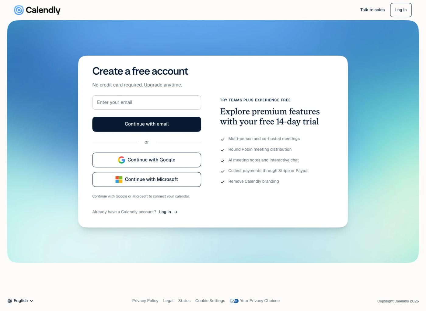
Check that handoff on your own site. If a free tool requires registration, does the next screen make the account step clear? If registration would affect someone’s decision to click, explain it beside the original CTA.
The screen also described a premium trial alongside the account entry. For your own product, explain how a trial relates to the free account or selected plan. Keep its duration, card requirement and end-of-trial behavior consistent throughout the flow.
Our check ended at the public account entry. On your own site, continue through account creation and check the confirmation, onboarding and first useful action.
Notion offers separate free and demo routes
Notion's homepage hero showed “Get Notion free” beside “Request a demo.” The first route went to signup. Selecting the second opened /contact-sales.
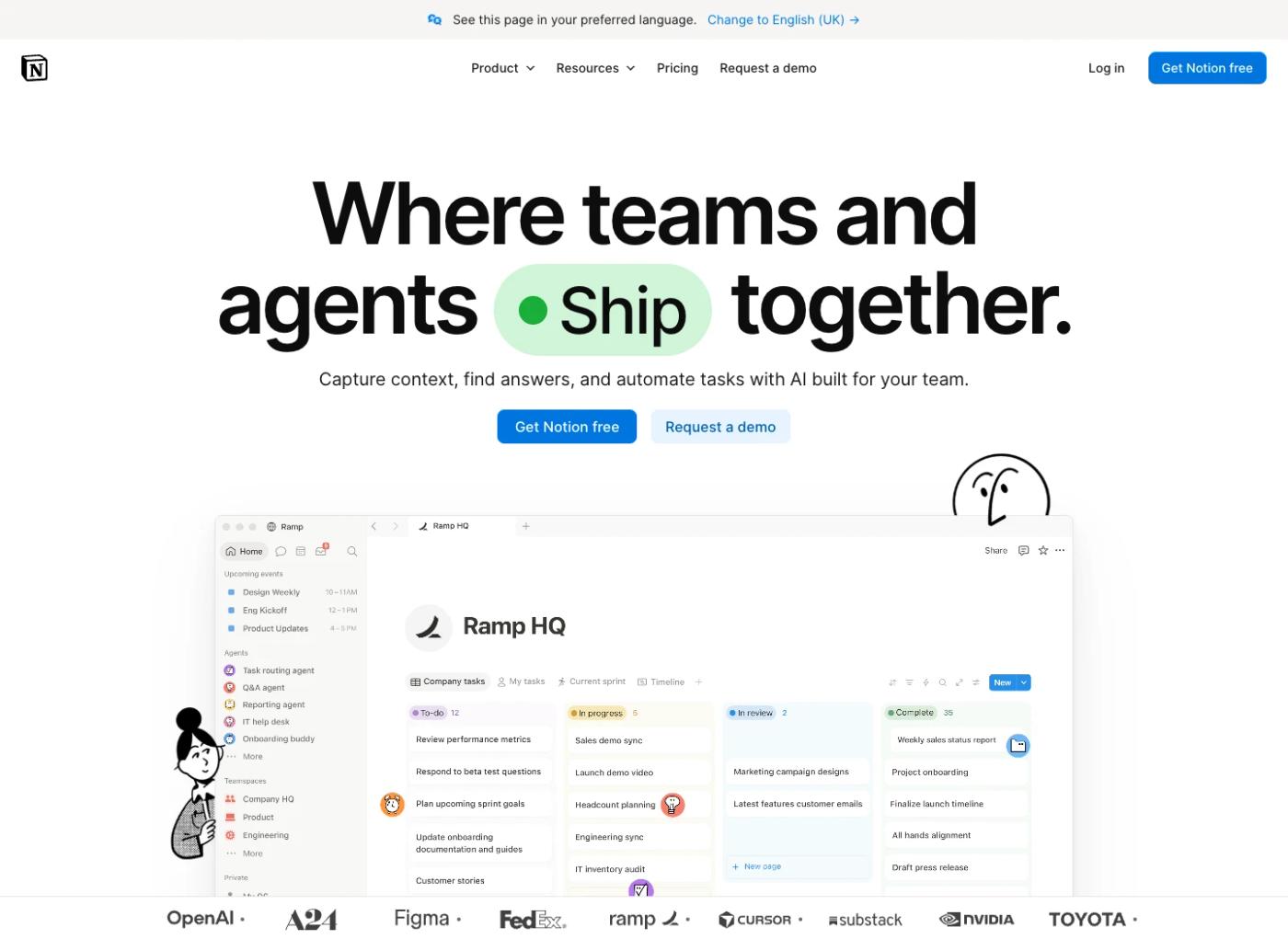
In our browser, the demo path began by asking for a work email and offering a Next button. It was the beginning of a request flow. A visitor had yet to supply information, arrange anything or watch a demonstration.
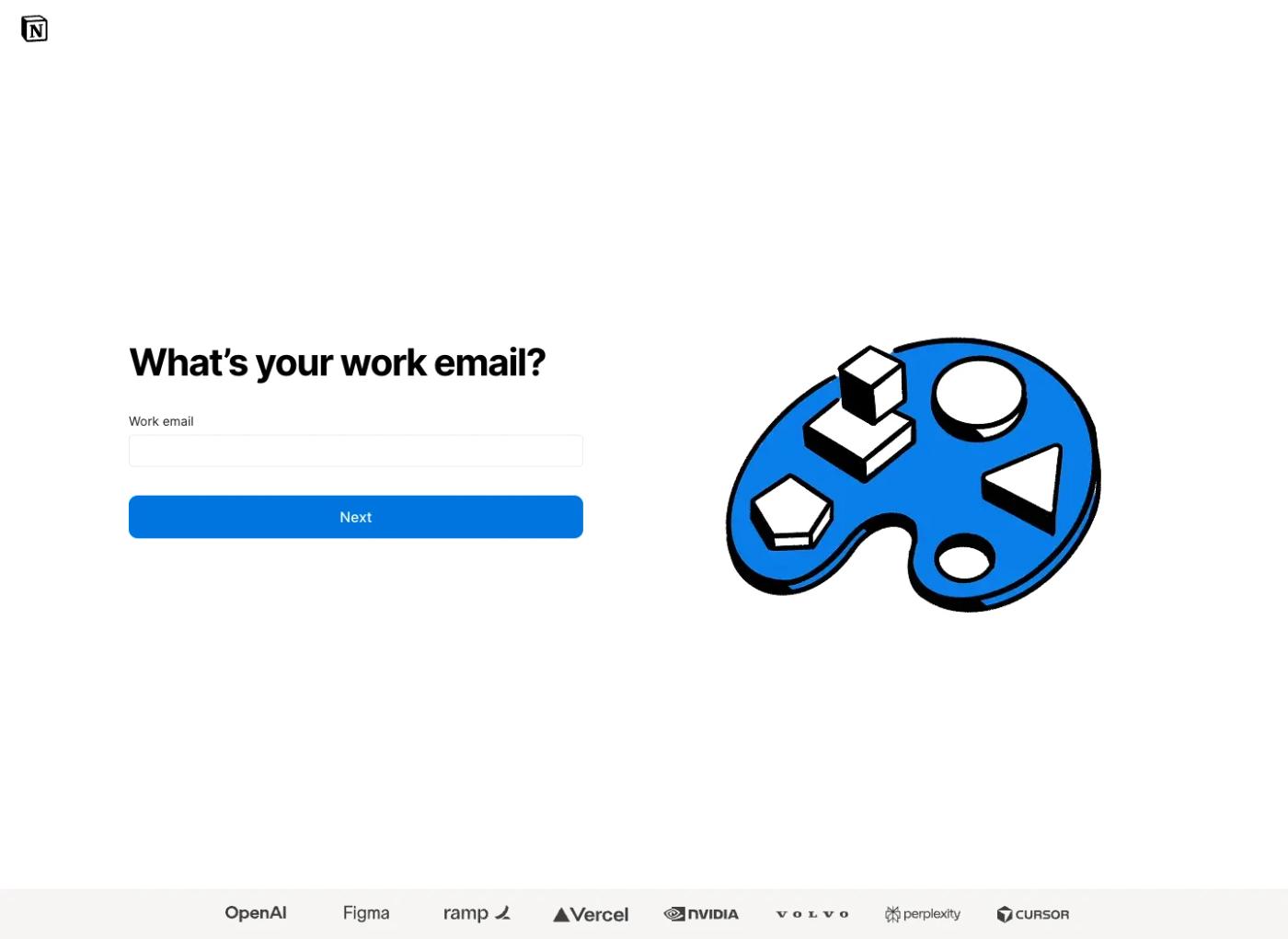
The signup route opened on app.notion.com and showed a work-email entry and identity-provider options. Both routes started on the homepage, and each led into its own task.
If you offer self-service and sales-assisted routes, explain who each one suits. A person trying the product and a buyer arranging a team demonstration may need different paths.
Review the destination before choosing the verb. If you ask for contact details so a person can request a demonstration, describe the request. If you offer a recording they can play, describe the recording. If the next screen is a calendar, explain what they are booking and any conditions they need to know.
Compare your own paths in the same way. Read each label, open its destination and record the first task. You can then decide whether the offer and the step agree.
Write the destination before rewriting the button
Open the current CTA and describe the next step in an ordinary sentence. For example, “This opens a form so the visitor can ask our team for an estimate.” That sentence gives you something concrete to compare with the button.
Now check what a person must do. Is an email address enough, or do you ask for a phone number and project budget? Does the action send a request, reserve a time, start a charge or open more information? Which of those details would affect the decision to proceed?
| If this is the actual flow | Wording to consider | Context to put near the CTA |
|---|---|---|
| A form starts an estimate request | Request an estimate | What information is needed and when a person can expect a response, if you can support that promise |
| A calendar lets people choose a consultation time | Book a consultation | Duration, price and who the session is for |
| A recording is available to play | Watch the walkthrough | Topic, approximate length and any access requirement |
| A visitor enters a self-service trial | Start your trial | Trial conditions and what happens when it ends |
| An existing customer is about to pay | Pay and confirm | Amount, order details and the effect of confirming |
The GOV.UK Design System makes a related distinction in its button guidance. It uses wording that describes the action, including different labels when information is saved and when someone simply moves to the next step. The practical question is whether the interface does what the label led the person to expect.
If you cannot write down what happens after the click, investigate the flow before polishing the copy. A clearer label may expose an awkward transition that needs a product or form change.
Put the decision-changing details beside the action
Put decision-changing conditions beside the CTA. For a trial, explain billing. For a consultation, give the time commitment. If a download arrives by email, say so before asking for an address.
Use conditions you can verify. If the plan requires a card, say so. If a consultation is an introductory sales call, describe it accurately. If response time varies, give the expectation your team can meet.
Here is illustrative markup for a fictional product trial. The duration and terms belong to the example and must be replaced with your real conditions.
<a href="/trial" aria-describedby="trial-terms">
  Start your trial
</a>
<p id="trial-terms">
  14 days. No card required. Choose a plan to continue afterward.
</p>
Here the description supplies the trial conditions alongside the link. The destination must carry the same offer. Inspect the rendered page and accessible description after your framework or CMS builds it.
For image-only links, the accessible name needs the same attention. Our alt text examples show how a text alternative changes when a picture becomes a link.
Decide whether the page needs a second CTA
Two actions can serve different visitors, as the Notion example shows. On your own page, write down who would use each route. A self-service signup and a sales conversation may both be relevant. Five labels that all start the same account flow may create extra reading without adding a choice.
Choose a primary action for the page's main task. Give a secondary route enough explanation to help the person who needs it. Review how they appear together on a phone, where one button may drop below the first screen or a floating widget may cover it.
On a long page, you may repeat the primary action after information the visitor needs to decide. Follow each repeated CTA. For a plan-specific link, check that the destination retains the selected plan.
Keep labels consistent for the same action. Use different wording for distinct tasks, such as opening plan information and confirming a purchase.
Check the element as well as the words
A CTA may look like a button while behaving as a link to another page. Use a link for navigation and a button for an action such as submitting a form or opening a dialog. W3C's button guidance distinguishes those functions and describes the expected keyboard interaction.
For an illustrative signup destination, ordinary link markup is enough.
<a href="/signup">Create your account</a>Inside a form, the control that submits the request is a button.
<button type="submit">Send your request</button>On the published page, use the keyboard to reach the action and check that focus remains visible. Activate it and confirm the page, dialog or form state you expected. If a dialog opens, check that focus moves into it and that closing it returns you to a sensible place.
A developer can inspect the accessible name in browser tools. Compare that name with the visible label and surrounding context. W3C's link-purpose guidance asks that a link's purpose be understandable from its text or the context programmatically associated with it.
Measure the outcome the CTA is meant to start
Before comparing two labels, define the result you want to improve. For signup, that might be a completed account followed by activation. For a demo request, it might be a qualified inquiry that reaches a scheduled meeting. For a shop, it may be a completed order.
Record the intermediate steps too. If more people click but abandon the form, check what changed in the handoff. Compare task completion with the initial click rate.
| Stage | What to check |
|---|---|
| Visitor reaches the CTA | Whether the intended audience had a chance to see it |
| Visitor activates it | Whether the label and context lead people into the flow |
| The destination works | Whether the next page or dialog loads with the expected offer |
| Visitor completes the task | Whether the signup, inquiry, booking or purchase succeeds |
| The business reviews the result | Whether the action produced a suitable customer, lead or other intended outcome |
If you run an experiment, compare the variants over the same period and with comparable audiences. Keep the offer and flow stable enough to understand what changed. On a low-traffic page, review recordings, test the task with users and fix observed obstacles while you collect enough data for a meaningful comparison.
Use the public examples to form a hypothesis, then test the change against the outcome you defined for your site.
A short CTA audit you can run today
Choose one important page and open its main CTA in a fresh session. Record the visible label, nearby offer details, destination and first task. Then follow the path on your own site through to the outcome you intend to count.
Look for a change in the offer, a surprise account requirement, an unexpected form or a selected plan that disappears. Repeat the check on mobile and with a keyboard. Save the observation beside the exact URL so the person changing the page can reproduce it.
If the problem is limited to the wording, propose a label that describes the action. If the problem starts in the destination, fix that step as well. For a broader page review, use our landing-page audit guide or SaaS demo-page checklist.
We build SavageAudit. You can compare your page with a competitor to spot differences worth checking, then open the actual CTA paths and decide which changes fit your offer. Keep the screenshot, destination and intended outcome together when you prioritize the fix.
Common questions
What are good call to action examples?
Create your account, Request a demo, Download the checklist and Add to cart can each be useful when they describe the action provided by the page. Choose the wording after opening the destination and checking what the visitor must do. Explain important conditions in the surrounding copy.
Is Get started a good CTA?
It can work when the page and destination make the next step understandable. In this article's Calendly check, the free-start label led to an account-creation screen that explained the entry options. On your own site, check whether the visitor can anticipate registration, a sales request or another commitment from the context.
What is the difference between Request a demo and Watch a demo?
Request a demo describes asking the company to arrange a demonstration. Watch a demo suggests a recording or demonstration the visitor can view. Inspect your actual flow and explain any form, scheduling or access requirement before a person provides information.
Should a page have more than one CTA?
A page can offer routes for different tasks, such as self-service signup and a sales conversation. Make the distinction understandable and choose a primary action for the main task. Check repeated buttons and plan-specific links to confirm each leads to the intended destination.
How do I know whether a CTA change works?
Define the completed outcome, record the steps that lead to it, and compare the change with a suitable baseline or experiment. Review task completion and result quality alongside clicks. A public screenshot can show wording and behavior at a moment in time, while your own measurement can test the effect on your visitors.
Run your own public presence audit
See how your website, search footprint, AI visibility, social proof, and conversion trust look from the outside.