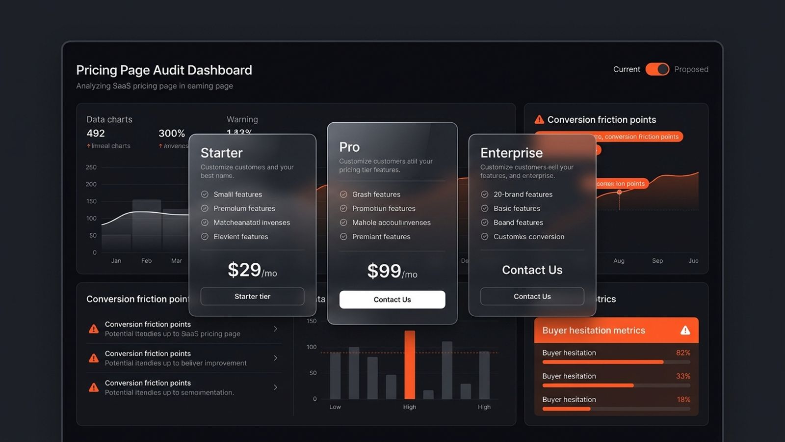
A SaaS pricing page teardown evaluates how your pricing table communicates value, differentiates tiers, handles buyer hesitation, and removes checkout friction. Key audit areas include annual toggle transparency, clear target persona labeling, eliminating feature table clutter, removing unnecessary 'Contact Sales' walls, and adding risk-reversal microcopy near CTAs.
Your homepage gets traffic. Visitors click around, maybe even read a blog post or your features page. Then they hit your pricing page — and vanish.
Most founders look at Google Analytics, see a 75% bounce rate on `/pricing`, and immediately assume their software is too expensive. So they lower prices or offer bigger discounts. But 9 times out of 10, price is not the problem. Friction is.
What is a SaaS pricing page teardown? A SaaS pricing page teardown is a direct, point-by-point audit of how your pricing table communicates value, handles buyer hesitation, and removes friction before checkout. Unlike a broad traffic report, a teardown checks the exact psychological bottlenecks that stop a credit card swipe: tier confusion, hidden annual commitments, feature matrix paralysis, and vague enterprise walls.
We already broke down how to audit your hero section in our SaaS homepage teardown. Now let's walk through what breaks on the pricing page and how to audit every element end to end.
1. The Monthly vs. Annual Toggle Trap
Almost every B2B SaaS has a billing toggle: 'Billed Annually (Save 20%)' vs. 'Billed Monthly'. The problem is how teams design it.
The most common mistake is defaulting the toggle to annual and displaying the discounted per-month price (for example, '$49/mo') without clearly stating that the user is billed $588 upfront today.
When a buyer clicks 'Start Trial' or 'Buy Now' expecting a $49 charge and suddenly sees $588 on the checkout screen, trust evaporates instantly. They feel tricked, and they close the tab.
What to audit on your toggle: Does the toggle switch smoothly without layout shift? Does the number clearly say 'billed annually at $X/yr' directly under the monthly breakdown? Is monthly pricing visible without jumping through hoops? If buyers cannot quickly calculate their real cash outflow, they will not buy.
2. The Tier Differentiation Failure: Who Is Each Plan For?
Look at your pricing table right now. You probably have three columns: Starter, Pro, and Enterprise. Or Basic, Plus, and Premium.
Now ask yourself: if a solo consultant or an engineering lead lands on this page, can they tell which plan was built for them in under 10 seconds?
Most SaaS pages list 15 identical features across all three columns with slight variations in numbers (e.g., '5 seats' vs '10 seats' vs 'Unlimited seats'). That is lazy positioning. It forces the prospect to do mental math and compare column by column.
How to fix plan differentiation: Put a clear buyer persona label right below the plan name. For example: 'Best for solo founders shipping their first MVP' or 'For growing agencies managing 5+ client accounts'. Tell the buyer who should buy each tier. Remove the guesswork.
3. Feature Matrix Paralysis: The 50-Row Checkbox Graveyard
Somewhere along the way, B2B SaaS teams decided that every pricing page needs an endless feature table with 50 rows of green checkmarks, grey dashes, and tooltips.
Here is what actually happens when a user scrolls down to that table: cognitive overload. Instead of clarifying the purchase, the matrix introduces new doubts. The buyer notices a feature marked 'No' on the Pro tier that they didn't even know existed 30 seconds ago, and now they wonder if they are missing out.
Keep the main pricing cards focused on the top 4 to 5 decision-making features — the actual value drivers that justify upgrading to the next tier. Move the full technical matrix below the fold as an expandable accordion for power buyers who need to verify compliance or API limits.
4. The 'Contact Sales' Brick Wall on Self-Serve Products
If you run a product-led or self-serve SaaS, hiding your highest tier behind a 'Contact Sales' button without any price anchor is a massive conversion killer.
Early-stage buyers and modern teams hate scheduling 30-minute discovery calls just to find out if your tool costs $300/month or $3,000/month. Unless you are selling true six-figure enterprise contracts with custom SLA and security audits, provide a price floor (e.g., 'Starting at $499/mo' or 'Custom plans for 50+ seats').
When buyers see zero pricing transparency, they assume it is outside their budget and move directly to a competitor with self-serve checkout.
5. The Missing Reassurance Layer Around the CTA Button
The space right around your pricing CTA button is the highest-friction real estate on your entire website. The user's mouse is hovering. Their brain is running risk calculations.
What thoughts are going through their head right at that moment?
• Will they charge my card immediately or after 14 days?
• Is it hard to cancel, or do I have to send an email to support?
• Is there a money-back guarantee if this doesn't work for my team?
• Is my payment secure?
If your pricing card just has a lonely 'Get Started' button with zero context, you leave those questions unanswered. Adding micro-copy like '14-day free trial • No credit card required • Cancel anytime in 1 click' directly under the primary CTA routinely bumps click-through rates by 15% to 25%.
6. The 20-Point SaaS Pricing Page Teardown Rubric
Use this checklist to score your pricing page across the four core dimensions: Clarity, Friction, Proof, and Action.
| Category | What to Inspect | Pass / Fail Standard |
|---|---|---|
| Clarity | Target Persona Labeling | Each tier clearly states who it is designed for in 1 sentence. |
| Clarity | Value Metric Alignment | Pricing scales on a metric customers understand (users, runs, domains). |
| Clarity | Top 5 Value Drivers | Each card lists only the 4-5 features that differentiate that tier. |
| Clarity | Annual Savings Math | Toggle displays both monthly cost and actual annual billed total. |
| Friction | Zero Checkout Surprises | No hidden setup fees, extra user costs, or sudden VAT spikes. |
| Friction | Self-Serve Upgrade Path | Low and mid-tier plans can be purchased directly without talking to sales. |
| Friction | Plan Comparison Layout | No horizontal scrolling required on standard desktop screens. |
| Friction | Mobile Card Stacking | Recommended plan appears first or is clearly highlighted on mobile. |
| Trust | Objection-Handling FAQs | Addresses cancellation terms, refund policy, and upgrade prorating. |
| Trust | Contextual Micro-Proof | Testimonial or customer quote placed near the recommended tier. |
| Trust | Risk Reversal Copy | 'No credit card required' or '30-day money-back guarantee' near CTA. |
| Action | Visual CTA Hierarchy | The recommended/most popular tier has a distinct high-contrast button. |
7. Mobile Pricing UX: Where Most Responsive Designs Break
Over 40% of B2B SaaS buyers check out tools on mobile before discussing them on desktop. Yet most pricing tables on mobile are completely broken.
When a three-column desktop table stacks vertically on mobile, the user has to scroll past 6 screens of features just to see what the second plan costs. By the time they reach Tier 3, they have forgotten what was included in Tier 1.
Clean mobile pricing design: On mobile, collapse the feature lists by default or use a clean horizontal swipe / segmented pill control ('Starter | Pro | Enterprise'). Always keep the primary recommended tier front and center so users do not get lost in vertical scroll fatigue.
How to Run This Teardown on Your Own Website
Do not try to redesign your pricing page in one massive overhaul. Fix the friction points in priority order:
Step 1: Fix your CTA micro-copy. Add cancellation terms and 'No credit card required' directly below your primary buttons. This takes 10 minutes and gives immediate lift.
Step 2: Clean up the annual toggle math. Ensure the exact total billed amount is visible so buyers never feel misled at checkout.
Step 3: Trim the feature matrix. Cut the clutter from your primary pricing cards. Move long comparison checklists to an expandable table below.
If you want an objective, brutal teardown of your pricing page alongside your SEO, UX, and copy, run a free SavageAudit Roast. We grade your site across all 6 core pillars so you can see exactly where buyers are dropping off.
Bottom Line
Your pricing page is not a spreadsheet. It is the final closing pitch of your entire marketing machine.
When buyers hesitate on `/pricing`, it is almost never about an extra $10 or $20 per month. It is because your tiers are confusing, your annual commitment is sneaky, or your CTA feels risky.
Audit the friction points, remove the cognitive clutter, and make picking the right plan the easiest decision of their day.
Common questions
What is a SaaS pricing page teardown?
A SaaS pricing page teardown is a structured audit that evaluates pricing tier architecture, plan differentiation, annual toggle mechanics, feature table clarity, and checkout friction. It uncovers the psychological hesitation points preventing visitors from converting into paying customers.
Why do SaaS pricing pages suffer high bounce rates?
The most common reasons for high bounce rates on SaaS pricing pages are: confusing tier names without buyer persona guidance, hidden annual billing traps (showing $49/mo but charging $588 upfront without warning), feature tables with 50+ rows causing decision paralysis, and missing reassurance copy around the CTA button.
Should I default my pricing toggle to annual or monthly billing?
Defaulting to annual billing is fine if you offer a meaningful discount (e.g. 15-20%), but you must clearly display the total upfront charge directly below the monthly equivalent. If buyers click expecting a monthly charge and see an annual total at checkout, drop-off rates spike dramatically.
How many pricing tiers should a SaaS have?
Three tiers is the standard optimal structure for most B2B SaaS products: an entry-level tier for individual users or small teams, a recommended growth/pro tier for the core target audience, and an enterprise tier for larger teams requiring advanced security, custom limits, or SLA support.
What copy should go under a SaaS pricing CTA button?
Add reassuring micro-copy that eliminates immediate purchase anxiety: '14-day free trial', 'No credit card required', 'Cancel anytime in 1 click', or '30-day money-back guarantee'. This reassures the buyer that their risk is zero.
Can SavageAudit analyze my SaaS pricing page?
Yes. SavageAudit audits conversion friction, layout hierarchy, copywriting clarity, and page performance across your entire domain, including dedicated pricing tables and demo landing pages.
Keep the diagnosis moving
Run your own public presence audit
See how your website, search footprint, AI visibility, social proof, and conversion trust look from the outside.