Loading Report View…
one10studio.com scored 82 out of 100 in this SavageAudit website audit covering Performance, SEO, Design, Copy, User Experience, and Conversion. The report uses captured website evidence to explain what is working, what is limiting the experience, and which improvements deserve attention first.
“A tasteful exterior hiding a lead-generation engine held together by missing structure and lazy labels.”
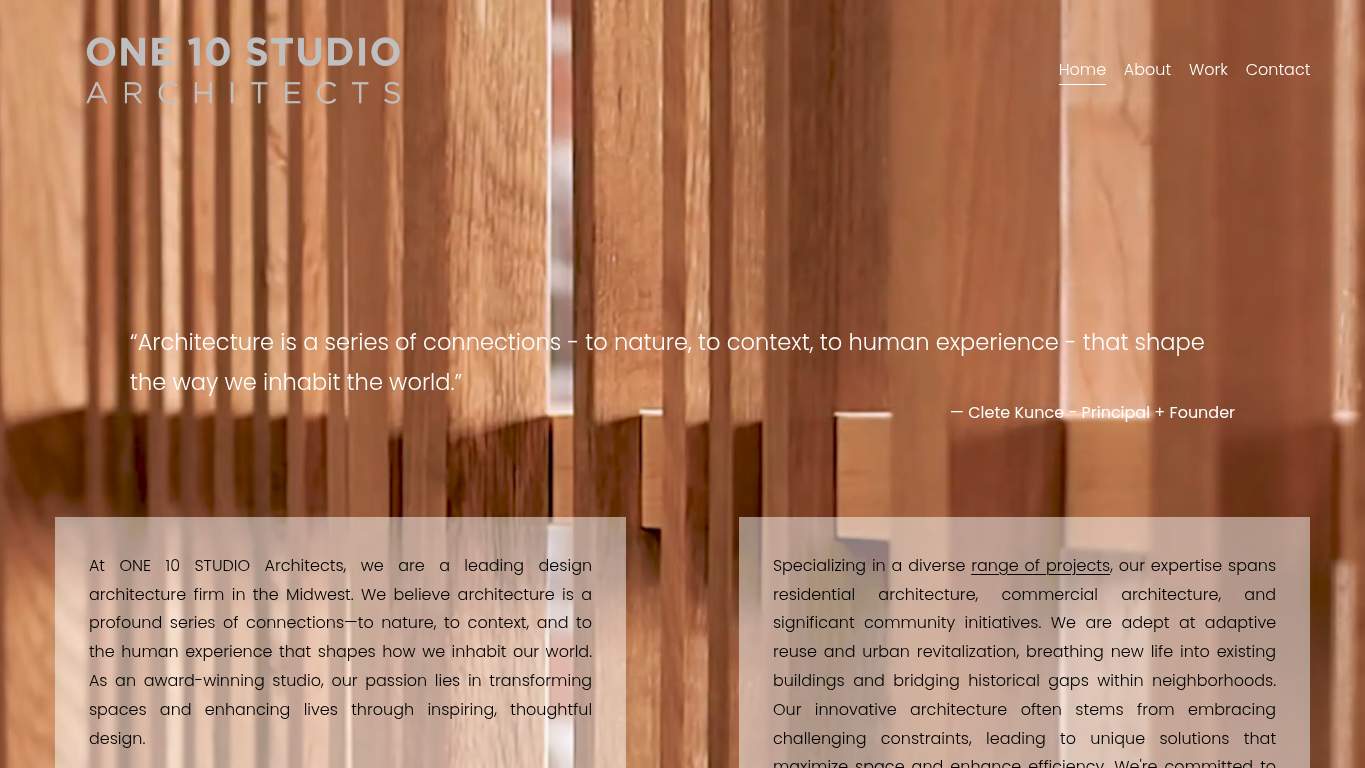
ONE 10 STUDIO dressed the showroom nicely, then hid the contact desk in the back and called it strategy. For an architecture firm selling thoughtful design in the Midwest, this site keeps acting like a brochure that forgot its job was to get hired.

The strongest signals are the clean metadata and complete schema coverage, but the site kneecaps itself with 0 headings, a 3.4s LCP, and 11.0s to become interactive. The biggest fix-first move is to add a real H1 and a clearer above-the-fold CTA, then cut the 1,676 KiB payload and 580 KiB of unused JavaScript so the page stops loading like a contractor showing up with half the tools. That matters because trust and contact intent are being delayed by structure and speed, not by the business model.
SavageAudit identified 36 visible findings and recommendations across 6 audit categories. Each section below combines the category score with observed evidence and prioritized fixes.
A heavy page with slow visibility and even slower self-control.
A 3.4 s LCP means the main visual is arriving late, so trimming hero weight is the fastest way to improve perceived speed and contact intent.
320 ms of blocking work is enough to make the page feel sticky, especially when 11.0 s to interactive is already dragging the experience down.
A 2.6 s first paint suggests repeat visits are not getting the fast-response treatment they should, and caching is the cheap win here.
Technically indexable, structurally underdressed, and one headline away from being useful.
With 0 H1s, the page gives search engines no primary topic anchor, which is embarrassing for a site already trying to rank like a professional firm.
AI crawler guidance is missing, so the site is making discovery harder for systems that increasingly summarize service businesses.
Only 2 profiles makes the brand graph thin, which weakens local trust signals and entity confidence for a lead-generation business.
Clean enough to survive, but not expressive enough to persuade.
Three images is thin for an architecture portfolio, and the page needs more visual proof to match the business promise.
Accessibility is already compliant on this metric, so this is a preventative quality pass rather than a rescue mission.
The viewport is present, but responsive behavior still needs confirmation so the layout doesn't fall apart outside the desktop showroom.
The words are competent, but the page still sounds like it’s whispering through a doorway.
With 0 headings, the page is missing the clearest possible sentence for what ONE 10 STUDIO does and why a Midwest client should care.
An average of 21 words per sentence is serviceable, but on a lead page it should read faster than a zoning hearing.
Three CTAs all saying the same thing weakens message hierarchy, so the copy needs one obvious next step instead of three identical nudges.
Nothing is shattered, but one broken asset and a monotone action pattern are doing the damage.
A single broken asset is still a user-facing failure, and for a service site it chips away at the impression that everything is under control.
The site already has nav and footer structure, so consistency work prevents the experience from feeling stitched together page by page.
The current zero-error state is a good baseline, and this keeps the page from regressing into avoidable browser drama.
It wants inquiries, but it built the least persuasive path possible to get them.
Three identical CTAs without a dominant one makes the action path fuzzy, especially when the hero already lacks a strong first click.
The contact path exists, but without a form or visible low-friction alternative, the lead capture flow is too easy to abandon.
One proof point is thin for a high-consideration service, and placing more trust signals near the CTA should raise inquiry confidence.
The strongest signals are the clean metadata and complete schema coverage, but the site kneecaps itself with 0 headings, a 3.4s LCP, and 11.0s to become interactive. The biggest fix-first move is to add a real H1 and a clearer above-the-fold CTA, then cut the 1,676 KiB payload and 580 KiB of unused JavaScript so the page stops loading like a contractor showing up with half the tools. That matters because trust and contact intent are being delayed by structure and speed, not by the business model.
Based on the category scores in this report, Copy is the strongest area while Performance has the most room for improvement.
SavageAudit evaluated the public website at https://www.one10studio.com/ across performance, technical SEO, design, copy, user experience, and conversion signals. Scores and recommendations reflect the website evidence available when this audit was generated on July 16, 2026.
Compare this result with other public SavageAudit reports that received a similar overall website score.