Loading Report View…
cliffordalmondfineart.com scored 66 out of 100 in this SavageAudit website audit covering Performance, SEO, Design, Copy, User Experience, and Conversion. The report uses captured website evidence to explain what is working, what is limiting the experience, and which improvements deserve attention first.
“A handsome portfolio with the urgency of a gallery wall after closing time.”
The site looks like it dressed well for the opening night and then forgot to hand anyone a programme. For a fine art business, it whispers when it should be showing work, proof, and a reason to contact.

The biggest drag is performance: LCP is 10.9 s, FCP is 4.1 s, and render-blocking savings of 2,090 ms are sitting there like unpaid studio rent. The page also ships 529 KiB of unused JavaScript, 136 KiB of unused CSS, and 118 KiB of legacy JavaScript, while the one-redirect entry path and missing H1 leave discoverability and first-impression clarity doing the bare minimum. Fix the heavy hero and blocking resources first, because right now the art has to wait for the page to catch its breath before anyone gets to the contact step.
SavageAudit identified 36 visible findings and recommendations across 6 audit categories. Each section below combines the category score with observed evidence and prioritized fixes.
Beautiful art, but the page loads like it’s still unpacking the studio.
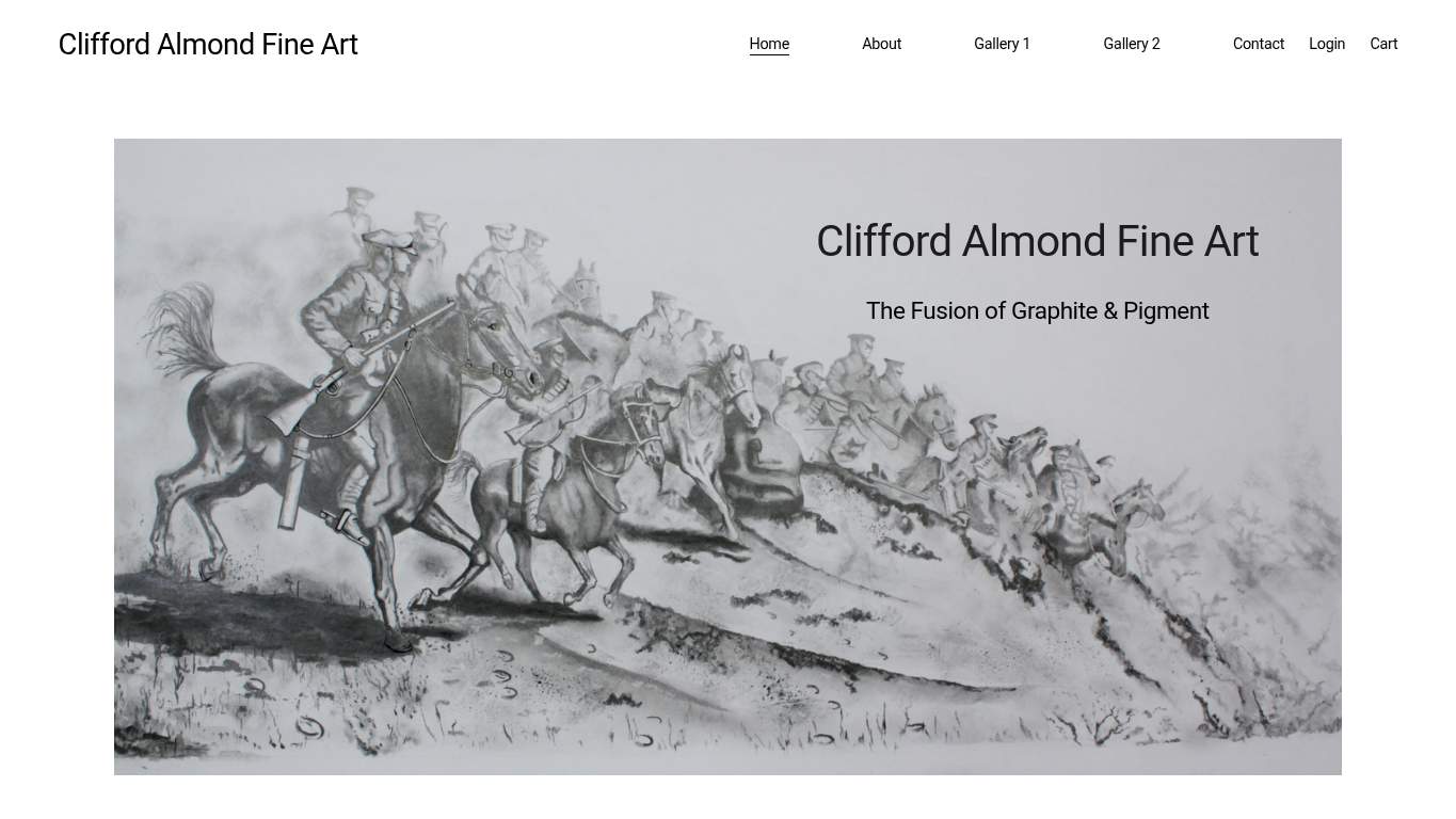
A 10.9 s LCP usually means the hero asset is dragging the whole first paint down, and the homepage is built around that image.
270 ms of blocking time plus 2,090 ms of render-blocking savings is the browser doing overtime for no reason.
A 4.1 s FCP suggests visitors are waiting too long for visible content, and caching is the easiest win in the pile.
Search visibility is doing portrait work with one eye closed.
Zero H1 elements leave the page without a clear primary topic, which is rough for both search understanding and human scanning.
The site currently gives AI crawlers no explicit guidance on what to cite or prioritize.
With only WebSite schema present, the brand entity is under-described and leaves search engines with less confidence about who this is.
The page is tidy, but it’s giving gallery brochure after the budget got cut.
One image on a fine art site is visually underfed, especially when the homepage needs to carry portfolio, lesson, and trust cues.
The current image audit shows no missing alt text, so keep it that way; this fix is preventive and limited to ongoing governance.
Viewport support exists, but that only means the page can respond; it does not guarantee the composition behaves well across screens.
The words are so sparse they make the art do all the customer acquisition.
With no H1 and only one sentence, the page lacks a clear sentence-level promise for art buyers or lesson seekers.
A single 59-word sentence is doing too much at once and makes the page harder to scan quickly.
Three identical CTAs blur the action instead of guiding it, especially on a page with this little explanatory copy.
It’s navigable, but the path to action has all the urgency of a gallery closed for lunch.
The page has nav and footer present, but consistency matters if the site is going to support browsing art, lessons, and contact details reliably.
There are currently zero JS errors, so the job is to keep it that way rather than let regressions sneak in.
There is no form yet, so the immediate need is not reduction but introduction; this issue is limited and should be addressed as part of the contact path.
The site wants enquiries, but it never gives visitors an easy place to say yes.
Three CTAs exist, but none are clearly dominant, so the first screen is not steering visitors toward contact.
The contact path exists in principle, but a visible, low-friction route is still missing from the available page data.
With no social proof visible, the CTA is carrying all the trust burden by itself, which is a terrible job description.
The biggest drag is performance: LCP is 10.9 s, FCP is 4.1 s, and render-blocking savings of 2,090 ms are sitting there like unpaid studio rent. The page also ships 529 KiB of unused JavaScript, 136 KiB of unused CSS, and 118 KiB of legacy JavaScript, while the one-redirect entry path and missing H1 leave discoverability and first-impression clarity doing the bare minimum. Fix the heavy hero and blocking resources first, because right now the art has to wait for the page to catch its breath before anyone gets to the contact step.
Based on the category scores in this report, Design is the strongest area while Copy has the most room for improvement.
SavageAudit evaluated the public website at https://cliffordalmondfineart.com/ across performance, technical SEO, design, copy, user experience, and conversion signals. Scores and recommendations reflect the website evidence available when this audit was generated on July 12, 2026.
Compare this result with other public SavageAudit reports that received a similar overall website score.